Gathering detailed insights and metrics for @asafarim/react-privacy-consent
Gathering detailed insights and metrics for @asafarim/react-privacy-consent
Gathering detailed insights and metrics for @asafarim/react-privacy-consent
Gathering detailed insights and metrics for @asafarim/react-privacy-consent
npm install @asafarim/react-privacy-consentTypescript
Module System
Node Version
NPM Version
TypeScript (77.59%)
CSS (22.41%)
Total Downloads
0
Last Day
0
Last Week
0
Last Month
0
Last Year
0
MIT License
22 Commits
1 Branches
1 Contributors
Updated on Jul 06, 2025
Latest Version
1.7.0
Package Id
@asafarim/react-privacy-consent@1.7.0
Unpacked Size
1.35 MB
Size
1.00 MB
File Count
36
NPM Version
10.8.2
Node Version
20.18.3
Published on
Jun 25, 2025
Cumulative downloads
Total Downloads
Last Day
0%
NaN
Compared to previous day
Last Week
0%
NaN
Compared to previous week
Last Month
0%
NaN
Compared to previous month
Last Year
0%
NaN
Compared to previous year
A comprehensive React TypeScript package for GDPR/CCPA privacy consent management with customizable UI components, automatic compliance handling, and modern accessibility features.


Experience the privacy consent system through these interactive examples:
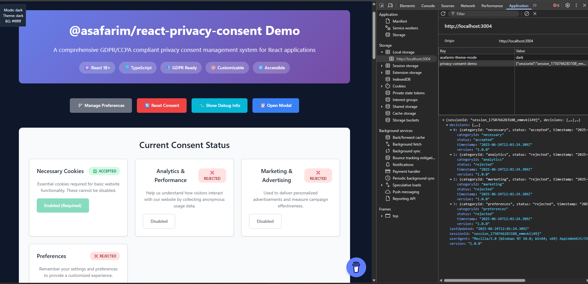
Visual representation of the consent status monitoring system showing real-time compliance tracking, category-specific consent states, and user preference management.
Key Features Demonstrated:
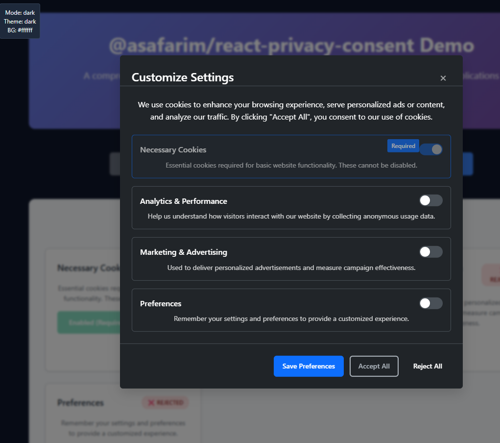
Interactive settings panel showcasing the comprehensive customization options available for tailoring the consent experience to your brand and legal requirements.
Customization Features Shown:
🔗 Try the Live Interactive Demo
The package includes professionally designed UI components and visual aids:
src/assets/consent-status.png)useConsent hook for real-time updates1// Implementation matching the status dashboard design 2import { useConsent } from '@asafarim/react-privacy-consent'; 3 4function StatusDashboard() { 5 const { getAllConsent, consentRecord } = useConsent(); 6 7 return ( 8 <div className="consent-dashboard"> 9 {/* Visual status grid as shown in the asset */} 10 <ConsentStatusGrid consent={getAllConsent()} /> 11 <ComplianceIndicator record={consentRecord} /> 12 </div> 13 ); 14}
src/assets/privacy-consent-customize-settings.png)1// Build a settings panel like the one shown in the asset 2import { PrivacyConsentConfig } from '@asafarim/react-privacy-consent'; 3 4function CustomizationPanel() { 5 const [config, setConfig] = useState<PrivacyConsentConfig>({ 6 // Configuration options matching the settings panel 7 banner: { 8 position: 'bottom', // Position dropdown 9 layout: 'banner', // Layout selector 10 animation: true, // Animation toggle 11 showCloseButton: true // Feature toggles 12 }, 13 theme: { 14 primaryColor: '#007bff', // Color picker 15 borderRadius: '8px', // Slider control 16 animationDuration: '0.3s' // Duration setting 17 } 18 }); 19 20 return <ConfigurationInterface config={config} onChange={setConfig} />; 21}
1<!-- Reference the included assets in your project documentation --> 2 3
1// Export your consent state for custom visualizations
2function ExportConsentData() {
3  const { consentRecord, getAllConsent } = useConsent();
4
5  const exportVisualData = () => {
6    return {
7      status: getAllConsent(),
8      record: consentRecord,
9      compliance: calculateCompliance(consentRecord),
10      timestamp: new Date().toISOString()
11    };
12  };
13
14  return (
15    <button onClick={() => generateCustomAsset(exportVisualData())}>
16      📊 Generate Custom Status Asset
17    </button>
18  );
19}
Experience all the features shown in our visual assets through our comprehensive demo:
🔗 Live Demo: bibliography.asafarim.com/react-privacy-consent/demo
| Visual Asset | Demo Section | Interactive Elements |
|---|---|---|
| 🖼️ Consent Status Dashboard | Status Monitoring | ✅ Real-time consent toggles 📊 Live compliance indicators 🔄 State persistence demo |
| ⚙️ Customization Settings | Configuration Panel | 🎨 Live theme editor 📍 Position controls 🎭 Animation toggles |
The demo page (ASafariM.Clients/asafarim-bibliography/src/components/PrivacyConsentDemo.tsx) showcases:
1// Live demonstration of features shown in our assets
2function PrivacyConsentDemo() {
3  return (
4    <div className="demo-showcase">
5      {/* Status dashboard matching our screenshot */}
6      <section className="status-section">
7        <h2>📊 Consent Status Dashboard</h2>
8        <ConsentStatusDashboard />
9        <p>↑ This interface matches our status dashboard asset</p>
10      </section>
11
12      {/* Customization panel matching our settings screenshot */}
13      <section className="customization-section">
14        <h2>⚙️ Live Customization</h2>
15        <CustomizationPanel />
16        <p>↑ Real-time configuration matching our settings asset</p>
17      </section>
18
19      {/* Use case demonstrations */}
20      <section className="use-cases">
21        <h2>🎯 Real-World Use Cases</h2>
22        <UseCaseExamples />
23      </section>
24    </div>
25  );
26}
Our demo validates that:
1npm install @asafarim/react-privacy-consent
2# or
3yarn add @asafarim/react-privacy-consent
4# or
5pnpm add @asafarim/react-privacy-consent
💡 See it in action: The examples below correspond to the features shown in our consent status dashboard and customization settings screenshots above.
1npm install @asafarim/react-privacy-consent
2# or
3yarn add @asafarim/react-privacy-consent
4# or
5pnpm add @asafarim/react-privacy-consent
1import React from 'react';
2import {
3  ConsentProvider,
4  defaultPrivacyConsentConfig
5} from '@asafarim/react-privacy-consent';
6import '@asafarim/react-privacy-consent/styles.css';
7
8function App() {
9  return (
10    <ConsentProvider config={defaultPrivacyConsentConfig}>
11      <YourAppContent />
12    </ConsentProvider>
13  );
14}
1import React from 'react';
2import {
3  ConsentBanner,
4  ConsentModal,
5  useConsent
6} from '@asafarim/react-privacy-consent';
7
8function ConsentManager() {
9  const { isPreferencesVisible, hidePreferences } = useConsent();
10
11  return (
12    <>
13      <ConsentBanner />
14      <ConsentModal
15        isOpen={isPreferencesVisible}
16        onClose={hidePreferences}
17      />
18    </>
19  );
20}
1import React, { useEffect } from 'react';
2import { useConsent } from '@asafarim/react-privacy-consent';
3
4function AnalyticsComponent() {
5  const { hasConsent, consentRecord } = useConsent();
6
7  useEffect(() => {
8    if (hasConsent('analytics')) {
9      // Initialize analytics - as shown in the status dashboard
10      console.log('Analytics consent granted');
11    }
12  }, [hasConsent]);
13
14  return (
15    <div>
16      {/* This status display matches our consent dashboard UI */}
17      Analytics Status: {hasConsent('analytics') ? '✅ Enabled' : '❌ Disabled'}
18    </div>
19  );
20}
Create a dashboard like the one shown in our status screenshot:
1import React from 'react';
2import { useConsent } from '@asafarim/react-privacy-consent';
3
4function ConsentStatusDashboard() {
5  const { getAllConsent, consentRecord } = useConsent();
6  const allConsent = getAllConsent();
7
8  return (
9    <div className="consent-status-dashboard">
10      <h3>🛡️ Privacy Consent Status</h3>
11
12      {/* Real-time status indicators as shown in the screenshot */}
13      <div className="status-grid">
14        {Object.entries(allConsent).map(([categoryId, status]) => (
15          <div key={categoryId} className={`status-card ${status ? 'granted' : 'denied'}`}>
16            <div className="status-indicator">
17              {status ? '✅' : '❌'}
18            </div>
19            <div className="category-name">{categoryId}</div>
20            <div className="status-text">
21              {status ? 'Granted' : 'Denied'}
22            </div>
23          </div>
24        ))}
25      </div>
26
27      {/* Compliance summary */}
28      <div className="compliance-summary">
29        <p>Last Updated: {new Date(consentRecord?.lastUpdated || Date.now()).toLocaleString()}</p>
30        <p>Version: {consentRecord?.version || 'N/A'}</p>
31      </div>
32    </div>
33  );
34}
🖼️ Visual Reference: The following examples demonstrate the features visible in our customization settings panel.
Perfect for online stores requiring marketing, analytics, and essential cookies:
1import { ConsentProvider, useConsent } from '@asafarim/react-privacy-consent';
2
3// Configuration matching the customization options shown in our screenshot
4const ecommerceConfig = {

5  settings: {

6    categories: [
7      {

8        id: 'necessary',

9        name: 'Essential',

10        description: 'Required for shopping cart and checkout functionality.',

11        type: 'necessary',

12        required: true,

13        defaultValue: true
14      },
15      {

16        id: 'analytics',

17        name: 'Analytics',

18        description: 'Help us understand shopping patterns and improve our store.',

19        type: 'analytics',

20        required: false,

21        defaultValue: false
22      },
23      {

24        id: 'marketing',

25        name: 'Marketing',

26        description: 'Personalized product recommendations and promotional offers.',

27        type: 'marketing',

28        required: false,

29        defaultValue: false
30      }
31    ],

32    version: '2.0.0',

33    expirationDays: 365,

34    storageKey: 'ecommerce-consent'
35  },

36  banner: {

37    position: 'bottom',          // As configurable in settings panel

38    layout: 'banner',            // Layout option from customization UI

39    animation: true              // Animation toggle from settings
40  },

41  texts: {

42    title: 'Your Privacy Matters',

43    description: 'We use cookies to enhance your shopping experience, provide personalized recommendations, and analyze our traffic.',

44    privacyPolicyUrl: '/privacy-policy',

45    cookiePolicyUrl: '/cookie-policy'
46  }
47};
48
49function EcommerceApp() {
50  return (
51    <ConsentProvider config={ecommerceConfig}>
52      <ProductRecommendations />
53      <AnalyticsDashboard />
54    </ConsentProvider>
55  );
56}
57
58function ProductRecommendations() {
59  const { hasConsent } = useConsent();
60
61  if (!hasConsent('marketing')) {
62    return (
63      <div className="consent-placeholder">
64        🍪 Enable marketing cookies for personalized recommendations
65      </div>
66    );
67  }
68
69  return <PersonalizedProducts />;
70}
71}
Enterprise-grade consent management with real-time status tracking (as shown in our status dashboard):
1const saasConfig = {

2  settings: {

3    categories: [
4      {

5        id: 'necessary',

6        name: 'Necessary',

7        description: 'Essential for platform functionality and security.',

8        type: 'necessary',

9        required: true,

10        defaultValue: true
11      },
12      {

13        id: 'analytics',

14        name: 'Usage Analytics',

15        description: 'Help us improve the platform based on usage patterns.',

16        type: 'analytics',

17        required: false,

18        defaultValue: true
19      },
20      {

21        id: 'preferences',

22        name: 'User Preferences',

23        description: 'Remember your dashboard layout and settings.',

24        type: 'preferences',

25        required: false,

26        defaultValue: true
27      }
28    ],

29    autoShowDelay: 2000,         // Configurable in settings panel

30    respectDoNotTrack: true      // Privacy option from customization UI
31  },

32  banner: {

33    position: 'top-right',       // Position control from settings

34    layout: 'corner-popup',      // Layout option shown in screenshot

35    showCloseButton: true
36  },

37  theme: {

38    primaryColor: '#007bff',     // Color customization from settings panel

39    borderRadius: '8px',         // Styling option

40    animation: 'slide'           // Animation type selector
41  },

42  onConsentChange: (record) => {
43    // Real-time analytics tracking - powers the status dashboard
44    analytics.track('consent_updated', {

45      categories: record.decisions.map(d => d.categoryId),

46      timestamp: record.lastUpdated,

47      version: record.version
48    });
49  }
50};
51
52// Advanced status monitoring component (matches our dashboard screenshot)
53function ConsentAnalyticsDashboard() {
54  const { consentRecord, getAllConsent } = useConsent();
55  const [analytics, setAnalytics] = useState(null);
56
57  useEffect(() => {
58    // Real-time consent analytics
59    const updateAnalytics = () => {
60      const consent = getAllConsent();
61      setAnalytics({

62        totalCategories: Object.keys(consent).length,

63        grantedCategories: Object.values(consent).filter(Boolean).length,

64        lastUpdated: consentRecord?.lastUpdated,

65        complianceStatus: 'GDPR_COMPLIANT'
66      });
67    };
68
69    updateAnalytics();
70  }, [consentRecord]);
71
72  return (
73    <div className="saas-consent-dashboard">
74      <h2>🛡️ Privacy Compliance Dashboard</h2>
75
76      {/* Status cards matching the screenshot layout */}
77      <div className="analytics-grid">
78        <div className="metric-card">
79          <h3>Total Categories</h3>
80          <span className="metric-value">{analytics?.totalCategories || 0}</span>
81        </div>
82        <div className="metric-card">
83          <h3>Granted</h3>
84          <span className="metric-value granted">{analytics?.grantedCategories || 0}</span>
85        </div>
86        <div className="metric-card">
87          <h3>Compliance</h3>
88          <span className="metric-value compliant">{analytics?.complianceStatus}</span>
89        </div>
90      </div>
91    </div>
92  );
93}
1interface ConsentProviderProps {

2  children: ReactNode;

3  config: PrivacyConsentConfig;
4}
1const {
2  // Visibility controls
3  isVisible,                    // Banner visibility
4  showBanner,                   // Show banner manually
5  hideBanner,                   // Hide banner
6  isPreferencesVisible,         // Preferences modal visibility
7  showPreferences,              // Show preferences modal
8  hidePreferences,              // Hide preferences modal
9
10  // Consent actions
11  acceptAll,                    // Accept all categories
12  rejectAll,                    // Reject non-required categories
13  updateConsent,                // Update specific category
14  resetConsent,                 // Clear all consent data
15
16  // Consent queries
17  getConsent,                   // Get consent status for category
18  getAllConsent,                // Get complete consent record
19  hasConsent,                   // Check if category is accepted
20
21  // Data
22  consentRecord,                // Current consent record
23  config                        // Configuration object
24} = useConsent();
1interface PrivacyConsentConfig {
2  settings: {
3    categories: ConsentCategory[];     // Consent categories
4    version: string;                   // Consent version
5    expirationDays: number;           // Consent validity period
6    storageKey: string;               // localStorage key
7    showDeclineAll: boolean;          // Show decline all button
8    showAcceptAll: boolean;           // Show accept all button
9    showManagePreferences: boolean;   // Show preferences button
10    autoShowDelay: number;            // Auto-show delay (ms)
11    respectDoNotTrack: boolean;       // Honor DNT header
12  };
13  banner: {
14    position: BannerPosition;         // Banner placement
15    layout: BannerLayout;             // Banner style
16    showCloseButton: boolean;         // Show close button
17    showCompanyLogo: boolean;         // Show company logo
18    blocking: boolean;                // Block page interaction
19    animation: boolean;               // Enable animations
20    backdrop: boolean;                // Show backdrop
21  };
22  texts: {
23    title: string;                    // Main title
24    description: string;              // Description text
25    acceptAllText: string;            // Accept button text
26    rejectAllText: string;            // Reject button text
27    managePreferencesText: string;    // Preferences button text
28    savePreferencesText: string;      // Save button text
29    closeText: string;                // Close button text
30    learnMoreText: string;            // Learn more link text
31    learnMoreUrl?: string;            // Learn more URL
32    privacyPolicyUrl?: string;        // Privacy policy URL
33    cookiePolicyUrl?: string;         // Cookie policy URL
34    poweredByText?: string;           // Attribution text
35  };
36  theme?: ConsentTheme;               // Custom theme
37  onConsentChange?: (record) => void; // Consent change callback
38  onBannerShow?: () => void;          // Banner show callback
39  onBannerHide?: () => void;          // Banner hide callback
40  onError?: (error) => void;          // Error callback
41}
🎛️ Live Configuration: All the options shown below are demonstrated in our customization settings panel.
The package uses CSS custom properties for easy theming:
1:root {
2  /* Primary color scheme - customizable in settings panel */
3  --consent-primary-color: #007bff;
4  --consent-secondary-color: #6c757d;
5  --consent-background-color: #ffffff;
6  --consent-text-color: #212529;
7
8  /* Layout and visual design */
9  --consent-border-color: #dee2e6;
10  --consent-border-radius: 0.375rem;     /* Adjustable in customization UI */
11  --consent-font-family: system-ui, -apple-system, sans-serif;
12  --consent-font-size: 14px;
13  --consent-shadow: 0 4px 6px rgba(0, 0, 0, 0.1);
14
15  /* Animation settings - toggle in settings panel */
16  --consent-animation-duration: 0.3s;
17  --consent-animation-easing: ease-in-out;
18}
19
20/* Dark theme variables (auto-detected or manually set) */
21@media (prefers-color-scheme: dark) {
22  :root {
23    --consent-background-color: #1a1a1a;
24    --consent-text-color: #ffffff;
25    --consent-border-color: #333333;
26  }
27}
Create themes using the options shown in our customization interface:
1import {
2  getDefaultTheme,
3  getDarkTheme,
4  PrivacyConsentConfig
5} from '@asafarim/react-privacy-consent';
6
7// Custom brand theme (matches customization panel options)
8const customBrandTheme = {
9  ...getDefaultTheme(),
10
11  // Color customization (as shown in settings)
12  primaryColor: '#ff6b6b',       // Brand primary color
13  secondaryColor: '#4ecdc4',     // Accent color
14  backgroundColor: '#f8f9fa',    // Background theme
15  textColor: '#2c3e50',          // Text contrast
16
17  // Layout options (configurable in UI)
18  borderRadius: '12px',          // Rounded corners slider
19  fontSize: '16px',              // Typography size
20  fontFamily: 'Inter, sans-serif', // Font selection dropdown
21
22  // Animation preferences (toggle in settings)
23  animationStyle: 'slide',       // Animation type selector
24  animationDuration: '0.4s',     // Speed control
25  animationEasing: 'cubic-bezier(0.4, 0, 0.2, 1)', // Easing function
26
27  // Shadow and depth (visual enhancement options)
28  shadowStyle: 'elevated',       // Shadow type
29  shadowColor: 'rgba(0, 0, 0, 0.15)'
30};
31
32// Multi-theme configuration for dynamic switching
33const themeConfig: PrivacyConsentConfig = {
34  settings: {
35    // ... other settings
36    enableThemeToggle: true,     // Theme switcher in settings panel
37    defaultTheme: 'auto'         // Auto-detect user preference
38  },
39  theme: customBrandTheme,
40
41  // Theme-aware positioning (as configured in settings panel)
42  banner: {
43    position: 'bottom-center',   // Position selector
44    layout: 'modern-card',       // Layout style dropdown
45    backdrop: true,              // Backdrop toggle
46    animation: true,             // Animation toggle
47
48    // Responsive behavior (mobile optimization settings)
49    mobilePosition: 'bottom',    // Mobile-specific positioning
50    tabletPosition: 'top-right' // Tablet layout override
51  }
52};
Ready-to-use themes matching common design systems:
1// Material Design inspired theme
2const materialTheme = {

3  primaryColor: '#1976d2',

4  secondaryColor: '#dc004e',

5  borderRadius: '4px',

6  elevation: 'material',

7  rippleEffect: true
8};
9
10// Apple Human Interface Guidelines theme
11const appleTheme = {

12  primaryColor: '#007aff',

13  backgroundColor: 'rgba(255, 255, 255, 0.95)',

14  backdropFilter: 'blur(20px)',

15  borderRadius: '12px',

16  fontFamily: '-apple-system, BlinkMacSystemFont'
17};
18
19// Windows Fluent Design theme
20const fluentTheme = {

21  primaryColor: '#0078d4',

22  accentColor: '#106ebe',

23  backgroundEffect: 'acrylic',

24  borderRadius: '2px',

25  focusStyle: 'fluent'
26};
Build a theme customizer like the one shown in our settings panel:
1function ThemeCustomizer() {
2  const [theme, setTheme] = useState(getDefaultTheme());
3  const { updateConfig } = useConsent();
4
5  const handleThemeChange = (property: string, value: any) => {
6    const newTheme = { ...theme, [property]: value };
7    setTheme(newTheme);
8
9    // Apply theme in real-time
10    updateConfig({
11      theme: newTheme
12    });
13  };
14
15  return (
16    <div className="theme-customizer">
17      <h3>🎨 Live Theme Customization</h3>
18
19      {/* Color pickers matching the settings panel */}
20      <div className="color-controls">
21        <label>Primary Color</label>
22        <input
23          type="color"
24          value={theme.primaryColor}
25          onChange={(e) => handleThemeChange('primaryColor', e.target.value)}
26        />
27      </div>
28
29      {/* Border radius slider (as shown in screenshot) */}
30      <div className="slider-control">
31        <label>Border Radius: {theme.borderRadius}</label>
32        <input
33          type="range"
34          min="0" max="20"
35          value={parseInt(theme.borderRadius)}
36          onChange={(e) => handleThemeChange('borderRadius', `${e.target.value}px`)}
37        />
38      </div>
39
40      {/* Animation toggle (matching settings UI) */}
41      <div className="toggle-control">
42        <label>
43          <input
44            type="checkbox"
45            checked={theme.animationEnabled}
46            onChange={(e) => handleThemeChange('animationEnabled', e.target.checked)}
47          />
48          Enable Animations
49        </label>
50      </div>
51    </div>
52  );
53}
1function DynamicConsentManager() {
2  const { config, updateConsent } = useConsent();
3
4  const handleCustomConsent = async () => {
5    // Load user-specific categories from API
6    const userCategories = await fetchUserCategories();
7
8    // Update consent for each category
9    userCategories.forEach(category => {
10      updateConsent(category.id, category.defaultValue);
11    });
12  };
13
14  return <button onClick={handleCustomConsent}>Load My Preferences</button>;
15}
1function AnalyticsIntegration() {
2  const { consentRecord, hasConsent } = useConsent();
3
4  useEffect(() => {
5    if (hasConsent('analytics')) {
6      // Initialize Google Analytics
7      gtag('config', 'GA_MEASUREMENT_ID');
8
9      // Track consent event
10      gtag('event', 'consent_granted', {
11        categories: consentRecord?.decisions
12          .filter(d => d.status === 'accepted')
13          .map(d => d.categoryId)
14      });
15    }
16  }, [consentRecord, hasConsent]);
17}
1// Send consent data to server
2const config = {
3  onConsentChange: async (record) => {
4    try {
5      await fetch('/api/consent', {
6        method: 'POST',
7        headers: { 'Content-Type': 'application/json' },
8        body: JSON.stringify({
9          userId: getCurrentUserId(),
10          consent: record,
11          timestamp: new Date().toISOString()
12        })
13      });
14    } catch (error) {
15      console.error('Failed to save consent:', error);
16    }
17  }
18};
The package is fully optimized for mobile devices:
1# Run tests
2pnpm test
3
4# Run tests with coverage
5pnpm test:coverage
6
7# Run tests in watch mode
8pnpm test:watch
We welcome contributions! Please see our Contributing Guide for details.
1git clone https://github.com/AliSafari-IT/asafarim
2cd ASafariM.Clients/packages/react-privacy-consent
3pnpm install
4pnpm build
5pnpm test
MIT License - see the LICENSE file for details.
| Asset | Purpose | Implementation Guide |
|---|---|---|
| 🖼️ Consent Status Dashboard | Real-time monitoring | Perfect for admin panels and user dashboards |
| ⚙️ Customization Settings | Configuration interface | Build admin tools and user preference centers |
@asafarim/react-themes - Theme management system with privacy-aware styling@asafarim/dd-menu - Dropdown menu component📊 View Status Dashboard | ⚙️ See Customization Panel
🎭 Try the Live Demo | 📚 View Documentation | 💻 See Source Code
Made with ❤️ and 🔒 by ASafariM
Empowering developers to build privacy-compliant applications with professional visual assets and comprehensive documentation
| 📸 Asset Preview | 🔗 Live Demo | 📖 Documentation |
|---|---|---|
| 🖼️ Status Dashboard | 🎛️ Interactive Dashboard | 📚 Status API Docs |
| ⚙️ Settings Panel | 🎨 Live Customizer | 🎨 Theming Guide |

No vulnerabilities found.
No security vulnerabilities found.