Gathering detailed insights and metrics for @cycle9898/react-custom-dropdown-component
Gathering detailed insights and metrics for @cycle9898/react-custom-dropdown-component
Gathering detailed insights and metrics for @cycle9898/react-custom-dropdown-component
Gathering detailed insights and metrics for @cycle9898/react-custom-dropdown-component
npm install @cycle9898/react-custom-dropdown-componentTypescript
Module System
51.9
Supply Chain
92.2
Quality
75.3
Maintenance
100
Vulnerability
100
License
Love this project? Help keep it running — sponsor us today! 🚀
Total Downloads
749
Last Day
2
Last Week
4
Last Month
14
Last Year
169
Minified
Minified + Gzipped
Latest Version
0.3.6
Package Id
@cycle9898/react-custom-dropdown-component@0.3.6
Unpacked Size
14.98 kB
Size
5.56 kB
File Count
12
Publised On
09 Nov 2023
Cumulative downloads
Total Downloads
Last day
-33.3%
2
Compared to previous day
Last week
33.3%
4
Compared to previous week
Last month
0%
14
Compared to previous month
Last year
-70.9%
169
Compared to previous year
1
This library provides a custom drop-down list React component that can be imported into any other React component.
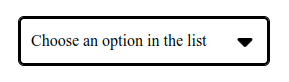
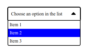
The component respects the common accessibility rules (WAI-ARIA).
Users can interact with the dropdown list with a mouse (clicks) and/or a keyboard :
Node v18.17.0 is required because a package manager (npm or yarn, for instance) is needed to install this library.
The project also need the React library to work.
React V18.2.0 and React-dom V18.2.0 are required.
React's docs advise to use controlled components, so this custom component also need a React state variable and its setState method to work (see Props in Component customization section).
1yarn add @cycle9898/react-custom-dropdown-component
1import {Dropdown } from "@cycle9898/react-custom-dropdown-component";
1function ExempleComponent() {
2   return (
3      <form>
4         <Dropdown displayedValue={displayedValue}
5                    setDisplayedValue={setDisplayedValue}
6                    optionArray={optionList} />
7      </form>
8   );
9}
This component have 3 main props:
It is a state variable, from the parent component's local state or the app's global state for exemple.
Additionally, it appears in the closed drop-down list when no options have been chosen.
If "displayedValue" is an empty string, it will be updated, if possible, with the first option's value from "optionArray".
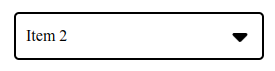
Afterwards, it will store the value from the chosen option from the list.
It is a setState method, from the parent component's local state or the app's global state for exemple, that will update the displayedValue state variable.
It is an array of objects, with an id (type: string) and a value (type: string) properties, that represent all the available options in the dropdown list.
The ID's must be unique, otherwise the component will throw an error.
This prop is optional.
It is a string that represents the ID of a HTML element that label the dropdown list, it is used for the "aria-labelledBy" attribute.
If this prop is not used, the attribute "aria-label" with the string "Choose an option from the dropdown list" will be set instead.
There are some HTML classes that can be used to change the style of dropdown list's elements:
This class is applied to the dropdown list container.
This class is applied to displayed value container.
The border color or border radius can be changed with the corresponding CSS properties and this class.
With the ":focus" pseudo-class, the outline style can also be modified.
This class is applied to the span tag of .rcdc-dropdown-value-container element and contain the displayedValue string.
This class is applied to the arrow icons. Its style can be changed like any Font Awesome icons.
The "color" and "font-size" CSS properties to change its color and size, for exemple.
This class is applied to the "ul" HTML tag that contains all the options.
The border color or border radius can be changed with the corresponding CSS properties and this class.
This class is applied to the "li" HTML tag that represent an option.
With ":hover" and ":focus" pseudo-classes and "background-color" or "color" CSS properties, the background color or text color can be changed when an option is hovered or focused.

No vulnerabilities found.
No security vulnerabilities found.