@duocvo/react-native-gesture-image
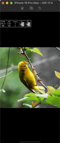
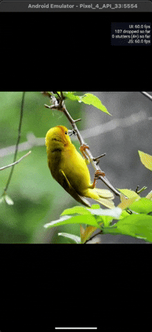
This library provides a highly customizable and performant image viewer component for React Native applications. It supports advanced gestures such as pinch-to-zoom, panning, and double-tap to zoom in and out, making it ideal for creating rich, interactive image viewing experiences. Built with react-native-gesture-handler for handling advanced touch gestures like pinch and pan, and react-native-reanimated for providing smooth animations for zooming and panning.
Prerequisites
This library relies on the following dependencies to enable gesture and animation support (you need to setup these library below)
Installation
npm install @duocvo/react-native-gesture-image
#or
yarn add @duocvo/react-native-gesture-image
Usage
import React, { useRef } from 'react';
import { View, StyleSheet, TouchableOpacity, Image } from 'react-native';
import Gallery from '@duocvo/react-native-gesture-image';
export default function App() {
const galleryRef = useRef(null);
const images = [
{ uri: 'https://picsum.photos/200/300' },
{ uri: 'https://picsum.photos/200/300' },
{ uri: 'https://picsum.photos/200/300' },
];
return (
<View style={styles.container}>
{/* Thumbnail images that open the gallery when tapped */}
<View style={styles.thumbnails}>
{images.map((image, index) => (
<TouchableOpacity
key={index}
onPress={() => galleryRef.current?.show(index)}
>
<Image source={image} style={styles.thumbnail} />
</TouchableOpacity>
))}
</View>
{/* Gallery component */}
<Gallery
ref={galleryRef}
data={images}
/>
</View>
);
}
const styles = StyleSheet.create({
container: {
flex: 1,
},
thumbnails: {
flexDirection: 'row',
flexWrap: 'wrap',
padding: 10,
},
thumbnail: {
width: 100,
height: 100,
margin: 5,
},
});
Props
Gallery
| Prop | Type | Default | Description | Required |
|---|
data | array | [] | Array of image sources | Yes |
style | object | | Custom style for the gallery container | No |
imageStyle | object | | Custom style for each image | No |
containerStyle | object | | Custom style for the gallery container | No |
contentContainerStyle | object | | Custom style for the content container | No |
backdropColor | string | black | Background color of the gallery | No |
initialIndex | number | 0 | Initial index of the image to display | No |
enablePanDownToClose | boolean | false | Enable closing the gallery by panning down | No |
renderHeader | function | | Custom header component | No |
renderFooter | function | | Custom footer component | No |
Gallery Ref Methods
| Method | Parameters | Description |
|---|
show | index?: number | Show the gallery, optionally at a specific index |
hide | - | Hide the gallery |
Examples
Basic Usage with Header and Footer
import React, { useRef } from 'react';
import { View, StyleSheet, TouchableOpacity, Image, Text } from 'react-native';
import Gallery from '@duocvo/react-native-gesture-image';
export default function App() {
const galleryRef = useRef(null);
const images = [
{ uri: 'https://picsum.photos/200/300' },
{ uri: 'https://picsum.photos/200/300' },
{ uri: 'https://picsum.photos/200/300' },
];
return (
<View style={styles.container}>
{/* Thumbnail images that open the gallery when tapped */}
<View style={styles.thumbnails}>
{images.map((image, index) => (
<TouchableOpacity
key={index}
onPress={() => galleryRef.current?.show(index)}
>
<Image source={image} style={styles.thumbnail} />
</TouchableOpacity>
))}
</View>
{/* Gallery component with custom header and footer */}
<Gallery
ref={galleryRef}
data={images}
renderHeader={() => (
<View style={styles.header}>
<TouchableOpacity onPress={() => galleryRef.current?.hide()}>
<Text style={styles.headerText}>Close</Text>
</TouchableOpacity>
</View>
)}
renderFooter={() => (
<View style={styles.footer}>
<Text style={styles.footerText}>Image Caption</Text>
</View>
)}
/>
</View>
);
}
const styles = StyleSheet.create({
container: {
flex: 1,
},
thumbnails: {
flexDirection: 'row',
flexWrap: 'wrap',
padding: 10,
},
thumbnail: {
width: 100,
height: 100,
margin: 5,
},
header: {
padding: 16,
flexDirection: 'row',
justifyContent: 'space-between',
},
headerText: {
color: 'white',
fontSize: 16,
},
footer: {
padding: 16,
},
footerText: {
color: 'white',
fontSize: 14,
},
});
Contributing
See the contributing guide to learn how to contribute to the repository and the development workflow.
License
MIT
Made with create-react-native-library
