Gathering detailed insights and metrics for @expo/react-native-action-sheet
Gathering detailed insights and metrics for @expo/react-native-action-sheet
Gathering detailed insights and metrics for @expo/react-native-action-sheet
Gathering detailed insights and metrics for @expo/react-native-action-sheet
@exponent/react-native-action-sheet
A cross-platform ActionSheet for React Native
react-native-expo-bottomsheet
A lightWeight and customizeble bottom sheet components for React Native Expo support. Includes Smooth animation
bs-react-native-action-sheet
BS bindings for https://github.com/expo/react-native-action-sheet/
@mtourj/react-native-action-sheet
A cross-platform ActionSheet for React Native
A cross-platform ActionSheet for React Native
npm install @expo/react-native-action-sheetTypescript
Module System
Node Version
NPM Version
TypeScript (99.5%)
JavaScript (0.5%)
Total Downloads
0
Last Day
0
Last Week
0
Last Month
0
Last Year
0
MIT License
1,510 Stars
323 Commits
224 Forks
9 Watchers
7 Branches
70 Contributors
Updated on Jul 11, 2025
Latest Version
4.1.1
Package Id
@expo/react-native-action-sheet@4.1.1
Unpacked Size
172.42 kB
Size
31.22 kB
File Count
54
NPM Version
6.14.18
Node Version
14.21.3
Published on
Feb 25, 2025
Cumulative downloads
Total Downloads
Last Day
0%
NaN
Compared to previous day
Last Week
0%
NaN
Compared to previous week
Last Month
0%
NaN
Compared to previous month
Last Year
0%
NaN
Compared to previous year
1
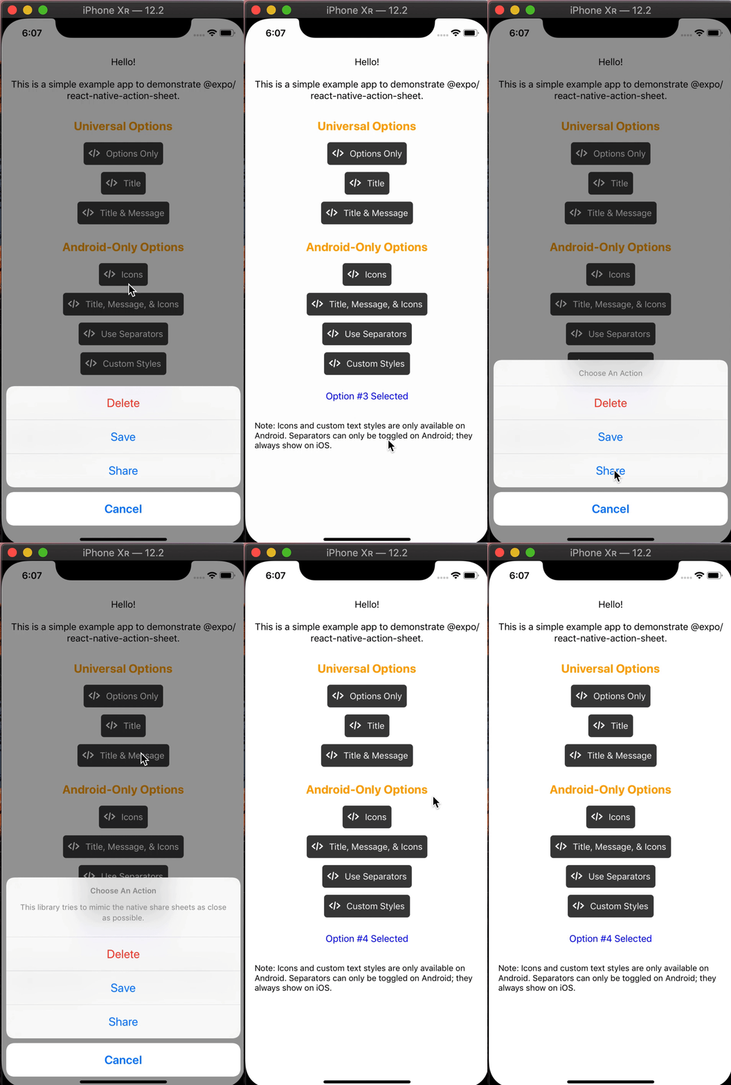
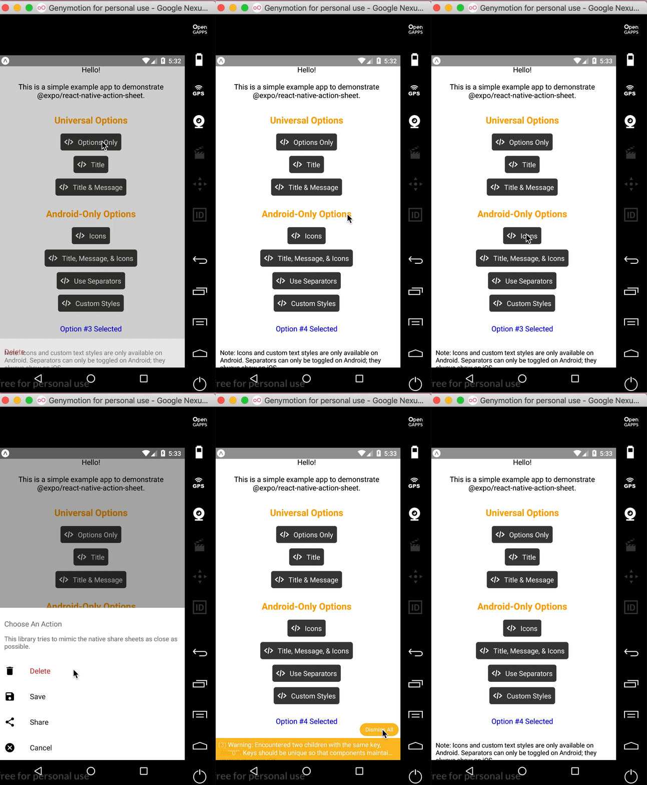
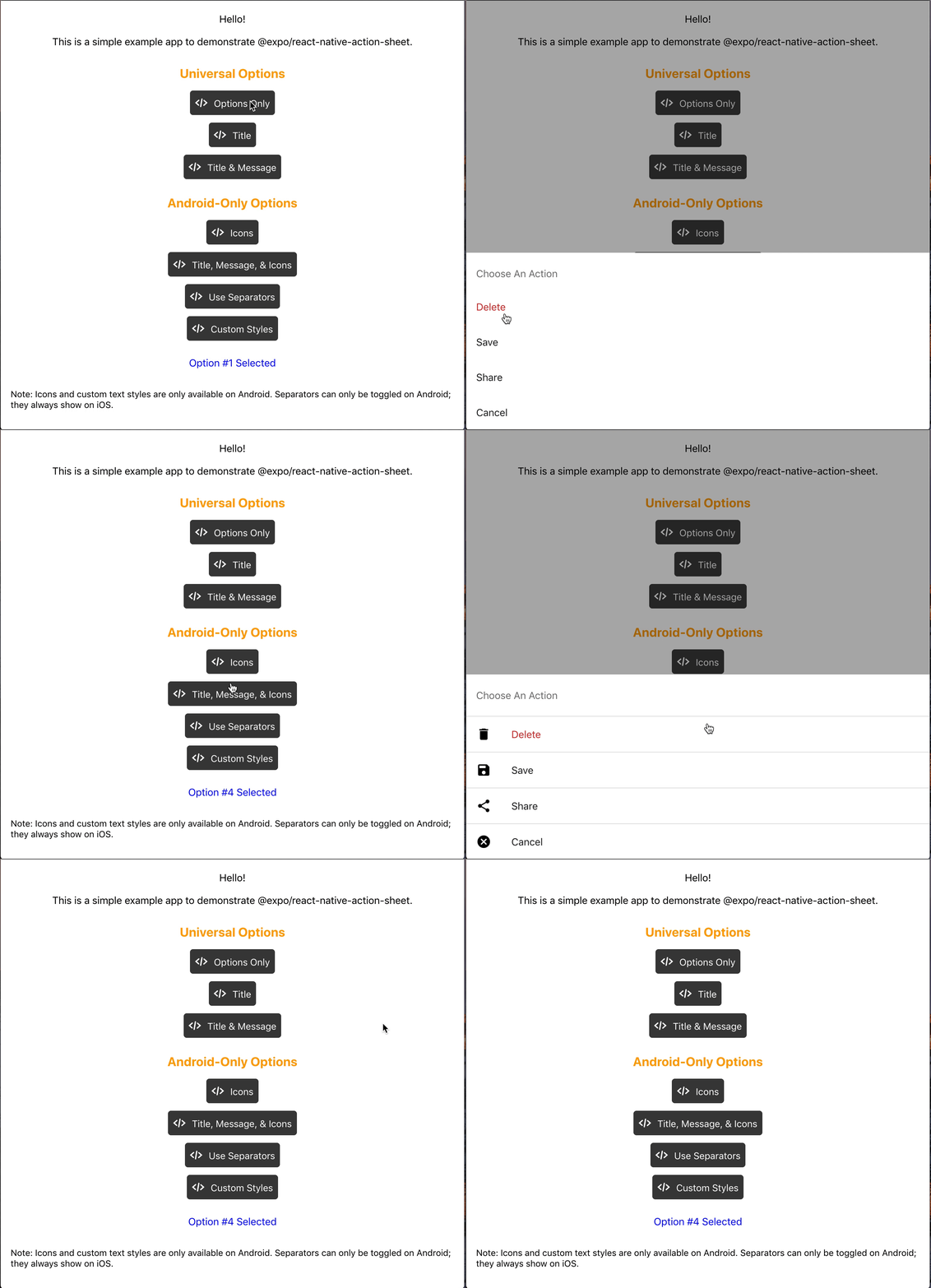
React Native Action Sheet is a cross-platform React Native component that uses the native UIActionSheet on iOS and a pure JS implementation on Android.
| iOS | Android | Web |
|---|---|---|
 |  |  |
npm install @expo/react-native-action-sheet
or
yarn add @expo/react-native-action-sheet
<ActionSheetProvider />ReactNativeActionSheet uses React context to allow your components to invoke the menu. This means your app needs to be wrapped with the ActionSheetProvider component first.
1import { ActionSheetProvider } from '@expo/react-native-action-sheet';
2
3export default function AppContainer() {
4  return (
5    <ActionSheetProvider>
6      <App />
7    </ActionSheetProvider>
8  );
9}
showActionSheetWithOptions method with a hook or a higher order component.1// Using the provided hook 2import { useActionSheet } from '@expo/react-native-action-sheet'; 3 4export default Menu() { 5 const { showActionSheetWithOptions } = useActionSheet(); 6 7 const onPress = () => { 8 const options = ['Delete', 'Save', 'Cancel']; 9 const destructiveButtonIndex = 0; 10 const cancelButtonIndex = 2; 11 12 showActionSheetWithOptions({ 13 options, 14 cancelButtonIndex, 15 destructiveButtonIndex 16 }, (selectedIndex: number) => { 17 switch (selectedIndex) { 18 case 1: 19 // Save 20 break; 21 22 case destructiveButtonIndex: 23 // Delete 24 break; 25 26 case cancelButtonIndex: 27 // Canceled 28 }}); 29 } 30 31 return ( 32 <Button title="Menu" onPress={onPress}/> 33 ) 34};
Alternatively, any component can use the higher order component to access the context and pass the showActionSheetWithOptions as a prop.
1// Using a Higher Order Component to wrap your component
2import { connectActionSheet } from '@expo/react-native-action-sheet';
3
4function Menu({ showActionSheetWithOptions }) {
5  /* ... */
6}
7
8export default connectActionSheet(Menu);
Menu component can now access the actionSheet prop as showActionSheetWithOptions.
The goal of this library is to mimic the native iOS and Android ActionSheets as closely as possible.
This library can also be used in the browser with Expo for web.
| Name | Type | Description |
|---|---|---|
options | array of strings | A list of button titles (required) |
cancelButtonIndex | number | Index of cancel button in options |
cancelButtonTintColor | string | Color used for the change the text color of the cancel button |
destructiveButtonIndex | number or array of numbers | Indices of destructive buttons in options |
title | string | Title to show above the action sheet |
message | string | Message to show below the title |
tintColor | string | Color used for non-destructive button titles |
disabledButtonIndices | array of numbers | Indices of disabled buttons in options |
| Name | Type | Description |
|---|---|---|
anchor | number | iPad only option that allows for docking the action sheet to a node. See ShowActionSheetButton.tsx for an example on how to implement this. |
userInterfaceStyle | string | The interface style used for the action sheet, can be set to light or dark, otherwise the default system style will be used. |
The below props allow modification of the Android ActionSheet. They have no effect on the look on iOS as the native iOS Action Sheet does not have options for modifying these options.
| Name | Type | Description |
|---|---|---|
icons | array of required images or icons | Show icons to go along with each option. If image source paths are provided via require, images will be rendered for you. Alternatively, you can provide an array of elements such as vector icons, pre-rendered Images, etc. |
tintIcons | boolean | Icons by default will be tinted to match the text color. When set to false, the icons will be the color of the source image. This is useful if you want to use multicolor icons. If you provide your own nodes/pre-rendered icons rather than required images in the icons array, you will need to tint them appropriately before providing them in the array of icons; tintColor will not be applied to icons unless they are images from a required source. |
textStyle | TextStyle | Apply any text style props to the options. If the tintColor option is provided, it takes precedence over a color text style prop. |
titleTextStyle | TextStyle | Apply any text style props to the title if present. |
messageTextStyle | TextStyle | Apply any text style props to the message if present. |
autoFocus | boolean | If true, this will give the first option screen reader focus automatically when the action sheet becomes visible. On iOS, this is the default behavior of the native action sheet. |
showSeparators | boolean | Show separators between items. On iOS, separators always show so this prop has no effect. |
containerStyle | ViewStyle | Apply any view style props to the container rather than use the default look (e.g. dark mode). |
separatorStyle | ViewStyle | Modify the look of the separators rather than use the default look. |
useModal | boolean | Defaults to false (true if autoFocus is also true) Wraps the ActionSheet with a Modal, in order to show in front of other Modals that were already opened (issue reference). |
destructiveColor | string | Modify color for text of destructive option. Defaults to #d32f2f. |
The following props can be set directly on the ActionSheetProvider
| Name | Type | Description |
|---|---|---|
useCustomActionSheet | boolean | iOS only prop that uses the custom pure JS action sheet (Android/Web version) instead of the native ActionSheetIOS component. Defaults to false. |
useNativeDriver | boolean | Windows only option that provides the option to disable the native animation driver for React Native Windows projects targeting Windows 10 Version-1809 ; Build-10.0.17763.0 and earlier. useNativeDriver is supported in Version-1903 and later so if your project is targeting that, you don't need to set this prop. |
1// example of using useCustomActionSheet on iOS
2export default function AppContainer() {
3  return (
4    <ActionSheetProvider useCustomActionSheet={true}>
5      <App />
6    </ActionSheetProvider>
7  );
8}
The second parameter of the showActionSheetWithOptions function is a callback for when a button is selected. The callback takes a single argument which will be the zero-based index of the pressed option. You can check the value against your cancelButtonIndex to determine if the action was cancelled or not.
1function onButtonPress(selectedIndex: number) {
2  // handle it!
3}
Try it in Expo Snack: https://snack.expo.dev/@expo-action-sheet/example.
See the example app.
$ cd example
$ yarn

// build simulator
$ yarn ios
$ yarn android

// web
$ yarn web
$ git clone git@github.com:expo/react-native-action-sheet.git
$ cd react-native-action-sheet
$ yarn
We use bob.
$ yarn build
// tsc
$ yarn type-check

// ESLint + Prettier
$ yarn lint

No vulnerabilities found.
Reason
no dangerous workflow patterns detected
Reason
no binaries found in the repo
Reason
license file detected
Details
Reason
Found 3/5 approved changesets -- score normalized to 6
Reason
branch protection is not maximal on development and all release branches
Details
Reason
0 commit(s) and 0 issue activity found in the last 90 days -- score normalized to 0
Reason
detected GitHub workflow tokens with excessive permissions
Details
Reason
no effort to earn an OpenSSF best practices badge detected
Reason
project is not fuzzed
Details
Reason
security policy file not detected
Details
Reason
dependency not pinned by hash detected -- score normalized to 0
Details
Reason
SAST tool is not run on all commits -- score normalized to 0
Details
Reason
24 existing vulnerabilities detected
Details
Score
Last Scanned on 2025-07-07
The Open Source Security Foundation is a cross-industry collaboration to improve the security of open source software (OSS). The Scorecard provides security health metrics for open source projects.
Learn More