UI Toolkit for Jupyter
Don't hesitate to open issues and PRs if you want to
help.


Explore the components | Online JupyterLab demo
Introduction
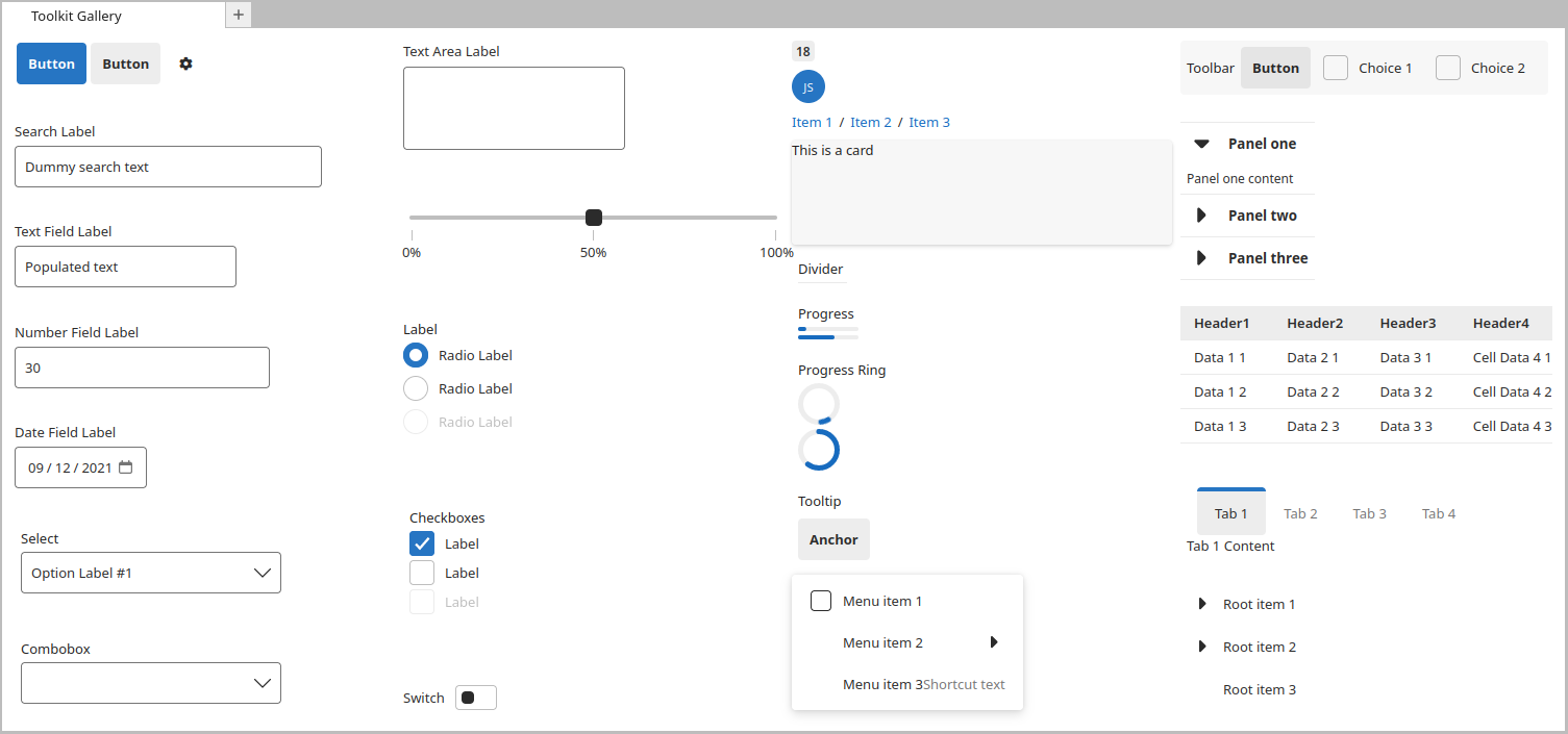
The UI Toolkit is a component library for building web interfaces in Jupyter ecosystem (JupyterHub,
Jupyter Widgets, JupyterLab,...).
Features of the library include:
- Implements the Jupyter design language: All components follow the design language of Jupyter
– enabling developers to create extensions that have a consistent look and feel with the rest of
the ecosystem.
- Automatic support for color themes: All components are designed with theming in mind and will
automatically display the current application theme.
- Use any tech stack: The library ships as a set of web components, meaning developers can use
the toolkit no matter what tech stack (React, Vue, Svelte, etc.) their extension is built with.
- Accessible out of the box: All components ship with web standard compliant ARIA labels and
keyboard navigation.
This repository contains three packages:
Those features are brought through the Fast Design. And it is inspired
by the WebView toolkit for Visual Studio Code
as example for creating a customized toolkit.
Release
The UI Toolkit is currently in a proof of concept. Track progress towards 1.0 here.
Styles and API are not guarantee between minor versions prior to v1.0.0.
Installation
From NPM
To install the web-components library, use either npm or yarn as follows:
npm install --save @jupyter/web-components
yarn add @jupyter/web-components
If you need the React components of the toolkit, you need to install @jupyter/react-components.
From CDN
A pre-bundled script that contains all APIs needed to use Jupyter UI Toolkit is available on CDN. You can use this script by adding type="module" to the script element and then importing from the CDN.
<!doctype html>
<html lang="en">
<head>
<script
type="module"
src="https://unpkg.com/@jupyter/web-components/dist/toolkit.min.js"
></script>
</head>
<!-- ... -->
</html>
The above CDN location points to the latest release of @jupyter/web-components. It is advised that when you deploy your site or app, you import the specific version you have developed and tested with.
See the example folder for more hints about theming.
Documentation
Further documentation can be found in the following places:
Contributing
See the contributing documentation.