Gathering detailed insights and metrics for @kyvg/vue3-notification
Gathering detailed insights and metrics for @kyvg/vue3-notification
Gathering detailed insights and metrics for @kyvg/vue3-notification
Gathering detailed insights and metrics for @kyvg/vue3-notification
npm install @kyvg/vue3-notificationTypescript
Module System
Node Version
NPM Version
TypeScript (88.58%)
JavaScript (9.17%)
CSS (2.24%)
Total Downloads
5,121,069
Last Day
8,250
Last Week
48,590
Last Month
206,422
Last Year
2,286,088
MIT License
393 Stars
323 Commits
75 Forks
3 Watchers
11 Branches
37 Contributors
Updated on Jul 18, 2025
Latest Version
3.4.1
Package Id
@kyvg/vue3-notification@3.4.1
Unpacked Size
42.84 kB
Size
12.89 kB
File Count
9
NPM Version
10.8.3
Node Version
22.9.0
Published on
Oct 28, 2024
Cumulative downloads
Total Downloads
Last Day
6.8%
8,250
Compared to previous day
Last Week
1.3%
48,590
Compared to previous week
Last Month
-0.8%
206,422
Compared to previous month
Last Year
29.8%
2,286,088
Compared to previous year

title and text no longer render with v-html. Use dangerouslySetInnerHtml prop to render title and text with v-htmlThis is a fork and port of Vue 2 vue-notifications created by euvl to now support Vue 3. If you're using Vue 2.x use his version.
1npm install --save @kyvg/vue3-notification
2
3yarn add @kyvg/vue3-notification
Add dependencies to your main.js:
1import { createApp } from 'vue'
2import Notifications from '@kyvg/vue3-notification'
3
4const app = createApp({...})
5app.use(Notifications)
Add the global component to your App.vue:
1<notifications />
Please note that this library does not inherently support Nuxt 3. To enable compatibility with Nuxt 3, use the nuxt3-notifications wrapper
Trigger notifications from your .vue files:
1// simple
2this.$notify("Hello user!");
3
4// using options
5this.$notify({
6  title: "Important message",
7  text: "Hello user!",
8});
Or trigger notifications from other files, for example, your router:
1import { notify } from "@kyvg/vue3-notification";
2
3notify({
4  title: "Authorization",
5  text: "You have been logged in!",
6});
Or use Composition API style:
1import { useNotification } from "@kyvg/vue3-notification";
2
3const { notify }  = useNotification()
4
5notify({
6  title: "Authorization",
7  text: "You have been logged in!",
8});
1Vue.notify({
2  title: "Vue 2 notification",
3});
1import { notify } from "@kyvg/vue3-notification";
2
3notify({
4  title: "Vue 3 notification 🎉",
5});
1import { useNotification } from "@kyvg/vue3-notification";
2
3const notification = useNotification()
4
5notification.notify({
6  title: "Vue 3 notification 🎉",
7});
Also you can use destructuring assignment
1import { useNotification } from "@kyvg/vue3-notification";
2
3const { notify } = useNotification()
4
5notify({
6  title: "Vue 3 notification 🎉",
7});
The majority of settings for the Notifications component are configured using props:
1<notifications position="bottom right" classes="my-custom-class" />
Note that all props are optional.
| Name | Type | Default | Description |
|---|---|---|---|
| position | String/Array | 'top right' | Part of the screen where notifications will pop out |
| width | Number/String | 300 | Width of notification holder, can be %, px string or number.Valid values: '100%', '200px', 200 |
| classes | String/Array | 'vue-notification' | List of classes that will be applied to notification element |
| group | String | null | Name of the notification holder, if specified |
| duration | Number | 3000 | Time (in ms) to keep the notification on screen (if negative - notification will stay forever or until clicked) |
| speed | Number | 300 | Time (in ms) to show / hide notifications |
| animation-type | String | 'css' | Type of animation, currently supported types are css and velocity |
| animation-name | String | null | Animation name required for css animation |
| animation | Object | Custom | Animation configuration for Velocity animation |
| max | Number | Infinity | Maximum number of notifications that can be shown in notification holder |
| reverse | Boolean | false | Show notifications in reverse order |
| ignoreDuplicates | Boolean | false | Ignore repeated instances of the same notification |
| closeOnClick | Boolean | true | Close notification when clicked |
| pauseOnHover | Boolean | false | Keep the notification open while mouse hovers on notification |
| dangerouslySetInnerHtml | Boolean | false | Use v-html to set title and text |
| Name | Type | Description |
|---|---|---|
| click | (item: NotificationItem) => void | The callback function that is triggered when notification was clicked |
| destroy | (item: NotificationItem) => void | The callback function that is triggered when notification was destroyes |
| start | (item: NotificationItem) => void | The callback function that is triggered when notification was appeared |
Notifications are triggered via the API:
1  this.$notify({
2    // (optional)
3    // Name of the notification holder
4    group: 'foo',
5
6    // (optional)
7    // Title (will be wrapped in div.notification-title)
8    title: 'This is the <em>title</em>',
9
10    // Content (will be wrapped in div.notification-content)
11    text: 'This is some <b>content</b>',
12
13    // (optional)
14    // Class that will be assigned to the notification
15    type: 'warn',
16
17    // (optional, override)
18    // Time (in ms) to keep the notification on screen
19    duration: 10000,
20
21    // (optional, override)
22    // Time (in ms) to show / hide notifications
23    speed: 1000
24
25    // (optional)
26    // Data object that can be used in your template
27    data: {}
28  })
To remove notifications, include the clean: true parameter.
1this.$notify({
2  group: "foo", // clean only the foo group
3  clean: true,
4});
Configure the plugin itself using an additional options object:
1app.use(Notifications, { name: "alert" });
All options are optional:
| Name | Type | Default | Description |
|---|---|---|---|
| name | String | notify | Defines the instance name. It's prefixed with the dollar sign. E.g. $notify |
| componentName | String | Notifications | The component's name |
| velocity | Object | undefined | A Velocity library object (see Animation) |
Note: setting
componentNamecan cause issues when using SSR.
This library is written with TypeScript. Since the notification component is registered globally, you need to register its types.
You can do this manually:
1import type { FunctionalComponent } from 'vue';
2import type { Notifications } from '@kyvg/vue3-notification';
3declare module 'vue' {
4  export interface GlobalComponents {
5    Notifications: FunctionalComponent<Notifications>;
6  }
7}
Or, you can use built-in unplugin-vue-components resolver. This resolver allows you to seamlessly integrate this library with Vue projects using unplugin-vue-components. It automates the import of components, making your development process more efficient.
To get started, install the necessary packages using npm or yarn:
1npm install --save @kyvg/vue3-notification unplugin-vue-components
2# or
3yarn add @kyvg/vue3-notification unplugin-vue-components
To configure the resolver, update your Vue project's plugin settings. For example, in a Vite project, modify vite.config.js:
1import Components from 'unplugin-vue-components/vite';
2import NotificationsResolver from '@kyvg/vue3-notification/auto-import-resolver';
3
4export default {
5  plugins: [
6    Components({
7      resolvers: [NotificationsResolver()],
8    }),
9  ],
10}
Specify the custom component's name if you have configured it:
1// main.js
2// ...
3app.use(Notifications, { componentName: "Alert" });
Note that component name should be in PascalCase
1import Components from 'unplugin-vue-components/vite';
2import NotificationsResolver from '@kyvg/vue3-notification/auto-import-resolver';
3
4export default {
5  plugins: [
6    Components({
7      resolvers: [NotificationsResolver("Alert")],
8    }),
9  ],
10}
Position the component on the screen using the position prop:
1<notifications position="bottom right" />
It requires a string with two keywords for vertical and horizontal postion.
Format: "<vertical> <horizontal>".
left, center, righttop, bottomDefault is "top right".
Width can be set using a number or string with optional % or px extensions:
1<notifications :width="100" />
2<notifications width="100" />
3<notifications width="100%" />
4<notifications width="100px" />
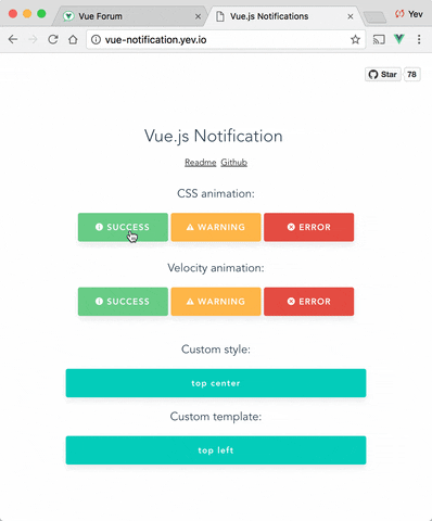
Set the type of a notification (warn, error, success, etc) by adding a type property to the call:
1this.$notify({ type: "success", text: "The operation completed" });
This will add the type (i.e. "success") as a CSS class name to the .vue-notification element.
See the Styling section for how to hook onto the class and style the popup.
For different classes of notifications, i.e...
...specify the group attribute:
1<notifications group="auth" position="top" />
2<notifications group="app" position="bottom right" />
Trigger a notification for a specific group by specifying it in the API call:
1this.$notify({ group: "auth", text: "Wrong password, please try again" });
Vue Notifications comes with default styling, but it's easy to replace with your own.
Specify one or more class hooks via the classes prop on the global component:
1<notifications classes="my-notification" />
This will add the supplied class/classes to individual notification elements:
1<div class="vue-notification-wrapper">
2  <div class="vue-notification-template my-notification">
3    <div class="notification-title">Info</div>
4    <div class="notification-content">You have been logged in</div>
5  </div>
6</div>
Then include custom css rules to style the notifications:
1// style of the notification itself
2.my-notification {
3  /*...*/
4
5  // style for title line
6  .notification-title {
7    /*...*/
8  }
9
10  // style for content
11  .notification-content {
12    /*...*/
13  }
14
15  // additional styling hook when using`type` parameter, i.e. this.$notify({ type: 'success', message: 'Yay!' })
16  &.success {
17    /*...*/
18  }
19  &.info {
20    /*...*/
21  }
22  &.error {
23    /*...*/
24  }
25}
Note that the default rules are:
1.vue-notification {
2  // styling
3  margin: 0 5px 5px;
4  padding: 10px;
5  font-size: 12px;
6  color: #ffffff;
7
8  // default (blue)
9  background: #44a4fc;
10  border-left: 5px solid #187fe7;
11
12  // types (green, amber, red)
13  &.success {
14    background: #68cd86;
15    border-left-color: #42a85f;
16  }
17
18  &.warn {
19    background: #ffb648;
20    border-left-color: #f48a06;
21  }
22
23  &.error {
24    background: #e54d42;
25    border-left-color: #b82e24;
26  }
27}
To completely replace notification content, use Vue's slots system:
1<notifications>
2  <template #body="props">
3    <div class="my-notification">
4      <p class="title">
5        {{ props.item.title }}
6      </p>
7      <button class="close" @click="props.close">
8        <i class="fa fa-fw fa-close"></i>
9      </button>
10      <div v-html="props.item.text"/>
11    </div>
12  </template>
13</notifications>
The props object has the following members:
| Name | Type | Description |
|---|---|---|
| item | Object | Notification object |
| close | Function | A function to close the notification |
Vue Notification can use the Velocity library to power the animations using JavaScript.
To use, manually install velocity-animate & pass the library to the vue-notification plugin (the reason for doing that is to reduce the size of this plugin).
In your main.js:
1import { createApp } from 'vue'
2import Notifications from '@kyvg/vue3-notification'
3import velocity from 'velocity-animate'
4
5const app = createApp({...})
6app.use(Notifications, { velocity })
In the template, set the animation-type prop:
1<notifications animation-type="velocity" />
The default configuration is:
1{
2  enter: { opacity: [1, 0] },
3  leave: { opacity: [0, 1] }
4}
To assign a custom animation, use the animation prop:
1<notifications animation-type="velocity" :animation="animation" />
Note that enter and leave can be an object or a function that returns an object:
1computed: {
2  animation () {
3    return {
4      /**
5       * Animation function
6       *
7       * Runs before animating, so you can take the initial height, width, color, etc
8       * @param  {HTMLElement}  element  The notification element
9       */
10      enter (element) {
11        let height = element.clientHeight
12        return {
13          // animates from 0px to "height"
14          height: [height, 0],
15
16          // animates from 0 to random opacity (in range between 0.5 and 1)
17          opacity: [Math.random() * 0.5 + 0.5, 0]
18        }
19      },
20      leave: {
21        height: 0,
22        opacity: 0
23      }
24    }
25  }
26}
1
2const id = Date.now() // This can be any unique number
3
4this.$notify({
5  id,
6  text: 'This message will be removed immediately'
7});
8
9this.$notify.close(id);
Or with composition API style:
1import { useNotification } from "@kyvg/vue3-notification"
2
3const notification = useNotification()
4
5const id = Date.now() // This can be any unique number
6
7notification.notify({
8  id,
9  text: 'This message will be removed immediately'
10})
11
12notification.notify.close(id)
13
Check closed issues with FAQ label to get answers for most asked questions.
To contribute to the library:
1# build main library
2npm install
3npm run build
4
5# run tests
6npm run test
7
8# watch unit tests
9npm run unit:watch

No vulnerabilities found.
Reason
no dangerous workflow patterns detected
Reason
no binaries found in the repo
Reason
license file detected
Details
Reason
dependency not pinned by hash detected -- score normalized to 2
Details
Reason
Found 4/30 approved changesets -- score normalized to 1
Reason
0 commit(s) and 0 issue activity found in the last 90 days -- score normalized to 0
Reason
detected GitHub workflow tokens with excessive permissions
Details
Reason
no effort to earn an OpenSSF best practices badge detected
Reason
security policy file not detected
Details
Reason
project is not fuzzed
Details
Reason
SAST tool is not run on all commits -- score normalized to 0
Details
Reason
12 existing vulnerabilities detected
Details
Score
Last Scanned on 2025-07-07
The Open Source Security Foundation is a cross-industry collaboration to improve the security of open source software (OSS). The Scorecard provides security health metrics for open source projects.
Learn More
