Gathering detailed insights and metrics for @nahana/react-svg-scurve
Gathering detailed insights and metrics for @nahana/react-svg-scurve
Gathering detailed insights and metrics for @nahana/react-svg-scurve
Gathering detailed insights and metrics for @nahana/react-svg-scurve
npm install @nahana/react-svg-scurveTypescript
Module System
Node Version
NPM Version
TypeScript (87.65%)
CSS (6.16%)
JavaScript (3.47%)
HTML (1.73%)
SCSS (0.99%)
Total Downloads
0
Last Day
0
Last Week
0
Last Month
0
Last Year
0
MIT License
14 Commits
1 Watchers
1 Branches
1 Contributors
Updated on May 13, 2025
Latest Version
1.0.1
Package Id
@nahana/react-svg-scurve@1.0.1
Unpacked Size
44.48 kB
Size
12.63 kB
File Count
18
NPM Version
10.1.0
Node Version
20.9.0
Published on
May 13, 2025
Cumulative downloads
Total Downloads
Last Day
0%
NaN
Compared to previous day
Last Week
0%
NaN
Compared to previous week
Last Month
0%
NaN
Compared to previous month
Last Year
0%
NaN
Compared to previous year
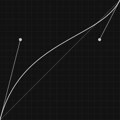
react-svg-scurve is a UI package to easily draw SVG cubic-bezier curves. During the creation of the react-easy-ease documentation I built a simple component to achieve this. I have since decided to build upon this and release it.
1npm i @nahana/react-svg-scurve
2
3#or
4
5yarn add @nahana/react-svg-scurve
6
7#or
8
9pnpm @nahana/react-svg-scurve
1import { SCurve } from '@nahana/react-svg-scurve'
2
3export const App = () => {
4	return <SCurve />
5}
Default Result:

The overall px size of the curve SVG viewport.
Best practice is to set
width&heightto the same value; but is not required.
| PROP | Type | Default |
|---|---|---|
| width | number | 400 |
| height | number | 400 |
1<SCurve width={800} height={800} />
Adds padding in px to width and / or height of the bounding box.
Useful if your curve goes +1 or -1 in value as this can clip part of the curve.
Value is per side; eg 50 would add 100px total
Value is in addition to
size; eg400width +50padding would result in a total of500pxwidth
| PROP | Type | Default | Description |
|---|---|---|---|
| paddingH | number | 0 | Top and Bottom |
| paddingW | number | 0 | Left and Right |
1<SCurve paddingH={50} paddingW={50} />
1<SCurve width={800} height={800} />
The cubic-bezier curve to draw
| PROP | Type | Default |
|---|---|---|
| curve | [number, number, number, number] | [0.17, 0.67, 0.83, 0.67] |
1<SCurve curve={[0.64, 0.03, 0.07, 0.97]} />
| PROP | Type | Default | Description |
|---|---|---|---|
| bgColor | string | rgba(0,0,0,.5) | Main viewport background |
| paddingColor | string | rgba(0,0,0,.5) | Color of padding "border" |
1<SCurve bgColor="white" paddingColor="rgba(255,255,255,.2)" />
Displays the start and end of curve handles
| PROP | Type | Default | Description |
|---|---|---|---|
| handles | false or options object | options object | Hide or customize the handles |
| PROP | Type | Default |
|---|---|---|
| lineOneColor | string | rgba(255, 255, 255, .5) |
| lineTwoColor | string | rgba(255, 255, 255, .5) |
| lineSize | number | 2 |
| circleOneColor | string | rgb(200, 200, 200) |
| circleTwoColor | string | rgb(200, 200, 200) |
| circleSize | number | 5 |
1// hide Handles
2<SCurve handles={false} />
3
4// only change line size
5<SCurve
6	handles={{
7	    lineSize: 5,
8	}}
9/>
10
11//change all options
12<SCurve
13    handles={{
14	    lineSize: 5,
15		circleSize: 10,
16		lineOneColor: 'red',
17		lineTwoColor: 'red',
18		circleOneColor: 'red',
19		circleTwoColor: 'red',
20	}}
21/>
Displays a linear guide line
| PROP | Type | Default | Description |
|---|---|---|---|
| guide | false or options object | options object | Hide or customize the guide line |
| PROP | Type | Default |
|---|---|---|
| color | string | rgba(255, 255, 255, .2) |
| size | number | 2 |
1// hide the guide
2<SCurve guide={false} />
3
4// only change guide color
5<SCurve
6	guide={{
7	    color: 'blue',
8	}}
9/>
10
11//change all options
12<SCurve
13	guide={{
14	    color: 'blue',
15		size: 1,
16	}}
17/>
Displays a grid or stripped background
| PROP | Type | Default |
|---|---|---|
| backgroundType | false or options object | false |
| kind | grid or stripe | option required |
| PROP | Type | Default |
|---|---|---|
| color | string | rgba(150, 150, 150, .1) |
| inPadding | boolean | false |
| size | number | 1 |
| spacing | number | 20 |
| PROP | Type | Default |
|---|---|---|
| color | string | rgba(150, 150, 150, .1) |
| inPadding | boolean | false |
| count | number | 10 |
| type | horizontal or vertical | horizontal |
1// show the default grid background
2<SCurve
3	backgroundType={{
4	    kind: 'grid',
5	}}
6/>
7
8// show the default stripe background
9<SCurve
10	backgroundType={{
11	    kind: 'stripe',
12	}}
13/>
14
15//stripe background with options
16<SCurve
17	backgroundType={{
18	    kind: 'stripe',
19		color: 'blue',
20		count: 20,
21	}}
22/>
Default Grid Background
Default Stripe Background

Use
containerto wrap the svg output in adiv
classNameadds className to outputsvg(ordivifcontaineris true)
classNamecan be css class, or css module. More on this in styling.
| PROP | Type | Default |
|---|---|---|
| container | boolean | false |
| className | string or undefined | undefined |
By default incorrect prop types will be replaced with their default value; eg type
stringis passed anumber, and console errors are suppressed. If you'd like to see the errors in console, enableshowErrors
| PROP | Type | Default |
|---|---|---|
| showErrors | boolean | false |
Each element is assigned a css class allowing custom styling.
| Element | Class |
|---|---|
| Base Background | bg |
| SVG Element | svg or className prop |
| Padding Background | padding |
| Main Curve | curve |
| Linear Guide | guide |
| Handle Start Line | handleLineOne |
| Handle End Line | handleLineTwo |
| Handle Start Circle | handleCircleOne |
| Handle End Circle | handleCircleTwo |
| Stripes | stripes |
| Grid | grid |
If you'd like different custom styles for multiple SVG outputs you can use the
classNameprop to help achieve this
Standard CSS
1import './App.css'
2
3export const App = () => {
4	return (
5		<>
6			<SCurve className="mainSVG" />
7			<SCurve className="secondSVG" />
8		</>
9	)
10}
1/* App.css */
2.mainSVG > .bg {
3	fill: red;
4}
5.secondSVG > .bg {
6	fill: blue;
7}
With Modules CSS we need to target the global class
1import styles from './scurve.module.scss'
2
3export const App = () => {
4	return (
5		<>
6			<SCurve className={styles.mainSVG} />
7			<SCurve className={styles.secondSVG} />
8		</>
9	)
10}
1/* scurve.module.scss */
2
3/* SASS nesting */
4.mainSVG {
5	:global(.bg) {
6		fill: red;
7	}
8}
9
10/* Standard Child Selector */
11.secondSVG > :global(.bg) {
12	fill: blue;
13}
14
15/* CSS Nesting */
16.secondSVG {
17	& :global(.bg) {
18		fill: orange;
19	}
20}
2025 Nate Mitchell, MIT

No vulnerabilities found.
No security vulnerabilities found.