Gathering detailed insights and metrics for @realtril/react-native-country-picker-modal
Gathering detailed insights and metrics for @realtril/react-native-country-picker-modal
Gathering detailed insights and metrics for @realtril/react-native-country-picker-modal
Gathering detailed insights and metrics for @realtril/react-native-country-picker-modal
npm install @realtril/react-native-country-picker-modalTypescript
Module System
Node Version
NPM Version
Total Downloads
0
Last Day
0
Last Week
0
Last Month
0
Last Year
0
Latest Version
1.0.12
Package Id
@realtril/react-native-country-picker-modal@1.0.12
Unpacked Size
328.27 kB
Size
95.00 kB
File Count
32
NPM Version
10.9.0
Node Version
22.11.0
Published on
Jun 09, 2025
Cumulative downloads
Total Downloads
Last Day
0%
NaN
Compared to previous day
Last Week
0%
NaN
Compared to previous week
Last Month
0%
NaN
Compared to previous month
Last Year
0%
NaN
Compared to previous year
30
A React Native country picker modal updated for Expo 53 and React Native 0.79.x.
This is a migrated version of the popular react-native-country-picker-modal library, updated to work with the latest versions of Expo and React Native.
This implementation imports and uses the components directly from the source files (src directory) without requiring a build step or a compiled lib directory. This makes the code more maintainable and easier to understand.
1import React, { useState } from 'react';
2import { StyleSheet, View, TouchableOpacity, Text } from 'react-native';
3import CountryPicker from './src';
4import { Country, CountryCode, TranslationLanguageCodeMap } from './src/types';
5
6export default function App() {
7  const [countryCode, setCountryCode] = useState<CountryCode>('US');
8  const [country, setCountry] = useState<Country>();
9  const [visible, setVisible] = useState(false);
10
11  const getCountryName = (name: TranslationLanguageCodeMap | string) => {
12    if (typeof name === 'string') return name;
13    return name.common;
14  };
15
16  const onSelect = (country: Country) => {
17    setCountryCode(country.cca2);
18    setCountry(country);
19    setVisible(false);
20  };
21
22  return (
23    <View style={styles.container}>
24      <TouchableOpacity
25        style={styles.button}
26        onPress={() => setVisible(true)}>
27        <Text style={styles.buttonText}>
28          {country ? getCountryName(country.name) : 'Select Country'}
29        </Text>
30      </TouchableOpacity>
31
32      <CountryPicker
33        countryCode={countryCode}
34        withFilter
35        withFlag
36        withEmoji={true}
37        onSelect={onSelect}
38        visible={visible}
39        onClose={() => setVisible(false)}
40      />
41    </View>
42  );
43}
44
45const styles = StyleSheet.create({
46  container: {
47    flex: 1,
48    justifyContent: 'center',
49    alignItems: 'center',
50    padding: 20,
51  },
52  button: {
53    backgroundColor: '#2196F3',
54    padding: 15,
55    borderRadius: 5,
56  },
57  buttonText: {
58    color: 'white',
59    fontWeight: 'bold',
60  },
61});
| Key | Type | Default | Description |
|---|---|---|---|
| countryCode | CountryCode | *required | The ISO 3166-1 alpha-2 code of the current selected country |
| translation | TranslationLanguageCode | 'common' | The translation language to use for country names |
| region | Region | null | Limit results to a specific region |
| subregion | Subregion | null | Limit results to a specific subregion |
| countryCodes | CountryCode[] | null | List of custom country codes to render |
| excludeCountries | CountryCode[] | null | List of countries to exclude |
| includeCountries | CountryCode[] | null | List of countries to include (all others will be excluded) |
| preferredCountries | CountryCode[] | null | List of countries at the top of the list |
| theme | Object | null | Theme for customizing the appearance |
| onSelect | (country: Country) => void | *required | Callback when a country is selected |
| onClose | () => void | *required | Callback when the modal is closed |
| visible | boolean | false | Show/hide the modal |
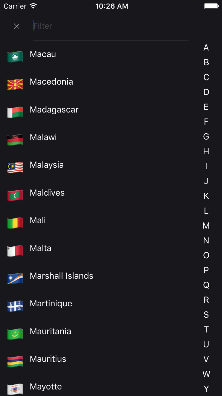
| withFilter | boolean | true | Enable search bar |
| withFlag | boolean | true | Show flags for each country |
| withEmoji | boolean | true | Use emoji flags for each country |
| withAlphaFilter | boolean | false | Show alphabet filter bar |
| withCallingCode | boolean | false | Show calling code for each country |
| withCurrency | boolean | false | Show currency for each country |
| withModal | boolean | true | Use a modal instead of a bottom sheet |
| disableNativeModal | boolean | false | Disables the native modal and uses a custom one |
| flatListProps | FlatListProps | null | Additional props for the country list |
| filterProps | CountryFilterProps | null | Additional props for the search bar |
| modalProps | ModalProps | null | Additional props for the modal |
| containerButtonStyle | StyleProp | null | Style for the container button |
A simple example to display a CountryPicker component with a dark theme.
1import CountryPicker, { DARK_THEME } from 'react-native-country-picker-modal'
2
3const MyDarkView = () => <CountryPicker theme={DARK_THEME} />
YES
YES : It used the world-countries package and image is stored into json and base64.
Feel free to contact me or create an issue
made with ♥
Looking for a ReactNative freelance expert with more than 12 years experience? Contact me from my website!

No vulnerabilities found.
No security vulnerabilities found.