Gathering detailed insights and metrics for @sb-konzept/mui-datatables
Gathering detailed insights and metrics for @sb-konzept/mui-datatables
Gathering detailed insights and metrics for @sb-konzept/mui-datatables
Gathering detailed insights and metrics for @sb-konzept/mui-datatables
npm install @sb-konzept/mui-datatablesTypescript
Module System
Node Version
NPM Version
JavaScript (99.9%)
HTML (0.1%)
Total Downloads
0
Last Day
0
Last Week
0
Last Month
0
Last Year
0
MIT License
2,717 Stars
1,034 Commits
927 Forks
39 Watchers
9 Branches
131 Contributors
Updated on Jul 09, 2025
Latest Version
2.3.0
Package Id
@sb-konzept/mui-datatables@2.3.0
Unpacked Size
233.13 kB
Size
62.41 kB
File Count
6
NPM Version
6.12.0
Node Version
12.13.0
Cumulative downloads
Total Downloads
Last Day
0%
NaN
Compared to previous day
Last Week
0%
NaN
Compared to previous week
Last Month
0%
NaN
Compared to previous month
Last Year
0%
NaN
Compared to previous year
11
45


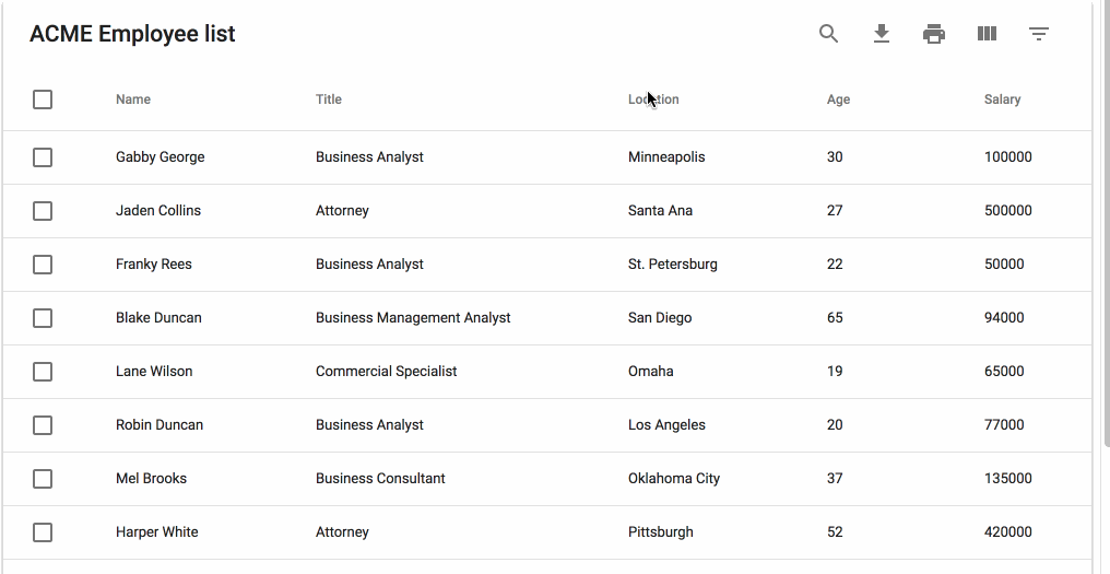
MUI-Datatables is a data tables component built on Material-UI. It comes with features like filtering, resizable + view/hide columns, search, export to CSV download, printing, selectable rows, expandable rows, pagination, and sorting. On top of the ability to customize styling on most views, there are two responsive modes "stacked" and "scroll" for mobile/tablet devices.
npm install mui-datatables --save

For a simple table:
1
2import MUIDataTable from "mui-datatables";
3
4const columns = ["Name", "Company", "City", "State"];
5
6const data = [
7 ["Joe James", "Test Corp", "Yonkers", "NY"],
8 ["John Walsh", "Test Corp", "Hartford", "CT"],
9 ["Bob Herm", "Test Corp", "Tampa", "FL"],
10 ["James Houston", "Test Corp", "Dallas", "TX"],
11];
12
13const options = {
14  filterType: 'checkbox',
15};
16
17<MUIDataTable
18  title={"Employee List"}
19  data={data}
20  columns={columns}
21  options={options}
22/>
23
Or customize columns:
1
2import MUIDataTable from "mui-datatables";
3
4const columns = [
5 {
6  name: "name",
7  label: "Name",
8  options: {
9   filter: true,
10   sort: true,
11  }
12 },
13 {
14  name: "company",
15  label: "Company",
16  options: {
17   filter: true,
18   sort: false,
19  }
20 },
21 {
22  name: "city",
23  label: "City",
24  options: {
25   filter: true,
26   sort: false,
27  }
28 },
29 {
30  name: "state",
31  label: "State",
32  options: {
33   filter: true,
34   sort: false,
35  }
36 },
37];
38
39const data = [
40 { name: "Joe James", company: "Test Corp", city: "Yonkers", state: "NY" },
41 { name: "John Walsh", company: "Test Corp", city: "Hartford", state: "CT" },
42 { name: "Bob Herm", company: "Test Corp", city: "Tampa", state: "FL" },
43 { name: "James Houston", company: "Test Corp", city: "Dallas", state: "TX" },
44];
45
46const options = {
47  filterType: 'checkbox',
48};
49
50<MUIDataTable
51  title={"Employee List"}
52  data={data}
53  columns={columns}
54  options={options}
55/>
56
The component accepts the following props:
| Name | Type | Description |
|---|---|---|
title | array | Title used to caption table |
columns | array | Columns used to describe table. Must be either an array of simple strings or objects describing a column |
data | array | Data used to describe table. Must be an array containing objects. (Arrays containing just strings or numbers also supported) |
options | object | Options used to describe table |
| Name | Type | Default | Description |
|---|---|---|---|
page | number | User provided starting page for pagination | |
count | number | User provided override for total number of rows | |
serverSide | boolean | false | Enable remote data source |
rowsSelected | array | User provided selected rows | |
filterType | string | Choice of filtering view. enum('checkbox', 'dropdown', 'multiselect', 'textField') | |
textLabels | object | User provided labels to localize text | |
pagination | boolean | true | Enable/disable pagination |
selectableRows | string | 'multiple' | Numbers of rows that can be selected. Options are "multiple", "single", "none". |
isRowSelectable | function | Enable/disable selection on certain rows with custom function. Returns true if not provided. function(dataIndex) => bool | |
resizableColumns | boolean | false | Enable/disable resizable columns |
expandableRows | boolean | false | Enable/disable expandable rows |
renderExpandableRow | function | Render expandable row. function(rowData, rowMeta) => React Component | |
customToolbar | function | Render a custom toolbar | |
customToolbarSelect | function | Render a custom selected rows toolbar. function(selectedRows, displayData, setSelectedRows) => void | |
customFooter | function | Render a custom table footer. function(count, page, rowsPerPage, changeRowsPerPage, changePage) => string| React Component | |
customRowRender | function | Override default row rendering with custom function. customRowRender(data, dataIndex, rowIndex) => React Component | |
customSort | function | Override default sorting with custom function. function(data: array, colIndex: number, order: string) => array | |
customSearch | function | Override default search with custom function. customSearch(searchQuery: string, currentRow: array, columns: array) => boolean | |
elevation | number | 4 | Shadow depth applied to Paper component |
caseSensitive | boolean | false | Enable/disable case sensitivity for search |
responsive | string | 'stacked' | Enable/disable responsive table views. Options: 'stacked', 'scroll' |
rowsPerPage | number | 10 | Number of rows allowed per page |
rowsPerPageOptions | array | [10,15,20] | Options to provide in pagination for number of rows a user can select |
rowHover | boolean | true | Enable/disable hover style over rows |
fixedHeader | boolean | true | Enable/disable fixed header columns |
sortFilterList | boolean | true | Enable/disable alphanumeric sorting of filter lists |
sort | boolean | true | Enable/disable sort on all columns |
filter | boolean | true | Show/hide filter icon from toolbar |
search | boolean | true | Show/hide search icon from toolbar |
searchText | string | Initial search text | |
print | boolean | true | Show/hide print icon from toolbar |
download | boolean | true | Show/hide download icon from toolbar |
downloadOptions | object | Options to change the output of the CSV file. Default options: {filename: 'tableDownload.csv', separator: ','} | |
onDownload | function | A callback function that triggers when the user downloads the CSV file. In the callback, you can control what is written to the CSV file. function(buildHead: (columns) => string, buildBody: (data) => string, columns, data) => string | |
viewColumns | boolean | true | Show/hide viewColumns icon from toolbar |
onRowsSelect | function | Callback function that triggers when row(s) are selected. function(currentRowsSelected: array, allRowsSelected: array) => void | |
onRowsDelete | function | Callback function that triggers when row(s) are deleted. function(rowsDeleted: object(lookup: {dataindex: boolean}, data: arrayOfObjects: {index, dataIndex})) => void OR false (Returning false prevents row deletion.) | |
onRowClick | function | Callback function that triggers when a row is clicked. function(rowData: string[], rowMeta: { dataIndex: number, rowIndex: number }) => void | |
onCellClick | function | Callback function that triggers when a cell is clicked. function(colData: any, cellMeta: { colIndex: number, rowIndex: number, dataIndex: number }) => void | |
onChangePage | function | Callback function that triggers when a page has changed. function(currentPage: number) => void | |
onChangeRowsPerPage | function | Callback function that triggers when the number of rows per page has changed. function(numberOfRows: number) => void | |
onSearchChange | function | Callback function that triggers when the search text value has changed. function(searchText: string) => void | |
onSearchOpen | function | Callback function that triggers when the searchbox opens. function() => void | |
onFilterChange | function | Callback function that triggers when filters have changed. function(changedColumn: string, filterList: array) => void | |
onColumnSortChange | function | Callback function that triggers when a column has been sorted. function(changedColumn: string, direction: string) => void | |
onColumnViewChange | function | Callback function that triggers when a column view has been changed. function(changedColumn: string, action: string) => void | |
onTableChange | function | Callback function that triggers when table state has changed. function(action: string, tableState: object) => void | |
setRowProps | function | Is called for each row and allows to return custom props for this row based on its data. function(row: array, dataIndex: number) => object |
On each column object, you have the ability to customize columns to your liking with the 'options' property. Example:
1const columns = [
2 {
3  name: "Name",
4  options: {
5   filter: true,
6   sort: false
7  }
8 },
9 ...
10];
| Name | Type | Description |
|---|---|---|
name | string | Name of column (This field is required) |
label | string | Column Header Name override |
options | object | Options for customizing column |
| Name | Type | Default | Description |
|---|---|---|---|
display | string | 'true' | Display column in table. enum('true', 'false', 'excluded') |
empty | boolean | false | This denotes whether the column has data or not (for use with intentionally empty columns) |
viewColumns | boolean | true | Allow user to toggle column visibility through 'View Column' list |
filterList | array | Filter value list Example | |
filterOptions | array | Filter options Example | |
customFilterListRender | function | Function that returns a string used as the chip label. function(value) => string Example | |
filter | boolean | true | Display column in filter list |
filterType | string | 'dropdown' | Choice of filtering view. Takes priority over global filterType option.enum('checkbox', 'dropdown', 'multiselect', 'textField'). |
sort | boolean | true | Enable/disable sorting on column |
searchable | boolean | true | Exclude/include column from search results |
sortDirection | string | Set default sort order enum('asc', 'desc') | |
print | boolean | true | Display column when printing |
download | boolean | true | Display column in CSV download file |
hint | string | Display hint icon with string as tooltip on hover. | |
customHeadRender | function | Function that returns a string or React component. Used as display for column header. function(columnMeta, handleToggleColumn) => string| React Component | |
customBodyRender | function | Function that returns a string or React component. Used as display data within all table cells of a given column. function(value, tableMeta, updateValue) => string| React Component Example | |
setCellProps | function | Is called for each cell and allows to return custom props for this cell based on its data. function(cellValue: string, rowIndex: number, columnIndex: number) => object |
customHeadRender is called with these arguments:
1function(columnMeta: {
2  customHeadRender: func,
3  display: enum('true', 'false', 'excluded'),
4  filter: bool,
5  sort: bool,
6  sortDirection: bool,
7  download: bool,
8  empty: bool,
9  index: number,
10  label: string,
11  name: string,
12  print: bool,
13  searchable: bool,
14  viewColumns: bool
15}, handleToggleColumn: function(columnIndex))
customBodyRender is called with these arguments:
1function(value: any, tableMeta: {
2  rowIndex: number,
3  columnIndex: number,
4  columnData: array, // Columns Options object
5  rowData: array, // Full row data
6  tableData: array, Full table data
7  tableState: {
8    announceText: null|string,
9    page: number,
10    rowsPerPage: number,
11    filterList: array,
12    selectedRows: {
13      data: array,
14      lookup: object,
15    },
16    showResponsive: boolean,
17    searchText: null|string,
18  },
19}, updateValue: function)
Using Material-UI theme overrides will allow you to customize styling to your liking. First, determine which component you would want to target and then lookup the override classname. Let's start with a simple example where we will change the background color of a body cell to be red:
1import React from "react";
2import MUIDataTable from "mui-datatables";
3import { createMuiTheme, MuiThemeProvider } from '@material-ui/core/styles';
4
5class BodyCellExample extends React.Component {
6
7  getMuiTheme = () => createMuiTheme({
8    overrides: {
9      MUIDataTableBodyCell: {
10        root: {
11          backgroundColor: "#FF0000"
12        }
13      }
14    }
15  })
16
17  render() {
18
19    return (
20      <MuiThemeProvider theme={this.getMuiTheme()}>
21        <MUIDataTable title={"ACME Employee list"} data={data} columns={columns} options={options} />
22      </MuiThemeProvider>
23    );
24
25  }
26}
27
If you are looking to work with remote data sets or handle pagination, filtering, and sorting on a remote server you can do that with the following options:
1const options = {
2  serverSide: true,
3  onTableChange: (action, tableState) => {
4    this.xhrRequest('my.api.com/tableData', result => {
5      this.setState({ data: result });
6    });
7  }
8};
To see an example Click Here
This package decided that the cost of bringing in another library to perform localizations would be too expensive. Instead the ability to override all text labels (which aren't many) is offered through the options property textLabels. The available strings:
1const options = {
2  ...
3  textLabels: {
4    body: {
5      noMatch: "Sorry, no matching records found",
6      toolTip: "Sort",
7    },
8    pagination: {
9      next: "Next Page",
10      previous: "Previous Page",
11      rowsPerPage: "Rows per page:",
12      displayRows: "of",
13    },
14    toolbar: {
15      search: "Search",
16      downloadCsv: "Download CSV",
17      print: "Print",
18      viewColumns: "View Columns",
19      filterTable: "Filter Table",
20    },
21    filter: {
22      all: "All",
23      title: "FILTERS",
24      reset: "RESET",
25    },
26    viewColumns: {
27      title: "Show Columns",
28      titleAria: "Show/Hide Table Columns",
29    },
30    selectedRows: {
31      text: "row(s) selected",
32      delete: "Delete",
33      deleteAria: "Delete Selected Rows",
34    },
35  }
36  ...
37}
Thanks for taking an interest in the library and the github community!
The following commands should get you started:
1npm i
2npm run dev
open http://localhost:5050/ in browser
After you make your changes locally, you can run the test suite with npm test.
The files included in this repository are licensed under the MIT license.
Thank you to BrowserStack for providing the infrastructure that allows us to test in real browsers.

No vulnerabilities found.
Reason
no binaries found in the repo
Reason
license file detected
Details
Reason
Found 9/15 approved changesets -- score normalized to 6
Reason
0 commit(s) and 0 issue activity found in the last 90 days -- score normalized to 0
Reason
no effort to earn an OpenSSF best practices badge detected
Reason
security policy file not detected
Details
Reason
project is not fuzzed
Details
Reason
branch protection not enabled on development/release branches
Details
Reason
SAST tool is not run on all commits -- score normalized to 0
Details
Reason
60 existing vulnerabilities detected
Details
Score
Last Scanned on 2025-07-07
The Open Source Security Foundation is a cross-industry collaboration to improve the security of open source software (OSS). The Scorecard provides security health metrics for open source projects.
Learn More