Gathering detailed insights and metrics for carousel-with-pagination-rn
Custom carousel with pagination for React-Native
Installations
npm install carousel-with-pagination-rnDeveloper Guide
BETA
Typescript
Yes
Module System
CommonJS
Node Version
16.16.0
NPM Version
8.11.0
Score
33.9
Supply Chain
56.5
Quality
66.6
Maintenance
50
Vulnerability
94.1
License
Releases
Unable to fetch releases
Contributors
2
Unable to fetch Contributors
Languages
7
TypeScript
Java
Ruby
JavaScript
Objective-C
Objective-C++
Shell
TypeScript (51.67%)
Java (21.44%)
Ruby (8.59%)
JavaScript (6.78%)
Objective-C (6.69%)
Objective-C++ (3.31%)
Shell (1.52%)
Love this project? Help keep it running — sponsor us today! 🚀
Developer
dvijeniii05
Download Statistics
Total Downloads
4,734
Last Day
3
Last Week
41
Last Month
222
Last Year
3,143
GitHub Statistics
MIT License
8 Stars
28 Commits
7 Forks
2 Watchers
3 Branches
2 Contributors
Updated on Jun 23, 2023
Bundle Size
3.10 kB
Minified
1.31 kB
Minified + Gzipped
Maintainers
1
Package Meta Information
Latest Version
1.1.8
Package Id
carousel-with-pagination-rn@1.1.8
Unpacked Size
81.48 kB
Size
17.91 kB
File Count
52
NPM Version
8.11.0
Node Version
16.16.0
Published on
Mar 02, 2023
Total Downloads
Cumulative downloads
Total Downloads
4,734
Last Day
-85.7%
3
Compared to previous day
Last Week
-21.2%
41
Compared to previous week
Last Month
56.3%
222
Compared to previous month
Last Year
97.5%
3,143
Compared to previous year
Daily Downloads
Weekly Downloads
Monthly Downloads
Yearly Downloads
Peer Dependencies
3
Dev Dependencies
18
Carousel With Pagination RN


Performant and accessible Carousel component for React-Native that can be used with images or nested components. Built on top of the pure FlatList component with additional styling and added animations. The pagination indicators allow user to navigate to a specific element of the carousel with animated indicator transition. All elements within the carousel are accessible for the user using the VoiceOverText feature of their device (iOS and Android)
Nothing special, but might be useful 😶🌫️
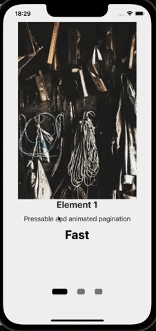
🤳 Showcase:
🚀 Installation:
Install latest carousel-with-pagination-rn :
yarn:
yarn add carousel-with-pagination-rn
npm:
npm install carousel-with-pagination-rn
🎮 Usage:
Import the default component:
1import CustomCarousel from 'carousel-with-pagination-rn';
Pass the required props data and renderItem:
1const YourScreen = () => {
2    return(
3        <CustomCarousel
4          data={dummyCarousel}
5          renderItem={({item}) => <YourItem item={item} />}
6        />
7    )
8}
Plug & Play example:
1import CustomCarousel from 'carousel-with-pagination-rn';
2
3const dummyData = [
4  {
5    id: 1,
6    img: 'https://picsum.photos/400/600?random=1',
7    title: 'Element 1',
8    description: 'Pressable and animated pagination',
9    price: 'Fast',
10  },
11  {
12    id: 2,
13    img: 'https://picsum.photos/400/600?random=2',
14    title: 'Element 2',
15    description: 'Full customization for carousel',
16    price: 'Simple',
17  },
18  {
19    id: 3,
20    img: 'https://picsum.photos/400/600?random=3',
21    title: 'Element 3',
22    description: 'Accessible for VoiceOver',
23    price: 'Efficient',
24  },
25];
26
27const {width} = Dimensions.get('screen');
28
29const YourScreen = () => {
30  return (
31    <SafeAreaView style={{flex: 1}}>
32      <View
33        style={{
34          justifyContent: 'center',
35          alignItems: 'center',
36        }}
37      >
38        <CustomCarousel
39          data={dummyData}
40          renderItem={({item}) => {
41            return (
42              <View style={styles.container}>
43                <Image
44                  source={{uri: item.img}}
45                  style={styles.image}
46                  resizeMode='contain'
47                />
48
49                <View style={styles.content}>
50                  <Text style={styles.title}>{item.title}</Text>
51                  <Text style={styles.description}>{item.description}</Text>
52                  <Text style={styles.extraDesc}>{item.price}</Text>
53                </View>
54              </View>
55            );
56          }}
57        />
58      </View>
59    </SafeAreaView>
60  );
61};
62
63const styles = StyleSheet.create({
64  container: {
65    width,
66    height: 700,
67    alignItems: 'center',
68  },
69  image: {
70    flex: 0.8,
71    width: '100%',
72  },
73  content: {
74    flex: 0.4,
75    alignItems: 'center',
76  },
77  title: {
78    fontSize: 24,
79    fontWeight: 'bold',
80    color: '#333',
81  },
82  description: {
83    fontSize: 18,
84    marginVertical: 12,
85    color: '#333',
86  },
87  extraDesc: {
88    fontSize: 32,
89    fontWeight: 'bold',
90  },
91});
92
93export default YourScreen;
94
🥷 Properties:
| Prop | Description | Default | Type |
|---|---|---|---|
data ❗Required | Used to pass in array of elements that should be rendere. The same as data prop in FlatList component | N/A | Array<any> |
renderItem ❗Required | Takes an item from data props and renders it as required. The same as renderItem prop in FlatList component | N/A | ListRenderItem<any> |
mainContainerStyle | Used to apply styling to the main container that wraps both: carousel and pagination | N/A | StyleProp<ViewStyle> |
carouselContainerStyle | Equivalent to style prop in FlatList and has the same affect to the Carousel | N/A | StyleProp<ViewStyle> |
carouselContentContainerStyle | Equivalent to contentContainerStyle prop in FlatList and has the same affect to the Carousel | N/A | StyleProp<ViewStyle> |
paginationContainerStyle | Used to apply styling to the container that wraps the pagination | N/A | StyleProp<ViewStyle> |
widthBoundaryForPagination | Is used to adjust inputRange of interpolated animations of pagination. Has to match to the width of renderItem. If not set, the device screen width will be used. | Dimensions.get('window').width | number |
indicatorWidth | Is used to adjust dynamic width of each pagination indicator. Has to be an array of 3 numbers where the second element of array will be assigned to the height of the active indicator. Example: indicatorWidth={[15,30,15]}. If static width is required, pass an array of three equal numbers as: [10,10,10] | [20,40,20] | Array<number> |
indicatorHeight | Is used to adjust dynamic height of each pagination indicator. Has to be an array of 3 numbers where the second element of array will be assigned to the width of the active indicator. Example: indicatorHeight={[15,30,15]}. If static width is required, pass an array of three equal numbers as: [10,10,10] | [15,15,15] | Array<number> |
indicatorColor | Is used to adjust dynamic color of each pagination indicator. Has to be an array of 3 strings/colors where the second element of array will be assigned to color of the active indicator. Example: indicatorColor={['grey', 'black', 'grey']}. If static width is required, pass an array of three equal numbers as: ['grey', 'grey', 'grey'] | ['grey', 'black', 'grey'] | Array<string> |
inidicatorBorderRadius | Is used to adjust borderRadius of each pagination indicator | 5 | number |
indicatorHorizontalPadding | Is used to adjust horizontalPadding of each pagination indicator | 10 | number |
paginataionBackgroundColor | Is used to change backgroundColor of each pagination container | transparent | string |
isEndReached | Will be called once the last element of the Carousel is displayed | (endReached: boolean) => void |
❗❗ It is important to pass a value to prop
widthBoundaryForPaginationif parent container withinrenderItemis not taking the full width of the screen. These values have to be the same.
⚙️ Methods attached to the Ref:
| Method | Description | Type |
|---|---|---|
ref | Can be used to access two methods: showNextItem() & showPreviousItem(). These methods then can be used to access behavior of the carousel and define it manually i.e. move to the next item in the carousel or move to the previous one. The Example below should provide a bit more information on the use and the implementation of these methods. | RefProps |
Explanation of use:
This feature was added in v1.1.5 following a feature request on the GitHub repository.
Now you can access the ref for CustomCarousel component, assign it as custom ref within your component using useRef and trigger two methods: showNextItem() AND showPreviousItem() to scroll trhough the Carousel using your custom component ( arrows as an example ).
Showcase:


Use of Ref methods with custom components that can be positioned anywhere.
Example:
1const CarouselScreen = () => {
2  let carouselRef = useRef<RefProps>(null); //RefProps interface can be imported from the library
3
4  const handleNextClick = () => {
5    carouselRef.current?.showNextItem(); //will scroll to the next item in carousel
6  };
7  const handlePreviousClick = () => {
8    carouselRef.current?.showPreviousItem(); //will scroll to the previous item in carousel
9  };
10  return (
11    <SafeAreaView style={{flex: 1}}>
12      <View
13        style={{
14          justifyContent: 'center',
15          alignItems: 'center',
16        }}
17      >
18        <CustomCarousel
19          ref={carouselRef} //access and assign the reference for the further use and manipulation
20          data={dummyData}
21          renderItem={renderItem} //Copy the renderItem from the 'Plug&Play' example or use your own renderItem.
22          disablePagination={true} //used to hide the pagination of the carousel
23        />
24        <View
25          style={{
26            flexDirection: 'row',
27            width: 100,
28            justifyContent: 'space-between',
29          }}
30        >
31          <TouchableOpacity onPress={handlePreviousClick}>
32            <Text>Previous</Text>
33          </TouchableOpacity>
34          <TouchableOpacity onPress={handleNextClick}>
35            <Text>Next</Text>
36          </TouchableOpacity>
37        </View>
38      </View>
39    </SafeAreaView>
40  );
41};
🪪 License & Sources:
- carousel-with-pagination-rn - MIT © veryrare104
- images used in Plug & Play example source - Lorem Picsum
- giphs created and sourced - GIPHY

No vulnerabilities found.
No security vulnerabilities found.