Gathering detailed insights and metrics for country-dropdown
Gathering detailed insights and metrics for country-dropdown
Gathering detailed insights and metrics for country-dropdown
Gathering detailed insights and metrics for country-dropdown
vue-country-dropdown
Country Dropdown with Vue
vue-country-dropdown-2
Country Dropdown for Vue@2
country-flags-dropdown
This component lists the country flags with phone codes with search filtering ability and dropdown selection with keyboard.
react-native-element-dropdown
React Native Element Dropdown is a library that provides a customizable dropdown component for React Native applications.
npm install country-dropdownTypescript
Module System
Node Version
NPM Version
Total Downloads
408
Last Day
1
Last Week
5
Last Month
27
Last Year
298
Latest Version
0.1.4
Package Id
country-dropdown@0.1.4
Unpacked Size
51.79 kB
Size
8.94 kB
File Count
22
NPM Version
9.8.0
Node Version
20.5.0
Published on
Jun 18, 2024
Cumulative downloads
Total Downloads
Last Day
0%
1
Compared to previous day
Last Week
-16.7%
5
Compared to previous week
Last Month
17.4%
27
Compared to previous month
Last Year
170.9%
298
Compared to previous year
A customizable React component for country, state, and city dropdowns.
To get started with the Country Dropdown component, follow these steps:
npm i country-dropdown
Before using the component, you need to get an API key from the Country State City API website.
Please make sure to replace the your_api_key in the .env file with your actual API key.
REACT_APP_COUNTRY_STATE_CITY_API_KEY = your_api_key
Wrap your components using the ValueProvider component to ensure proper functionality.
import { ValueProvider } from "country-dropdown";

<ValueProvider>
    <YourComponents>
</ValueProvider>
Import the Dropdown component and integrate it into your application, providing a suitable onChange function.
import { Dropdown, ValueProvider } from "country-dropdown";

<ValueProvider>
    <Dropdown
        onChange={(value, type) => handleChange(value, type)}
    />
</ValueProvider>
| Prop Name | Type | Description |
|---|---|---|
| onChange | (value: object, type: string) => void | A callback function triggered when the value of the dropdown changes. Receives the selected value and the type of dropdown (e.g., "Country", "State", "City"). |
| dropdownOptions (optional) | Array<string> | An array of strings representing the dropdown options. Determines the number of dropdowns to display. Example: ["Country", "State", "City"]. |
| cityPlaceholder (optional) | string | The placeholder text to display in the city dropdown. |
| statePlaceholder (optional) | string | The placeholder text to display in the state dropdown. |
| countryPlaceholder (optional) | string | The placeholder text to display in the country dropdown. |
| containerClassName (optional) | string | A CSS class name or Tailwind classes to customize the styling of the container that wraps the dropdown component. |
| inputClassName (optional) | string | A CSS class name or Tailwind classes to customize the styling of the dropdown input field. |
| optionItemClassName (optional) | string | A CSS class name or Tailwind classes to customize the styling of the dropdown options. |
| optionItemSelectedClassName (optional) | string | A CSS class name or Tailwind classes to customize the styling of the selected dropdown options. |
| optionsListClassName (optional) | string | A CSS class name or Tailwind classes to customize the styling of the dropdown options list. |
| optionItemHoverClassName (optional) | string | A CSS class name or Tailwind classes to customize the styling of the dropdown options when hovered. Use hover: for Tailwind classes and :hover for regular CSS classes. |
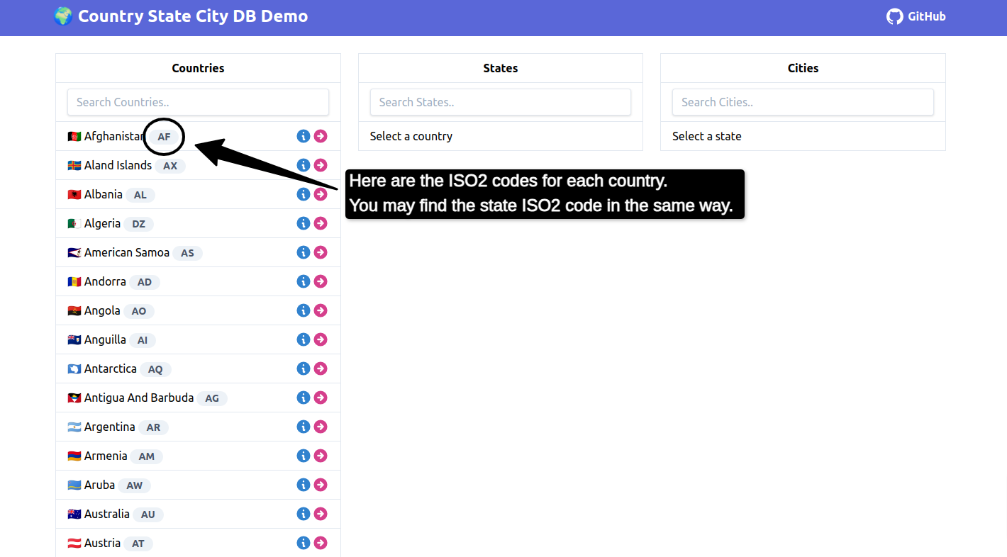
| defaultCountryValue (optional) | string | The ISO2 code for the default country to be selected if Country is not present in the dropdown options. |
| defaultStateValue (optional) | string | The ISO2 code for the default state to be selected if Country and State are not present in the dropdown options. |
| labelClasses (optional) | string | A CSS class name or Tailwind classes to customize the styling of the input label. |
| cityLabel (optional) | string | A label for the city dropdown. |
| countryLabel (optional) | string | A label for the country dropdown. |
| stateLabel (optional) | string | A label for the state dropdown. |
| cityDropdownName (optional) | string | A name for the city dropdown. |
| stateDropdownName (optional) | string | A name for the state dropdown. |
| countryDropdownName (optional) | string | A name for the country dropdown. |
import { DropdownWithReactHookForm } from "country-dropdown";

<DropdownWithReactHookForm
    onDropdownChange={(value, type) =>
        handleChange(value, type)
    }
    dropdownOptions={["City", "State", "Country"]}
/>
| Prop Name | Type | Description |
|---|---|---|
| onDropdownChange | (value: object, type: string) => void | A callback function triggered when the value of the dropdown changes. Receives the selected value and the type of dropdown (e.g., "Country", "State", "City"). |
| dropdownOptions (optional) | Array<string> | An array of strings representing the dropdown options. Determines the number of dropdowns to display. Example: ["Country", "State", "City"]. |
| cityPlaceholder (optional) | string | The placeholder text to display in the city dropdown. |
| statePlaceholder (optional) | string | The placeholder text to display in the state dropdown. |
| countryPlaceholder (optional) | string | The placeholder text to display in the country dropdown. |
| containerClassName (optional) | string | A CSS class name or Tailwind classes to customize the styling of the container that wraps the dropdown component. |
| inputClassName (optional) | string | A CSS class name or Tailwind classes to customize the styling of the dropdown input field. |
| optionItemClassName (optional) | string | A CSS class name or Tailwind classes to customize the styling of the dropdown options. |
| optionItemSelectedClassName (optional) | string | A CSS class name or Tailwind classes to customize the styling of the selected dropdown options. |
| optionsListClassName (optional) | string | A CSS class name or Tailwind classes to customize the styling of the dropdown options list. |
| optionItemHoverClassName (optional) | string | A CSS class name or Tailwind classes to customize the styling of the dropdown options when hovered. Use hover: for Tailwind classes and :hover for regular CSS classes. |
| defaultCountryValue (optional) | string | The ISO2 code for the default country to be selected if Country is not present in the dropdown options. |
| defaultStateValue (optional) | string | The ISO2 code for the default state to be selected if Country and State are not present in the dropdown options. |
| labelClasses (optional) | string | A CSS class name or Tailwind classes to customize the styling of the input label. |
| cityLabel (optional) | string | A label for the city dropdown. |
| countryLabel (optional) | string | A label for the country dropdown. |
| stateLabel (optional) | string | A label for the state dropdown. |
| cityDropdownName (optional) | string | A name for the city dropdown. |
| stateDropdownName (optional) | string | A name for the state dropdown. |
| countryDropdownName (optional) | string | A name for the country dropdown. |
| errorClassNames (optional) | string | CSS class name or Tailwind classes to customize the styling of the error message. |
| cityValidations (optional) | RegisterOptions | Validations for city dropdown |
| stateValidations (optional) | RegisterOptions | Validations for state dropdown |
| countryValidations (optional) | RegisterOptions | Validations for country dropdown |

No vulnerabilities found.