Gathering detailed insights and metrics for expo-images-picker
Gathering detailed insights and metrics for expo-images-picker
Gathering detailed insights and metrics for expo-images-picker
Gathering detailed insights and metrics for expo-images-picker
expo-image-picker
Provides access to the system's UI for selecting images and videos from the phone's library or taking a photo with the camera.
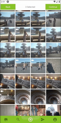
expo-image-multiple-picker
Fully customizable image picker for react native
@monceeef/expo-images-picker
Expo images picker, Selecting Multiple images and videos from user device
expo-multiple-images-picker
Multiple image selecting package for React Native using Expo FileSystem
Multiple Asset Photos Videos selecting package for Expo SDK
npm install expo-images-pickerTypescript
Module System
Node Version
NPM Version
TypeScript (100%)
Total Downloads
0
Last Day
0
Last Week
0
Last Month
0
Last Year
0
MIT License
97 Stars
70 Commits
37 Forks
4 Watchers
1 Branches
7 Contributors
Updated on Feb 26, 2025
Latest Version
2.5.1
Package Id
expo-images-picker@2.5.1
Unpacked Size
47.77 kB
Size
13.80 kB
File Count
13
NPM Version
8.13.2
Node Version
16.6.1
Cumulative downloads
Total Downloads
Last Day
0%
NaN
Compared to previous day
Last Week
0%
NaN
Compared to previous week
Last Month
0%
NaN
Compared to previous month
Last Year
0%
NaN
Compared to previous year
1
3
Multiple Asset Photos | Videos selecting package for Expo SDK 43+. For users who use React native and managed workflow + Styled Components.

Install with
1$ npm install expo-images-picker
or
1$ yarn add expo-images-picker
then
1$ expo install expo-image-manipulator expo-media-library
import to the top of your file like
1import { AssetsSelector } from 'expo-images-picker'
install @expo-vectors package and send icons as props to the widget
1import { Ionicons } from '@expo/vector-icons'
Use the imported as Following =>
1<AssetsSelector
2   Settings={widgetSettings}
3   Errors={widgetErrors}
4   Styles={widgetStyles}
5   Resize={widgetResize}       // optional
6   Navigator={widgetNavigator} // optional
7   CustomNavigator={{          // optional
8        Component: CustomNavigator,
9        props: {
10            backFunction: true,
11            onSuccess,
12            text: T.ACTIONS.SELECT,
13       },
14    }}
15 />
##[📚 Params]
you better create this const out of your component , if you do need it inside your component , use useMemo from react.
1   const widgetSettings = useMemo(
2       () => ({
3           getImageMetaData: false,
4           initialLoad: 100,
5           assetsType: [MediaType.photo, MediaType.video],
6           minSelection: 1,
7           maxSelection: 3,
8           existingSelectionIds: ["<selected Id 1>", "<selected Id 2>", "<selected Id N>"],
9           portraitCols: 4,
10           landscapeCols: 4,
11       }),
12       []
13   )
getImageMetaData - return an asset with extra metadata fields * may cause slower results .file:// and not asset-library://initialLoad - initial amount of assets to load first time.
assetsType - array that includes [MediaType.photo, MediaType.video].
[photo , video ].
minSelection - min amount of images user need to select.
maxSelection - max amount of images user need to select.
existingSelectionIds - array that includes the id's of those assets previously selected. Each value comes from the Asset in onSuccess callback. optional
portraitCols - Number of columns in portrait Mode.
landscapeCols - Number of columns in landscape Mode.
1    const widgetErrors = useMemo(
2        () => ({
3            errorTextColor: polar_text_2,
4            errorMessages: {
5                hasErrorWithPermissions: translator(
6                    T.ERROR.HAS_PERMISSIONS_ERROR
7                ),
8                hasErrorWithLoading: translator(T.ERROR.HAS_INTERNAL_ERROR),
9                hasErrorWithResizing: translator(T.ERROR.HAS_INTERNAL_ERROR),
10                hasNoAssets: translator(T.ERROR.HAS_NO_ASSETS),
11            },
12        }),
13        []
14    )
onError - callback function that you can pass and will fire whenever there is an error.
errorTextColor - set the text color of an error message.
errorMessages
`hasErrorWithPermissions`- error text when there are no permissions.
`hasErrorWithLoading` - error text for issue with loading assets.
`hasErrorWithResizing` - error text for issue with resizing.
`hasNoAssets` - text shows when there are no assets to show.
1    const widgetStyles = useMemo(
2        () => ({
3            margin: 2,
4            bgColor: bg,
5            spinnerColor: main,
6            widgetWidth: 99,
7            screenStyle:{
8                borderRadius: 5,
9                overflow: "hidden",
10            },
11            widgetStyle:{
12                margin: 10
13            },
14            videoIcon: {
15                Component: Ionicons,
16                iconName: 'ios-videocam',
17                color: polar_text_1,
18                size: 20,
19            },
20            selectedIcon: {
21                Component: Ionicons,
22                iconName: 'ios-checkmark-circle-outline',
23                color: 'white',
24                bg: mainWithOpacity,
25                size: 26,
26            },
27        }),
28        [polar_text_1, mainWithOpacity]
29    )
margin - set margin between the images.
bgColor - set the widget background color.
spinnerColor - set the color of the spinner (loading indicator).
widgetWidth - the widget width in percentages .
screenStyle (Optional) - set the style of the Screen wrapping both Navigator and Widget.
widgetStyle (Optional) - set the style of the Widget wrapping the AssetList (contains all the images, videos,etc)
videoIcon
Component - the icon component.(from @expo/vector-icons).
iconName - the icon name.
Component - the icon color.
Component - the icon size.
selectedIcon - the widget width in percentages .
Component - the icon component.(from @expo/vector-icons).
iconName - the icon name.
color - the icon color.
bg - set the cover color when an asset is select.
size - the icon size.
1    const widgetNavigator = useMemo(
2        () => ({
3            Texts: {
4                finish: 'finish',
5                back: 'back',
6                selected: 'selected',
7            },
8            midTextColor: polar_text_2,
9            minSelection: 3,
10            buttonTextStyle: _textStyle,
11            buttonStyle: _buttonStyle,
12            onBack: () => navigation.goBack(),
13            onSuccess: (data: Asset[]) => onSuccess(data),
14        }),
15        []
16    )
Texts - send in finish back selected texts.
midTextColor - set the color of the middle text aka "selected" .
minSelection - set the min selection , continue button will be unavailable until user select this amount of images.
buttonTextStyle - Text Style Object , design the text inside the buttons.
buttonStyle - View Style Object, design the button itself.
onBack - Send in a function to go back to your screen.
onSuccess - Send in a function to go back and send the returned data.
1    const widgetResize = useMemo(
2        () => ({
3            width: 512,
4            height: 384,
5            majorAxis: 512,
6            compress: 0.7,
7            base64: false,
8            saveTo: SaveType.JPG,
9        }),
10        []
11    )
**Note that using manipulate might result with crash or slow loading times on older phones.
width - Manipulate image width optional
height - Manipulate image width optional
majorAxis - Manipulate image's major axis only (if width and height are not specified) optional
compress - compress 0.1 Super low quality 1.0 leave as is (high quality).
base64 - will add extra result , image as a base64 string.
saveTo - can be png or jpeg .
Make sure your CustomTopNavigator can receive onSuccess function. And bind this onFinish function on the correct button. This is useful for integrating with React Navigation header.
Component - Send in your Custom nav bar.
props Send any props your Custom Component needs.
Example with React Navigation
1type CustomNavImageSelectionProps = {
2  navigation: CustomNavigationProp
3  onSuccess: () => void
4  backFunction: boolean
5  text: string
6};
7
8function CustomNavImageSelection({ navigation, onSuccess, backFunction, text }: CustomNavImageSelectionProps) {
9  useEffect(() => {
10    navigation.setOptions({
11      headerRight: () => <Button title={text} onPress={onSuccess} />,
12    })
13  }, [navigation, onSuccess, text])
14
15  return null
16}
17
18<AssetsSelector
19  options={{
20    ...otherProps,
21    CustomTopNavigator: {
22      Component: CustomNavImageSelection,
23      props: {
24        navigation,
25        onSuccess: (data: Asset[]) => {
26            onDone(data)
27            navigation.goBack()
28        },
29        backFunction: true,
30        text: T.ACTIONS.SELECT
31      },
32    },
33  }}
34/>

No vulnerabilities found.
Reason
no binaries found in the repo
Reason
0 existing vulnerabilities detected
Reason
license file detected
Details
Reason
Found 6/16 approved changesets -- score normalized to 3
Reason
0 commit(s) and 0 issue activity found in the last 90 days -- score normalized to 0
Reason
no effort to earn an OpenSSF best practices badge detected
Reason
security policy file not detected
Details
Reason
project is not fuzzed
Details
Reason
branch protection not enabled on development/release branches
Details
Reason
SAST tool is not run on all commits -- score normalized to 0
Details
Score
Last Scanned on 2025-07-07
The Open Source Security Foundation is a cross-industry collaboration to improve the security of open source software (OSS). The Scorecard provides security health metrics for open source projects.
Learn More