Gathering detailed insights and metrics for glitzy-native
Gathering detailed insights and metrics for glitzy-native
Gathering detailed insights and metrics for glitzy-native
Gathering detailed insights and metrics for glitzy-native
npm install glitzy-nativeTypescript
Module System
Node Version
NPM Version
TypeScript (100%)
Total Downloads
0
Last Day
0
Last Week
0
Last Month
0
Last Year
0
MIT License
11 Stars
154 Commits
1 Watchers
1 Branches
8 Contributors
Updated on Jan 14, 2025
Latest Version
0.3.2
Package Id
glitzy-native@0.3.2
Unpacked Size
57.91 kB
Size
12.87 kB
File Count
29
NPM Version
10.2.4
Node Version
18.19.1
Published on
Jan 01, 2025
Cumulative downloads
Total Downloads
Last Day
0%
NaN
Compared to previous day
Last Week
0%
NaN
Compared to previous week
Last Month
0%
NaN
Compared to previous month
Last Year
0%
NaN
Compared to previous year


ℹ️ Note
This was originally a fork of react-native-skeleton-content-nonexpo, which depends on the gradient implementation in react-native-linear-gradient. It also resolves the issue with using Reanimated >= v2.0.0 and removes the hard requirement on Redash.
A simple and fully customizable implementation of a skeleton placeholder for React Native. Works on both iOS and Android.
1bun add glitzy-native
or
1yarn add glitzy-native
or
1npm install glitzy-native
Also install reanimated which is used as the animation driver:
1bun install react-native-reanimated
or
1npm install react-native-reanimated
or
1yarn add react-native-reanimated
This package exposes three different animationType: shiver, pulse and none. If you want to use the shiver animationType you would need to have a gradient package or implementation.
You have the flexibility of providing your own linear gradient implementation based on your project, all you need to do is to pass the implementation via the LinearGradientComponent prop. There are implementation files for common gradient packages like expo, skia and react-native-linear-gradient.
1import { Glitzy } from "glitzy-native";
For shiver animation, you can import based on the default linear gradient implementations ⬇️
If you use expo workflow, install expo-linear-gradient and import like so:
1import { Glitzy } from "glitzy-native/expo";
If you prefer to use @shopify/react-native-skia:
1import { Glitzy } from "glitzy-native/skia";
If you prefer to use react-native-linear-gradient:
1import { Glitzy } from "glitzy-native/native";
OR you can just provide your own gradient implementation and use it like so:
1import { Glitzy } from "glitzy-native";
2...
3const Gradient = /* Your gradient implementation **/
4...
5  <Glitzy LinearGradientComponent={Gradient} {...props} />
6...
layout to the component specifying the size of the bones (see the Examples section below). Here is the example with a custom layout. A key prop is optional but highly recommended.1export default function Placeholder() { 2 return ( 3 <Glitzy.Layout 4 containerStyle={{ flex: 1, width: 300 }} 5 isLoading={false} 6 renderContent={ 7 <> 8 <Text style={styles.normalText}>Your content</Text> 9 <Text style={styles.bigText}>Other content</Text> 10 </> 11 } 12 > 13 <Glitzy.Box key="someId" width={220} height={20} marginBottom={6} /> 14 <Glitzy.Box key="someOtherId" width={180} height={20} marginBottom={6} /> 15 </Glitzy.Layout> 16 ); 17} 18 19// OR 20 21export default function Placeholder() { 22 return ( 23 <Glitzy 24 containerStyle={{ flex: 1, width: 300 }} 25 isLoading={false} 26 layout={[ 27 { key: "someId", width: 220, height: 20, marginBottom: 6 }, 28 { key: "someOtherId", width: 180, height: 20, marginBottom: 6 }, 29 ]} 30 > 31 <Text style={styles.normalText}>Your content</Text> 32 <Text style={styles.bigText}>Other content</Text> 33 </Glitzy> 34 ); 35}
isLoading to your state to show/hide the Skeleton when the assets/data are available to the user.1export default function Placeholder() { 2 const [loading, setLoading] = useState(true); 3 return ( 4 <Glitzy 5 containerStyle={{ flex: 1, width: 300 }} 6 isLoading={isLoading} 7 {...otherProps} 8 /> 9 ); 10}
| Name | Type | Default | Description |
|---|---|---|---|
| isLoading | bool | required | Shows the skeleton bones when true |
| LinearGradientComponent | ReactComponent | required for shiver animation | The gradient implementation to use for the "shiver" animation |
| layout | array of objects | [] | A custom layout for the skeleton bones |
| duration | number | 1200 ms | Duration of one cycle of animation |
| containerStyle | object | flex: 1 | The style applied to the View containing the bones |
| easing | Easing | bezier(0.5, 0, 0.25, 1) | Easing of the bones animation |
| animationType | string | "shiver" | The animation to be used for animating the bones (see demos below) |
| animationDirection | string | "horizontalRight" only for shiver animationType | Used only for shiver animation, describes the direction and end-point (ex: horizontalRight goes on the x-axis from left to right) |
| boneColor | string | "#E1E9EE" | Color of the bones |
| highlightColor | string | "#F2F8FC" | Color of the highlight of the bones |
See the example app to experiment:
1 - Changing the direction of the animation (animationDirection prop) :

1export default function Placeholder() {
2  return (
3    <Glitzy
4      containerStyle={{ flex: 1, width: 300 }}
5      animationDirection="horizontalLeft"
6      isLoading={true}
7      // ...
8    />
9  );
10}
2 - Changing the colors and switching to "pulse" animation (boneColor, highlightColor and animationType prop) :
1export default function Placeholder() {
2  return (
3    <Glitzy
4      containerStyle={{ flex: 1, width: 300 }}
5      boneColor="#121212"
6      highlightColor="#333333"
7      animationType="pulse"
8      isLoading={true}
9      // ...
10    />
11  );
12}
3 - Customizing the layout of the bones :

There are 2 ways to customize the layout of the bones, either using the declarative API (via layout components) or imperatively by building your layout.
1// Declarative:
2export default function Placeholder() {
3  return (
4    <Glitzy.Layout
5      containerStyle={{ flex: 1, width: 300 }}
6      animationDirection="horizontalLeft"
7      isLoading={true}
8      // ...
9    >
10      {/** long line */}
11      <Glitzy.Box width={220} height={20} marginBottom={6} />
12      {/** short line */}
13      <Glitzy.Box width={180} height={20} marginBottom={6} />
14    </Glitzy.Layout>
15  );
16}
17
18// Imperative:
19export default function Placeholder() {
20  return (
21    <Glitzy
22      containerStyle={{ flex: 1, width: 300 }}
23      animationDirection="horizontalLeft"
24      layout={[
25        // long line
26        { width: 220, height: 20, marginBottom: 6 },
27        // short line
28        { width: 180, height: 20, marginBottom: 6 },
29        // ...
30      ]}
31      isLoading={true}
32      // ...
33    />
34  );
35}
4 - Syncing skeleton animations in groups
Say we have a group of Glitzy Skeletons that we want to visually keep their animation in sync no matter when any of them mounts, we can wrap these skeletons as children of Glitzy.Group
Before:
1export default function Placeholder() {
2  return (
3    <>
4      <Glitzy.Layout
5        isLoading={true}
6        // ...
7      >
8        <Glitzy.Box width={200}>{/** ... */}</Glitzy.Box>
9      </Glitzy.Layout>
10      <Glitzy
11        layout={[
12          {
13            children: [
14              //  ...
15            ],
16            width: 200,
17          },
18          // ...
19        ]}
20        isLoading={true}
21        // ...
22      />
23    </>
24  );
25}
After:
1export default function Placeholder() {
2  return (
3    <Glitzy.Group>
4      <Glitzy.Layout
5        isLoading={true}
6        // ...
7      >
8        <Glitzy.Box width={200}>{/** ... */}</Glitzy.Box>
9      </Glitzy.Layout>
10      <Glitzy
11        layout={[
12          {
13            children: [
14              //  ...
15            ],
16            width: 200,
17          },
18          // ...
19        ]}
20        isLoading={true}
21        // ...
22      />
23    </Glitzy.Group>
24  );
25}
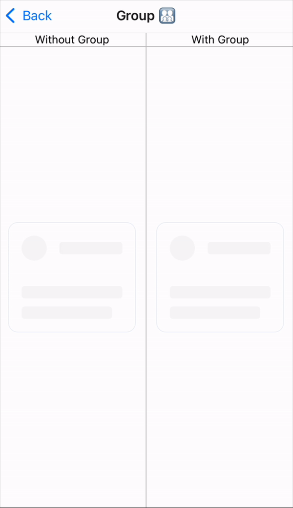
In the before case (without group), the animation of each skeleton in the group is independent and kicks off when the skeleton mounts. In the after case (with group), the animation is controlled in a group so no matter when any skeleton is mounted within that group, its animation is kept in sync with the rest of the group.

No vulnerabilities found.
No security vulnerabilities found.