Gathering detailed insights and metrics for msc-input-assistant
Gathering detailed insights and metrics for msc-input-assistant
Gathering detailed insights and metrics for msc-input-assistant
Gathering detailed insights and metrics for msc-input-assistant
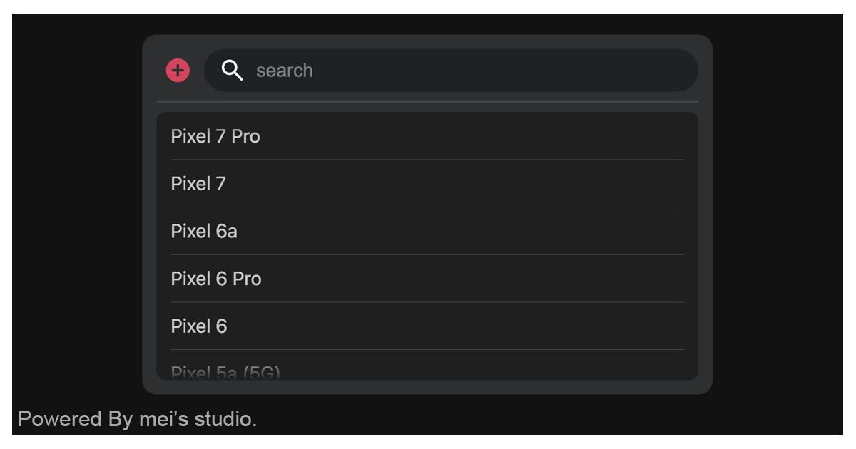
<msc-input-assistant /> is a web component which help user to input wisely. Users could search or pick option with list we provide. Once options are not good enough for them, they can 「add」 their own options for usage.
npm install msc-input-assistantTypescript
Module System
Node Version
NPM Version
JavaScript (94.83%)
HTML (5.17%)
Total Downloads
0
Last Day
0
Last Week
0
Last Month
0
Last Year
0
MIT License
1 Stars
8 Commits
1 Watchers
1 Branches
1 Contributors
Updated on Aug 16, 2023
Latest Version
1.0.5
Package Id
msc-input-assistant@1.0.5
Unpacked Size
188.67 kB
Size
54.34 kB
File Count
10
NPM Version
8.15.0
Node Version
16.17.1
Published on
Aug 07, 2023
Cumulative downloads
Total Downloads
Last Day
0%
NaN
Compared to previous day
Last Week
0%
NaN
Compared to previous week
Last Month
0%
NaN
Compared to previous month
Last Year
0%
NaN
Compared to previous year

No dependencies detected.
<msc-input-assistant /> is a web component which help user to input wisely. Users could search or pick option with list we provide. Once options are not good enough for them, they can 「add」 their own options for usage. <msc-input-assistant /> will save options which user added in indexedDB. These options will be available in the same domain.
<msc-input-assistant /> is a web component. All we need to do is put the required script into your HTML document. Then follow
1<script
2  type="module"
3  src="https://your-domain/wc-msc-input-assistant.js">
4</script>
Put <msc-input-assistant /> into HTML document. It will have different functions and looks with attribute mutation.
1<msc-input-assistant>
2  <script type="application/json">
3    {
4      "module": "assistant",
5      "options": [
6        "iPhone 12",
7        "iPhone SE",
8        "iPhone 13",
9        "iPhone 14",
10        "iPhone 14 Pro",
11        "iPad mini",
12        "iPad",
13        "iPad Air",
14        "iPad Pro"
15      ],
16      "l10n": {
17        "back": "Back",
18        "search": "search",
19        "submit": "SUBMIT",
20        "inputLabel": "Add option",
21        "inputPlaceholder": "add option please"
22      },
23      "forceupdate": false
24    }
25  </script>
26</msc-input-assistant>
Otherwise, developers could also choose remoteconfig to fetch config for <msc-input-assistant />.
1<msc-input-assistant
2  remoteconfig="https://your-domain/api-path"
3>
4</msc-input-assistant>
<msc-input-assistant /> could also use JavaScript to create DOM element. Here comes some examples.
1<script type="module">
2import { MscInputAssistant } from 'https://your-domain/wc-msc-input-assistant.js';
3
4// use DOM api
5const nodeA = document.createElement('msc-input-assistant');
6document.body.appendChild(nodeA);
7nodeA.forceupdate = true;
8nodeA.options = [
9  'iPhone',
10  'iPad'
11];
12
13// new instance with Class
14const nodeB = new MscInputAssistant();
15document.body.appendChild(nodeB);
16nodeB.options = [
17  'Pixel 7 Pro',
18  'Pixel 7',
19];
20
21// new instance with Class & default config
22const config = {
23  'module': 'assistant',
24  'options': [
25    'iPhone 12',
26    'iPhone SE',
27    'iPhone 13',
28    'iPhone 14',
29    'iPhone 14 Pro',
30    'iPad mini',
31    'iPad',
32    'iPad Air',
33    'iPad Pro'
34  ],
35  'l10n': {
36    'back': 'Back',
37    'search': 'search',
38    'submit': 'SUBMIT',
39    'inputLabel': 'Add option',
40    'inputPlaceholder': 'add option please'
41  },
42  'forceupdate': false
43};
44const nodeC = new MscInputAssistant(config);
45document.body.appendChild(nodeC);
46</script>
Developers could apply styles to decorate <msc-input-assistant />'s looking.
1<style>
2msc-input-assistant {
3  --msc-input-assistant-background-color: rgba(242 242 246);
4  --msc-input-assistant-module-background-color: rgba(255 255 255);
5  --msc-input-assistant-option-text-color: rgba(0 0 0);
6  --msc-input-assistant-theme-color: rgba(230 50 89);
7  --msc-input-assistant-line-color: rgba(198 198 200);
8
9  /* search */
10  --msc-input-assistant-search-background-color: rgba(227, 227, 232);
11  --msc-input-assistant-search-text-color: rgba(127 127 132);
12  --msc-input-assistant-search-placeholder-text-color: rgba(127 127 132);
13
14  /* submit */
15  --msc-input-assistant-input-background-color: rgba(255 255 255);
16  --msc-input-assistant-input-theme-color: rgba(15 105 255);
17  --msc-input-assistant-input-label-color: rgba(110 119 128);
18  --msc-input-assistant-input-text-color: rgba(35 42 49);
19  --msc-input-assistant-input-placeholder-text-color: rgba(70 78 86);
20
21  --msc-input-assistant-submit-background-color: rgba(15 105 255);
22  --msc-input-assistant-submit-text-color: rgba(255 255 255);
23
24  --msc-input-assistant-no-result-content: 'Oops! nothing exist.';
25
26  --msc-input-assistant-overlay: 29 34 40;
27}
28</style>
<msc-input-assistant /> supports some attributes to let it become more convenience & useful.
Set module for <msc-input-assistant />. assistant (not set).
1<msc-input-assistant
2  module="assistant"
3>
4  ...
5</msc-input-assistant>
Set options for <msc-input-assistant />. It should be JSON string. Developers could set defalt options. Default is [] (not set).
1<msc-input-assittant
2  options='["iPhone","iPad"]'
3>
4  ...
5</msc-input-assittant>
Set forceupdate for ^lt;msc-input-assistant />. It will decide append data or just remain current options' data. Default is false (not set).
1<msc-input-assittant
2  forceupdate
3>
4  ...
5</msc-input-assittant>
Set localization for <msc-input-assittant />. It will replace some message & button text to anything you like. It should be JSON string. Developers could set back、search、submit、inputLabel and inputPlaceholder.
back:back to pick mode text. Default is Back.search:search field's placeholder. Default is search.submit:button 「SUBMIT」text. Default is SUBMIT.inputLabel:Add Mode > input field's label. Default is Add option.inputPlaceholder:Add Mode > input field's placeholder. Default is add option please.1<msc-input-assistant 2 l10n='{"back":"Back","search":"search","submit":"SUBMIT","inputLabel":"Add option","inputPlaceholder":"add option please"}' 3> 4 ... 5</msc-input-assistant>
| Property Name | Type | Description |
|---|---|---|
| module | String | Getter / Setter for current storage key. Default is assistant (not set). |
| options | Array | Getter / Setter for options. Default is [] (not set). |
| forceupdate | Boolean | Getter / Setter for data writing mode. It will decide append data or just remain current options' data. Default is false (not set). |
| l10n | Object | Getter / Setter for l10n. It will replace some message & button text to anything you like. Developers could set back、search、submit、inputLabel and inputPlaceholder. |
| results | Array | Getter for current display options. |
| Method Signature | Description |
|---|---|
| clearStorage | Clear current storage data (by current module). This is an async method. |
| add(option) | Add option. This is an async method and makes UI mutated. |
| query(keyword) | Query options by keyword and return results. This is an async method and makes UI mutated. |
| Event Signature | Description |
|---|---|
| msc-input-assistant-pick | Fired when option picked. |
| msc-input-assistant-add | Fired when option added. |
| msc-input-assistant-delete | Fired when option deleted. |
No vulnerabilities found.
No security vulnerabilities found.