Gathering detailed insights and metrics for react-autocomplete-tagbox
Gathering detailed insights and metrics for react-autocomplete-tagbox
Gathering detailed insights and metrics for react-autocomplete-tagbox
Gathering detailed insights and metrics for react-autocomplete-tagbox
npm install react-autocomplete-tagboxTypescript
Module System
Node Version
NPM Version
Total Downloads
0
Last Day
0
Last Week
0
Last Month
0
Last Year
0
Latest Version
1.0.1
Package Id
react-autocomplete-tagbox@1.0.1
Unpacked Size
153.22 kB
Size
47.74 kB
File Count
8
NPM Version
11.0.0
Node Version
22.12.0
Published on
Jun 07, 2025
Cumulative downloads
Total Downloads
Last Day
0%
NaN
Compared to previous day
Last Week
0%
NaN
Compared to previous week
Last Month
0%
NaN
Compared to previous month
Last Year
0%
NaN
Compared to previous year
Modern, flexible, and fully customizable React tag input with autocomplete.


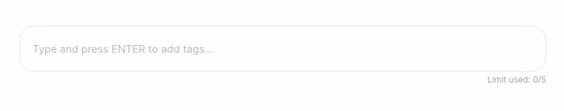
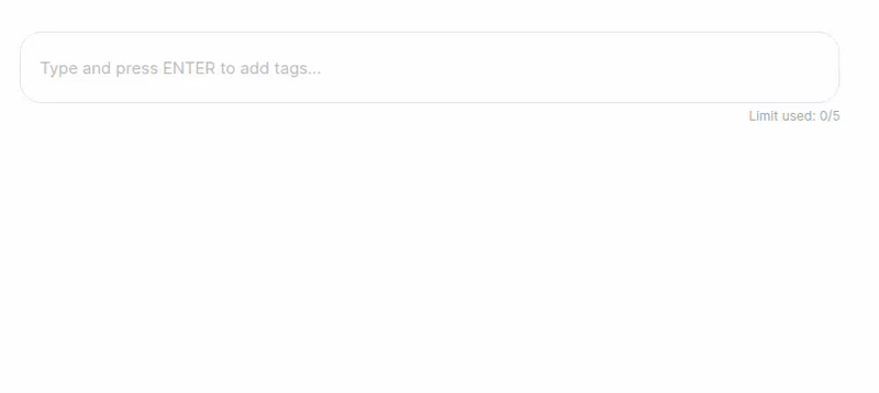
React Autocomplete Tagbox is a modern, flexible, and fully customizable React component for tag input with optional autocomplete. Effortlessly add, remove, and select tags with keyboard or mouse. Supports both free-form and restricted tag entry, smart suggestions, and a clean, accessible UI. Perfect for forms, search bars, and dynamic filters. Easy to integrate and fully styleable to match your project.
filterData): Accept only tags that match your custom logic (e.g., only URLs, emails, etc.).1npm install react-autocomplete-tagbox 2# or 3yarn add react-autocomplete-tagbox
1import React, { useState } from "react";
2import ReactAutocompleteTagbox from "react-autocomplete-tagbox";
3
4const options = [
5  "React",
6  "JavaScript",
7  "TypeScript",
8  "GraphQL",
9  "Redux",
10  "Bootstrap",
11];
12
13// Example filter: only allow options that are at least 5 characters
14const filterData = (str: string) => str.length >= 5;
15const filteredOptions = options.filter(filterData);
16
17export default function App() {
18  const [tags, setTags] = useState<string[]>([]);
19
20  return (
21    <ReactAutocompleteTagbox
22      tags={tags}
23      onChange={setTags}
24      options={filteredOptions} // Filtered options
25      filterData={filterData}
26      limit={5}
27      placeholder="Add technologies..."
28    />
29  );
30}
Note:
If you use bothoptionsandfilterData, only options that passfilterDatawill be selectable or added as tags.
It's recommended to filter youroptionswithfilterDatabefore passing them to the component.
| Prop | Type | Default | Description |
|---|---|---|---|
tags | string[] | [] | The current list of tags. |
onChange | (tags: string[]) => void | Callback when tags change. | |
options | string[] | undefined | Optional. Restricts tags to these options and enables autocomplete. |
limit | number | undefined | Optional. Maximum number of tags allowed. |
placeholder | string | "Type and press ENTER to add tags..." | Placeholder text for the input. |
containerStyle | React.CSSProperties | undefined | Optional. Inline styles for the container. |
className | string | undefined | Optional. Additional class for the container. |
filterData | (data: string) => boolean | undefined | Optional. Custom validation/filter function for tags. |
If you use both options and filterData, make sure your options match your filter. For example, to only allow URLs:
1const filterData = (str: string) => {
2  try {
3    const url = new URL(str.trim());
4    return url.protocol === "http:" || url.protocol === "https:";
5  } catch {
6    return false;
7  }
8};
9const filteredOptions = options.filter(filterData);
10
11<ReactAutocompleteTagbox
12  tags={tags}
13  onChange={setTags}
14  options={filteredOptions}
15  filterData={filterData}
16/>;
className prop.Clone the repo and run:
1npm install
2npm run dev
Contributions, issues, and feature requests are welcome!
Feel free to check issues page.
React Autocomplete Tagbox — The smart, beautiful way to manage tags in your React apps!

No vulnerabilities found.
No security vulnerabilities found.