Gathering detailed insights and metrics for react-infinity-sidebar
Gathering detailed insights and metrics for react-infinity-sidebar
Gathering detailed insights and metrics for react-infinity-sidebar
Gathering detailed insights and metrics for react-infinity-sidebar
npm install react-infinity-sidebarTypescript
Module System
Node Version
NPM Version
JavaScript (91.59%)
CSS (8.09%)
HTML (0.32%)
Total Downloads
0
Last Day
0
Last Week
0
Last Month
0
Last Year
0
11 Commits
1 Watchers
1 Branches
1 Contributors
Updated on Mar 01, 2025
Latest Version
1.0.18
Package Id
react-infinity-sidebar@1.0.18
Unpacked Size
453.89 kB
Size
122.95 kB
File Count
39
NPM Version
10.9.0
Node Version
22.11.0
Published on
Mar 01, 2025
Cumulative downloads
Total Downloads
Last Day
0%
NaN
Compared to previous day
Last Week
0%
NaN
Compared to previous week
Last Month
0%
NaN
Compared to previous month
Last Year
0%
NaN
Compared to previous year
Click here to view. Sidebar Preview
Click here to view. Codesandbox
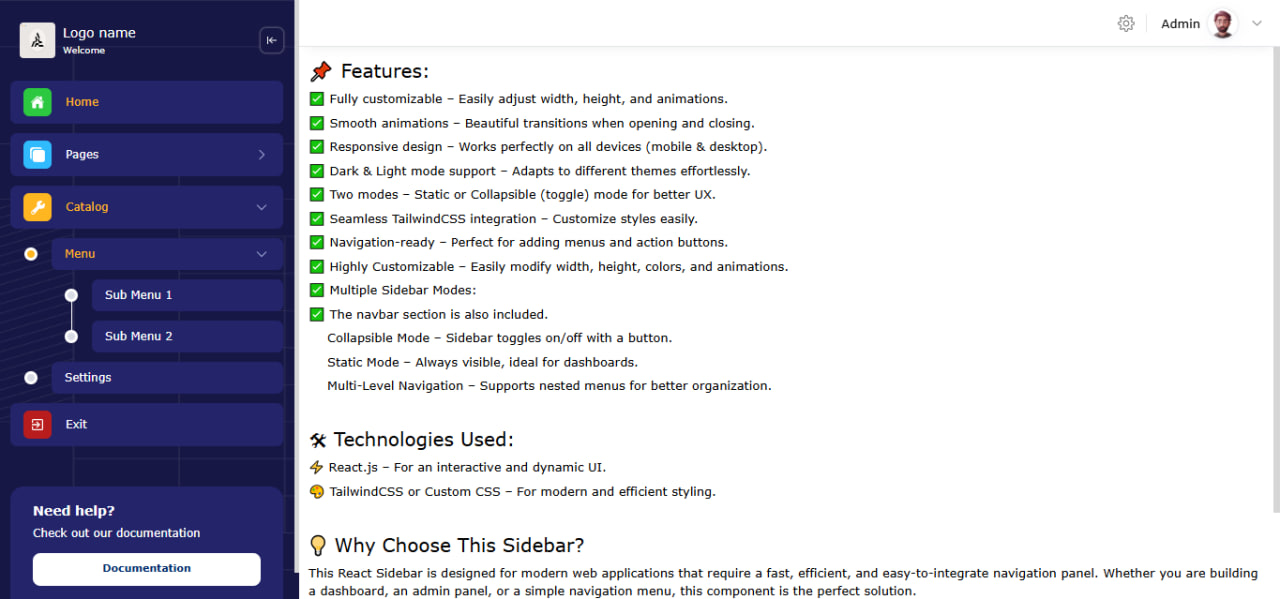
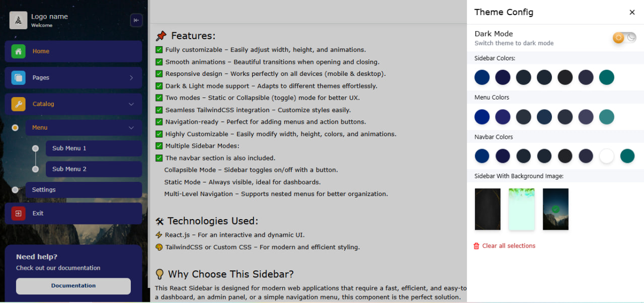
A fully customizable and responsive sidebar component for React applications, built with TailwindCSS and Headless UI. Easily integrate dynamic navigation menus, dark mode, and various styling options. Designed for dashboards, admin panels, and modern web applications, this component provides a smooth user experience with minimal setup. Supports multiple layouts, collapsible sections, and seamless animations. Works out-of-the-box with TailwindCSS configurations and allows deep customization to match your project’s branding. Enhance your React app’s navigation experience with a professional sidebar solution.
| Image 1 | Image 2 | Image 3 | Image 4 |
|---|---|---|---|
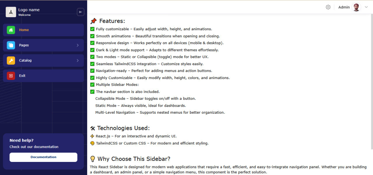 |  |  |  |
✅ Fully responsive sidebar navigation,
✅ Fully customizable – Easily adjust width, height, and animations.
✅ Smooth animations – Beautiful transitions when opening and closing.
✅ Responsive design – Works perfectly on all devices (mobile & desktop).
✅ Dark & Light mode support – Adapts to different themes effortlessly.
✅ Two modes – Static or Collapsible (toggle) mode for better UX.
✅ Seamless TailwindCSS integration – Customize styles easily.
✅ Navigation-ready – Perfect for adding menus and action buttons.
✅ Highly Customizable – Easily modify width, height, colors, and animations.
✅ The navbar section is also included.
✅ Collapsible Mode – Sidebar toggles on/off with a button.
✅ Static Mode – Always visible, ideal for dashboards.
✅ Customizable styles via props
✅ Supports sections, nested menus, and icons
✅ Easy integration with Tailwind CSS
✅ Routes are also built in, you don't have to do it yourself.
🛠 Technologies Used:
⚡ React.js – For an interactive and dynamic UI.
🎨 TailwindCSS or Custom CSS – For modern and efficient styling.
1npm install react-infinity-sidebar
or using yarn:
1yarn add react-infinity-sidebar
1import { StrictMode, Suspense } from 'react';
2import { createRoot } from 'react-dom/client';
3import { BrowserRouter } from 'react-router-dom'; // Installation is mandatory.
4import { SidebarProvider, Loader } from 'react-infinity-sidebar';
5import App from './App.jsx';
6
7createRoot(document.getElementById('root')).render(
8  <StrictMode>
9    <BrowserRouter>
10      <Suspense fallback={<Loader />}>
11        <SidebarProvider>
12          <App />
13        </SidebarProvider>
14      </Suspense>
15    </BrowserRouter>
16  </StrictMode>,
17)
18
1import { lazy } from "react";
2import Sidebar, { NotFound } from "react-infinity-sidebar";
3
4import Home from "../pages/home/Home";
5const About = lazy(() => import("../pages/about/About"));
6const Services = lazy(() => import("../pages/services/Services"));
7const Settings = lazy(() => import("../pages/settings/Settings"));
8const Menu1 = lazy(() => import("../pages/menu/Menu1"));
9const Menu2 = lazy(() => import("../pages/menu/Menu2"));
10
11const routes = [
12    { path: '/', name: 'Home', component: Home },
13    { path: '/about', name: 'About', component: About },
14    { path: '/services', name: 'Services', component: Services },
15    { path: '/settings', name: 'Settings', component: Settings },
16    { path: '/catalog/menu/submenu1', name: 'Menu1', component: Menu1 },
17    { path: '/catalog/menu/submenu2', name: 'Menu2', component: Menu2 },
18    { path: '*', name: 'PageNotFound', component: NotFound },
19];
20
21export default routes;
1
2export const sidebar_sections = [
3    { id: 1, name: 'Home', icons: { bgColor: "#2BC840", icon: "https://i.postimg.cc/90NNkmFt/default.png" }, href: "/", dropdown: false, },
4    {
5        id: 2, name: 'Pages', icons: { bgColor: "#30bbff", icon: "https://i.postimg.cc/FK7bPykq/copy.png" }, dropdown: true, menu: [
6            { id: 3, name: 'About', href: '/about' },
7            { id: 4, name: 'Services', href: '/services' },
8        ]
9    },
10    {
11        id: 5, name: 'Catalog', icons: { bgColor: "#FFB620", icon: "https://i.postimg.cc/zXKc7rYW/Vector.png" }, dropdown: true, menu: [
12            {
13                id: 6, name: 'Menu', dropdown: true, menu: [
14                    { id: 7, name: 'Sub Menu 1', href: '/catalog/menu/submenu1' },
15                    { id: 8, name: 'Sub Menu 2', href: '/catalog/menu/submenu2' },
16                ]
17            },
18            { id: 9, name: 'Settings', href: '/settings' },
19        ],
20    },
21]
22
23export const profile_menu = [
24    { id: 1, name: 'Profile', icon: "https://i.postimg.cc/kXhh7vPJ/people.png", href: '/profile' },
25    { id: 2, name: 'Account Settings', icon: "https://i.postimg.cc/8cNxrpZT/settings.png", href: '/settings' },
26    { id: 3, name: 'Exit', icon: "https://i.postimg.cc/vBLNMRbk/logout-1.png", href: '/login' },
27]
1import { Suspense } from 'react';
2import { BrowserRouter } from 'react-router-dom';
3import Sidebar, { Loader } from "react-infinity-sidebar";
4import routes from 'the path of this component';
5import { sidebar_sections } from 'the path of this component';
6import { profile_menu } from 'the path of this component';
7
8import "react-infinity-sidebar/dist/sidebar.css"; // import CSS file (important)
9
10let sidebarOptions = {
11  bgColor: "#171745",
12  bgImage: "",
13  logoInfo: {
14    visibleLogo: true,
15    image: "",
16    width: "38px",
17    height: "38px",
18    borderRadius: "4px",
19    textColor: "#fff",
20    chevronLeftColor: "#fff",
21    logoName: {
22      visible: true,
23      name: "Logo name",
24      fontSize: "14px",
25      info: "Welcome",
26    },
27  },
28  sectionItem: {
29    fontSize: "12px",
30    bgColor: "#24246b",
31    darkMode: "#292727",
32    textColor: "#fff",
33    activeColor: "#FFB620",
34    paddingY: "8px",
35    paddingX: "14px",
36    borderRadius: "7px",
37    exit: {
38      visible: true,
39      name: "Exit",
40      onExitHandler: onExitHandler
41    },
42  },
43  info: {
44    visible: true,
45    bgColor: "#24246b",
46    content: {
47      top: "Need help?",
48      bottom: "Check out our documentation",
49      btn: {
50        bgColor: "white",
51        textColor: "#012C6E",
52        fontSize: "11px",
53        name: "Documentation",
54        viewInfoHandler: viewInfoHandler
55      }
56    }
57  }
58}
59
60let navbarOptions = {
61  visible: true,
62  bgColor: "#fff",
63  textColor: "#000",
64  height: "50px",
65  profileDropdownData: profile_menu,
66  profileDropdownHandler: profileDropdownHandler
67}
68
69const App = () => {
70
71  // view info handler
72  const viewInfoHandler = () => alert("The full documentation is provided at this link.");
73
74  // exit handler
75  const onExitHandler = () => alert("Do you really want to leave?");
76
77  // profile dropdown event
78  const profileDropdownHandler = (event, value) => {
79    event.preventDefault(); // Oldini oladi
80    console.log(value);
81
82    if (value?.href === "/login") {
83      // The logout code is written here.
84    }
85  }
86
87  return (
88    <div className='max-w-[2200px] m-auto'>
89      <Sidebar
90        user={{
91          name: "Admin", // user name
92          image: "", // default
93        }}
94        routes={routes} // routes navigation
95        sections={sidebar_sections} // sidebar section
96        darkMode="#121212" // working with localstorage, name is darkMode (boolean type)
97        sidebarOptions={sidebarOptions}
98        navbarOptions={navbarOptions}
99      />
100    </div>
101  );
102};
103
104export default App;
| Prop | Type | Description | Default |
|---|---|---|---|
user | Object | User details | {name: "Admin"} |
routes | Array | Navigation routes | |
sections | Array | Sidebar sections | |
darkMode | String | Dark mode background color | #121212 |
sidebarOptions | Object | Sidebar styling options | |
navbarOptions | Object | Navbar settings |
react-infinity-sidebar?🚀 Easy to set up
🎨 Highly customizable
📱 Works on all devices
🛠 Minimal setup required
react, sidebar, react-infinity-sidebar, navigation, ui-component, menu, responsive, dashboard, tailwindcss, react-sidebar, sidebar-component, sidebar-pro, sidebar-modern, sidebar-pro-component, sidebar-navigation, collapsible-sidebar, dropwdown-menu, sidebar-menu, sidebar-multi-menu, dynamic-sidebar, animated-sidebar, react-sidebar-component, sidebar-layout, admin-sidebar, custom-sidebar, dark-mode-sidebar, tailwind-sidebar, multi-level-sidebar, mobile-friendly-sidebar, sidebar-ui, sidebar-panel, modern-sidebar, sidebar-toggle, sidebar-with-navbar, react-navigation-sidebar", "LuxeSidebar", "react-pro-sidebar", "ProSidebarX", "PrimeSidebar", "InfinitySidebar", "UltraSidebar", "FlexiSidebar", "SideMaster", "EasySidebar", "ReactSidePro", "SmoothSidebar", "MegaSidebar"
To contribute or make changes, clone the repository and install dependencies:
1git clone https://github.com/hikmatjan1/sidebar-free.git
2cd sidebar-free
3npm install
Run the development server:
1npm run dev
sidebar, menu, and navbar.dark mode.Routes, Route.Your feedback is important to us! If you find a bug or have something new to add, please let us know:
React Select Custom Component is open-source and available under the MIT License.
Developed by Khikmat Turaev. For inquiries, contact thravshanovich@gmail.com.

No vulnerabilities found.
No security vulnerabilities found.