Gathering detailed insights and metrics for react-js-cron
Gathering detailed insights and metrics for react-js-cron
Gathering detailed insights and metrics for react-js-cron
Gathering detailed insights and metrics for react-js-cron
react-js-cron-mantine
Fork of [react-js-cron](https://github.com/xrutayisire/react-js-cron), made to work with [mantine](https://mantine.dev)
@chinggis-systems/react-cron
A React cron editor with antd inspired by jqCron
@impelsys/react-js-cron-mui
A React cron editor with Material UI a forked repo from Xavier Rutayisire (https://github.com/xrutayisire/react-js-cron)
react-gnu-cron
A React cron editor using Material UI, inspired by react-cron
npm install react-js-cronTypescript
Module System
Node Version
NPM Version
TypeScript (95.84%)
CSS (2.76%)
JavaScript (1.3%)
HTML (0.1%)
Total Downloads
0
Last Day
0
Last Week
0
Last Month
0
Last Year
0
MIT License
261 Stars
174 Commits
123 Forks
1 Watchers
4 Branches
7 Contributors
Updated on Jul 11, 2025
Latest Version
5.2.0
Package Id
react-js-cron@5.2.0
Unpacked Size
103.79 kB
Size
20.61 kB
File Count
35
NPM Version
10.9.2
Node Version
22.14.0
Published on
Apr 18, 2025
Cumulative downloads
Total Downloads
Last Day
0%
NaN
Compared to previous day
Last Week
0%
NaN
Compared to previous week
Last Month
0%
NaN
Compared to previous month
Last Year
0%
NaN
Compared to previous year
44
A React cron editor built with antd

Live demo and usage at https://xrutayisire.github.io/react-js-cron/
react-js-cron is written in TypeScript with complete definitions
Be sure that you have these dependencies on your project:
1# NPM
2npm install react-js-cron
3
4# Yarn
5yarn add react-js-cron
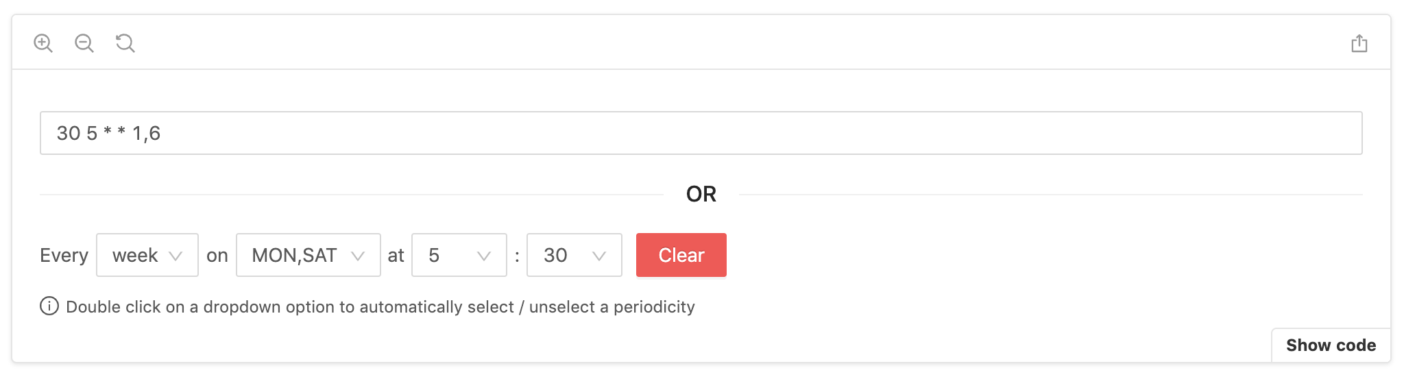
1import { Cron } from 'react-js-cron'
2import 'react-js-cron/dist/styles.css'
3
4export function App() {
5  const [value, setValue] = useState('30 5 * * 1,6')
6
7  return <Cron value={value} setValue={setValue} />
8}
Don't forget to import styles manually:
1import 'react-js-cron/dist/styles.css'
If you want to use the converter that react-js-cron uses internally, you can import it into your project:
1import { converter } from 'react-js-cron'
2
3const cronString = converter.getCronStringFromValues(
4  'day', // period: 'year' | 'month' | 'week' | 'day' | 'hour' | 'minute' | 'reboot'
5  [], // months: number[] | undefined
6  [], // monthDays: number[] | undefined
7  [], // weekDays: number[] | undefined
8  [2], // hours: number[] | undefined
9  [1], // minutes: number[] | undefined
10  false // humanizeValue?: boolean
11)
12
13console.log('cron string:', converted)
cron string: '1 2 * * *'
The converter can also be helpful for parsing a string. Note that Sunday is represented as 0 in the output array but can be either 0 or 7 in the cron expression.
1import { converter } from 'react-js-cron'
2
3const [minutes, hours, daysOfMonth, months, daysOfWeek] =
4  converter.parseCronString('0 2,14 * * 1-5')
5
6console.log('parsed cron:', {
7  minutes,
8  hours,
9  daysOfMonth,
10  months,
11  daysOfWeek,
12})
parsed cron: {
  minutes: [0],
  hours: [2, 14],
  daysOfMonth: [],
  months: [],
  daysOfWeek: [1, 2, 3, 4, 5]
}
Learn more with dynamic settings.
CronProps {
  /**
   * Cron value, the component is by design a controlled component.
   * The first value will be the default value.
   *
   * required
   */
  value: string

  /**
   * Set the cron value, similar to onChange.
   * The naming tells you that you have to set the value by yourself.
   *
   * required
   */
  setValue:
    | (value: string, extra: { selectedPeriod }) => void
    | Dispatch<SetStateAction<string>>

  /**
   * Set the container className and used as a prefix for other selectors.
   * Available selectors: https://xrutayisire.github.io/react-js-cron/?path=/story/reactjs-cron--custom-style
   */
  className?: string

  /**
   * Humanize the labels in the cron component, SUN-SAT and JAN-DEC.
   *
   * Default: true
   */
  humanizeLabels?: boolean

  /**
   * Humanize the value, SUN-SAT and JAN-DEC.
   *
   * Default: false
   */
  humanizeValue?: boolean

  /**
   * Add a "0" before numbers lower than 10.
   *
   * Default: false
   */
  leadingZero?: boolean | ['month-days', 'hours', 'minutes']

  /**
   * Define the default period when the default value is empty.
   *
   * Default: 'day'
   */
  defaultPeriod?: 'year' | 'month' | 'week' | 'day' | 'hour' | 'minute' | 'reboot'

  /**
   * Disable the cron component.
   *
   * Default: false
   */
  disabled?: boolean

  /**
   * Make the cron component read-only.
   *
   * Default: false
   */
  readOnly?: boolean

  /**
   * Show clear button for each dropdown.
   *
   * Default: true
   */
  allowClear?: boolean

  /**
   * Define if empty should trigger an error.
   *
   * Default: 'for-default-value'
   */
  allowEmpty?: 'always' | 'never' | 'for-default-value'

  /**
   * Support cron shortcuts.
   *
   * Default: ['@yearly', '@annually', '@monthly', '@weekly', '@daily', '@midnight', '@hourly']
   */
  shortcuts?: boolean | ['@yearly', '@annually', '@monthly', '@weekly', '@daily', '@midnight', '@hourly', '@reboot']

  /**
   * Define the clock format.
   *
   * Default: undefined
   */
  clockFormat?: '12-hour-clock' | '24-hour-clock'

  /**
   * Display the clear button.
   *
   * Default: true
   */
  clearButton?: boolean

  /**
   * antd button props to customize the clear button.
   */
  clearButtonProps?: ButtonProps

  /**
   * Define the clear button action.
   *
   * Default: 'fill-with-every'
   */
  clearButtonAction?: 'empty' | 'fill-with-every'

  /**
   * Display error style (red border and background).
   *
   * Display: true
   */
  displayError?: boolean

  /**
   * Triggered when the cron component detects an error with the value.
   */
  onError?:
    | (error: {
      type: 'invalid_cron'
      description: string
    }) => void
    | Dispatch<SetStateAction<{
      type: 'invalid_cron'
      description: string
    }>>
    | undefined

  /**
   * Define if a double click on a dropdown option should automatically
   * select / unselect a periodicity.
   *
   * Default: true
   */
  periodicityOnDoubleClick?: boolean

  /**
   * Define if it's possible to select only one or multiple values for each dropdown.
   *
   * Even in single mode, if you want to disable the double click on a dropdown option that
   * automatically select / unselect a periodicity, set 'periodicityOnDoubleClick'
   * prop at false.
   *
   * When single mode is active and 'periodicityOnDoubleClick' is false,
   * each dropdown will automatically close after selecting a value
   *
   * Default: 'multiple'
   */
  mode?: 'multiple' | 'single'

  /**
   * Define which dropdowns need to be displayed.
   *
   * Default: ['period', 'months', 'month-days', 'week-days', 'hours', 'minutes']
   */
  allowedDropdowns?: [
    'period',
    'months',
    'month-days',
    'week-days',
    'hours',
    'minutes'
  ]

  /**
   * Define the list of periods available.
   *
   * Default: ['year', 'month', 'week', 'day', 'hour', 'minute', 'reboot']
   */
  allowedPeriods?: ['year', 'month', 'week', 'day', 'hour', 'minute', 'reboot']

  /**
   * Define a configuration that is used for each dropdown specifically.
   * Configuring a dropdown will override any global configuration for the same property.
   *
   * Configurations available:
   *
   * // See global configuration
   * // For 'months' and 'week-days'
   * humanizeLabels?: boolean
   *
   * // See global configuration
   * // For 'months' and 'week-days'
   * humanizeValue?: boolean
   *
   * // See global configuration
   * // For 'month-days', 'hours' and 'minutes'
   * leadingZero?: boolean
   *
   * // See global configuration
   * For 'period', 'months', 'month-days', 'week-days', 'hours' and 'minutes'
   * disabled?: boolean
   *
   * // See global configuration
   * For 'period', 'months', 'month-days', 'week-days', 'hours' and 'minutes'
   * readOnly?: boolean
   *
   * // See global configuration
   * // For 'period', 'months', 'month-days', 'week-days', 'hours' and 'minutes'
   * allowClear?: boolean
   *
   * // See global configuration
   * // For 'months', 'month-days', 'week-days', 'hours' and 'minutes'
   * periodicityOnDoubleClick?: boolean
   *
   * // See global configuration
   * // For 'months', 'month-days', 'week-days', 'hours' and 'minutes'
   * mode?: Mode
   *
   * // The function will receive one argument, an object with value and label.
   * // If the function returns true, the option will be included in the filtered set.
   * // Otherwise, it will be excluded.
   * // For 'months', 'month-days', 'week-days', 'hours' and 'minutes'
   * filterOption?: FilterOption
   *
   * Default: undefined
   */
  dropdownsConfig?: {
    'period'?: {
      disabled?: boolean
      readOnly?: boolean
      allowClear?: boolean
    }
    'months'?: {
      humanizeLabels?: boolean
      humanizeValue?: boolean
      disabled?: boolean
      readOnly?: boolean
      allowClear?: boolean
      periodicityOnDoubleClick?: boolean
      mode?: 'multiple' | 'single'
      filterOption?: ({
          value,
          label,
        }: {
          value: string
          label: string
        }) => boolean
    }
    'month-days'?: {
      leadingZero?: boolean
      disabled?: boolean
      readOnly?: boolean
      allowClear?: boolean
      periodicityOnDoubleClick?: boolean
      mode?: 'multiple' | 'single'
      filterOption?: ({
          value,
          label,
        }: {
          value: string
          label: string
        }) => boolean
    }
    'week-days'?: {
      humanizeLabels?: boolean
      humanizeValue?: boolean
      disabled?: boolean
      readOnly?: boolean
      allowClear?: boolean
      periodicityOnDoubleClick?: boolean
      mode?: 'multiple' | 'single'
      filterOption?: ({
          value,
          label,
        }: {
          value: string
          label: string
        }) => boolean
    }
    'hours'?: {
      leadingZero?: boolean
      disabled?: boolean
      readOnly?: boolean
      allowClear?: boolean
      periodicityOnDoubleClick?: boolean
      mode?: 'multiple' | 'single'
      filterOption?: ({
          value,
          label,
        }: {
          value: string
          label: string
        }) => boolean
    }
    'minutes'?: {
      leadingZero?: boolean
      disabled?: boolean
      readOnly?: boolean
      allowClear?: boolean
      periodicityOnDoubleClick?: boolean
      mode?: 'multiple' | 'single'
      filterOption?: ({
          value,
          label,
        }: {
          value: string
          label: string
        }) => boolean
    }
  }

  /**
   * Change the component language.
   * Can also be used to remove prefix and suffix.
   *
   * When setting 'humanizeLabels' you can change the language of the
   * alternative labels with 'altWeekDays' and 'altMonths'.
   *
   * The order of the 'locale' properties 'weekDays', 'months', 'altMonths'
   * and 'altWeekDays' is important! The index will be used as value.
   *
   * Default './src/locale.ts'
   */
  locale?: {
    everyText?: string
    emptyMonths?: string
    emptyMonthDays?: string
    emptyMonthDaysShort?: string
    emptyWeekDays?: string
    emptyWeekDaysShort?: string
    emptyHours?: string
    emptyMinutes?: string
    emptyMinutesForHourPeriod?: string
    yearOption?: string
    monthOption?: string
    weekOption?: string
    dayOption?: string
    hourOption?: string
    minuteOption?: string
    rebootOption?: string
    prefixPeriod?: string
    prefixMonths?: string
    prefixMonthDays?: string
    prefixWeekDays?: string
    prefixWeekDaysForMonthAndYearPeriod?: string
    prefixHours?: string
    prefixMinutes?: string
    prefixMinutesForHourPeriod?: string
    suffixMinutesForHourPeriod?: string
    errorInvalidCron?: string
    weekDays?: string[]
    months?: string[]
    altWeekDays?: string[]
    altMonths?: string[]
  }

  /**
   * Define the container for the dropdowns.
   * By default, the dropdowns will be rendered in the body.
   * This is useful when you want to render the dropdowns in a specific
   * container, for example, when using a modal or a specific layout.
   */
  getPopupContainer?: () => HTMLElement
}
MIT © xrutayisire

No vulnerabilities found.
Reason
no dangerous workflow patterns detected
Reason
9 commit(s) and 5 issue activity found in the last 90 days -- score normalized to 10
Reason
no binaries found in the repo
Reason
license file detected
Details
Reason
Found 5/26 approved changesets -- score normalized to 1
Reason
detected GitHub workflow tokens with excessive permissions
Details
Reason
no effort to earn an OpenSSF best practices badge detected
Reason
security policy file not detected
Details
Reason
branch protection not enabled on development/release branches
Details
Reason
project is not fuzzed
Details
Reason
dependency not pinned by hash detected -- score normalized to 0
Details
Reason
SAST tool is not run on all commits -- score normalized to 0
Details
Reason
54 existing vulnerabilities detected
Details
Score
Last Scanned on 2025-07-07
The Open Source Security Foundation is a cross-industry collaboration to improve the security of open source software (OSS). The Scorecard provides security health metrics for open source projects.
Learn More