Gathering detailed insights and metrics for react-native-app-intro-x
Gathering detailed insights and metrics for react-native-app-intro-x
Gathering detailed insights and metrics for react-native-app-intro-x
Gathering detailed insights and metrics for react-native-app-intro-x
npm install react-native-app-intro-xTypescript
Module System
Node Version
NPM Version
JavaScript (84.05%)
Objective-C (10.63%)
Python (3.19%)
Java (2.13%)
Total Downloads
0
Last Day
0
Last Week
0
Last Month
0
Last Year
0
MIT License
1 Stars
107 Commits
2 Watchers
2 Branches
1 Contributors
Updated on Nov 07, 2018
Latest Version
3.1.1
Package Id
react-native-app-intro-x@3.1.1
Unpacked Size
10.27 MB
Size
10.15 MB
File Count
66
NPM Version
6.4.1
Node Version
8.11.2
Cumulative downloads
Total Downloads
Last Day
0%
NaN
Compared to previous day
Last Week
0%
NaN
Compared to previous week
Last Month
0%
NaN
Compared to previous month
Last Year
0%
NaN
Compared to previous year
3
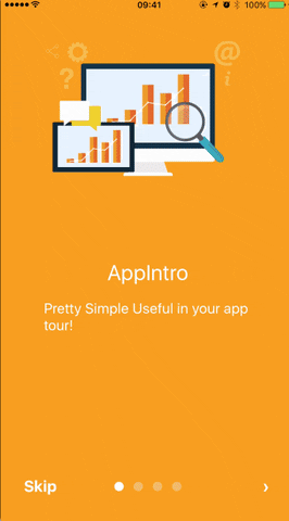
react-native-app-intro is a react native component implementing a parallax effect welcome page using base on react-native-swiper , similar to the one found in Google's app like Sheet, Drive, Docs...

1$ npm i react-native-app-intro --save
You can use pageArray quick generation your app intro with parallax effect. With the basic usage, the Android status bar will be updated to match your slide background color.
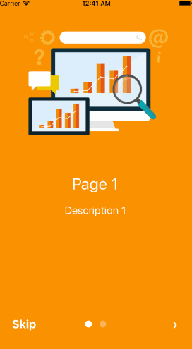

1import React, { Component } from 'react';
2import { AppRegistry, Alert } from 'react-native';
3import AppIntro from 'react-native-app-intro';
4
5class Example extends Component {
6  onSkipBtnHandle = (index) => {
7    Alert.alert('Skip');
8    console.log(index);
9  }
10  doneBtnHandle = () => {
11    Alert.alert('Done');
12  }
13  nextBtnHandle = (index) => {
14    Alert.alert('Next');
15    console.log(index);
16  }
17  onSlideChangeHandle = (index, total) => {
18    console.log(index, total);
19  }
20  render() {
21    const pageArray = [{
22      title: 'Page 1',
23      description: 'Description 1',
24      img: 'https://goo.gl/Bnc3XP',
25      imgStyle: {
26        height: 80 * 2.5,
27        width: 109 * 2.5,
28      },
29      backgroundColor: '#fa931d',
30      fontColor: '#fff',
31      level: 10,
32    }, {
33      title: 'Page 2',
34      description: 'Description 2',
35      img: require('../assets/some_image.png'),
36      imgStyle: {
37        height: 93 * 2.5,
38        width: 103 * 2.5,
39      },
40      backgroundColor: '#a4b602',
41      fontColor: '#fff',
42      level: 10,
43    }];
44    return (
45      <AppIntro
46        onNextBtnClick={this.nextBtnHandle}
47        onDoneBtnClick={this.doneBtnHandle}
48        onSkipBtnClick={this.onSkipBtnHandle}
49        onSlideChange={this.onSlideChangeHandle}
50        pageArray={pageArray}
51      />
52    );
53  }
54}
55
56AppRegistry.registerComponent('Example', () => Example);
If you need customized page like my Example, you can pass in View component into AppIntro component and set level. Remember any need use parallax effect component, Need to be <View level={10}></View> inside.
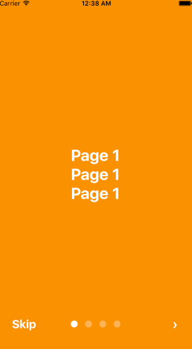
1import React, { Component } from 'react';
2import {
3  AppRegistry,
4  StyleSheet,
5  Text,
6  View,
7} from 'react-native';
8import AppIntro from 'react-native-app-intro';
9
10const styles = StyleSheet.create({
11  slide: {
12    flex: 1,
13    justifyContent: 'center',
14    alignItems: 'center',
15    backgroundColor: '#9DD6EB',
16    padding: 15,
17  },
18  text: {
19    color: '#fff',
20    fontSize: 30,
21    fontWeight: 'bold',
22  },
23});
24
25class Example extends Component {
26
27  render() {
28    return (
29      <AppIntro>
30        <View style={[styles.slide,{ backgroundColor: '#fa931d' }]}>
31          <View level={10}><Text style={styles.text}>Page 1</Text></View>
32          <View level={15}><Text style={styles.text}>Page 1</Text></View>
33          <View level={8}><Text style={styles.text}>Page 1</Text></View>
34        </View>
35        <View style={[styles.slide, { backgroundColor: '#a4b602' }]}>
36          <View level={-10}><Text style={styles.text}>Page 2</Text></View>
37          <View level={5}><Text style={styles.text}>Page 2</Text></View>
38          <View level={20}><Text style={styles.text}>Page 2</Text></View>
39        </View>
40        <View style={[styles.slide,{ backgroundColor: '#fa931d' }]}>
41          <View level={8}><Text style={styles.text}>Page 3</Text></View>
42          <View level={0}><Text style={styles.text}>Page 3</Text></View>
43          <View level={-10}><Text style={styles.text}>Page 3</Text></View>
44        </View>
45        <View style={[styles.slide, { backgroundColor: '#a4b602' }]}>
46          <View level={5}><Text style={styles.text}>Page 4</Text></View>
47          <View level={10}><Text style={styles.text}>Page 4</Text></View>
48          <View level={15}><Text style={styles.text}>Page 4</Text></View>
49        </View>
50      </AppIntro>
51    );
52  }
53}
54AppRegistry.registerComponent('Example', () => Example);
And in Android, image inside view component, view need width、height.
1<View style={{
2  position: 'absolute',
3  top: 80,
4  left: 30,
5  width: windows.width,
6  height: windows.height,
7}} level={20}
8>
9  <Image style={{ width: 115, height: 70 }} source={require('./img/1/c2.png')} />
10</View>
| Prop | PropType | Default Value | Description |
|---|---|---|---|
| dotColor | string | 'rgba(255,255,255,0.3)' | Bottom of the page dot color |
| activeDotColor | string | '#fff' | Active page index dot color |
| rightTextColor | string | '#fff' | The bottom right Text Done、> color |
| leftTextColor | string | '#fff' | The bottom left Text Skip color |
| onSlideChange | (index, total) => {} | function to call when the pages change | |
| onSkipBtnClick | (index) => {} | function to call when the Skip button click | |
| onDoneBtnClick | func | function to call when the Done button click | |
| onNextBtnClick | (index) => {} | function to call when the Next '>' button click | |
| doneBtnLabel | string、Text element | Done | The bottom right custom Text label |
| skipBtnLabel | string、Text element | Skip | The bottom left custom Text label |
| nextBtnLabel | string、Text element | › | The bottom left custom Text label |
| pageArray | array | In the basic usage, you can input object array to render basic view example: [[{title: 'Page 1', description: 'Description 1', img: 'https://goo.gl/uwzs0C', imgStyle: {height: 80 * 2.5, width: 109 * 2.5 }, backgroundColor: '#fa931d', fontColor: '#fff', level: 10 }] , level is parallax effect level ,if you use pageArray you can't use custom view | |
| defaultIndex | number | 0 | number of the index of the initial index |
| showSkipButton | bool | true | a boolean defining if we should render the skip button |
| showDoneButton | bool | true | a boolean that defines if we should render the done button |
| showDots | bool | true | a boolean that defines if we should render the bottom dots |
| Prop | PropType | Default Value | Description |
|---|---|---|---|
| level | number | parallax effect level |

No vulnerabilities found.
Reason
license file detected
Details
Reason
binaries present in source code
Details
Reason
7 existing vulnerabilities detected
Details
Reason
Found 0/30 approved changesets -- score normalized to 0
Reason
no SAST tool detected
Details
Reason
0 commit(s) and 0 issue activity found in the last 90 days -- score normalized to 0
Reason
no effort to earn an OpenSSF best practices badge detected
Reason
security policy file not detected
Details
Reason
project is not fuzzed
Details
Reason
branch protection not enabled on development/release branches
Details
Score
Last Scanned on 2025-07-14
The Open Source Security Foundation is a cross-industry collaboration to improve the security of open source software (OSS). The Scorecard provides security health metrics for open source projects.
Learn More