Gathering detailed insights and metrics for react-native-beauty-tabs
Gathering detailed insights and metrics for react-native-beauty-tabs
Gathering detailed insights and metrics for react-native-beauty-tabs
Gathering detailed insights and metrics for react-native-beauty-tabs
npm install react-native-beauty-tabsTypescript
Module System
Node Version
NPM Version
Total Downloads
0
Last Day
0
Last Week
0
Last Month
0
Last Year
0
Latest Version
0.0.1
Package Id
react-native-beauty-tabs@0.0.1
Unpacked Size
12.67 kB
Size
3.87 kB
File Count
6
NPM Version
10.9.2
Node Version
22.4.0
Published on
Apr 16, 2025
Cumulative downloads
Total Downloads
Last Day
0%
NaN
Compared to previous day
Last Week
0%
NaN
Compared to previous week
Last Month
0%
NaN
Compared to previous month
Last Year
0%
NaN
Compared to previous year
4
3
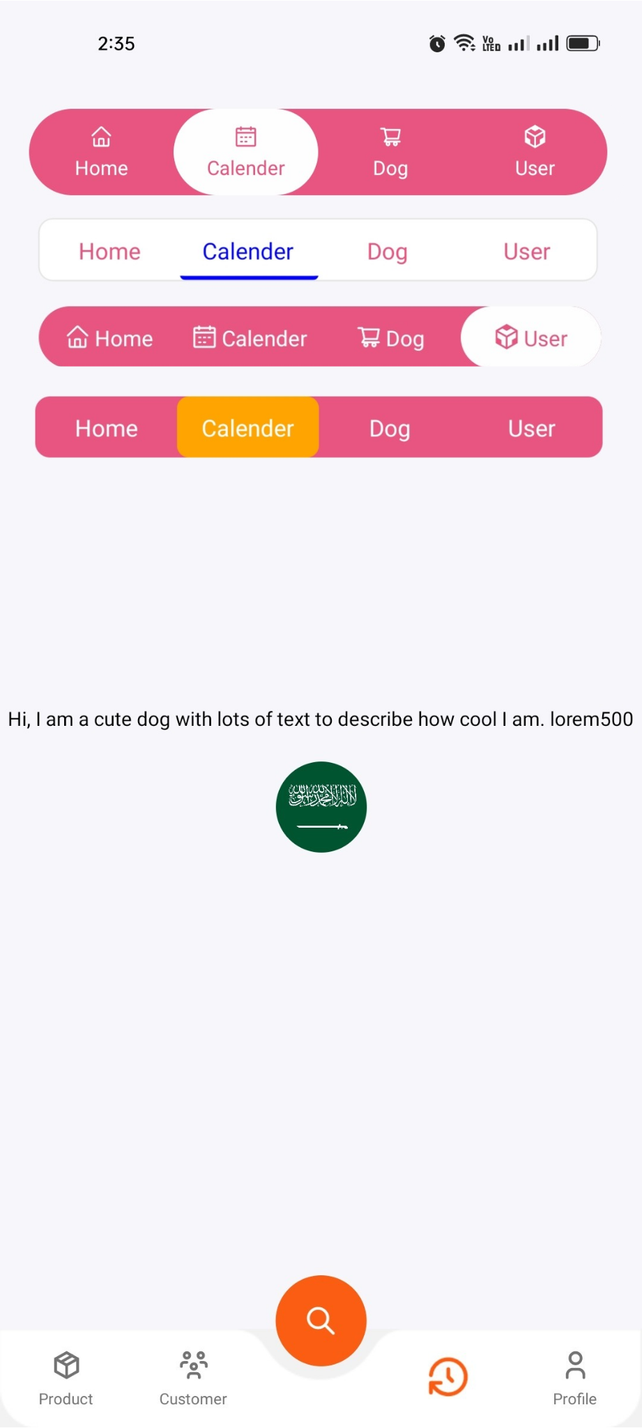
A lightweight and customizable tab navigation component for React Native, built with full Expo support. Perfect for creating beautiful tabbed interfaces, modals, action sheets, and more — with smooth animations and flexible styling.
⚡ Built for Expo & React Native
🎯 Smooth animations
💅 Fully customizable tabs and styling
🧩 Icon support for each tab
📐 Dynamic width ratio support
🔄 More exciting features are on the way!
🛠️ Planned updates include new enhancements and improved performance.
. If you encounter an error, stop the Terminal and run the project again.
1npm install react-native-beauty-tabs
2# or
3yarn add react-native-beauty-tabs
1import React from "react";
2import { View, Text } from "react-native";
3import { AntDesign } from "@expo/vector-icons";
4import { NativeTabs } from "react-native-beauty-tabs";
5
6const Example = () => {
7  return (
8    <View style={{ backgroundColor: "" }}>
9      <NativeTabs
10        ContainerStyle={{
11          backgroundColor: "#f5f5f5",
12          flexDirection: "column",
13          gap: 20,
14          marginTop: 20,
15          alignSelf: "center",
16        }}
17        Tabcontainer={{ alignSelf: "center" }}
18        IndicatorStyle={{
19          backgroundColor: "white",
20          borderRadius: 25,
21        }}
22        TabTextStyle={{ fontWeight: "400" }}
23        ActiveTextColors={"#E75480"}
24        InActiveTextColors="white"
25        TabsRowStyle={{
26          borderRadius: 40,
27          backgroundColor: "#E75480",
28          elevation: 10,
29          shadowColor: "black",
30        }}
31        PageContentStyle={{
32          alignItems: "center",
33          justifyContent: "center",
34          padding: 10,
35        }}
36        TabContentStyle={{ flexDirection: "row", alignItems: "center", gap: 5 }}
37        widthRatio={0.8}
38        Tabs={[
39          {
40            label: "Home",
41            Icons: <AntDesign name="home" size={15} color="black" />,
42            Content: (
43              <View>
44                <Text>Your Content</Text>
45              </View>
46            ),
47          },
48          {
49            label: "Calendar",
50            Icons: <AntDesign name="calendar" size={15} color="black" />,
51            Content: (
52              <View>
53                <Text>Your Content</Text>
54              </View>
55            ),
56          },
57          {
58            label: "Cart",
59            Icons: <AntDesign name="shoppingcart" size={15} color="black" />,
60            Content: (
61              <View>
62                <Text>Your Content</Text>
63              </View>
64            ),
65          },
66          {
67            label: "Profile",
68            Icons: <AntDesign name="user" size={15} color="black" />,
69            Content: (
70              <View>
71                <Text>Your Content</Text>
72              </View>
73            ),
74          },
75        ]}
76      />
77    </View>
78  );
79};
80
81export default Example;
| Prop | Type | Default | Description |
|---|---|---|---|
Tabs | Tab[] | [] | Array of tab objects (label, Icons, Content) |
ContainerStyle | ViewStyle | null | Style for the main container |
Tabcontainer | ViewStyle | null | Style for the tab wrapper container |
TabsRowStyle | ViewStyle | null | Style for the row of tabs |
IndicatorStyle | ViewStyle | null | Style for the active tab indicator |
TabTextStyle | TextStyle | null | Style applied to each tab label text |
ActiveTextColors | string | "#fff" | Text color for the active tab |
InActiveTextColors | string | "#007aff" | Text color for inactive tabs |
TabContentStyle | ViewStyle | null | Style for each tab's icon + label container |
PageContentStyle | ViewStyle | null | Style for the tab content wrapper |
widthRatio | number | 0.9 | Width ratio of the whole tab layout (0–1, relative to screen width) |

No vulnerabilities found.
No security vulnerabilities found.