Gathering detailed insights and metrics for react-native-calendar-picker-patch
Gathering detailed insights and metrics for react-native-calendar-picker-patch
Gathering detailed insights and metrics for react-native-calendar-picker-patch
Gathering detailed insights and metrics for react-native-calendar-picker-patch
npm install react-native-calendar-picker-patchTypescript
Module System
Min. Node Version
Node Version
NPM Version
JavaScript (99.93%)
Shell (0.07%)
Total Downloads
0
Last Day
0
Last Week
0
Last Month
0
Last Year
0
321 Commits
1 Forks
1 Branches
1 Contributors
Updated on Dec 15, 2022
Latest Version
7.1.6
Package Id
react-native-calendar-picker-patch@7.1.6
Unpacked Size
96.09 kB
Size
22.78 kB
File Count
31
NPM Version
8.15.0
Node Version
16.17.0
Published on
Jan 23, 2023
Cumulative downloads
Total Downloads
Last Day
0%
NaN
Compared to previous day
Last Week
0%
NaN
Compared to previous week
Last Month
0%
NaN
Compared to previous month
Last Year
0%
NaN
Compared to previous year
3
3
3


This is a Calendar Picker Component for React Native
The scrollable prop was introduced in 7.0.0 and features a bi-directional infinite scroller. It recycles months using RecyclerListView, shifting them as the ends are reached. If the Chrome debugger is used during development, month shifting may be erratic due to a RN setTimeout bug. To prevent month shifts at the ends of the scroller, set restrictMonthNavigation, minDate, and maxDate range to 5 years or less.
To use the calendar you just need to:
1npm install --save react-native-calendar-picker-patch
CalendarPicker requires Moment JS >=2.0. Date props may be anything parseable by Moment: Javascript Date, Moment date, or ISO8601 datetime string.
npm install --save moment
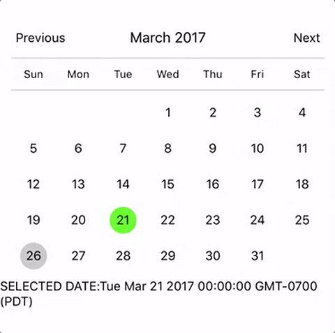
1import React, { Component } from 'react';
2import {
3  StyleSheet,
4  Text,
5  View
6} from 'react-native';
7import CalendarPicker from 'react-native-calendar-picker-patch';
8
9export default class App extends Component {
10  constructor(props) {
11    super(props);
12    this.state = {
13      selectedStartDate: null,
14    };
15    this.onDateChange = this.onDateChange.bind(this);
16  }
17
18  onDateChange(date) {
19    this.setState({
20      selectedStartDate: date,
21    });
22  }
23  render() {
24    const { selectedStartDate } = this.state;
25    const startDate = selectedStartDate ? selectedStartDate.toString() : '';
26    return (
27      <View style={styles.container}>
28        <CalendarPicker
29          onDateChange={this.onDateChange}
30        />
31
32        <View>
33          <Text>SELECTED DATE:{ startDate }</Text>
34        </View>
35      </View>
36    );
37  }
38}
39
40const styles = StyleSheet.create({
41  container: {
42    flex: 1,
43    backgroundColor: '#FFFFFF',
44    marginTop: 100,
45  },
46});
| Prop | Type | Description |
|---|---|---|
weekdays | Array | Optional. List of week days. Eg. ['Mon', 'Tue', ...] Must be 7 days |
months | Array | Optional. List of months names. Eg. ['Jan', 'Feb', ...] Must be 12 months |
firstDay | Number | Optional. Default first day of week will be Sunday. You can set start of week with number from 0 to 6. Default is 0 or Sunday |
startFromMonday | Boolean | Optional. Default first day of week will be Sunday. You can set start of week from Monday by setting this to true. Default is false |
showDayStragglers | Boolean | Optional. Populate previous & next month days in empty slots. Default is false |
allowRangeSelection | Boolean | Optional. Allow to select date ranges. Default is false |
allowBackwardRangeSelect | Boolean | Optional. Allow selecting range in reverse. Default is false |
previousTitle | String | Optional. Title of button for previous month. Default is Previous |
nextTitle | String | Optional. Title of button for next month. Default is Next |
previousTitleStyle | TextStyle | Optional. Text styling for Previous text. |
nextTitleStyle | TextStyle | Optional. Text styling for Next text. |
previousComponent | Object | Optional. Component to use in Previous button. Overrides previousTitle & previousTitleStyle. |
nextComponent | Object | Optional. Component to use in Next button. Overrides nextTitle & nextTitleStyle. |
selectedDayColor | String | Optional. Color for selected day |
selectedDayStyle | ViewStyle | Optional. Style for selected day. May override selectedDayColor. |
selectedDayTextColor | String | Optional. Text color for selected day |
selectedDayTextStyle | Object | Optional. Text style for selected day (including all days in range) |
selectedRangeStartTextStyle | Object | Optional. Text style for start day of range |
selectedRangeEndTextStyle | Object | Optional. Text style for end day of range |
selectedRangeStartStyle | ViewStyle | Optional. Container style for start day of range. |
selectedRangeEndStyle | ViewStyle | Optional. Container style for end day of range. |
selectedRangeStyle | ViewStyle | Optional. Container style for all days in range selection. |
selectedDisabledDatesTextStyle | Object | Optional. Text style for ineligible dates during range selection. |
disabledDates | Array or Function | Optional. Specifies dates that cannot be selected. Array of Dates, or a function that returns true for a given Moment date (apologies for the inverted logic). |
disabledDatesTextStyle | TextStyle | Optional. Text styling for disabled dates. |
selectedStartDate | Date | Optional. Specifies a selected Start Date. |
selectedEndDate | Date | Optional. Specifies a selected End Date. |
minRangeDuration | Number or Array | Optional. Specifies a minimum range duration when using allowRangeSelection. Can either pass a number to be used for all dates or an Array of objects if the minimum range duration depends on the date {date: Moment-parsable date, minDuration: Number} |
maxRangeDuration | Number or Array | Optional. Specifies a maximum range duration when using allowRangeSelection. Can either pass a number to be used for all dates or an Array of objects if the maximum range duration depends on the date {date: Moment-parsable date, maxDuration: Number} |
todayBackgroundColor | String | Optional. Background color for today. Default is #cccccc |
todayTextStyle | TextStyle | Optional. Text styling for today. |
textStyle | TextStyle | Optional. Style overall text. Change fontFamily, color, etc. |
customDatesStyles | Array or Func | Optional. Style individual date(s). Supports an array of objects {date: Moment-parseable date, containerStyle: ViewStyle, style: ViewStyle, textStyle: TextStyle, allowDisabled: Boolean}, or a callback which receives a date param and returns {containerStyle: ViewStyle, style: ViewStyle, textStyle: TextStyle, allowDisabled: Boolean} for that date. |
customDayHeaderStyles | Func | Optional. Style day of week header (Monday - Sunday). Callback that receives ISO {dayOfWeek, month, year} and should return {style: ViewStyle, textStyle: TextStyle} |
scaleFactor | Number | Optional. Default (375) scales to window width |
minDate | Date | Optional. Specifies minimum date to be selected |
maxDate | Date | Optional. Specifies maximum date to be selected |
initialDate | Date | Optional. Date that calendar opens to. Defaults to today. |
width | Number | Optional. Width of CalendarPicker's container. Defaults to Dimensions width. |
height | Number | Optional. Height of CalendarPicker's container. Defaults to Dimensions height. |
scrollable | Boolean | Optional. Months are scrollable if true. Default is false |
horizontal | Boolean | Optional. Scroll axis when scrollable set. Default is true |
enableDateChange | Boolean | Optional. Whether to enable pressing on day. Default is true |
restrictMonthNavigation | Boolean | Optional. Whether to disable Previous month button if it is before minDate or Next month button if it is after MaxDate. Default is false |
onDateChange | Function | Optional. Callback when a date is selected. Returns Moment date as first param; START_DATE or END_DATE as second param. |
onMonthChange | Function | Optional. Callback when Previous / Next month is pressed. Returns Moment date as first parameter. |
dayShape | String | Optional. Shape of the Day component. Default is circle. Available options are circle and square. |
headingLevel | Number | Optional. Sets the aria-level for the calendar title heading when on Web. Default is 1. |
selectMonthTitle | String | Optional. Title of month selector view. Default is "Select Month in " + {year}. |
selectYearTitle | String | Optional. Title of year selector view. Default is "Select Year". |
dayLabelsWrapper | ViewStyle | Optional. Style for weekdays wrapper. E.g If you want to remove top and bottom divider line. |
enableSwipe | Deprecated | Use scrollable. |
swipeConfig | Deprecated | Use scrollable. |
onSwipe | Deprecated | Use onMonthChange. |
dayOfWeekStyles | Deprecated | Use customDatesStyles & customDayHeaderStyles callbacks to style individual dates, days of week, and/or header. |
customDatesStylesPriority | Deprecated | Use customDatesStyles & customDayHeaderStyles callbacks to style individual dates, days of week, and/or header. |
monthYearHeaderWrapperStyle | ViewStyle | Optional. Style for header MonthYear title wrapper. E.g If you want to change the order of year and month. |
headerWrapperStyle | ViewStyle | Optional. Style for entire header controls wrapper. This contains the previous / next controls plus month & year. |
monthTitleStyle | TextStyle | Optional. Text styling for header's month text. |
yearTitleStyle | TextStyle | Optional. Text styling for header's year text. |
Some styles will overwrite some won't. For instance:
Order of precedence:
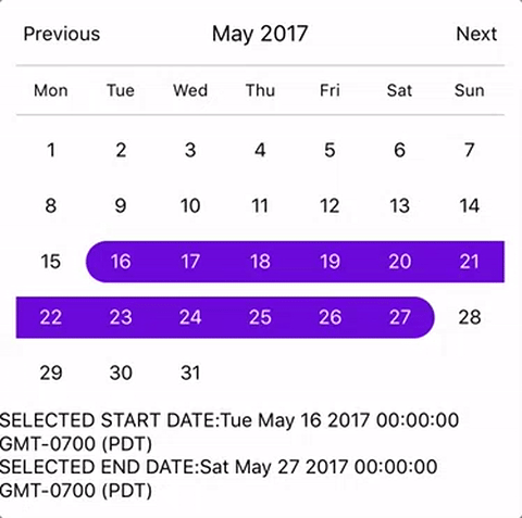
1import React, { Component } from 'react';
2import {
3  StyleSheet,
4  Text,
5  View
6} from 'react-native';
7import CalendarPicker from 'react-native-calendar-picker-patch';
8
9export default class App extends Component {
10  constructor(props) {
11    super(props);
12    this.state = {
13      selectedStartDate: null,
14      selectedEndDate: null,
15    };
16    this.onDateChange = this.onDateChange.bind(this);
17  }
18
19  onDateChange(date, type) {
20    if (type === 'END_DATE') {
21      this.setState({
22        selectedEndDate: date,
23      });
24    } else {
25      this.setState({
26        selectedStartDate: date,
27        selectedEndDate: null,
28      });
29    }
30  }
31
32  render() {
33    const { selectedStartDate, selectedEndDate } = this.state;
34    const minDate = new Date(); // Today
35    const maxDate = new Date(2017, 6, 3);
36    const startDate  =  selectedStartDate ? selectedStartDate.toString() : '';
37    const endDate = selectedEndDate ? selectedEndDate.toString() : '';
38
39    return (
40      <View style={styles.container}>
41        <CalendarPicker
42          startFromMonday={true}
43          allowRangeSelection={true}
44          minDate={minDate}
45          maxDate={maxDate}
46          todayBackgroundColor="#f2e6ff"
47          selectedDayColor="#7300e6"
48          selectedDayTextColor="#FFFFFF"
49          onDateChange={this.onDateChange}
50          yearHeaderWrapperStyle={{justifyContent: 'center'}}
51          onViewTypeChange={(type) => { // Possible value days|months|years
52            // On view change to days or month or year
53          }}
54        />
55
56        <View>
57          <Text>SELECTED START DATE:{ startDate }</Text>
58          <Text>SELECTED END DATE:{ endDate }</Text>
59        </View>
60      </View>
61    );
62  }
63}
64
65const styles = StyleSheet.create({
66  container: {
67    flex: 1,
68    backgroundColor: '#FFFFFF',
69    marginTop: 100,
70  },
71});
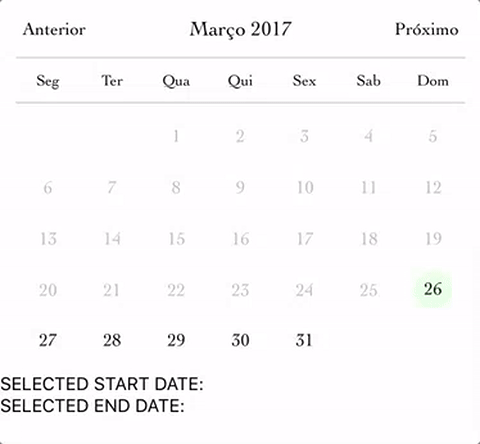
1import React, { Component } from 'react';
2import {
3  StyleSheet,
4  Text,
5  View
6} from 'react-native';
7import CalendarPicker from 'react-native-calendar-picker-patch';
8
9export default class App extends Component {
10  constructor(props) {
11    super(props);
12    this.state = {
13      selectedStartDate: null,
14      selectedEndDate: null,
15    };
16    this.onDateChange = this.onDateChange.bind(this);
17  }
18
19  onDateChange(date, type) {
20    if (type === 'END_DATE') {
21      this.setState({
22        selectedEndDate: date,
23      });
24    } else {
25      this.setState({
26        selectedStartDate: date,
27        selectedEndDate: null,
28      });
29    }
30  }
31
32  render() {
33    const { selectedStartDate, selectedEndDate } = this.state;
34    const minDate = new Date(); // Today
35    const maxDate = new Date(2017, 6, 3);
36    const startDate  =  selectedStartDate ? selectedStartDate.toString() : '';
37    const endDate = selectedEndDate ? selectedEndDate.toString() : '';
38
39    return (
40      <View style={styles.container}>
41        <CalendarPicker
42          startFromMonday={true}
43          allowRangeSelection={true}
44          minDate={minDate}
45          maxDate={maxDate}
46          weekdays={['Seg', 'Ter', 'Qua', 'Qui', 'Sex', 'Sab', 'Dom']}
47          months={['Janeiro', 'Fevereiro', 'Março', 'Abril', 'Maio', 'Junho', 'Julho', 'Agosto', 'Setembro', 'Outubro', 'Novembro', 'Dezembro']}
48          previousTitle="Anterior"
49          nextTitle="Próximo"
50          todayBackgroundColor="#e6ffe6"
51          selectedDayColor="#66ff33"
52          selectedDayTextColor="#000000"
53          scaleFactor={375}
54          textStyle={{
55            fontFamily: 'Cochin',
56            color: '#000000',
57          }}
58          yearHeaderWrapperStyle={{justifyContent: 'center'}}
59          onDateChange={this.onDateChange}
60           onViewTypeChange={(type) => { // Possible value days|months|years
61            // On view change to days or month or year
62          }}
63        />
64
65        <View>
66          <Text>SELECTED START DATE:{ startDate }</Text>
67          <Text>SELECTED END DATE:{ endDate }</Text>
68        </View>
69      </View>
70    );
71  }
72}
73
74const styles = StyleSheet.create({
75  container: {
76    flex: 1,
77    backgroundColor: '#FFFFFF',
78    marginTop: 100,
79  },
80});
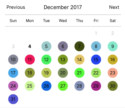
1
2let today = moment();
3let day = today.clone().startOf('month');
4let customDatesStyles = [];
5while(day.add(1, 'day').isSame(today, 'month')) {
6  customDatesStyles.push({
7    date: day.clone(),
8    // Random colors
9    style: {backgroundColor: '#'+('#00000'+(Math.random()*(1<<24)|0).toString(16)).slice(-6)},
10    textStyle: {color: 'black'}, // sets the font color
11    containerStyle: [], // extra styling for day container
12    allowDisabled: true, // allow custom style to apply to disabled dates
13  });
14}
15
16render() {
17  return (
18    <CalendarPicker
19      todayTextStyle={{fontWeight: 'bold'}}
20      todayBackgroundColor={'transparent'}
21      customDatesStyles={customDatesStyles}
22      minDate={today}
23       onViewTypeChange={(type) => { // Possible value days|months|years
24            // On view change to days or month or year
25          }}
26    />
27  );
28}
1
2const customDayHeaderStylesCallback = {dayOfWeek, month, year} => {
3  switch(dayOfWeek) { // can also evaluate month, year
4    case 4: // Thursday
5      return {
6        style: {
7          borderRadius: 12,
8          backgroundColor: 'cyan',
9        },
10        textStyle: {
11          color: 'blue',
12          fontSize: 22,
13          fontWeight: 'bold',
14        }
15      };
16  }
17}
18
19const customDatesStylesCallback = date => {
20  switch(date.isoWeekday()) {
21    case 1: // Monday
22      return {
23        style:{
24          backgroundColor: '#909',
25        },
26        textStyle: {
27          color: '#0f0',
28          fontWeight: 'bold',
29        }
30      };
31    case 7: // Sunday
32      return {
33        textStyle: {
34          color: 'red',
35        }
36      };
37  }
38}
39
40<CalendarPicker
41      customDayHeaderStyles={customDayHeaderStylesCallback}
42      customDatesStyles={customDatesStylesCallback}
43       onViewTypeChange={(type) => { // Possible value days|months|years
44            // On view change to days or month or year
45          }}
46    />
These internal methods may be accessed through a ref to the CalendarPicker.
| Name | Params | Description |
|---|---|---|
handleOnPressDay | {year, month, day} (Integers) | Programmatically select date. year, month and day are numbers. day is the day of the current month. Moment example for today's day of month: moment().date() |
handleOnPressNext | Programmatically advance to next month. | |
handleOnPressPrevious | Programmatically advance to previous month. | |
resetSelections | Clear date selections. Useful for resetting date range selection when user has picked a start date but not an end date. |
Definitions are available at https://www.npmjs.com/package/@types/react-native-calendar-picker-patch courtesy of automatensalat.
npm install --save @types/react-native-calendar-picker-patch
Open Issues. Submit PRs.
I would like to call out some contributors who have been helping with this project
The sample app is an Expo project created with create-react-native-app.
1cd example
2npm run cp
3npm install
4npm start
The source files are copied from the project root directory into example using npm run cp. If a source file is modified, it must be copied over again with npm run cp.

No vulnerabilities found.
No security vulnerabilities found.