Gathering detailed insights and metrics for react-native-calendars-datepicker
Gathering detailed insights and metrics for react-native-calendars-datepicker
Gathering detailed insights and metrics for react-native-calendars-datepicker
Gathering detailed insights and metrics for react-native-calendars-datepicker
react-native-common-date-picker
An awesome and cross-platform React Native date picker and calendar component for iOS and Android
@syong9295/react-native-modern-datepicker
A customizable calendar, time & month picker for React Native (including Persian Jalaali calendar & locale)
@varis.a/react-native-modern-datepicker
A customizable calendar, time & month picker for React Native (including Persian Jalaali calendar & locale)
react-native-modern-datepicker-fr
A customizable calendar, including french and english
This fork to support multiple calendar systems, mainly Arabic Hijri one
npm install react-native-calendars-datepickerTypescript
Module System
Min. Node Version
Node Version
NPM Version
TypeScript (96.62%)
JavaScript (3.38%)
Total Downloads
0
Last Day
0
Last Week
0
Last Month
0
Last Year
0
MIT License
345 Commits
1 Branches
1 Contributors
Updated on Apr 23, 2025
Latest Version
1.1.2
Package Id
react-native-calendars-datepicker@1.1.2
Unpacked Size
811.17 kB
Size
141.36 kB
File Count
280
NPM Version
10.8.2
Node Version
18.20.7
Published on
Apr 20, 2025
Cumulative downloads
Total Downloads
Last Day
0%
NaN
Compared to previous day
Last Week
0%
NaN
Compared to previous week
Last Month
0%
NaN
Compared to previous month
Last Year
0%
NaN
Compared to previous year
7
3
30
react-native-ui-datepicker to support Hijri calendar with the help of @calidy/dayjs-calendarsystems calendar systems package which extends Day.js library to allow the use of different non-gregorian calendar systems with many thanks for their great effort.

DateTimePicker component for React Native that allows you to create a customizable datetime picker. The component uses extensive set of props that allows you to customizing the calendar based on your own UI design. Please visit demo.
To use this fork of the library
1npm install react-native-calendars-datepicker
Or
1yarn add react-native-calendars-datepicker
react-native-calendars-datepicker.calendar prop to change between islamic and gregory which is the default in case no calendar passed.mode prop. The available modes are: single, range, and multiple.onChange prop to handle date changes.1import { useState } from 'react'; 2import DateTimePicker, { DateType, useDefaultStyles } from 'react-native-calendars-datepicker'; 3 4export function Calendar() { 5 const defaultStyles = useDefaultStyles(); 6 const [selected, setSelected] = useState<DateType>(); 7 8 return ( 9 <DateTimePicker 10 calendar="islamic" 11 mode="single" 12 date={selected} 13 onChange={({ date }) => setSelected(date)} 14 styles={defaultStyles} 15 /> 16 ); 17}
| Name | Type | Description |
|---|---|---|
mode | "single" | "range" | "multiple" | Defines the DatePicker mode. |
calendar | "gregory" | "jalali"| "islamic" | Defines the calendar type of DatePicker. |
minDate | DateType | Defines the minimum selectable date in the DatePicker. |
maxDate | DateType | Defines the maximum selectable date in the DatePicker. |
enabledDates | DateType[] | (date: DateType) => boolean | Defines an array of enabled dates or a function that returns true for enabled dates. It takes precedence over disabledDates. |
disabledDates | DateType[] | (date: DateType) => boolean | Defines an array of disabled dates or a function that returns true for disabled dates. |
firstDayOfWeek | number | Defines the first day of the week: 0-6 (0 = Sunday, 6 = Saturday). |
initialView | "day" | "month" | "year" | "time" | Defines the initial view of the DatePicker |
month | number | Defines the currently selected month. |
year | number | Defines the currently selected year. |
onMonthChange | (month: number) => void | Callback function triggered when the current month changes. |
onYearChange | (year: number) => void | Callback function triggered when the current year changes. |
1export function Calendar() {
2  let today = new Date();
3  const [selected, setSelected] = useState<DateType>();
4
5  return (
6    <DateTimePicker
7      mode="single"
8      calendar="islamic" // default is gregory
9      date={selected}
10      onChange={({ date }) =>  setSelected(date)}
11      minDate={today} // Set the minimum selectable date to today
12      enabledDates={(date) => dayjs(date).day() === 1} // Enable only Mondays (takes precedence over disabledDates)
13      disabledDates={(date) => [0, 6].includes(dayjs(date).day())} // Disable weekends
14    />
15  );
16}

| Name | Type | Description |
|---|---|---|
date | DateType | Specifies the currently selected date. |
onChange | ({date}) => void | Callback function triggered when the date change. |
timePicker | boolean | Whether to enable the time picker. |
timePickerOptions.renderBesideSelectors | boolean | whether to render the picker beside month & year selectors or justified withen row. |
use12Hours | boolean | Whether to use a 12-hour format (AM/PM) in the time picker. |
| Name | Type | Description |
|---|---|---|
startDate | DateType | Defines the start date for a range selection. |
endDate | DateType | Defines the end date for a range selection. |
onChange | ({startDate, endDate}) => void | Callback function triggered when the start and end change. |
min | number | Defines the minimum allowed nights. |
max | number | Defines the maximum allowed nights. |
| Name | Type | Description |
|---|---|---|
dates | DateType[] | Defines the selected dates for multiple date selection. |
onChange | ({dates}) => void | Callback function triggered when the dates change. |
max | number | Defines the maximum allowed days to select. |
multiRangeMode | boolean | Whether to display selecting multiple dates in a range row. |
| Name | Type | Description |
|---|---|---|
showOutsideDays | boolean | Whether to show the days of the previous and next months. |
navigationPosition | "around" | "right" | "left" | Defines the position of the navigation. |
containerHeight | number | Defines the height of the calendar days container. |
weekdaysHeight | number | Defines the height of the weekdays row. |
weekdaysFormat | "short" | "full" | "min" | Defines the format for displaying weekdays. |
monthsFormat | "short" | "full" | Defines the format for displaying months. |
monthCaptionFormat | "short" | "full" | Defines the format for displaying the month caption. |
hideHeader | boolean | Whether to hide the calendar header. |
hideWeekdays | boolean | Whether to hide the weekdays row. |
disableMonthPicker | boolean | Whether to disable the month picker. |
disableYearPicker | boolean | Whether to disable the year picker. |
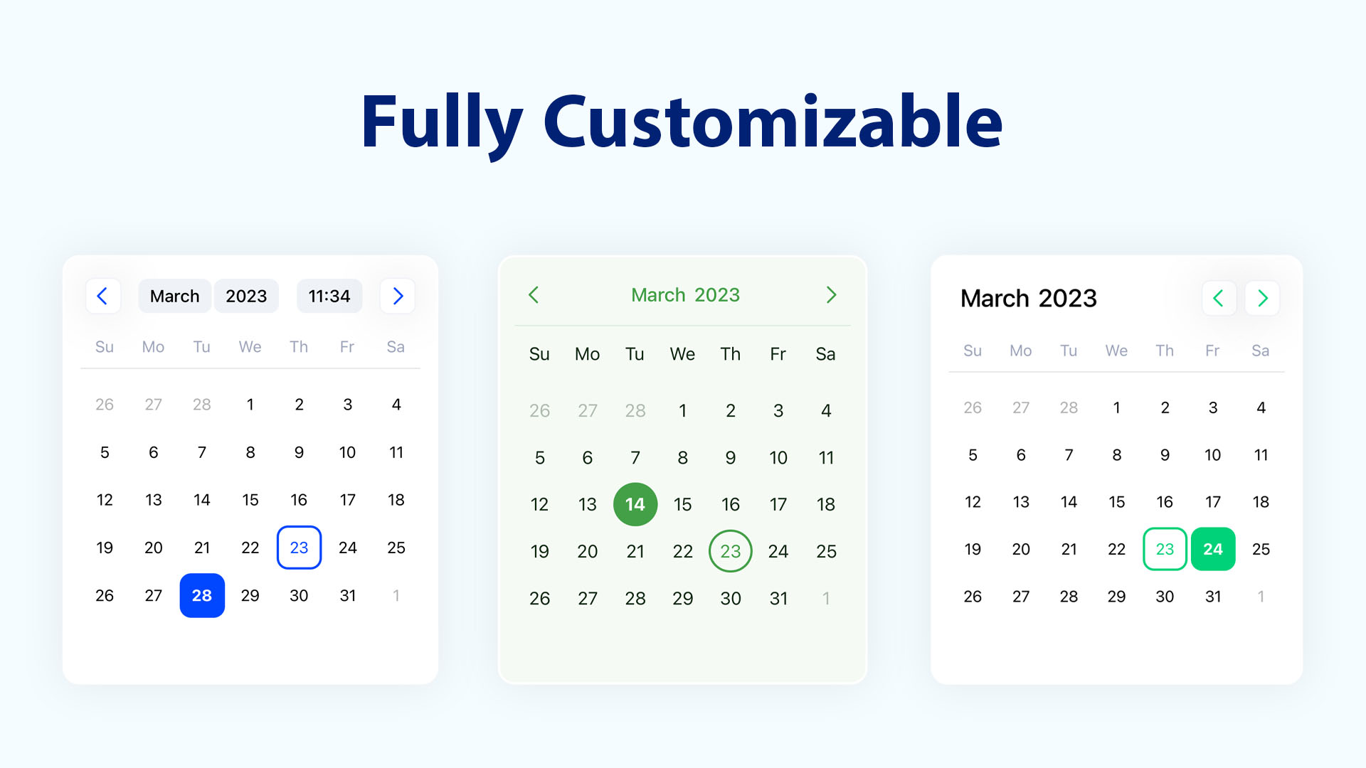
DateTimePicker comes with a minimal style, making it easy to extend and customize according to your needs.
| Name | Type | Description |
|---|---|---|
style | ViewStyle | style for the calendar container. |
className | string | className for the calendar container. |
styles | Styles | Custom styles for specific components inside the calendar. |
classNames | ClassNames | Custom classNames for specific components inside the calendar. |
Use the styles prop to apply custom styles instead of the default ones.
These styles are mapped to the values of the UI Theme enums.
1import DateTimePicker, { useDefaultStyles } from 'react-native-calendars-datepicker';
2
3export function Calendar() {
4  const defaultStyles = useDefaultStyles();
5
6  return (
7    <DateTimePicker
8      styles={{
9        ...defaultStyles,
10        today: { borderColor: 'blue', borderWidth: 1 }, // Add a border to today's date
11        selected: { backgroundColor: 'blue' }, // Highlight the selected day
12        selected_label: { color: 'white' }, // Highlight the selected day label
13      }}
14    />
15  );
16}
If you're using NativeWind in your project, apply Tailwind CSS class names to style the calendar.
Use the classNames prop to apply custom class names instead of the default ones.
These class names are mapped to the values of the UI Theme enums.
1import DateTimePicker, { useDefaultClassNames } from 'react-native-calendars-datepicker';
2
3export function Calendar() {
4  const defaultClassNames = useDefaultClassNames();
5
6  return (
7    <DateTimePicker
8      classNames={{
9        ...defaultClassNames,
10        today: 'border-amber-500', // Add a border to today's date
11        selected: 'bg-amber-500 border-amber-500', // Highlight the selected day
12        selected_label: "text-white", // Highlight the selected day label
13        day: `${defaultClassNames.day} hover:bg-amber-100`, // Change background color on hover
14        disabled: 'opacity-50', // Make disabled dates appear more faded
15      }}
16    />
17  );
18}
Use the timeZone prop to set the time zone for the calendar.
| Name | Type | Description |
|---|---|---|
timeZone | string | Defines the timezone for the DatePicker. |
The time zone can be set using either an IANA time zone identifier or a UTC offset.
1<DateTimePicker timeZone="UTC" /> // Use Coordinated Universal Time
2<DateTimePicker timeZone="Asia/Tokyo" /> //  Use Japan Standard Time (JST)
DateTimePicker offers multiple options to customize the calendar for different languages.
| Name | Type | Description |
|---|---|---|
locale | string | Defines the locale of the DateTimePicker. Default is en |
numerals | Numerals | Specifies the numeral system to use (e.g., Arabic, Persian). |
Use the components prop to replace the default rendered elements with your own custom components.
| Name | Type | Description |
|---|---|---|
components | CalendarComponents | Custom components to replace default calendar elements. |
Pass the custom components to the components prop. Refer to the list below for available custom components.
1import DateTimePicker, {
2  CalendarDay,
3  CalendarMonth,
4  CalendarComponents,
5} from 'react-native-calendars-datepicker';
6
7const components: CalendarComponents = {
8  Day: (day: CalendarDay) => <YourCustomDay day={day} />,
9  Month: (month: CalendarMonth) => <YourCustomMonth month={month} />
10  // etc
11};
12
13export function Calendar() {
14  return (
15      <DateTimePicker
16        components={components}
17      />
18  );
19}
| Name | Type | Description |
|---|---|---|
Day | (day: CalendarDay) => ReactNode | The component containing the day in the days grid. |
Month | (month: CalendarMonth) => ReactNode | The component containing the month in the months grid. |
Year | (year: CalendarYear) => ReactNode | The component containing the year in the years grid. |
Weekday | (weekday: CalendarWeek) => ReactNode | The component containing the weekday in the header. |
IconPrev | ReactNode | The previous month/year button icon in the header. |
IconNext | ReactNode | The next month button/year icon in the header. |
1type DateType = string | number | Dayjs | Date | null | undefined;
2
3type CalendarMode = 'single' | 'range' | 'multiple';
4
5type NavigationPosition = 'around' | 'right' | 'left';
6
7type WeekdayFormat = 'min' | 'short' | 'full';
8
9type MonthFormat = 'short' | 'full';
10
11type CalendarDay = {
12  number: number;
13  text: string;
14  date: string;
15  isDisabled: boolean;
16  isCurrentMonth: boolean;
17  dayOfMonth?: number;
18  isToday: boolean;
19  isSelected: boolean;
20  inRange: boolean;
21  leftCrop: boolean;
22  rightCrop: boolean;
23  isStartOfWeek: boolean;
24  isEndOfWeek: boolean;
25  isCrop: boolean;
26  inMiddle: boolean;
27  rangeStart: boolean;
28  rangeEnd: boolean;
29};
30
31type CalendarWeek = {
32  index: number;
33  name: {
34    full: string;
35    short: string;
36    min: string;
37  };
38};
39
40type CalendarMonth = {
41  index: number;
42  name: {
43    full: string;
44    short: string;
45  };
46  isSelected: boolean;
47};
48
49type CalendarYear = {
50  number: number;
51  text: string;
52  isSelected: boolean;
53  isActivated: boolean;
54};
| Name | Description |
|---|---|
latn | Western Latin. |
arab | Standard Arabic. |
arabext | Eastern Arabic-Indic (Persian). |
deva | Devanagari, used in Indian languages. |
beng | Bengali, used in Bengali and Assamese. |
guru | Gurmukhi, used in Punjab, India. |
gujr | Gujarati, used in Gujarat, India. |
orya | Odia, used in Odisha, India. |
tamldec | Tamil, used in Tamil-speaking regions. |
telu | Telugu, used in Andhra Pradesh and Telangana. |
knda | Kannada, used in Karnataka, India. |
mlym | Malayalam, used in Kerala, India. |

MIT. See the LICENSE file for more details.
Contributions are welcome! Please feel free to submit a PR.

No vulnerabilities found.
No security vulnerabilities found.