Gathering detailed insights and metrics for react-native-country-picker-samcodeng
Gathering detailed insights and metrics for react-native-country-picker-samcodeng
Gathering detailed insights and metrics for react-native-country-picker-samcodeng
Gathering detailed insights and metrics for react-native-country-picker-samcodeng
npm install react-native-country-picker-samcodengTypescript
Module System
Node Version
NPM Version
Total Downloads
0
Last Day
0
Last Week
0
Last Month
0
Last Year
0
1 Commits
1 Watchers
1 Branches
1 Contributors
Updated on Nov 01, 2022
Latest Version
1.0.1
Package Id
react-native-country-picker-samcodeng@1.0.1
Unpacked Size
128.61 kB
Size
30.77 kB
File Count
10
NPM Version
8.5.0
Node Version
16.14.2
Cumulative downloads
Total Downloads
Last Day
0%
NaN
Compared to previous day
Last Week
0%
NaN
Compared to previous week
Last Month
0%
NaN
Compared to previous month
Last Year
0%
NaN
Compared to previous year
2
3
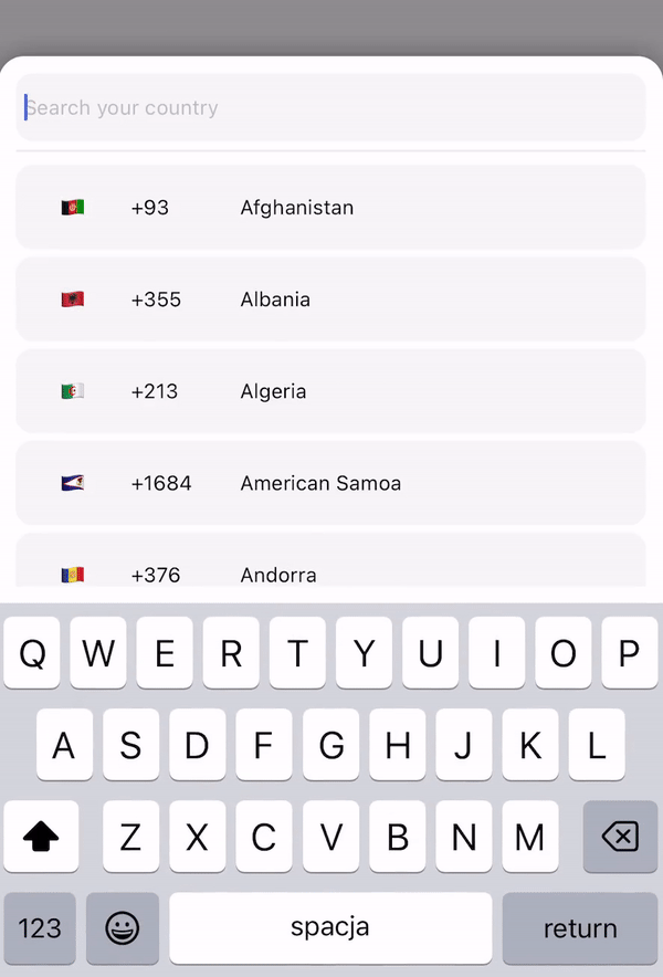
:zap: :zap: :zap: This lib. provide multi lang. country picker or country list with search functionality. Fully crossplatform and supported on React-native and expo. Didn't find your country ? Just add the required countries or locales and make a PR. :zap: :zap: :zap:
If you have something interesting ! Just write to us :)
expo: expo install react-native-country-picker-samcode
npm: npm i react-native-country-picker-samcode
yarn: yarn add react-native-country-picker-samcode
1import {CountryPicker} from "react-native-country-picker-samcode";
2
3export default function App() {
4  const [show, setShow] = useState(false);
5  const [countryCode, setCountryCode] = useState('');
6
7  return (
8    <View style={styles.container}>
9      <TouchableOpacity
10        onPress={() => setShow(true)}
11        style={{
12            width: '80%',
13            height: 60,
14            backgroundColor: 'black',
15            padding: 10,
16        }}
17      >
18        <Text style={{
19            color: 'white',
20            fontSize: 20
21        }}>
22            {countryCode}
23        </Text>
24      </TouchableOpacity>
25
26      // For showing picker just put show state to show prop
27      <CountryPicker
28        show={show}
29        // when picker button press you will get the country object with dial code
30        pickerButtonOnPress={(item) => {
31          setCountryCode(item.dial_code);
32          setShow(false);
33        }}
34      />
35    </View>
36  );
37}
1import {CountryList} from "react-native-country-picker-samcode";
2
3export default function App() {
4  const [countryCode, setCountryCode] = useState('');
5
6  return (
7    <View style={styles.container}>
8      <View
9        style={{
10            width: '80%',
11            height: 60,
12            backgroundColor: 'black',
13            padding: 10,
14        }}
15      >
16        <Text style={{
17            color: 'white',
18            fontSize: 20
19        }}>
20            {countryCode}
21        </Text>
22      </TouchableOpacity>
23
24      // All props the same as for picker
25       <CountryList
26          lang={'pl'}
27          pickerButtonOnPress={(item) => {
28              setCountryCode(item.dial_code);
29          }}
30       />
31    </View>
32  );
33}
Below are the props you can pass to the React Component.
| Prop | Type | Default | Example | Description |
|---|---|---|---|---|
| show | boolean | This prop using for displaying the modal. Put your show state here. | ||
| pickerButtonOnPress | function | (country) => setCode(country.dial_code) | Put your function/functions here for getting country data from picker. | |
| inputPlaceholder | string | inputPlaceholder={'Your placeholder'} | If you need a custom placeholder for your input you may need this prop. | |
| searchMessage | string | searchMessage={'Some search message here'} | If you want to customize search message just use this prop. | |
| lang | string | 'en' | lang={'pl'} | If you need to change the lang. just put one of supported lang. Or if you didn't find required lang just add them and make a PR :) |
| enableModalAvoiding | boolean | false | enableModalAvoiding={true} | Is modal should avoid keyboard ? On android to work required to use with androidWindowSoftInputMode with value pan, by default android will avoid keyboard by itself |
| androidWindowSoftInputMode | string | androidWindowSoftInputMode={'pan'} | Basicaly android avoid keyboard by itself, if you want to use custom avoiding you may use this prop | |
| itemTemplate | ReactNode | CountryButton | itemTemplate={YourTemplateComponentsHere} | This parameter gets a React Node element to render it as a template for each item of the list. These properties are sent to the item: key, item, style, name, and onPress |
| style | Object | style={{yoursStylesHere}} | If you want to change styles for component you probably need this props. You can check the styling part below. | |
| disableBackdrop | boolean | false | disableBackdrop | if you don't wanna show modal backdrop pass this prop. |
| onBackdropPress | function | null | onBackdropPress={() => setShow(false)} | If you want to close modal when user taps on the modal background. |
| initialState | string | initialState={'+380'} | Sometimes you need to pre-select country for example by user current location so you may use this prop. | |
| excludedCountries | array | excludedCountries={['RU', 'BY']} | In this prop you can define list of countries which you want to remove by adding their codes. |
:grey_exclamation: Also you can use all other FlatList and TextInput props if you need. :grey_exclamation:
1<CountryPicker
2    show={show}
3    lang={'cz'}
4    style={{
5        // Styles for whole modal [View]
6        modal: {
7            height: 500,
8            backgroundColor: 'red'
9        },
10        // Styles for modal backdrop [View]
11        backdrop: {
12
13        },
14        // Styles for bottom input line [View]
15        line: {
16
17        },
18        // Styles for list of countries [FlatList]
19        itemsList: {
20
21        },
22        // Styles for input [TextInput]
23        textInput: {
24              height: 80,
25              borderRadius: 0,
26        },
27        // Styles for country button [TouchableOpacity]
28        countryButtonStyles: {
29              height: 80
30        },
31        // Styles for search message [Text]
32        searchMessageText: {
33
34        },
35        // Styles for search message container [View]
36        countryMessageContainer: {
37
38        },
39        // Flag styles [Text]
40        flag: {
41
42        },
43        // Dial code styles [Text]
44        dialCode: {
45
46        },
47        // Country name styles [Text]
48        countryName: {
49
50        }
51    }}
52    pickerButtonOnPress={(item) => {
53        setCountry(item.name.en);
54        setShow(false);
55    }}
56/>
1  "name": {
2    "en": "English",
3  },

No vulnerabilities found.
No security vulnerabilities found.