Gathering detailed insights and metrics for react-native-flexible-grid
Gathering detailed insights and metrics for react-native-flexible-grid
Gathering detailed insights and metrics for react-native-flexible-grid
Gathering detailed insights and metrics for react-native-flexible-grid
react-native-unistyles-grid
A flexible and responsive grid system for React Native applications, built on top of [react-native-unistyles](unistyl.es). It works with `12` columns layout system and provides a simple API to define responsive layouts.
react-native-sortables
Powerful Sortable Components for Flexible Content Reordering in React Native
@mr_gain/react-native-flexible-grid
React Native Flexible Grid is an advanced grid layout system inspired by CSS Grid, designed to facilitate responsive, customizable, and dynamic grid layouts in React Native applications. It supports both responsive and fixed layouts, enabling the creation
react-native-photo-grid
React Native component that handles the complexities of building a grid of photos with a flexible number of photos per row.
React Native Flexible Grid is an advanced grid layout system inspired by CSS Grid, designed to facilitate responsive, customisable, and dynamic grid layouts in React Native applications.
npm install react-native-flexible-gridTypescript
Module System
Node Version
NPM Version
TypeScript (95.57%)
JavaScript (4.43%)
Total Downloads
0
Last Day
0
Last Week
0
Last Month
0
Last Year
0
MIT License
94 Stars
57 Commits
6 Forks
1 Watchers
6 Branches
3 Contributors
Updated on Jul 11, 2025
Latest Version
0.2.4
Package Id
react-native-flexible-grid@0.2.4
Unpacked Size
178.00 kB
Size
32.35 kB
File Count
66
NPM Version
10.8.2
Node Version
18.20.7
Published on
May 04, 2025
Cumulative downloads
Total Downloads
Last Day
0%
NaN
Compared to previous day
Last Week
0%
NaN
Compared to previous week
Last Month
0%
NaN
Compared to previous month
Last Year
0%
NaN
Compared to previous year


React Native Flexible Grid is an advanced grid layout system inspired by CSS Grid, designed to facilitate responsive, customizable, and dynamic grid layouts in React Native applications. It supports both responsive and fixed layouts, enabling the creation of intricate designs with minimal effort.
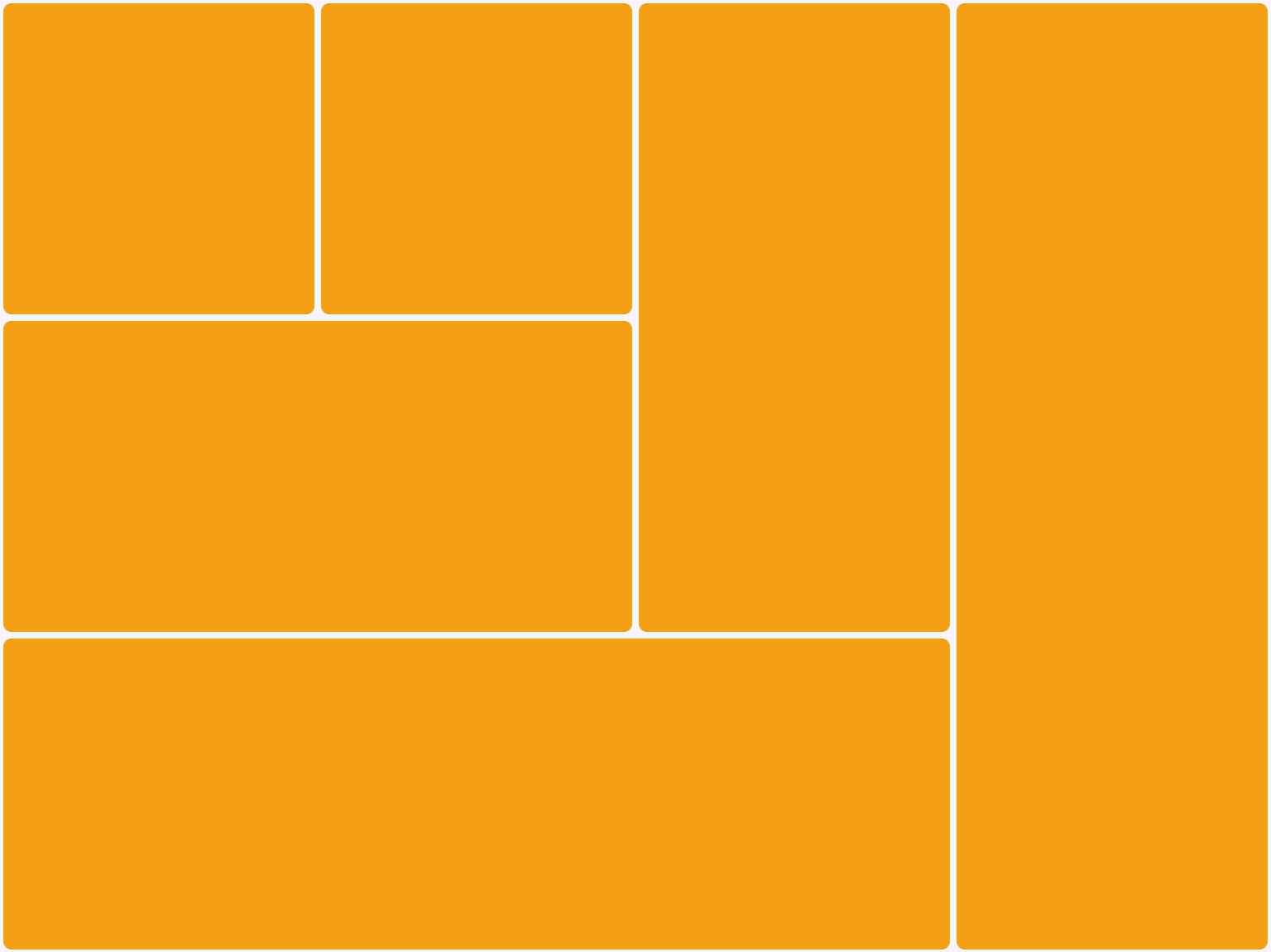
 |  |
| Instagram Explore Example | Pinterest Example |
 |
| Grid Board Example |
1npm install react-native-flexible-grid
or
1yarn add react-native-flexible-grid
FlexGrid is designed for creating highly flexible and dynamic grid layouts, capable of two-way scrolling to accommodate content that extends beyond both the viewport's width and height. By leveraging maxColumnRatioUnits, itemSizeUnit, and smooth scrolling mechanics, FlexGrid facilitates precise control over the grid's arrangement, dimensions, and scrolling behavior. This makes it exceptionally suited for applications requiring a versatile grid system that can display content in both horizontally and vertically overflowed layouts with ease.
1import { FlexGrid } from 'react-native-flexible-grid';
2
3export default function App() {
4  const data = [
5    {
6      imageUrl: 'https://picsum.photos/200/300?random=1',
7      widthRatio: 1,
8      heightRatio: 1,
9      text: 'Item 1',
10      id: 1,
11    },
12    {
13      imageUrl: 'https://picsum.photos/200/300?random=2',
14      widthRatio: 2,
15      heightRatio: 1,
16      text: 'Item 2',
17      id: 2,
18    },
19    {
20      imageUrl: 'https://picsum.photos/200/300?random=3',
21      widthRatio: 2,
22      heightRatio: 1,
23      text: 'Item 3',
24      id: 3,
25    },
26  ];
27
28  const renderItem = ({ item, index }) => (
29    <View style={styles.boxContainer}>
30      <Image
31        source={{ uri: item.imageUrl }}
32        style={styles.box}
33        resizeMode="cover"
34      />
35      <Text style={styles.text}>{item.text}</Text>
36    </View>
37  );
38
39  return (
40    <View style={styles.container}>
41      <FlexGrid
42        keyExtractor={(item) => item.id.toString()}
43        maxColumnRatioUnits={60}
44        itemSizeUnit={60}
45        data={data}
46        virtualizedBufferFactor={2}
47        renderItem={renderItem}
48        virtualization={true}
49        showScrollIndicator={false}
50        style={{ flex: 1 }}
51      />
52    </View>
53  );
54}
The ResponsiveGrid is designed for optimal responsiveness, dynamically adjusting grid items based on the container's width or a specified width within the component's style properties. Utilizing a combination of maxItemsPerColumn alongside item-specific widthRatio and heightRatio, it efficiently organizes content into a vertically scrollable grid. This component is ideally suited for layouts where vertical scrolling is preferred and where the grid's adaptability to varying container widths or device width is crucial.
1import { ResponsiveGrid } from 'react-native-flexible-grid';
2
3export default function App() {
4  const data = [
5    {
6      imageUrl: 'https://picsum.photos/200/300?random=1',
7      widthRatio: 1,
8      heightRatio: 1,
9      text: 'Item 1',
10      id: 1,
11    },
12    {
13      imageUrl: 'https://picsum.photos/200/300?random=2',
14      widthRatio: 2,
15      heightRatio: 1,
16      text: 'Item 2',
17      id: 2,
18    },
19    {
20      imageUrl: 'https://picsum.photos/200/300?random=3',
21      widthRatio: 2,
22      heightRatio: 1,
23      text: 'Item 3',
24      id: 3,
25    },
26  ];
27
28  const renderItem = ({ item, index }) => (
29    <View style={styles.boxContainer}>
30      <Image
31        source={{ uri: item.imageUrl }}
32        style={styles.box}
33        resizeMode="cover"
34      />
35    </View>
36  );
37
38  return (
39    <View style={styles.container}>
40      <ResponsiveGrid
41        keyExtractor={(item) => item.id.toString()}
42        maxItemsPerColumn={3}
43        data={data}
44        renderItem={renderItem}
45        style={{ padding: 5 }}
46      />
47    </View>
48  );
49}
FlexGrid Props| Prop | Type | Default | Required | Description |
|---|---|---|---|---|
data | Array | [] | true | The array of items to be rendered in the grid. |
renderItem | Function | () => null | true | Defines how each individual item should appear, it allows utilizing the item's properties to construct a custom layout or UI for that item within the grid. |
keyExtractor | (item, index) => string | Function | false | Defines a function that extracts a unique key for a given item in the list. By default, the keyExtractor uses the item's index in the array as the key. This is crucial for optimizing the rendering and re-rendering of list items by providing a stable identity. The function receives an item from the data array and its index, and should return a unique string. Providing a custom keyExtractor is recommended when the items have a unique identifier other than the index, especially in cases where the list's order might change, or items are dynamically added or removed, to ensure consistent and efficient updates. |
maxColumnRatioUnits | Number | 1 | true | The value controls the maximum number of ratio units that can be allocated to a single column, either from one item or cumulatively from multiple items that a column can accommodate, this defines the grid layout density and item sizing and positioning within each column of the grid. |
itemSizeUnit | Number | 50 | true | Defines the base unit size for grid items. The actual displayed size of each item in the grid is calculated by multiplying this unit by the item's widthRatio and heightRatio |
virtualization | Boolean | true | false | Virtualization significantly optimizes performance by only rendering the items currently visible in the viewport, plus buffer. This reduces the number of components rendered at any given time, leading to improved frame rates and smoother scrolling experiences, especially with large data.
Disabling virtualization results in all items being rendered at once, regardless of their visibility. It can impact performance and responsiveness for larger data. This is only suitable for grids with a small number of items to render. |
virtualizedBufferFactor | Number | 2 | false | Defines the buffer size for pre-loading items outside the current viewport. The buffer's actual dimensions are determined by multiplying this factor by the containerHeight for vertical scrolling and containerWidth for horizontal scrolling.
A higher buffer factor increases the number of items pre-loaded outside the viewport, contributing to a smoother scrolling experience as more content is ready for immediate display when scrolling. However, setting a large buffer factor can affect overall performance, especially on devices with limited resources, as it increases the number of components rendered off-screen.
While, a lower buffer factor reduces the off-screen component count, optimizing performance and resource usage. This setting is beneficial for large data or resource-constrained environments. However, it may lead to brief moments where content needs to catch up with the user's scroll speed, momentarily displaying blank areas until new items are rendered. |
scrollEventInterval | Number | 200 | false | Defines the interval, in milliseconds, at which scroll events are processed for the purpose of recalculating visible items and buffer in a virtualized grid. By setting this prop, you can throttle the frequency of scroll event handling, optimizing performance during rapid scrolling by reducing the computational load associated with updating the list of visible items and buffer.
A lower value results in more frequent updates, offering smoother visual updates of the grid's content at the potential cost of higher computational overhead. While, a higher interval decreases the frequency of updates, potentially improving performance but with less immediate recalculation triggered by scroll actions. This is crucial for fine-tuning the performance and experience of virtualized grid. |
showScrollIndicator | Boolean | true | false | Controls the visibility of the scroll indicator. |
style | ViewStyle | {} | false | Accepts a React Native ViewStyle object. This property applies to the outermost container of the component and can be used to set various styling aspects such as fixed width, height, background color, margin, padding, and more. |
itemContainerStyle | ViewStyle | {} | false | Accepts a React Native ViewStyle object. This applies to the container of each item in the grid layout and can be used to create a gap between each grid item with padding, apply background color, etc. |
onHorizontalEndReached | () => void | undefined | false | Defines a callback function that is called when the horizontal scroll position reaches the onHorizontalEndReachedThreshold. Useful for loading more data as the user scrolls horizontally. |
onHorizontalEndReachedThreshold | number | 0.5 | false | Defines the threshold for triggering onHorizontalEndReached. Represented as a fraction of the total width of the scrollable grid, indicating how far from the end the horizontal scroll must be to trigger the event. |
onVerticalEndReached | () => void | undefined | false | Defines a callback function that is called when the vertical scroll position reaches the onVerticalEndReachedThreshold. Useful for loading more data as the user scrolls vertically. |
onVerticalEndReachedThreshold | number | 0.5 | false | Defines the threshold for triggering onVerticalEndReached. Represented as a fraction of the total height of the scrollable grid, indicating how far from the end the vertical scroll must be to trigger the event. |
autoAdjustItemWidth | boolean | true | false | Prevents width overflow by adjusting items with width ratios that exceed available columns in their row & width overlap by adjusting items that would overlap with items extending from previous rows |
HeaderComponent | React.ComponentType<any> | React.ReactElement | null | undefined | null | false | Accepts a React component or element that will be rendered at the top of the grid, before any grid items are displayed. Suitable for titles, search bar, etc |
FooterComponent | React.ComponentType<any> | React.ReactElement | null | undefined | null | false | Accepts a React component or element that will be rendered at the bottom of the grid, after all the grid items have been displayed. Suitable for load more buttons, indicator or component |
ResponsiveGrid Props| Prop | Type | Default | Required | Description |
|---|---|---|---|---|
data | Array | [] | true | The array of items to be rendered in the grid. |
renderItem | Function | () => null | true | Defines how each individual item should appear, it allows utilizing the item's properties to construct a custom layout or UI for that item within the grid. |
keyExtractor | (item, index) => string | Function | false | Defines a function that extracts a unique key for a given item in the list. By default, the keyExtractor uses the item's index in the array as the key. This is crucial for optimizing the rendering and re-rendering of list items by providing a stable identity. The function receives an item from the data array and its index, and should return a unique string. Providing a custom keyExtractor is recommended when the items have a unique identifier other than the index, especially in cases where the list's order might change, or items are dynamically added or removed, to ensure consistent and efficient updates. |
maxItemsPerColumn | Number | 3 | true | Defines the maximum number of items that can be displayed within a single column of the grid. This property is required for ensuring a balanced and visually appealing layout across various screen sizes and orientations, optimizing the use of available space. Suitable for responsive designs, allows for dynamic adjustments based on the container's width, ensuring a consistent and adaptable presentation of content. |
itemUnitHeight | Number | containerWidth / maxItemsPerColumn | false | Defines the base unit height for items within the grid. This value serves as a foundational measure to determine the actual height of each grid item. The item's final height is calculated by multiplying this base unit height (itemUnitHeight) by the item's heightRatio, allowing for proportional scaling of items based on their content or design requirements. While widthRatio affects the item's width in relation to the column width, itemUnitHeight and heightRatio together define the item's vertical dimension, enabling dynamic grid layouts that adapt seamlessly to varying content sizes. |
direction | string | ltr | false | Determines the direction for arranging grid items in the layout: left-to-right (ltr) or right-to-left (rtl). |
virtualization | Boolean | true | false | Virtualization significantly optimizes performance by only rendering the items currently visible in the viewport, plus buffer. This reduces the number of components rendered at any given time, leading to improved frame rates and smoother scrolling experiences, especially with large data.
Disabling virtualization results in all items being rendered at once, regardless of their visibility. It can impact performance and responsiveness for larger data. This is only suitable for grids with a small number of items to render. |
virtualizedBufferFactor | Number | 2 | false | Defines the buffer size for pre-loading items outside the current viewport. The buffer's actual dimensions are determined by multiplying this factor by the containerHeight for vertical scrolling
A higher buffer factor increases the number of items pre-loaded outside the viewport, contributing to a smoother scrolling experience as more content is ready for immediate display when scrolling. However, setting a large buffer factor can affect overall performance, especially on devices with limited resources, as it increases the number of components rendered off-screen.
While, a lower buffer factor reduces the off-screen component count, optimizing performance and resource usage. This setting is beneficial for large data or resource-constrained environments. However, it may lead to brief moments where content needs to catch up with the user's scroll speed, momentarily displaying blank areas until new items are rendered. |
scrollEventInterval | Number | 200 | false | Defines the interval, in milliseconds, at which scroll events are processed for the purpose of recalculating visible items and buffer in a virtualized grid. By setting this prop, you can throttle the frequency of scroll event handling, optimizing performance during rapid scrolling by reducing the computational load associated with updating the list of visible items and buffer.
A lower value results in more frequent updates, offering smoother visual updates of the grid's content at the potential cost of higher computational overhead. While, a higher interval decreases the frequency of updates, potentially improving performance but with less immediate recalculation triggered by scroll actions. This is crucial for fine-tuning the performance and experience of virtualized grid. |
showScrollIndicator | Boolean | true | false | Controls the visibility of the scroll indicator. |
style | ViewStyle | {} | false | Accepts a React Native ViewStyle object. This property applies to the outermost container of the component and can be used to set various styling aspects such as fixed width, height, background color, margin, padding, and more. |
itemContainerStyle | ViewStyle | {} | false | Accepts a React Native ViewStyle object. This applies to the container of each item in the grid layout and can be used to create a gap between each grid item with padding, apply background color, etc. |
onEndReached | () => void | undefined | false | Defines a callback function that is triggered when the scroll reaches near the end of the scrollable grid. Useful for loading more data as the user scrolls horizontally |
onEndReachedThreshold | number | 0.5 | false | Defines the distance from the end of the content at which onEndReached should be triggered, expressed as a proportion of the total content length. For example, a value of 0.1 triggers the callback when the user has scrolled to within 10% of the end of the content. |
onScroll | (event: NativeSyntheticEvent | undefined | false | Callback function triggered when the scroll view is scrolled. Receives the scroll event as a parameter and can be used for custom scroll handling. |
bounces | boolean | true | false | Controls whether the ScrollView content can "bounce" when it reaches the end of the content. When set to false, disables the bouncing effect. |
autoAdjustItemWidth | boolean | true | false | Prevents width overflow by adjusting items with width ratios that exceed available columns in their row & width overlap by adjusting items that would overlap with items extending from previous rows |
HeaderComponent | React.ComponentType<any> | React.ReactElement | null | undefined | null | false | Accepts a React component or element that will be rendered at the top of the grid, before any grid items are displayed. Suitable for titles, search bar, etc |
FooterComponent | React.ComponentType<any> | React.ReactElement | null | undefined | null | false | Accepts a React component or element that will be rendered at the bottom of the grid, after all the grid items have been displayed. Suitable for load more buttons, indicator or component |
Our mission is not just to provide a flexible layout solution but to improve grid systems and layout flexibility in React Native. By continuously refining our algorithm and incorporating feedback, we aim to bring CSS Grid-like capabilities to the React Native ecosystem, fostering creativity and pushing the boundaries of what's possible in app design with React Native.
See the contributing guide to learn how to contribute to the repository and the development workflow.

No vulnerabilities found.
No security vulnerabilities found.