Gathering detailed insights and metrics for react-native-responsive-ui
Gathering detailed insights and metrics for react-native-responsive-ui
Gathering detailed insights and metrics for react-native-responsive-ui
Gathering detailed insights and metrics for react-native-responsive-ui
npm install react-native-responsive-uiModule System
Min. Node Version
Typescript Support
Node Version
NPM Version
630 Stars
97 Commits
67 Forks
8 Watching
17 Branches
10 Contributors
Updated on 23 Oct 2024
Minified
Minified + Gzipped
TypeScript (84.81%)
JavaScript (14.41%)
Shell (0.78%)
Cumulative downloads
Total Downloads
Last day
-52.2%
192
Compared to previous day
Last week
-37.2%
1,367
Compared to previous week
Last month
11.6%
7,880
Compared to previous month
Last year
3.7%
85,337
Compared to previous year
1
2
21
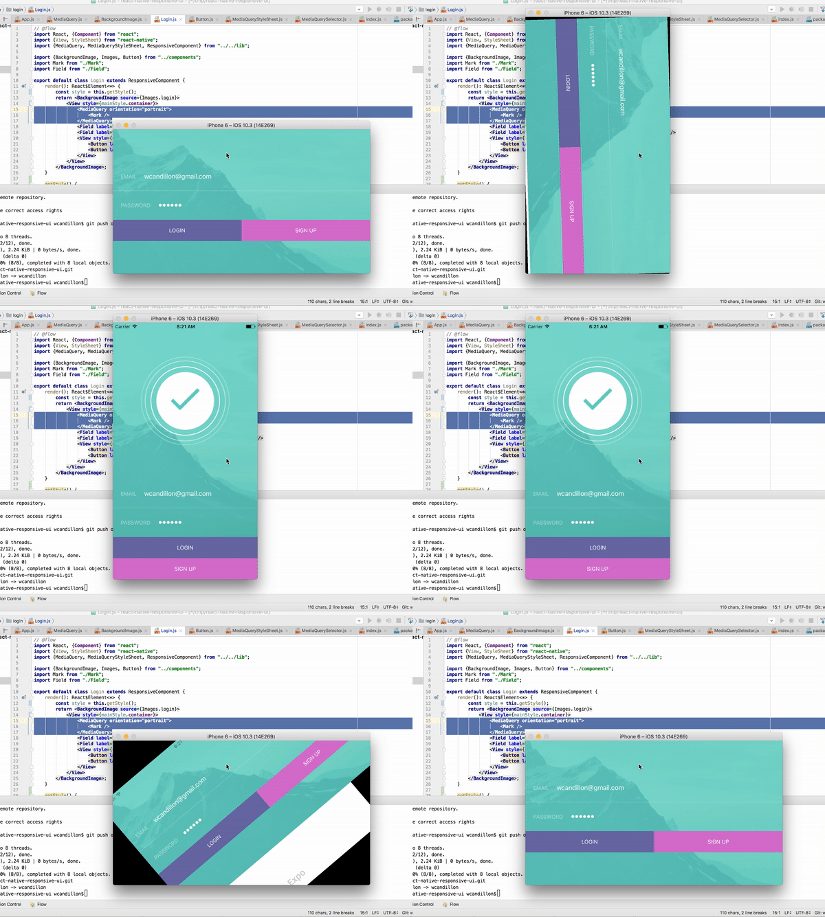
Building responsive UIs in React Native.

An example is available via expo here.
1npm install react-native-responsive-ui --save
The MediaQuery component renders its children only if the query evaluates to true (see list of properties below).
This component listens to changes in the window dimensions.
In the example below, we render the Logo component if the window's height has a minimum size of 450dp and if the device orientation is in portrait mode (height is larger than width).
1// @flow
2import React, {Component} from "react";
3import {View} from "react-native";
4import {MediaQuery} from "react-native-responsive-ui";
5
6export default class Login extends Component {
7    render(): React$Element<*> {
8        return <View>
9            <MediaQuery minHeight={450} orientation="portrait">
10                <Logo />
11            </MediaQuery>
12        </View>;
13    }
14}
15
| Name | Type | Description |
|---|---|---|
| minHeight | dp | Minimum height of the window. |
| maxHeight | dp | Maximum height of the window. |
| minWidth | dp | Minimum width of the window. |
| maxWidth | dp | Maximum width of the window. |
| minAspectRatio | number | Minimum aspect ration of the window (ratio of horizontal pixels to vertical pixels). |
| maxAspectRatio | number | Maximum aspect ration of the window (ratio of horizontal pixels to vertical pixels). |
| minPixelRatio | number | Minimum device pixel density. See PixelRatio. |
| maxPixelRatio | number | Maximum device pixel density. See PixelRatio. |
| orientation | portrait or landspace | Indicates whether the viewport is in landscape (the display is wider than it is tall) or portrait (the display is square or taller than it is wide) mode. |
| platform | string | Platform of the device. See Platform. |
| condition | boolean | Abritrary boolean value that must be true for the media query to pass. |
1import React from "react";
2import {useDimensions} from "react-native-responsive-ui";
3
4export default ({ children }) =>  {
5  const {width, height} = useDimensions();
6  console.log(`New window dimensions: ${width}x${height}`);
7  return children;
8};
1import React from "react";
2import {useStylesheet} from "react-native-responsive-ui";
3
4export default class Buttons extends ResponsiveComponent {
5    render() {
6        const style = useStylesheet(staticStyle)
7        return <View style={style.btns}>
8            <Button label="Login" primary style={style.btn} />
9            <Button label="Sign Up" style={style.btn} />
10        </View>;
11    }
12}
13
14const staticStyle = [
15  {
16      query: { orientation: "landscape" },
17      style: {
18          btns: {
19              flexDirection: "row"
20          },
21          btn: {
22              flex: 1
23          }
24      }
25  },
26  {
27      query: { orientation: "portrait" },
28      style: {
29          btns: {
30              alignSelf: "stretch"
31          },
32          btn: {
33              flex: 0
34          }
35      }
36  }
37];
mediaQuery() evaluates a media query and return true or false.
See example below.
1import {mediaQuery, useDimensions} from "react-native-responsive-ui";
2
3const {width, height} = useDimensions();
4mediaQuery({ orientation: "portrait", minHeight: 450 }, width, height)
ResponsiveComponents extends React.Component and add the window dimensions to the state of the component.
1import React from "react";
2import {ResponsiveComponent} from "react-native-responsive-ui";
3
4export default class Debug extends ResponsiveComponent {
5    render() {
6        const {width, height} = this.state.window;
7        console.log(`New window dimensions: ${width}x${height}`);
8        return null;
9    }
10}
1import React from "react";
2import {ResponsiveComponent, getStylesheet} from "react-native-responsive-ui";
3
4export default class Debug extends ResponsiveComponent {
5    render() {
6        const {width, height} = this.state.window;
7        const styles = [
8            {
9                query: { minHeight: 500 },
10                style: { container: { backgroundColor: "red" } }
11            }
12        ];
13        const style = getStylesheet({width, height}, styles)
14        return <View style={style.container} />
15    }
16}

No vulnerabilities found.
Reason
no binaries found in the repo
Reason
license file detected
Details
Reason
Found 2/8 approved changesets -- score normalized to 2
Reason
project is archived
Details
Reason
no effort to earn an OpenSSF best practices badge detected
Reason
security policy file not detected
Details
Reason
project is not fuzzed
Details
Reason
SAST tool is not run on all commits -- score normalized to 0
Details
Reason
54 existing vulnerabilities detected
Details
Score
Last Scanned on 2024-11-18
The Open Source Security Foundation is a cross-industry collaboration to improve the security of open source software (OSS). The Scorecard provides security health metrics for open source projects.
Learn More