📲 react-native-slider-intro


A simple and full customizable React Native package which implements a unique slider.

Installation
yarn add react-native-slider-intro
or
npm install react-native-slider-intro --save
Running the example project
iOS
yarn example ios
Android
yarn example android
Usage
Basic example
import React from 'react';
import SliderIntro from 'react-native-slider-intro';
const slides = [
{
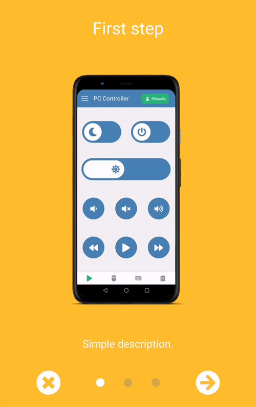
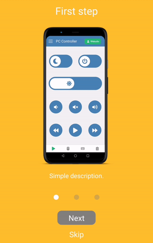
index: 1,
title: 'First step',
text: 'Simple description.',
link: 'https://rnstudio.hu',
image: require('./images/step1.png'),
backgroundColor: '#febe29',
},
{
index: 2,
title: 'Second step',
text: 'Simple description for the second step.',
image: require('./images/step2.png'),
backgroundColor: '#febe29',
},
];
const BasicExample = ({ closeExample }: { closeExample: () => void }) => (
<SliderIntro data={slides} onDone={closeExample} onSkip={closeExample} />
);
export default BasicExample;
The package includes two rendering options. In addition to the default render, where you can pass data as an array of SliderIntroItemProps, you can use a custom render with children and numberOfSlides properties.
Properties
| Name | Type | Default value | Description |
|---|
data | array | [] | Default render - An array of items. If data is provided, children will be ignored. |
numberOfSlides | array | number | Custom render - if children is provided, data will be ignored. numberOfSlides is required in this case. |
children | ReactNode | null | Custom render - JSX elements to render. |
navigationBarBottom | number | 0 | Custom bottom position of the dot navigation container. |
navigationBarHeight | number | 70 | Height of the dot navigation container. |
animateSlideSpeed | number | 15 | Speed of the slider animation. |
navContainerMaxSizePercent | number | 0.5 | The maximum width of the navigation container as a percentage of the total width. |
dotWidth | number | 12 | The radius of the navigation dots. |
fixDotOpacity | number | 0.35 | Opacity of inactive (non-animated) dots. |
fixDotBackgroundColor | color | grey | Background color of inactive dots. |
animatedDotBackgroundColor | color | white | Background color of the animated dot. |
animateDotSpeed | number | 8 | Speed of the dot animation. |
animateDotBouncing | number | 2 | Bounciness value of all animations. https://reactnative.dev/docs/animated#spring |
skipLabel | string | Skip | Custom label for skip button. |
nextLabel | string | Next | Custom label for next button. |
doneLabel | string | Done | Custom label for done button. |
renderSkipButton | function | Default skip/previous button renderer | Custom renderer for the skip/previous button. |
renderNextButton | function | Default next button renderer | Custom renderer for the next button. |
renderDoneButton | function | Default done button renderer | Custom renderer for the done button. |
onDone | function | none | Callback function executed when the done button is pressed. |
onSkip | function | none | Callback function executed when the skip button is pressed. |
showLeftButton | boolean | true | Whether to show the skip/previous button on the left side. |
leftButtonType | string | skip | The button type on the left side, either skip or previous. |
columnButtonStyle | boolean | false | If true, buttons will be displayed in a column. |
limitToSlide | number | (Device max width) * 0.35 | Defines the slide animation limit, based on PanResponder's gestureState.dx property. |
Examples
Contributing
See the contributing guide to learn how to contribute to the repository and the development workflow.
License
MIT
