Gathering detailed insights and metrics for react-native-ui-lib
Gathering detailed insights and metrics for react-native-ui-lib
Gathering detailed insights and metrics for react-native-ui-lib
Gathering detailed insights and metrics for react-native-ui-lib
npm install react-native-ui-libModule System
Min. Node Version
Typescript Support
Node Version
NPM Version
6,582 Stars
4,400 Commits
717 Forks
322 Watching
250 Branches
191 Contributors
Updated on 28 Nov 2024
Minified
Minified + Gzipped
TypeScript (70.07%)
JavaScript (20.98%)
Objective-C (4.35%)
Java (3.32%)
SCSS (0.41%)
Objective-C++ (0.26%)
CSS (0.19%)
Ruby (0.18%)
Kotlin (0.12%)
Shell (0.08%)
HTML (0.04%)
Cumulative downloads
Total Downloads
Last day
-2.3%
9,715
Compared to previous day
Last week
20.1%
61,790
Compared to previous week
Last month
-6.6%
226,312
Compared to previous month
Last year
165%
3,466,725
Compared to previous year
15
5
68

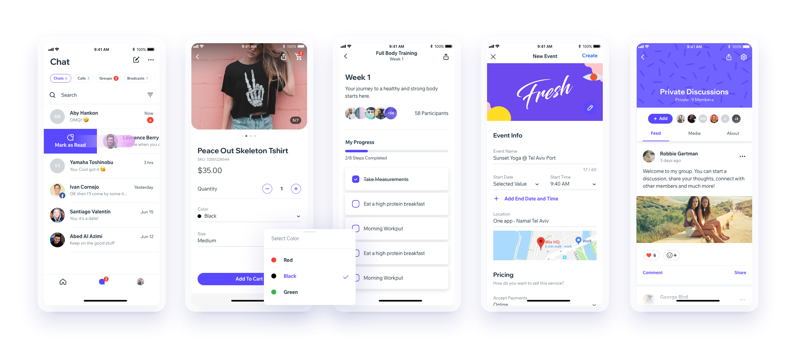
UI Toolset & Components Library for React Native

Download our Expo demo app
(You will need the Expo App)
or open link in your devices
[expo ] exp://exp.host/@vn.chemgio/rnuilib?release-channel=default
See setup instructions here.
See breaking changes
please use react-native-ui-lib
please use react-native-ui-lib@^3.0.0
Load your foundations and presets (colors, typography, spacings, etc...)
1// FoundationConfig.js
2
3import {Colors, Typography, Spacings} from 'react-native-ui-lib';
4
5Colors.loadColors({
6  primaryColor: '#2364AA',
7  secondaryColor: '#81C3D7',
8  textColor: '##221D23',
9  errorColor: '#E63B2E',
10  successColor: '#ADC76F',
11  warnColor: '##FF963C'
12});
13
14Typography.loadTypographies({
15  heading: {fontSize: 36, fontWeight: '600'},
16  subheading: {fontSize: 28, fontWeight: '500'},
17  body: {fontSize: 18, fontWeight: '400'}
18});
19
20Spacings.loadSpacings({
21  page: 20,
22  card: 12,
23  gridGutter: 16
24});Set default configurations to your components
1// ComponentsConfig.js
2
3import {ThemeManager} from 'react-native-ui-lib';
4
5// with plain object
6ThemeManager.setComponentTheme('Card', {
7  borderRadius: 8
8});
9
10// with a dynamic function
11ThemeManager.setComponentTheme('Button', (props, context) => {
12  // 'square' is not an original Button prop, but a custom prop that can
13  // be used to create different variations of buttons in your app
14  if (props.square) {
15    return {
16      borderRadius: 0
17    };
18  }
19});Use it all together. Your configurations will be applied on uilib components so you can use them easily with modifiers.
1// MyScreen.js
2
3import React, {Component} from 'react';
4import {View, Text, Card, Button} from 'react-native-ui-lib';
5
6class MyScreen extends Component {
7  render() {
8    return (
9      <View flex padding-page>
10        <Text heading marginB-s4>
11          My Screen
12        </Text>
13        <Card height={100} center padding-card marginB-s4>
14          <Text body>This is an example card </Text>
15        </Card>
16
17        <Button label="Button" body bg-primaryColor square></Button>
18      </View>
19    );
20  }
21}

No vulnerabilities found.
Reason
30 commit(s) and 9 issue activity found in the last 90 days -- score normalized to 10
Reason
no dangerous workflow patterns detected
Reason
license file detected
Details
Reason
binaries present in source code
Details
Reason
Found 7/12 approved changesets -- score normalized to 5
Reason
detected GitHub workflow tokens with excessive permissions
Details
Reason
no effort to earn an OpenSSF best practices badge detected
Reason
security policy file not detected
Details
Reason
project is not fuzzed
Details
Reason
dependency not pinned by hash detected -- score normalized to 0
Details
Reason
14 existing vulnerabilities detected
Details
Score
Last Scanned on 2024-11-18
The Open Source Security Foundation is a cross-industry collaboration to improve the security of open source software (OSS). The Scorecard provides security health metrics for open source projects.
Learn More