Gathering detailed insights and metrics for storybook-addon-coverage-panel
Gathering detailed insights and metrics for storybook-addon-coverage-panel
Gathering detailed insights and metrics for storybook-addon-coverage-panel
Gathering detailed insights and metrics for storybook-addon-coverage-panel
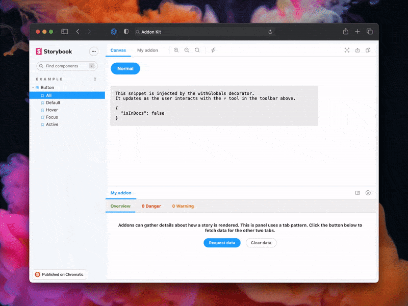
A storybook add-on to work in conjunction with @storybook/addon-coverage to display the coverage metrics in storybook UI panel
npm install storybook-addon-coverage-panelTypescript
Module System
Node Version
NPM Version
TypeScript (59.37%)
JavaScript (23.17%)
MDX (12.26%)
CSS (5.1%)
HTML (0.1%)
Total Downloads
0
Last Day
0
Last Week
0
Last Month
0
Last Year
0
MIT License
4 Commits
1 Watchers
1 Branches
1 Contributors
Updated on Sep 25, 2024
Latest Version
0.0.1
Package Id
storybook-addon-coverage-panel@0.0.1
Unpacked Size
56.68 kB
Size
16.34 kB
File Count
22
NPM Version
10.8.2
Node Version
20.17.0
Published on
Sep 25, 2024
Cumulative downloads
Total Downloads
Last Day
0%
NaN
Compared to previous day
Last Week
0%
NaN
Compared to previous week
Last Month
0%
NaN
Compared to previous month
Last Year
0%
NaN
Compared to previous year
1
1
A storybook add-on to work in conjunction with @storybook/addon-coverage to display the coverage metrics in storybook UI panel
npm run start runs babel in watch mode and starts Storybooknpm run build build and package your addon codeDon't want to use TypeScript? We offer a handy eject command: npm run eject-ts
This will convert all code to JS. It is a destructive process, so we recommended running this before you start writing any code.
The addon code lives in src. It demonstrates all core addon related concepts. The three UI paradigms
src/Tool.tsxsrc/Panel.tsxsrc/Tab.tsxWhich, along with the addon itself, are registered in src/manager.ts.
Managing State and interacting with a story:
src/withGlobals.ts & src/Tool.tsx demonstrates how to use useGlobals to manage global state and modify the contents of a Story.src/withRoundTrip.ts & src/Panel.tsx demonstrates two-way communication using channels.src/Tab.tsx demonstrates how to use useParameter to access the current story's parameters.Your addon might use one or more of these patterns. Feel free to delete unused code. Update src/manager.ts and src/preview.ts accordingly.
Lastly, configure you addon name in src/constants.ts.
Addons can interact with a Storybook project in multiple ways. It is recommended to familiarize yourself with the basics before getting started.
main.ts configurations.Since each of these places represents a different environment with different features and modules, it is also recommended to split and build your modules accordingly. This addon-kit comes with a preconfigured bundling configuration that supports this split, and you are free to modify and extend it as needed.
You can define which modules match which environments in the package.json#bundler property:
exportEntries is a list of module entries that users can manually import from anywhere they need to. For example, you could have decorators that users need to import into their preview.ts file or utility functions that can be used in their main.ts files.managerEntries is a list of module entries meant only for the manager UI. These modules will be bundled to ESM and won't include types since they are mostly loaded by Storybook directly.previewEntries is a list of module entries meant only for the preview UI. These modules will be bundled to ESM and won't include types since they are mostly loaded by Storybook directly.Manager and preview entries are only used in the browser so they only output ESM modules. Export entries could be used both in the browser and in Node depending on their use case, so they both output ESM and CJS modules.
Storybook provides a predefined set of packages that are available in the manager UI and the preview UI. In the final bundle of your addon, these packages should not be included. Instead, the imports should stay in place, allowing Storybook to replace those imports with the actual packages during the Storybook build process.
The list of packages differs between the manager and the preview, which is why there is a slight difference between managerEntries and previewEntries. Most notably, react and react-dom are prebundled in the manager but not in the preview. This means that your manager entries can use React to build UI without bundling it or having a direct reference to it. Therefore, it is safe to have React as a devDependency even though you are using it in production. Requiring React as a peer dependency would unnecessarily force your users to install React.
An exception to this rule is if you are using React to inject UI into the preview, which does not come prebundled with React. In such cases, you need to move react and react-dom to a peer dependency. However, we generally advise against this pattern since it would limit the usage of your addon to React-based Storybooks.
Storybook addons are listed in the catalog and distributed via npm. The catalog is populated by querying npm's registry for Storybook-specific metadata in package.json. This project has been configured with sample data. Learn more about available options in the Addon metadata docs.
To help the community use your addon and understand its capabilities, please document it thoroughly.
To get started, replace this README with the content in this sample template, modeled after how essential addons (like Actions) are documented. Then update the content to describe your addon.
1# My Addon
2
3## Installation
4
5First, install the package.
6
7```sh
8npm install --save-dev my-addon
9```
10
11Then, register it as an addon in `.storybook/main.js`.
12
13```js
14// .storybook/main.ts
15
16// Replace your-framework with the framework you are using (e.g., react-webpack5, vue3-vite)
17import type { StorybookConfig } from '@storybook/your-framework';
18
19const config: StorybookConfig = {
20  // ...rest of config
21  addons: [
22    '@storybook/addon-essentials'
23    'my-addon', // 👈 register the addon here
24  ],
25};
26
27export default config;
28```
29
30## Usage
31
32The primary way to use this addon is to define the `exampleParameter` parameter. You can do this the
33component level, as below, to affect all stories in the file, or you can do it for a single story.
34
35```js
36// Button.stories.ts
37
38// Replace your-framework with the name of your framework
39import type { Meta } from '@storybook/your-framework';
40
41import { Button } from './Button';
42
43const meta: Meta<typeof Button> = {
44  component: Button,
45  parameters: {
46    myAddon: {
47      exampleParameter: true,
48      // See API section below for available parameters
49    }
50  }
51};
52
53export default meta;
54```
55
56Another way to use the addon is...
57
58## API
59
60### Parameters
61
62This addon contributes the following parameters to Storybook, under the `myAddon` namespace:
63
64#### `disable`
65
66Type: `boolean`
67
68Disable this addon's behavior. This parameter is most useful to allow overriding at more specific
69levels. For example, if this parameter is set to true at the project level, it could then be
70re-enabled by setting it to false at the meta (component) or story level.
71
72### Options
73
74When registering this addon, you can configure it with the following options, which are passed when
75registering the addon, like so:
76
77```ts
78// .storybook/main.ts
79
80// Replace your-framework with the framework you are using (e.g., react-webpack5, vue3-vite)
81import type { StorybookConfig } from '@storybook/your-framework';
82
83const config: StorybookConfig = {
84  // ...rest of config
85  addons: [
86    '@storybook/essentials',
87    {
88      name: 'my-addon',
89      options: {
90        // 👈 options for my-addon go here
91      },
92    },
93  ],
94};
95
96export default config;
97```
98
99#### `useExperimentalBehavior`
100
101Type: `boolean`
102
103Enable experimental behavior to...
104
This project is configured to use auto for release management. It generates a changelog and pushes it to both GitHub and npm. Therefore, you need to configure access to both:
NPM_TOKEN Create a token with both Read and Publish permissions.GH_TOKEN Create a token with the repo scope.Then open your package.json and edit the following fields:
nameauthorrepositoryTo use auto locally create a .env file at the root of your project and add your tokens to it:
1GH_TOKEN=<value you just got from GitHub>
2NPM_TOKEN=<value you just got from npm>
Lastly, create labels on GitHub. You’ll use these labels in the future when making changes to the package.
1npx auto create-labels
If you check on GitHub, you’ll now see a set of labels that auto would like you to use. Use these to tag future pull requests.
This template comes with GitHub actions already set up to publish your addon anytime someone pushes to your repository.
Go to Settings > Secrets, click New repository secret, and add your NPM_TOKEN.
To create a release locally you can run the following command, otherwise the GitHub action will make the release for you.
1npm run release
That will:

No vulnerabilities found.
No security vulnerabilities found.