React Native Swiper & Carousel


(swiper-cum-carousel) - ts support added
Flexible, lightweight and fully customizable Swiper as well as Carousel wrapper for your React Native app components, images or cards.
Important
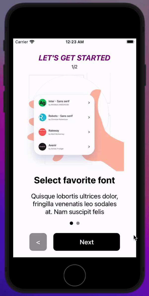
Basically, <SwiperCumCarousel> for React Native is a wrapper to wrap around your components/children & convert it into a slider / slideshow/ swiper, (e.g. best for onboarding screens).
It can also be used as Carousel displaying multiple components in single view at a time, (e.g. product cards of flipkart/ecommerce).
Thus, 2 in 1 premade swiper-cum-carousel for ease of any swipe in React Native. (examples below)
Installation
-
npm i swiper-cum-carousel
or
yarn add swiper-cum-carousel
-
cd ios && pod install
Use
import SwiperCumCarousel from 'swiper-cum-carousel'
<SwiperCumCarousel>
..two or more children
</SwiperCumCarousel>
Props
(items prop to make carousel active)
| Name | Description |
| w | width of the wrapper (give width here {200},{300} etc) |
| renderTitle | renders a title to the wrapper's top (give name in '..') |
| titleStyle | gives style to title |
| autoPlay | autoplays the swiper as slideshow |
| autoPlayDuration | duration of autoplay (givr timing here 2000,3000 etc) |
| style | styling for the wrapper |
| loop | infitive slideshows, works upon button click or autoplay on but doesn't work on manual finger swiper |
| pagingEnabled | default it is true, but we can set false |
| showsScrollBar | shows a scrollbar at bottom of wrapper |
| showsIndex | shows index (which slide no.) is currently visible to user |
| indexStyle | gives styling to index |
| showsPagination | render pagination at bottom of wrapper (dots) |
| pagingNavigation | navigate to the slide through clicking on pagination dots |
| showsButtons | render buttons |
| buttonLeftText | give your button title (or component) to change left button label |
| buttonGroupStyle | gives styling to group of buttons (collectively) |
| buttonStyle | gives styling to every button |
| buttonRightText | give your button title (or component) to change right button label |
| buttonLeftStyle | gives styling to left button |
| buttonRightStyle | gives styling to right button |
| renderNextButtonOnly | renders only Next button & make th Previous button invisible (showsButtons prop needs to be stated true along) |
| buttonTextStyle | gives common styling to text of all buttons |
| disablePrevButton | Both button will be shown but Previous Button won't work |
| disableNextButton | Both button will be shown but Next Button won't work |
| animate | state is to 'faded' & fading animation will be applied (works good with autoplay,pagination click or button click) |
| items | Enables Carousel give it a number {2},{3},{4} etc & carousel will be automatically enabled (giving it {1.2},{1.5},{2.5} shows some portion/percentage of view accordingly) - [many props might not work good when using this prop since it changes swiper to carousel] |
Contact me at mohit.chawla@workmail.com
