Installations
npm install volkeno-react-country-state-city-french-langDeveloper Guide
Typescript
Yes
Module System
CommonJS
Min. Node Version
>=10
Node Version
16.15.0
NPM Version
8.5.5
Score
59.1
Supply Chain
88.2
Quality
73.4
Maintenance
50
Vulnerability
99.6
License
Releases
Unable to fetch releases
Contributors
Download Statistics
Total Downloads
341
Last Day
1
Last Week
2
Last Month
8
Last Year
158
Bundle Size
25.06 kB
Minified
8.52 kB
Minified + Gzipped
Maintainers
Package Meta Information
Latest Version
1.0.0
Package Id
volkeno-react-country-state-city-french-lang@1.0.0
Unpacked Size
65.20 kB
Size
9.22 kB
File Count
10
NPM Version
8.5.5
Node Version
16.15.0
Publised On
28 Jun 2023
Total Downloads
Cumulative downloads
Total Downloads
341
Last day
0%
1
Compared to previous day
Last week
100%
2
Compared to previous week
Last month
166.7%
8
Compared to previous month
Last year
-13.7%
158
Compared to previous year
Daily Downloads
Weekly Downloads
Monthly Downloads
Yearly Downloads
Dependencies
1
Peer Dependencies
2
Dev Dependencies
30
volkeno-react-country-state-city
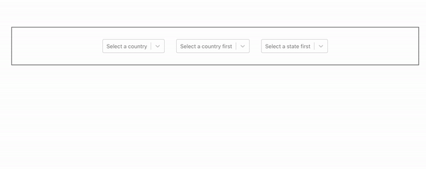
This library provides React components to display dropdowns of connected countries, states and cities (choose a country, it displays the affected states, choose a state, it has displays the affected cities).

Install
1npm install --save volkeno-react-country-state-city
Usage
1import React, { useState } from 'react'
2import {
3  CountrySelector,
4  StateSelector,
5  CitySelector
6} from 'volkeno-react-country-state-city'
7import 'volkeno-react-country-state-city/dist/index.css'
8
9const App = () => {
10  const [country, setCountry] = useState<any>('')
11  const [state, setState] = useState<any>('')
12  const [city, setCity] = useState<any>('')
13
14  const handleCountrySelect = (option: any) => {
15    setCountry(option)
16  }
17
18  const handleStateSelect = (option: any) => {
19    setState(option)
20  }
21
22  const handleCitySelect = (option: any) => {
23    setCity(option)
24  }
25  return (
26    <div style={{display: 'flex', justifyContent: 'center', alignItems: 'center', border: '2px solid grey', margin: '5rem'}}>
27      <CountrySelector
28        onChange={handleCountrySelect}
29        name='country'
30        placeholder='Select a country'
31        value={country}
32      />
33      <StateSelector
34        country={country}
35        name='state'
36        value={state}
37        countryPlaceholder='Select a country first'
38        onChange={handleStateSelect}
39      />
40      <CitySelector
41        state={state}
42        name='city'
43        value={city}
44        statePlaceholder='Select a state first'
45        onChange={handleCitySelect}
46      />
47    </div>
48  )
49}
50
51export default App
Configuration - Props
<CountrySelector/>
| Property | Type | Require | Default | Description |
|---|---|---|---|---|
| name | string | false | country | name of input |
| containerClass | string | false | ... | ClassName of select container |
| onChange | function | true | ... | Callback that gets called when the user selects a country. Use this to store the value in whatever store you're using. |
| optionClass | string | false | ... | ClassName of label container |
| styleContainer | React.CSSProperties | false | ... | Apply a style to the select container |
| value | number | true | ... | The currently selected country. |
| placeholder | string | false | "Select Country" | The default option label. |
<StateSelector/>
| Property | Type | Require | Default | Description |
|---|---|---|---|---|
| country | object | true | ... | The currently selected country. |
| name | string | false | state | name of input |
| containerClass | string | false | ... | ClassName of select container |
| onChange | function | true | ... | Callback that gets called when the user selects a state. Use this to store the value in whatever store you're using. |
| optionClass | string | false | ... | ClassName of label container |
| styleContainer | React.CSSProperties | false | ... | Apply a style to the select container |
| value | number | true | ... | The currently selected country. |
| placeholder | string | false | "Select State" | The default option label. |
| countryPlaceholder | string | false | "Select Country" | The label that appears in the state dropdown when the user hasn't selected a country yet. |
<CitySelector/>
| Property | Type | Require | Default | Description |
|---|---|---|---|---|
| state | object | true | ... | The currently selected state. |
| name | string | false | city | name of input |
| containerClass | string | false | ... | ClassName of select container |
| onChange | function | true | ... | Callback that gets called when the user selects a state. Use this to store the value in whatever store you're using. |
| optionClass | string | false | ... | ClassName of label container |
| styleContainer | React.CSSProperties | false | ... | Apply a style to the select container |
| value | number | true | ... | The currently selected state. |
| placeholder | string | false | "Select State" | The default option label. |
| statePlaceholder | string | false | "Select State" | The label that appears in the city dropdown when the user hasn't selected a state yet. |
License
MIT © VolkenoMakers

No vulnerabilities found.
No security vulnerabilities found.