React Native Basic Calendar
한국어 | English
A lightweight and customizable calendar component for React Native apps,
featuring basic functionalities like date marking and modal support.
Available in both English and Korean languages.


Screenshots
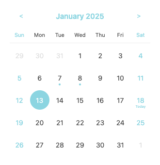
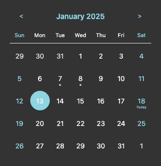
- Left: Default calendar with sky blue theme
- Right: Calendar with dark theme customization
Used In Production
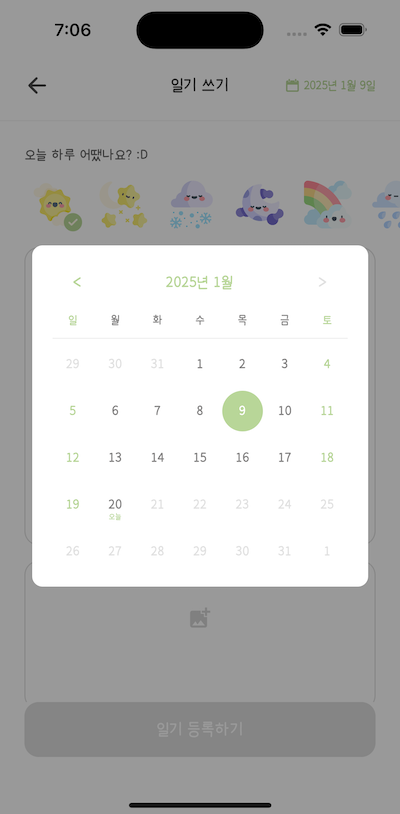
- 새싹일기 - A journaling app using CalendarModal component for date selection
Features
- 📅 Simple and intuitive calendar interface
- 🎨 Customizable styles & themes
- 🌍 Multi-language support (English & Korean)
- 📱 Cross-platform compatibility
- 📏 Configurable date selection range
- 📍 Date marking support
- ✨ Today highlighting
- 🗓️ Modal calendar view
Installation
- Install the package:
# Using npm
npm install @choi12/rn-basic-calendar
# Using yarn
yarn add @choi12/rn-basic-calendar
- Install peer dependencies:
# Using npm
npm install dayjs@^1.11.0
# Using yarn
yarn add dayjs@^1.11.0
Peer Dependencies
This package requires the following peer dependencies:
{
"dayjs": "^1.11.0",
"react": "^17.0.0 || ^18.0.0",
"react-native": ">=0.65.0 <1.0.0"
}
Types
The package uses the following types for date handling:
type CalendarDay = Dayjs; // dayjs object for date manipulation
type MarkedDate = string; // Date string in 'YYYY-MM-DD' format
Usage
Basic Calendar
import React, { useState } from 'react';
import { Calendar } from '@choi12/rn-basic-calendar';
import dayjs, { Dayjs } from 'dayjs';
const CalendarExample = () => {
const [value, setValue] = useState<Dayjs>(dayjs());
return (
<Calendar
value={value}
onChange={setValue}
markedDates={['2025-01-02', '2025-01-03']}
/>
);
};
Calendar Modal
import React, { useState } from 'react';
import { CalendarModal } from '@choi12/rn-basic-calendar';
import dayjs, { Dayjs } from 'dayjs';
const CalendarModalExample = () => {
const [isVisible, setIsVisible] = useState<boolean>(false);
const [value, setValue] = useState<Dayjs>(dayjs());
return (
<CalendarModal
isVisible={isVisible}
onClose={() => setIsVisible(false)}
value={value}
onChange={(date) => {
setValue(date);
setIsVisible(false);
}}
/>
);
};
Props
Calendar Props
| Prop | Type | Required | Default | Description |
|---|
| value | CalendarDay | Yes | - | Currently selected date |
| onChange | (date: CalendarDay)=>void | Yes | - | Callback when a date is selected |
| minDate | CalendarDay | No | - | Minimum selectable date |
| maxDate | CalendarDay | No | - | Maximum selectable date |
| defaultValue | CalendarDay | No | dayjs() | Default selected date |
| language | 'en' | 'ko' | No | 'en' | Calendar language |
| styles | CalendarStyles | No | {} | Custom styles object |
| colors | CalendarColors | No | {} | Custom colors object |
| markedDates | string[] | No | [] | Array of dates to be marked (YYYY-MM-DD format) |
CalendarModal Props
Extends Calendar Props with additional properties:
| Prop | Type | Required | Default | Description |
|---|
| isVisible | boolean | Yes | - | Controls modal visibility |
| onClose | () => void | Yes | - | Callback when modal is closed |
| title | string | No | - | Modal title |
| overlayOpacity | number | No | 0.4 | Opacity of modal overlay |
Customization
Theme Colors
const colors = {
primaryColor: '#8CD5E1', // Primary theme color
backgroundColor: '#FFFFFF', // Background color
textColor: '#4A4A4A', // Text color
};
Component Styles
const styles = {
// Calendar container
containerStyle: {},
daysContainerStyle: {},
weekStyle: {},
// Day elements
dayContainerStyle: {},
dayTextStyle: {},
selectedDayStyle: {},
selectedDayTextStyle: {},
todayLabelStyle: {},
weekendDayTextStyle: {},
disabledDayTextStyle: {},
// Month selector
monthSelectorContainerStyle: {},
monthSelectorButtonStyle: {},
monthTextStyle: {},
arrowStyle: {},
disabledArrowStyle: {},
// Weekday header
weekdayHeaderContainerStyle: {},
weekdayTextStyle: {},
weekendHeaderTextStyle: {},
// Modal specific (for CalendarModal)
modalOverlayStyle: {},
modalContainerStyle: {},
modalTitleStyle: {},
};
Full Example with Customization
const customColors = {
primaryColor: '#8CD5E1',
backgroundColor: '#333333',
textColor: '#FFFFFF',
};
const customStyles = {
containerStyle: { borderRadius: 12 },
dayTextStyle: { fontSize: 14 },
selectedDayStyle: { backgroundColor: '#8CD5E1' },
selectedDayTextStyle: { color: '#FFFFFF' },
disabledDayTextStyle: { color: '#989797' },
};
<Calendar
value={value}
onChange={onChange}
language="en"
defaultValue={dayjs('2025-01-15')}
minDate={dayjs().subtract(2, 'month')}
maxDate={dayjs().add(2, 'month')}
markedDates={['2025-01-02', '2025-01-03']}
colors={customColors}
styles={customStyles}
/>
Testing
The package includes comprehensive test coverage for all components and utilities:
-
Components
- Calendar: Core calendar functionality, date selection, navigation, and styling
- CalendarModal: Modal behavior, interactions, and customization
- WeekdayHeader: Localization and layout
- MonthSelector: Month navigation and boundary handling
- Day: Date rendering, selection, and marker display
-
Hooks
- useCalendar: Date grid generation and month calculations
- useCalendarState: State management and month navigation
-
Utils
- Date utilities: Range validation, month comparison, and weekend checks
- Locale utilities: Language configuration for EN/KO support
Run tests using:
# Using npm
npm test
# Using yarn
yarn test
License
MIT © choi12
