Gathering detailed insights and metrics for @dev.mohe/mwc-textfield
Gathering detailed insights and metrics for @dev.mohe/mwc-textfield
Gathering detailed insights and metrics for @dev.mohe/mwc-textfield
Gathering detailed insights and metrics for @dev.mohe/mwc-textfield
npm install @dev.mohe/mwc-textfieldTypescript
Module System
Node Version
NPM Version
72.5
Supply Chain
91.5
Quality
74.8
Maintenance
100
Vulnerability
88
License
TypeScript (55.5%)
SCSS (42.02%)
JavaScript (1.33%)
CSS (0.72%)
HTML (0.44%)
Total Downloads
0
Last Day
0
Last Week
0
Last Month
0
Last Year
0
Apache-2.0 License
10,163 Stars
4,998 Commits
976 Forks
204 Watchers
22 Branches
131 Contributors
Updated on Jul 16, 2025
Latest Version
0.19.3
Package Id
@dev.mohe/mwc-textfield@0.19.3
Unpacked Size
194.76 kB
Size
35.19 kB
File Count
13
NPM Version
lerna/3.22.1/node@v12.18.4+x64 (linux)
Node Version
12.18.4
Cumulative downloads
Total Downloads
Last Day
0%
NaN
Compared to previous day
Last Week
0%
NaN
Compared to previous week
Last Month
0%
NaN
Compared to previous month
Last Year
0%
NaN
Compared to previous year
10
<mwc-textfield> 
IMPORTANT: The Material Web Components are a work in progress and subject to major changes until 1.0 release.
Text fields let users enter and edit text.
Material Design Guidelines: text fields
1npm install @dev.mohe/mwc-textfield
NOTE: The Material Web Components are distributed as ES2017 JavaScript Modules, and use the Custom Elements API. They are compatible with all modern browsers including Chrome, Firefox, Safari, Edge, and IE11, but an additional tooling step is required to resolve bare module specifiers, as well as transpilation and polyfills for IE11. See here for detailed instructions.
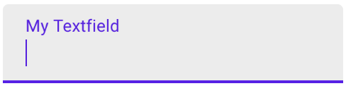
1<mwc-textfield label="My Textfield"></mwc-textfield>
2
3<script type="module">
4  import '@dev.mohe/mwc-textfield';
5</script>
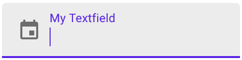
1<mwc-textfield label="My Textfield" icon="event"></mwc-textfield>
2
3<script type="module">
4  import '@dev.mohe/mwc-textfield';
5  import '@dev.mohe/mwc-icon/mwc-icon-font';
6</script>
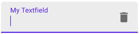
1<mwc-textfield label="My Textfield" iconTrailing="delete"></mwc-textfield>
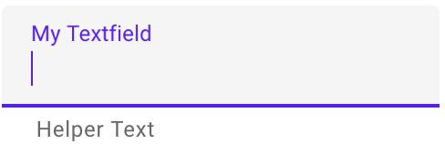
1<mwc-textfield label="My Textfield" helper="Helper Text"></mwc-textfield>
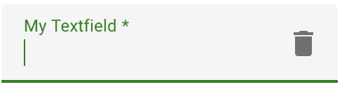
1<style>
2  mwc-textfield {
3    --mdc-theme-primary: green;
4  }
5</style>
6
7<mwc-textfield
8    label="My Textfield"
9    iconTrailing="delete"
10    required>
11</mwc-textfield>
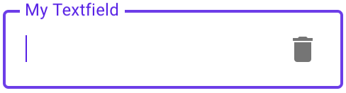
1<mwc-textfield
2    outlined
3    label="My Textfield"
4    iconTrailing="delete">
5</mwc-textfield>
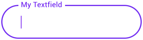
1<style>
2  mwc-textfield.rounded {
3    --mdc-shape-small: 28px;
4  }
5</style>
6
7<mwc-textfield
8    class="rounded"
9    label="My Textfield"
10    outlined>
11</mwc-textfield>
| Name | Type | Description |
|---|---|---|
value | string | The input control's value. |
type | TextFieldType* | A string specifying the type of control to render. |
label | string | Sets floating label value. |
placeholder | string | Sets disappearing input placeholder. |
prefix | string | Prefix text to display before the input. |
suffix | string | Suffix text to display after the input. |
icon | string | Leading icon to display in input. See mwc-icon. |
iconTrailing | string | Trailing icon to display in input. See mwc-icon. |
disabled | boolean | Whether or not the input should be disabled. |
charCounter | boolean | Note: requries maxLength to be set. Display character counter with max length. |
outlined | boolean | Whether or not to show the material outlined variant. |
helper | string | Helper text to display below the input. Display default only when focused. |
helperPersistent | boolean | Always show the helper text despite focus. |
required | boolean | Displays error state if value is empty and input is blurred. |
maxLength | number | Maximum length to accept input. |
validationMessage | string | Message to show in the error color when the textfield is invalid. (Helper text will not be visible) |
pattern | string | HTMLInputElement.prototype.pattern (empty string will unset attribute) |
min | number|string | HTMLInputElement.prototype.min (empty string will unset attribute) |
max | number|string | HTMLInputElement.prototype.max (empty string will unset attribute) |
size | number|null | HTMLInputElement.prototype.size (null will unset attribute) |
step | number|null | HTMLInputElement.prototype.step (null will unset attribute) |
autoValidate | boolean | Reports validity on input rather than only on blur. |
validity | ValidityState (readonly) | The ValidityState of the textfield. |
willValidate | boolean (readonly) | HTMLInputElement.prototype.willValidate |
validityTransform | ValidityTransform**|null | Callback called before each validation check. See the validation section for more details. |
validateOnInitialRender | boolean | Runs validation check on initial render. |
name | string | Sets the name attribute on the internal input.*** |
* TextFieldType is exported by mwc-textfield and mwc-textfield-base
1type TextFieldType = 'text'|'search'|'tel'|'url'|'email'|'password'|
2    'date'|'month'|'week'|'time'|'datetime-local'|'number'|'color';
** ValidityTransform is not exported. See the validation section for more details.
1type ValidityTransform = (value: string, nativeValidity: ValidityState) => Partial<ValidityState>
*** The name property should only be used for browser autofill as webcomponent form participation does not currently consider the name attribute. See #289.
| Name | Description |
|---|---|
checkValidity() => boolean | Returns true if the textfield passes validity checks. Returns false and fires an invalid event on the textfield otherwise. NOTE: When accessing any property or function that checks validity at textfield initial boot up, you may have to await <mwc-textfield>.updateComplete. |
reportValidity() => boolean | Runs checkValidity() method, and if it returns false, then it reports to the user that the input is invalid. |
setCustomValidity(message:string) => void | Sets a custom validity message (also overwrites validationMessage). If this message is not the empty string, then the element is suffering from a custom validity error and does not validate. |
layout() => Promise<void> | Re-calculate layout. If a textfield is styled with display:none before it is first rendered, and it has a label that is floating, then you must call layout() the first time you remove display:none, or else the notch surrounding the label will not render correctly. |
Inherits CSS Custom properties from:
| Name | Default | Description |
|---|---|---|
--mdc-text-field-filled-border-radius | 4px 4px 0 0 | Border radius of the standard / filled textfield's background filling. |
--mdc-text-field-idle-line-color | rgba(0, 0, 0, 0.42) | Color of the filled textfield's bottom line when idle. |
--mdc-text-field-hover-line-color | rgba(0, 0, 0, 0.87) | Color of the filled textfield's bottom line when hovering. |
--mdc-text-field-disabled-line-color | rgba(0, 0, 0, 0.06) | Color of the filled textfield's bottom line when disabled. |
--mdc-text-field-outlined-idle-border-color | rgba(0, 0, 0, 0.38) | Color of the outlined textfield's outline when idle. |
--mdc-text-field-outlined-hover-border-color | rgba(0, 0, 0, 0.87) | Color of the outlined textfield's outline when hovering. |
--mdc-text-field-outlined-disabled-border-color | rgba(0, 0, 0, 0.06) | Color of the outlined textfield's outline when disabled. |
--mdc-text-field-fill-color | rgb(245, 245, 245) | Color of the textfield's background fill (non-outlined). |
--mdc-text-field-disabled-fill-color | rgb(250, 250, 250) | Color of the textfield's background fill (non-outlined) when disabled. |
--mdc-text-field-ink-color | rgba(0, 0, 0, 0.87) | Color of the input text. |
--mdc-text-field-label-ink-color | rgba(0, 0, 0, 0.6) | Color of the non-focused floating label, helper text, char counter, and placeholder. |
--mdc-text-field-disabled-ink-color | rgba(0, 0, 0, 0.37) | Color of the input text, the floating label, helper text, char counter, and placeholder of a disabled textfield. |
This component exposes the following global theming custom properties.
| Name | Description |
|---|---|
--mdc-theme-primary | Color when active of the underline ripple, the outline, and the caret. |
--mdc-theme-error | Color when errored of the underline, the outline, the caret, and the icons. |
--mdc-typography-subtitle1-<PROPERTY> | Styles the typography of the textfield. |
<mwc-textfield> follows the basic <input> constraint validation model.
It exposes:
requiredmaxLengthpatternminmaxstepvaliditywillValidatecheckValidity()reportValidity()setCustomValidity(message)Additionally, it implements more features such as:
validationMessagevalidateOnInitialRendervalidityTransformBy default, <mwc-textfield> will report validation on blur.
The validityTransform property is a function that can be set on <mwc-textfield> to
implement custom validation logic that transforms the ValidityState of the
input control. The type of a ValidityTransform is the following:
1(value: string, nativeValidity: ValidityState) => Partial<ValidityState>
Where value is the new value in the textfield to be validated and
nativeValidity is an interface of
ValidityState
of the native input control. For example:
1<mwc-textfield
2    id="my-textfield"
3    pattern="[0-9]+"
4    value="doggos">
5</mwc-textfield>
6<script>
7  const textfield = document.querySelector('#my-textfield');
8  textfield.validityTransform = (newValue, nativeValidity) => {
9    if (!nativeValidity.valid) {
10      if (nativeValidity.patternMismatch) {
11        const hasDog = newValue.includes('dog');
12        // changes to make to the nativeValidity
13        return {
14          valid: hasDog,
15          patternMismatch: !hasDog;
16        };
17      } else {
18        // no changes
19        return {};
20      }
21    } else {
22      const isValid = someExpensiveOperation(newValue);
23      // changes to make to the native validity
24      return {
25        valid: isValid,
26        // or whatever type of ValidityState prop you would like to set (if any)
27        customError: !isValid,
28      };
29    }
30  }
31</script>
In this example we first check the native validity which is invalid due to the
pattern mismatching (the value is doggos which is not a number). The value
includes dog, thus we make it valid and undo the pattern mismatch.
In this example, we also skip an expensive validity check by short-circuiting the validation by checking the native validation.
Note: the UI will only update as valid / invalid by checking the valid
property of the transformed ValidityState.

No vulnerabilities found.
Reason
security policy file detected
Details
Reason
25 commit(s) and 7 issue activity found in the last 90 days -- score normalized to 10
Reason
no dangerous workflow patterns detected
Reason
no binaries found in the repo
Reason
license file detected
Details
Reason
Found 11/18 approved changesets -- score normalized to 6
Reason
SAST tool is not run on all commits -- score normalized to 6
Details
Reason
6 existing vulnerabilities detected
Details
Reason
dependency not pinned by hash detected -- score normalized to 3
Details
Reason
detected GitHub workflow tokens with excessive permissions
Details
Reason
no effort to earn an OpenSSF best practices badge detected
Reason
project is not fuzzed
Details
Score
Last Scanned on 2025-07-07
The Open Source Security Foundation is a cross-industry collaboration to improve the security of open source software (OSS). The Scorecard provides security health metrics for open source projects.
Learn More