Gathering detailed insights and metrics for @itpsolver/react-multi-date-picker
a simple React datepicker component for working with gregorian, persian, arabic and indian calendars
Installations
npm install @itpsolver/react-multi-date-pickerDeveloper Guide
BETA
Typescript
Yes
Module System
CommonJS
Node Version
16.20.0
NPM Version
8.19.4
Releases
25
Contributors
1
Unable to fetch Contributors
Languages
2
JavaScript
CSS
JavaScript (89%)
CSS (11%)
Love this project? Help keep it running — sponsor us today! 🚀
Developer
Download Statistics
Total Downloads
7,873
Last Day
4
Last Week
23
Last Month
114
Last Year
1,294
GitHub Statistics
463 Commits
3 Branches
1 Contributors
Bundle Size
65.96 kB
Minified
20.78 kB
Minified + Gzipped
Maintainers
1
Package Meta Information
Latest Version
0.3.0
Package Id
@itpsolver/react-multi-date-picker@0.3.0
Unpacked Size
324.35 kB
Size
62.12 kB
File Count
53
NPM Version
8.19.4
Node Version
16.20.0
Publised On
30 May 2023
Total Downloads
Cumulative downloads
Total Downloads
7,873
Last day
300%
4
Compared to previous day
Last week
-47.7%
23
Compared to previous week
Last month
72.7%
114
Compared to previous month
Last year
-68%
1,294
Compared to previous year
Daily Downloads
Weekly Downloads
Monthly Downloads
Yearly Downloads
Dependencies
2
Dev Dependencies
21
@babel/core@babel/preset-env@babel/preset-react@babel/preset-typescript@rollup/plugin-babel@rollup/plugin-commonjs@rollup/plugin-node-resolve@rollup/plugin-url@svgr/rollup@tabler/icons@testing-library/jest-dom@testing-library/reactjestpostcsspostcss-css-variablesreactreact-domrolluprollup-plugin-peer-deps-externalrollup-plugin-postcssrollup-plugin-terser
Versions
This is forked version of react-multi-date-picker.
And modified by itpsolver for personal use.
테스트 방법
-
이 프로젝트는 website 라는 프로젝트(온라인 매뉴얼, 샘플 페이지)가 포함되어 있다.
-
website의 런칭 방법은 다음과 같다.
- 라이브러리 빌드
- 빌드명령: npm run build
- 웹사이트
- cd website
- 서버실행: npm start
- 메인 페이지: http://localhost:8000
- 테스트 페이지(임시): http://localhost:8000/test
- 라이브러리 빌드
-
커스터마이징
- 웹사이트를 실행시킨 상태에서 라이브러리를 수정하고, 라이브러리 빌드를 통해 hmr을 수행하며 테스트 해 보자.
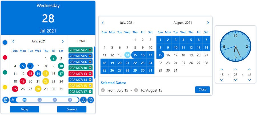
DatePicker
Simple React datepicker component for working with gregorian, persian, arabic and indian calendars
with the ability to select the date in single, multiple and range modes.

Layouts
You can change the appearance of the datepicker to prime or mobile by importing css files from the styles folder.

Plugins
Ability to further customize the calendar and datepicker by adding one or more plugins.
Installation
1npm install --save react-multi-date-picker
Demo
Usage
1import React, { useState } from "react";
2import DatePicker from "@itpsolver/react-multi-date-picker";
3
4export default function Example() {
5  const [value, setValue] = useState(new Date());
6
7  return <DatePicker value={value} onChange={setValue} />;
8}
Browser (non react-app)
1<!DOCTYPE html>
2<html>
3  <head>
4    <meta charset="UTF-8" />
5    <title>React Multi Date Picker</title>
6  </head>
7  <body>
8    <span>Calendar Example :</span>
9    <div id="calendar"></div>
10
11    <span>DatePicker Example :</span>
12    <div id="datePicker"></div>
13
14    <span>Plugins Example :</span>
15    <div id="datePickerWithPlugin"></div>
16
17    <!-- Ract -->
18    <script src="https://unpkg.com/react@17/umd/react.production.min.js"></script>
19    <script src="https://unpkg.com/react-dom@17/umd/react-dom.production.min.js"></script>
20
21    <!-- DatePicker and dependencies-->
22    <script src="https://cdn.jsdelivr.net/npm/date-object@latest/dist/umd/date-object.min.js"></script>
23    <script src="https://cdn.jsdelivr.net/npm/react-element-popper@latest/build/browser.min.js"></script>
24    <script src="https://cdn.jsdelivr.net/npm/react-multi-date-picker@latest/build/browser.min.js"></script>
25
26    <!-- Optional Plugin -->
27    <script src="https://cdn.jsdelivr.net/npm/react-multi-date-picker@latest/build/date_picker_header.browser.js"></script>
28
29    <script>
30      const { DatePicker, Calendar } = ReactMultiDatePicker;
31
32      ReactDOM.render(
33        React.createElement(Calendar),
34        document.getElementById("calendar")
35      );
36
37      ReactDOM.render(
38        React.createElement(DatePicker),
39        document.getElementById("datePicker")
40      );
41
42      ReactDOM.render(
43        React.createElement(DatePicker, {
44          plugins: [React.createElement(DatePickerHeader)],
45        }),
46        document.getElementById("datePickerWithPlugin")
47      );
48    </script>
49  </body>
50</html>
Available props
| Name | Type | Default | Availability (DatePicker/ Calendar) |
|---|---|---|---|
| value | Date, DateObject , String, Number or Array | new Date() | both |
| ref | React.RefObject | both | |
| multiple | Boolean | false (true if value is Array) | both |
| range | Boolean | false | both |
| onlyMonthPicker | Boolean | false | both |
| onlyYearPicker | Boolean | false | both |
| format | String | YYYY/MM/DD | both |
| formattingIgnoreList | Array | both | |
| calendar | Object | gregorian | both |
| locale | Object | gregorian_en | both |
| mapDays | Function | both | |
| onChange | Function | both | |
| onOpen | Function | DatePicker | |
| onClose | Function | DatePicker | |
| onPropsChange | Function | both | |
| onMonthChange | Function | both | |
| onYearChange | Function | both | |
| onFocusedDateChange | Function | both | |
| onPositionChange | Function | DatePicker | |
| digits | Array | both | |
| weekDays | Array | both | |
| months | Array | both | |
| showOtherDays | Boolean | false | both |
| minDate | Date, DateObject, String or Number | both | |
| maxDate | Date, DateObject, String or Number | both | |
| disableYearPicker | Boolean | false | both |
| disableMonthPicker | Boolean | false | both |
| disableDayPicker | Boolean | false | both |
| zIndex | Number | 100 | both |
| plugins | Array | [] | both |
| sort | Boolean | false | both |
| numberOfMonths | Number | 1 | both |
| currentDate | DateObject | both | |
| buttons | Boolean | true | both |
| renderButton | React.ReactElement or Function | both | |
| weekStartDayIndex | Number | both | |
| className | String | both | |
| readOnly | Boolean | false | both |
| disabled | Boolean | false | both |
| hideMonth | Boolean | false | both |
| hideYear | Boolean | false | both |
| hideWeekDays | Boolean | false | both |
| shadow | Boolean | true | both |
| fullYear | Boolean | false | both |
| displayWeekNumbers | Boolean | false | both |
| weekNumber | String | both | |
| weekPicker | Boolean | false | both |
| containerClassName | String | DatePicker | |
| arrowClassName | String | 0 | DatePicker |
| style | React.CSSProperties | {} | DatePicker |
| containerStyle | React.CSSProperties | DatePicker | |
| arrowStyle | React.CSSProperties | 0 | DatePicker |
| arrow | Boolean or React.ReactElement | true | DatePicker |
| animations | Array | false | DatePicker |
| inputClass | String | DatePicker | |
| name | String | DatePicker | |
| id | String | DatePicker | |
| title | String | DatePicker | |
| required | Boolean | DatePicker | |
| placeholder | String | DatePicker | |
| render | React.ReactElement or Function | DatePicker | |
| inputMode | String | DatePicker | |
| scrollSensitive | Boolean | true | DatePicker |
| hideOnScroll | Boolean | false | DatePicker |
| calendarPosition | String | "bottom-left" | DatePicker |
| editable | Boolean | true | DatePicker |
| onlyShowInRangeDates | Boolean | true | DatePicker |
| fixMainPosition | Boolean | false | DatePicker |
| fixRelativePosition | Boolean | false | DatePicker |
| offsetY | Number | 0 | DatePicker |
| offsetX | Number | 0 | DatePicker |
| mobileLabels | Object | DatePicker | |
| portal | Boolean | DatePicker | |
| portalTarget | HTMLElement | DatePicker | |
| onOpenPickNewDate | Boolean | true | DatePicker |
| mobileButtons | HTMLButtonElement[] | [] | DatePicker |
Calendars & Locales
Click here to see the descriptions.
| Calendars | Gregorian | Persian (Solar Hijri) | Jalali | Arabic (Lunar Hijri) | Indian | |
|---|---|---|---|---|---|---|
| /calendars/gregorian | /calendars/persian | /calendars/jalali | /calendars/arabic | /calendars/indian | ||
| Locales | English | /locales/gregorian_en | /locales/persian_en | /locales/persian_en | /locales/arabic_en | /locales/indian_en |
| Farsi | /locales/gregorian_fa | /locales/persian_fa | /locales/persian_fa | /locales/arabic_fa | /locales/indian_fa | |
| Arabic | /locales/gregorian_ar | /locales/persian_ar | /locales/persian_ar | /locales/arabic_ar | /locales/indian_ar | |
| Hindi | /locales/gregorian_hi | /locales/persian_hi | /locales/persian_hi | /locales/arabic_hi | /locales/indian_hi | |
Of course, you can customize the names of the months and days of the week
in both the calendar & input by using the months and weekDays Props.
Also, you can create a custom Calendar and Locale:

No vulnerabilities found.
No security vulnerabilities found.