Gathering detailed insights and metrics for @lbgm/phone-number-input
Installations
npm install @lbgm/phone-number-inputDeveloper Guide
BETA
Typescript
Yes
Module System
CommonJS, ESM
Min. Node Version
>=16.20.1
Node Version
16.20.1
NPM Version
8.19.4
Releases
Unable to fetch releases
Contributors
4
Unable to fetch Contributors
Languages
5
TypeScript
SCSS
Vue
JavaScript
HTML
TypeScript (38.58%)
SCSS (32.62%)
Vue (25.57%)
JavaScript (2.65%)
HTML (0.58%)
Love this project? Help keep it running — sponsor us today! 🚀
Developer
lbgm
Download Statistics
Total Downloads
35,972
Last Day
8
Last Week
8
Last Month
2,400
Last Year
26,478
GitHub Statistics
31 Stars
36 Commits
6 Forks
2 Watching
1 Branches
4 Contributors
Bundle Size
168.56 kB
Minified
50.11 kB
Minified + Gzipped
Maintainers
1
Package Meta Information
Latest Version
1.1.6-alpha.2
Package Id
@lbgm/phone-number-input@1.1.6-alpha.2
Unpacked Size
351.93 kB
Size
91.28 kB
File Count
17
NPM Version
8.19.4
Node Version
16.20.1
Publised On
26 Feb 2024
Total Downloads
Cumulative downloads
Total Downloads
35,972
Last day
0%
8
Compared to previous day
Last week
-97.9%
8
Compared to previous week
Last month
47.5%
2,400
Compared to previous month
Last year
276.6%
26,478
Compared to previous year
Daily Downloads
Weekly Downloads
Monthly Downloads
Yearly Downloads
Versions
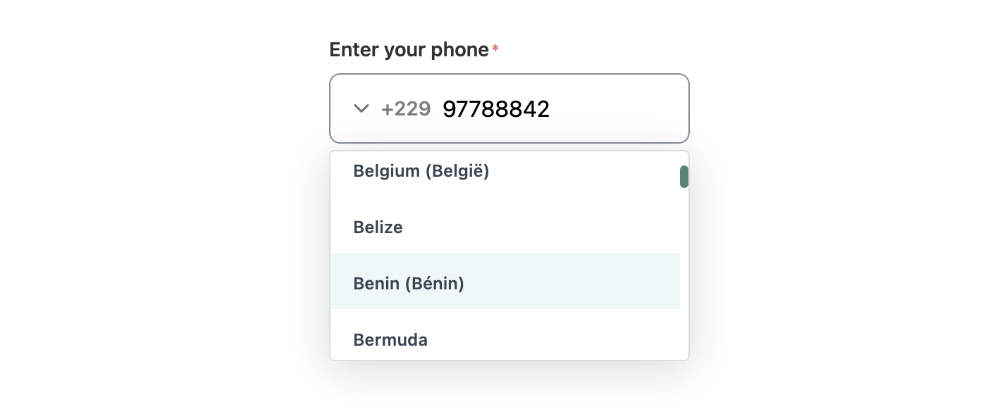
Phone number input
Simple Phone Number Input for VueJs
install
1npm i @lbgm/phone-number-input
Props & Types
1interface PhoneDATA {
2  country?: string;
3  dialCode?: string | number;
4  nationalNumber?: string | number;
5  number?: string | number;
6  isValid?: boolean;
7}
8
9interface Props {
10  value?: string;
11  label?: string;
12  hasError?: boolean;
13  hasSuccess?: boolean;
14  successMessage?: string;
15  errorMessage?: string;
16  placeholder?: string;
17  name?: string;
18  required?: boolean;
19  defaultCountry?: string;
20  arrow?: boolean;
21  listHeight?: number;
22  allowed?: string[];
23}
24
25// default props values
26
27{
28  value: "", // like '22997000000',
29  label: "",
30  hasError: false,
31  hasSuccess: false,
32  successMessage: "",
33  errorMessage: "",
34  placeholder: "",
35  name: "",
36  required: false,
37  defaultCountry: "BJ",
38  arrow: true, // show or hide arrow
39  listHeight: 150,
40  allowed: () => [],
41}
- pass
valueon this format:${dialCode}${nationalNumber} allowedis an array of country iso2 (string).
Slots
arrow
1<!-- to change arrow icon-->
2<phone-input>
3 <template #arrow><icon /><template>
4</phone-input>
use global slot to append content at the end of the component.
1<phone-input>
2  <div>Hello</div>
3</phone-input>
Use
main.ts :
1 import { PhoneInput } from '@lbgm/phone-number-input';
2
3 // register as global component
4 app.component('PhoneInput', PhoneInput);
App.vue :
1// import component style
2import '@lbgm/phone-number-input/style';
use component:
1   <phone-input
2     @phone="phone = $event"
3     @country="country = $event"
4     @phoneData="phoneData = $event"
5     name="phone-number-input"
6     label="Enter your phone"
7     required
8     :value="'22997788842'"
9   />
phoneis stringcountryis stringphoneDatais type PhoneDATA
Use it with Vee-validate
Sample wrapper code:
1<template>
2 <phone-input
3   :has-error="hasError"
4   :errorMessage="errorMessage"
5   @phoneData="validatePhone"
6   ref="phoneInput"
7 />
8</template>
1<script setup lang="ts">
2import { useField } from 'vee-validate';
3import { computed, onMounted, useAttrs, getCurrentInstance, type ComponentInternalInstance } from 'vue';
4import { PhoneInput, type PhoneDATA } from '@lbgm/phone-number-input';
5
6type T_PhoneInput = typeof PhoneInput;
7
8const that: ComponentInternalInstance | null = getCurrentInstance();
9const attrs = useAttrs();
10const emit = defineEmits(['inputData']);
11
12const {
13  value: inputValue,
14  errorMessage,
15  handleBlur,
16  handleChange,
17  meta,
18} = useField(attrs.name, undefined, {
19  initialValue: attrs.value ? attrs.value : '',
20  validateOnValueUpdate: false,
21});
22
23// compute error from vee-validate
24const hasError = computed((): boolean => {
25  return errorMessage.value !== undefined;
26});
27
28const validatePhone = (data: PhoneDATA) => {
29  handleChange(data.nationalNumber, false);
30  emit('inputData', data);
31};
32
33onMounted(() => {
34  if ((that?.refs?.phoneInput as T_PhoneInput).phone) {
35    handleChange((that?.refs.phoneInput as T_PhoneInput).phone);
36  }
37});
38</script>

No vulnerabilities found.
No security vulnerabilities found.