Gathering detailed insights and metrics for @thomasloven/round-slider
Gathering detailed insights and metrics for @thomasloven/round-slider
Gathering detailed insights and metrics for @thomasloven/round-slider
Gathering detailed insights and metrics for @thomasloven/round-slider
npm install @thomasloven/round-sliderTypescript
Module System
Node Version
NPM Version
78
Supply Chain
82.1
Quality
75.9
Maintenance
100
Vulnerability
99.6
License
JavaScript (68.19%)
TypeScript (24.16%)
HTML (7.65%)
Total Downloads
0
Last Day
0
Last Week
0
Last Month
0
Last Year
0
MIT License
86 Stars
57 Commits
26 Forks
3 Watchers
3 Branches
6 Contributors
Updated on Mar 04, 2025
Latest Version
0.6.0
Package Id
@thomasloven/round-slider@0.6.0
Unpacked Size
78.62 kB
Size
15.26 kB
File Count
6
NPM Version
8.19.3
Node Version
16.19.0
Cumulative downloads
Total Downloads
Last Day
0%
NaN
Compared to previous day
Last Week
0%
NaN
Compared to previous week
Last Month
0%
NaN
Compared to previous month
Last Year
0%
NaN
Compared to previous year
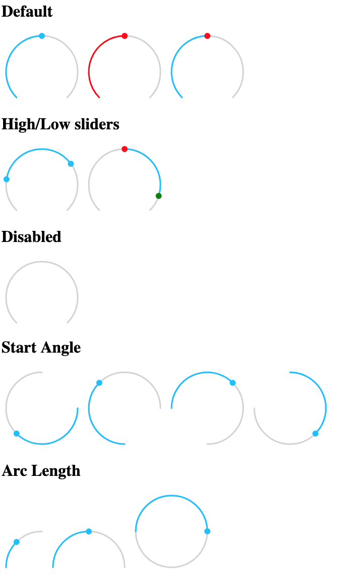
A simple round slider webcomponent - demo

value - Required for single slider
low - Required for high/low slider
high - Required for high/low slider
min - Lower limit of values
max - Higher limit of values
step - Step size of slider
startAngle - Angle in degrees at which slider bar starts (default: 135)
arcLength - Length in degrees of slider bar (default: 270)
handleSize - Radius of handle in pixels (default: 6)
handleZoom - The factor the handle size scales when dragged (default: 1.5)
disabled - Boolean property disabling the slider (default: false)
readonly - Boolean property disabling slider events (default: false)
rtl - Boolean property to have the slider move Right to Left (default: false)
valueLabel - Value to apply to aria-label property of value handle
lowLabel - Value to apply to aria-label property of low handle
highLabel - Value to apply to aria-label property of high handle
outside - if true a high/low slider will fill up from the outsides in of inside out (default: false)
The slider dispatches two events
value-changing when the value is changed but the mouse button is still pressedvalue-changed on release of mouse buttonBoth events pass an object as detail with either value, low, or high set to the new value depending on which slider was pulled.
The following css variables can be used to change the styles:
--round-slider-path-color - color of bar path--round-slider-bar-color - color of bar--round-slider-handle-color - color of handles--round-slider-low-handle-color - color of low handle (overrides --round-slider-handle-color)--round-slider-high-handle-color - color of high handle (overrides --round-slider-handle-color)--round-slider-low-bar-color - color of low bar when outside is true (overrides --round-slider-bar-color)--round-slider-high-bar-color - color of high bar when outside is true (overrides --round-slider-bar-color)--round-slider-handle-cursor - cursor to use on the handles (default pointer)--round-slider-path-width - bar width in pixels (default: 3)--round-slider-linecap - svg linecaps of bar (default: round)See example.html for usage examples.

No vulnerabilities found.
Reason
no binaries found in the repo
Reason
license file detected
Details
Reason
4 existing vulnerabilities detected
Details
Reason
Found 4/30 approved changesets -- score normalized to 1
Reason
0 commit(s) and 0 issue activity found in the last 90 days -- score normalized to 0
Reason
no effort to earn an OpenSSF best practices badge detected
Reason
security policy file not detected
Details
Reason
project is not fuzzed
Details
Reason
branch protection not enabled on development/release branches
Details
Reason
SAST tool is not run on all commits -- score normalized to 0
Details
Score
Last Scanned on 2025-07-07
The Open Source Security Foundation is a cross-industry collaboration to improve the security of open source software (OSS). The Scorecard provides security health metrics for open source projects.
Learn More