Gathering detailed insights and metrics for @wuweiweiwu/react-shopify-draggable
Gathering detailed insights and metrics for @wuweiweiwu/react-shopify-draggable
Gathering detailed insights and metrics for @wuweiweiwu/react-shopify-draggable
Gathering detailed insights and metrics for @wuweiweiwu/react-shopify-draggable
Port of @shopify/draggable to React 🐒
npm install @wuweiweiwu/react-shopify-draggableTypescript
Module System
Node Version
NPM Version
JavaScript (100%)
Total Downloads
0
Last Day
0
Last Week
0
Last Month
0
Last Year
0
MIT License
29 Stars
91 Commits
5 Forks
4 Branches
1 Contributors
Updated on Aug 04, 2024
Latest Version
0.0.5
Package Id
@wuweiweiwu/react-shopify-draggable@0.0.5
Unpacked Size
57.86 kB
Size
12.32 kB
File Count
4
NPM Version
5.6.0
Node Version
8.9.4
Cumulative downloads
Total Downloads
Last Day
0%
NaN
Compared to previous day
Last Week
0%
NaN
Compared to previous week
Last Month
0%
NaN
Compared to previous month
Last Year
0%
NaN
Compared to previous year
54
Port of @shopify/draggable to React
1# adding to project
2npm install @wuweiweiwu/react-shopify-draggable
3# or
4yarn add @wuweiweiwu/react-shopify-draggable
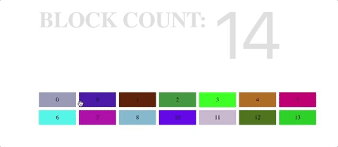
1import React, { Component } from 'react';
2import {
3  DraggableItem,
4  DraggableContainer,
5} from '@wuweiweiwu/react-shopify-draggable';
6
7import '../shared/favicon/favicon.ico';
8import './stylesheets/app.css';
9
10const random255 = () => Math.floor(Math.random() * 256);
11const randomColor = () => `rgb(${random255()}, ${random255()}, ${random255()})`;
12
13class App extends Component {
14  constructor(props) {
15    super(props);
16    this.state = {
17      blockCount: 14,
18    };
19    this.handleBlockCount = this.handleBlockCount.bind(this);
20  }
21
22  handleBlockCount(e) {
23    if (e.target.value) {
24      this.setState({
25        blockCount: parseInt(e.target.value),
26      });
27    }
28  }
29
30  render() {
31    return (
32      <div className="App">
33        <div className="App-body">
34          <div className="App-body-count">
35            <h1 className="App-body-count-text">Block count:</h1>
36            <input
37              type="number"
38              className="App-body-count-input"
39              value={this.state.blockCount}
40              onChange={this.handleBlockCount}
41            />
42          </div>
43          <DraggableContainer
44            as="div"
45            type="sortable"
46            className="BlockGenerator"
47          >
48            {Array.from(Array(this.state.blockCount).keys()).map(number => (
49              <DraggableItem
50                as="div"
51                className="Block"
52                style={{ backgroundColor: randomColor() }}
53              >
54                {number}
55              </DraggableItem>
56            ))}
57          </DraggableContainer>
58        </div>
59      </div>
60    );
61  }
62}
63
64export default App;
<DraggableContainer/>This is the base component that wraps <DraggableItem/>,<DraggableHandle/>, <DroppableZone/>
You specify the draggable, handle, droppable props in this component and they will automatically be passed (deeply) to the Draggable children via React Context
Props that will cause a re-rendering of self (and also child components if shouldComponentUpdate returns true):
aschildren (Nodes passed/nested as children)Props that will only force a re-rendering of child Draggable components using forceUpdate:
draggablehandledroppable| Props | Type | Default | Description |
|---|---|---|---|
| as | string | 'div' | what to render this component as |
| id | string | id to add to this element | |
| className | string or Array<string> | class(es) to add to this element | |
| style | object | css inline styling (React style) | |
| type | 'draggable' or 'droppable' or 'swappable' or 'sortable' | 'draggable' | what type of Draggable instance is it? Draggable, Droppable, Swappable, Sortable. |
| draggable | string | 'draggable-source' | the class added to draggable items |
| handle | string | null | the class added to draggable handles |
| droppable | string | the class added to the droppable zone | |
| collidable | string | the class that specifies the collidable elements | |
| sensors | Array<Sensor> | [] | additional sensors added to Draggable (MouseSensor & TouchSensor already included) |
| plugins | Array<BasePlugin> | [] | additional plugins added to Draggable |
| classes | { [string]: string } | object keyed by events. Values are classnames added. ex: { 'drag:start': '.add-class' } | |
| eleRef | HTMLElement => void | exactly like how refs work in React. This ref will return the base element of the component | |
| dragRef | Draggable => void | similar to how refs work in React. This ref will return the Draggable instance | |
| appendTo | string or HTMLElement or(()=>HTMLElement) | what to append the mirror element to | |
| mirror | { xAxis: boolean, yAxis: boolean, constrainDimensions: boolean} | { xAxis: true, yAxis: true, constrainDimensions: false } | mirror options (see @shopify/draggable docs) |
| swapAnimation | { duration: number, easingFunction: string } | { duration: 150, easingFunction: 'ease-in-out' } | Sortable swap animation options (see @shopify/draggable docs) |
for more documentation on these see @shopify/draggable
ex: onDragStart is the same as 'drag:start' and onSwappableStart is the same as 'swappable:start'
1// Draggable events
2onDragStart?: BaseEvent => void,
3onDragMove?: BaseEvent => void,
4onDragOver?: BaseEvent => void,
5onDragOverContainer?: BaseEvent => void,
6onDragOut?: BaseEvent => void,
7onDragOutContainer?: BaseEvent => void,
8onDragStop?: BaseEvent => void,
9onDragPressure?: BaseEvent => void,
10
11// Mirror events
12onMirrorCreated?: BaseEvent => void,
13onMirrorAttached?: BaseEvent => void,
14onMirrorMove?: BaseEvent => void,
15onMirrorDestroy?: BaseEvent => void,
16
17// Droppable events
18onDroppableOver?: BaseEvent => void,
19onDroppableOut?: BaseEvent => void,
20
21// Sortable events
22onSortableStart?: BaseEvent => void,
23onSortableSorted?: BaseEvent => void,
24onSortableStop?: BaseEvent => void,
25
26// Swappable events
27onSwappableStart?: BaseEvent => void,
28onSwappableSwapped?: BaseEvent => void,
29onSwappableStop?: BaseEvent => void,
30
31// Collidable events
32onCollidableIn?: BaseEvent => void,
33onCollidableOut?: BaseEvent => void,
34
35// Snappable events
36onSnapIn?: BaseEvent => void,
37onSnapOut?: BaseEvent => void,
<DraggableItem/>,<DraggableHandle/>, <DroppableZone/>NOTE #1: DraggableHandle HAS to be nested inside a DraggableItem for it to work
NOTE #2: If you set the handle prop for DraggableContainer but don't have a DraggableHandle inside the container then it won't work.
Props that will cause a re-rendering of self (and child components where shouldComponentUpdate returns true):
aschildren (Nodes passed/nested as children)| Props | Type | Default | Description |
|---|---|---|---|
| as | string | 'div' | what to render this component as |
| id | string | id to add to this element | |
| className | string | class to add to this element (on top of what DraggableContainer will inject) | |
| style | object | css inline styling (React style) | |
| eleRef | HTMLElement => void | exactly like how refs work in React. This ref will return the base element of the component |
@wuweiweiwu/react-shopify-react was built to address @shopify/draggable issue #32 where users were having trouble integrating Draggable with React because re renders would cause the state of the Draggable elements to reset. Unless you wanted to implement the details of shouldComponentUpdate and componentWillReceiveProps it would be difficult to use Draggable with React.
This component provides a <DraggableContainer/> that represents the Draggable container that contains draggable elements. It also provides the classnames that child Draggable components will have. For example: instead of specifying the draggable option and also putting that class explicitly in your HTML it uses React Context to pass down the class names internally. Thus you should NOT nest <DraggableContainer/> inside each other.
Deciding when to rerender in React is a little finicky. If we don't want the internal Draggable state to change on renders then we need to implement our shouldComponentUpdate functions and decide how to update properties such as id and className without causing a rerender. <DraggableContainer/> and other components provided in this package should only rerender if you are changing as or children prop. Other prop changes should not cause a rerender, event options passed to @shopify/draggable. Thus we maintain an internal instance of Draggable that is updated in the React lifecycle function componentWillReceiveProps which is called when the component received new or updated props. Thus we can reset/update the instance without causing a rerender.
1shouldComponentUpdate(nextProps: Props): boolean {
2  console.log('shouldComponentUpdate');
3  // only rerender if as or children is different
4  if (propertiesChanged(this.props, nextProps, ['as', 'children'])) {
5    return true;
6  }
7  return false;
8}
By using context to pass the draggable, handle, droppable options to child components. It means that <DraggableItem/>,<DraggableHandle/>, <DroppableZone/> can be nested infinitely inside other components and it will always receive these update. This functionality is implemented following this concept in this article How to use React Context safely. Thus you can even use Redux with this component and there will be no problems.
Setting inline styles without rerendering involved stealing some code from Facebook React
After cloning the repository and running npm install inside, you can use the following commands to develop and build the project.
1# Starts a webpack dev server that hosts a demo page with the component.
2# It uses react-hot-loader so changes are reflected on save.
3npm start
4
5# Start the storybook, which has several different examples to play with.
6# Also hot-reloaded.
7npm run storybook
8
9# Runs the library tests
10npm test
11
12# Lints the code with eslint
13npm run lint
14
15# run flow type checking
16npm run flow
17
18# Lints and builds the code, placing the result in the dist directory.
19# This build is necessary to reflect changes if you're
20#  `npm link`-ed to this repository from another local project.
21npm run build
Pull requests are welcome!
MIT

No vulnerabilities found.
Reason
no binaries found in the repo
Reason
license file detected
Details
Reason
0 existing vulnerabilities detected
Reason
project is archived
Details
Reason
no SAST tool detected
Details
Reason
Found 0/30 approved changesets -- score normalized to 0
Reason
no effort to earn an OpenSSF best practices badge detected
Reason
security policy file not detected
Details
Reason
project is not fuzzed
Details
Reason
branch protection not enabled on development/release branches
Details
Score
Last Scanned on 2025-06-30
The Open Source Security Foundation is a cross-industry collaboration to improve the security of open source software (OSS). The Scorecard provides security health metrics for open source projects.
Learn More