Gathering detailed insights and metrics for @zougt/vite-plugin-theme-preprocessor
Gathering detailed insights and metrics for @zougt/vite-plugin-theme-preprocessor
Gathering detailed insights and metrics for @zougt/vite-plugin-theme-preprocessor
Gathering detailed insights and metrics for @zougt/vite-plugin-theme-preprocessor
css theme preprocessor plugin for vite
npm install @zougt/vite-plugin-theme-preprocessorTypescript
Module System
Min. Node Version
Node Version
NPM Version
JavaScript (100%)
Total Downloads
0
Last Day
0
Last Week
0
Last Month
0
Last Year
0
MIT License
164 Stars
52 Commits
14 Forks
1 Watchers
1 Branches
2 Contributors
Updated on May 16, 2025
Latest Version
1.4.8
Package Id
@zougt/vite-plugin-theme-preprocessor@1.4.8
Unpacked Size
55.22 kB
Size
15.43 kB
File Count
13
NPM Version
8.1.2
Node Version
16.13.1
Cumulative downloads
Total Downloads
Last Day
0%
NaN
Compared to previous day
Last Week
0%
NaN
Compared to previous week
Last Month
0%
NaN
Compared to previous month
Last Year
0%
NaN
Compared to previous year
5
26
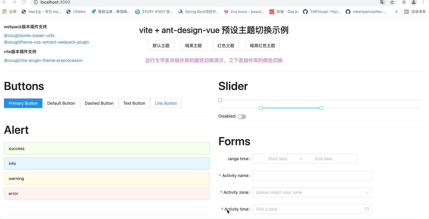
A vite v2.0+ plugin, allows you to easily implementing dynamic themes based on Less or Sass.
v1.4.0 + supported
Any theme color can be selected from the color palette. Here, take LESS as an example, which is also applicable to SCSS.

1# use pnpm (or npm)
2pnpm install color @zougt/vite-plugin-theme-preprocessor @zougt/some-loader-utils -D
3# use yarn
4yarn add color @zougt/vite-plugin-theme-preprocessor @zougt/some-loader-utils -D
vite.config.js
The config Only for Dynamic theme mode.
1import { defineConfig } from "vite";
2import {
3  themePreprocessorPlugin,
4  themePreprocessorHmrPlugin,
5} from "@zougt/vite-plugin-theme-preprocessor";
6import path from "path";
7export default defineConfig({
8  plugins: [
9    themePreprocessorPlugin({
10      less: {
11        // Enable Dynamic theme mode.
12        arbitraryMode: true,
13        // Default theme color,It is usually the same as a theme color (@primary-color) in src/theme/theme-vars.less .
14        defaultPrimaryColor: "#512da7",
15        // Only one item of multipleScopeVars
16        multipleScopeVars: [
17          {
18            // Any string, required
19            scopeName: "theme-default",
20            // path or varscontent must be selected
21            path: path.resolve("src/theme/theme-vars.less"),
22            // varsContent same as content in path
23            // varsContent:`@primary-color:${defaultPrimaryColor};`
24          },
25        ],
26        // The color in CSS is not generated by the theme color variable, and it can also be extracted into the theme CSS to improve the weight
27        includeStyleWithColors: [
28          {
29            // color can be string or string[], example: ["#ffffff","#000"] or ["transparent","none"].
30            color: "#ffffff",
31            // Exclude css props, example: not be #ffffff in background.
32            // excludeCssProps:["background","background-color"]
33            // Exclude css selectors
34            // excludeSelectors: [
35            //   ".ant-btn-link:hover, .ant-btn-link:focus, .ant-btn-link:active",
36            // ],
37          },
38        ],
39      },
40      // scss:{
41
42      // },
43    }),
44    // development need theme HMR
45    themePreprocessorHmrPlugin(),
46  ],
47});
src/theme/theme-vars.less
1/*Note: This file should not be @import in other .less, The variables in this file are not used to set the theme of the project (of course, you can use it as the default theme during loading). The main function is that as long as the variable value here is different from the original variable value of the project, CSS that changes with the theme color gradient will be extracted after compilation*/
2
3/*Important: Once the content of this file is fixed, it does not need to be changed. You can dynamically switch topics online use setCustomTheme method*/
4
5/*Emphasis: the change of variable value will affect the changes of gradientReplacer and targetValueReplacer available attributes of setCustomTheme method, so once the content is fixed, it does not need to be changed.*/
6
7/*A theme color, same as defaultPrimaryColor of themePreprocessorPlugin, inline switch use setCustomTheme({primaryColor})*/
8@primary-color: #512da7;
9
10/*The style corresponding to this color will also change with the main color by default, inline switch  can use setCustomTheme({gradientReplacer:{"#F7D06B"}}) */
11@alert-success-bg-color: #F7D06B;
12
13@border-radius-base: 6px;
Switch Theme Online
use @setCustomTheme module
1import Color from "color";
2// "@setCustomTheme" from themePreprocessorPlugin,Color is essential in setCustomTheme method.
3import setCustomTheme from "@setCustomTheme";
4setCustomTheme({
5  Color,
6  primaryColor: "#FF005A",
7  //gradientReplacer:{},
8  //targetValueReplacer:{}
9});
The available attributes of gradientReplacer and targetValueReplacer follow Less/SCSS content changes.
1# npm run dev
2# npx z-theme inspect to see  gradientReplacer and targetValueReplacer
3npx z-theme inspect
1# use pnpm or npm
2pnpm install @zougt/vite-plugin-theme-preprocessor -D
3# use yarn
4yarn add @zougt/vite-plugin-theme-preprocessor -D
vite.config.js
The config Only for Preset theme mode。
1import themePreprocessorPlugin from "@zougt/vite-plugin-theme-preprocessor";
2export default {
3  plugins: [
4    themePreprocessorPlugin({
5      scss: {
6        // close arbitraryMode
7        arbitraryMode: false,
8        // Provide multiple  LESS/SCSS variable files
9        multipleScopeVars: [
10          {
11            scopeName: "theme-default",
12            // path or varscontent must be selected
13            path: path.resolve("src/theme/default-vars.scss"),
14            // varsContent same as content in path
15            // varsContent:`@primary-color:${defaultPrimaryColor};`
16          },
17          {
18            scopeName: "theme-mauve",
19            path: path.resolve("src/theme/mauve-vars.scss"),
20          },
21        ],
22        // The color in CSS is not generated by the theme color variable, and it can also be extracted into the theme CSS to improve the weight
23        includeStyleWithColors: [
24          {
25            // color can be string or string[], example: ["#ffffff","#000"] or ["transparent","none"].
26            color: "#ffffff",
27            // Exclude css props, example: not be #ffffff in background.
28            // excludeCssProps:["background","background-color"]
29            // Exclude css selectors
30            // excludeSelectors: [
31            //   ".ant-btn-link:hover, .ant-btn-link:focus, .ant-btn-link:active",
32            // ],
33          },
34        ],
35        // add scopeName to html tag className. default use multipleScopeVars[0].scopeName
36        defaultScopeName: "",
37        //  extract independent theme CSS files in production mode  extract为true以下属性有效
38        extract: true,
39        // theme CSS files output dir , default use viteConfig.build.assetsDir
40        outputDir: "",
41        // link tag id
42        themeLinkTagId: "theme-link-tag",
43        // "head"||"head-prepend" || "body" ||"body-prepend"
44        themeLinkTagInjectTo: "head",
45        // Remove scopeName in the extracted CSS content.
46        removeCssScopeName: false,
47        // custom css file name.
48        customThemeCssFileName: (scopeName) => scopeName,
49      },
50      // less: {
51      //   multipleScopeVars: [
52      //     {
53      //       scopeName: "theme-default",
54      //       path: path.resolve("src/theme/default-vars.less"),
55      //     },
56      //     {
57      //       scopeName: "theme-mauve",
58      //       path: path.resolve("src/theme/mauve-vars.less"),
59      //     },
60      //   ],
61      // },
62    }),
63  ],
64};
Switch Theme Online
What needs to be done:
for this, has toggleTheme method :
1import { toggleTheme } from "@zougt/vite-plugin-theme-preprocessor/dist/browser-utils";
2
3toggleTheme({
4  scopeName: "theme-default",
5});

No vulnerabilities found.
Reason
no binaries found in the repo
Reason
license file detected
Details
Reason
0 existing vulnerabilities detected
Reason
Found 2/28 approved changesets -- score normalized to 0
Reason
0 commit(s) and 0 issue activity found in the last 90 days -- score normalized to 0
Reason
no effort to earn an OpenSSF best practices badge detected
Reason
security policy file not detected
Details
Reason
project is not fuzzed
Details
Reason
branch protection not enabled on development/release branches
Details
Reason
SAST tool is not run on all commits -- score normalized to 0
Details
Score
Last Scanned on 2025-07-07
The Open Source Security Foundation is a cross-industry collaboration to improve the security of open source software (OSS). The Scorecard provides security health metrics for open source projects.
Learn More