dw-neit-rc-dropdown
react dropdown component


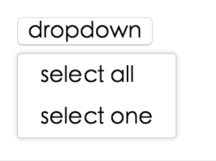
Screenshot
Example
online example: http://react-component.github.io/dropdown/examples/
install

Usage
var Dropdown = require('dw-neit-rc-dropdown');
// use dropdown
API
props
| name | type | default | description |
|---|
| overlayClassName | String | | additional css class of root dom node |
| openClassName | String | `${prefixCls}-open` | className of trigger when dropdown is opened |
| prefixCls | String | dw-neit-rc-dropdown | prefix class name |
| transitionName | String | | dropdown menu's animation css class name |
| animation | String | | part of dropdown menu's animation css class name |
| placement | String | bottomLeft | Position of menu item. There are: top, topCenter, topRight, bottomLeft, bottom, bottomRight |
| onVisibleChange | Function | | call when visible is changed |
| visible | boolean | | whether tooltip is visible |
| defaultVisible | boolean | | whether tooltip is visible initially |
| overlay | rc-menu | | rc-menu element |
| onOverlayClick | function(e) | | call when overlay is clicked |
| minOverlayWidthMatchTrigger | boolean | true (false when set alignPoint) | whether overlay's width must not be less than trigger's |
| getPopupContainer | Function(menuDOMNode): HTMLElement | () => document.body | Where to render the DOM node of dropdown |
|---|
Note: Additional props are passed into the underlying rc-trigger component. This can be useful for example, to display the dropdown in a separate portal-driven window via the getDocument() rc-trigger prop.
Development
npm install
npm start
Test Case
npm test
npm run chrome-test
Coverage
npm run coverage
open coverage/ dir
License
dw-neit-rc-dropdown is released under the MIT license.
