Gathering detailed insights and metrics for dw-neit-rc-dropdown
Installations
npm install dw-neit-rc-dropdownDeveloper Guide
BETA
Typescript
Yes
Module System
CommonJS
Node Version
18.20.4
NPM Version
10.7.0
Score
64.3
Supply Chain
87.2
Quality
75.7
Maintenance
100
Vulnerability
100
License
Releases
Unable to fetch releases
Contributors
1
Love this project? Help keep it running — sponsor us today! 🚀
Download Statistics
Total Downloads
3,642
Last Day
1
Last Week
8
Last Month
24
Last Year
1,052
Bundle Size
58.95 kB
Minified
21.02 kB
Minified + Gzipped
Maintainers
1
Package Meta Information
Latest Version
4.2.0
Package Id
dw-neit-rc-dropdown@4.2.0
Unpacked Size
42.66 kB
Size
8.40 kB
File Count
24
NPM Version
10.7.0
Node Version
18.20.4
Publised On
16 Aug 2024
Total Downloads
Cumulative downloads
Total Downloads
3,642
Last day
0%
1
Compared to previous day
Last week
100%
8
Compared to previous week
Last month
-31.4%
24
Compared to previous month
Last year
-51.4%
1,052
Compared to previous year
Daily Downloads
Weekly Downloads
Monthly Downloads
Yearly Downloads
Dev Dependencies
27
@rc-component/father-plugin@testing-library/jest-dom@testing-library/react@types/classnames@types/jest@types/react@types/react-dom@types/warning@umijs/fabriccross-envdumieslintfatherglobjest-environment-jsdomjquerylesslint-stagednpprettierrc-menurc-resize-observerrc-testreactreact-domregenerator-runtimetypescript
Versions
dw-neit-rc-dropdown
react dropdown component


Screenshot
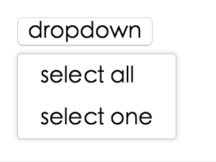
Example
online example: http://react-component.github.io/dropdown/examples/
install

Usage
1var Dropdown = require('dw-neit-rc-dropdown');
2// use dropdown
API
props
| name | type | default | description |
|---|---|---|---|
| overlayClassName | String | additional css class of root dom node | |
| openClassName | String | `${prefixCls}-open` | className of trigger when dropdown is opened |
| prefixCls | String | dw-neit-rc-dropdown | prefix class name |
| transitionName | String | dropdown menu's animation css class name | |
| animation | String | part of dropdown menu's animation css class name | |
| placement | String | bottomLeft | Position of menu item. There are: top, topCenter, topRight, bottomLeft, bottom, bottomRight |
| onVisibleChange | Function | call when visible is changed | |
| visible | boolean | whether tooltip is visible | |
| defaultVisible | boolean | whether tooltip is visible initially | |
| overlay | rc-menu | rc-menu element | |
| onOverlayClick | function(e) | call when overlay is clicked | |
| minOverlayWidthMatchTrigger | boolean | true (false when set alignPoint) | whether overlay's width must not be less than trigger's |
| getPopupContainer | Function(menuDOMNode): HTMLElement | () => document.body | Where to render the DOM node of dropdown |
Note: Additional props are passed into the underlying rc-trigger component. This can be useful for example, to display the dropdown in a separate portal-driven window via the getDocument() rc-trigger prop.
Development
1npm install
2npm start
Test Case
1npm test
2npm run chrome-test
Coverage
1npm run coverage
open coverage/ dir
License
dw-neit-rc-dropdown is released under the MIT license.

No vulnerabilities found.
No security vulnerabilities found.