Gathering detailed insights and metrics for rc-calendar
Gathering detailed insights and metrics for rc-calendar
Gathering detailed insights and metrics for rc-calendar
Gathering detailed insights and metrics for rc-calendar
npm install rc-calendarModule System
Min. Node Version
Typescript Support
Node Version
NPM Version
1,701 Stars
745 Commits
494 Forks
52 Watching
17 Branches
125 Contributors
Updated on 07 Nov 2024
JavaScript (90.86%)
Less (8.97%)
TypeScript (0.16%)
Cumulative downloads
Total Downloads
Last day
-5.6%
23,437
Compared to previous day
Last week
-1.5%
133,650
Compared to previous week
Last month
2.3%
574,372
Compared to previous month
Last year
-11.5%
6,308,473
Compared to previous year
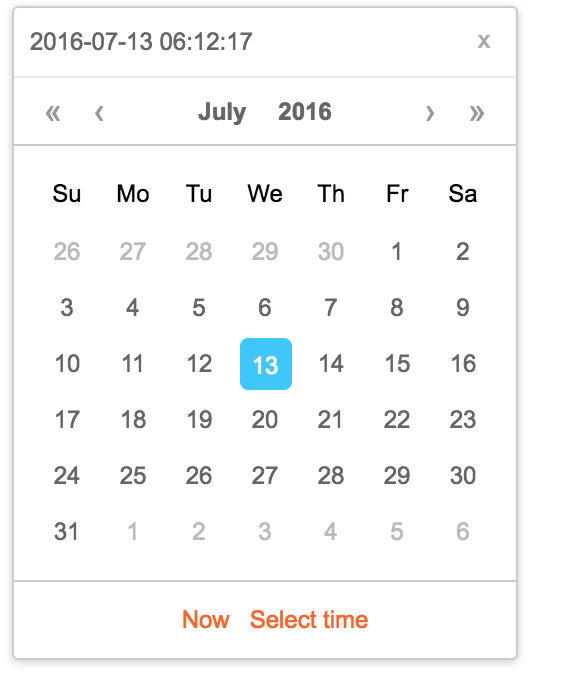
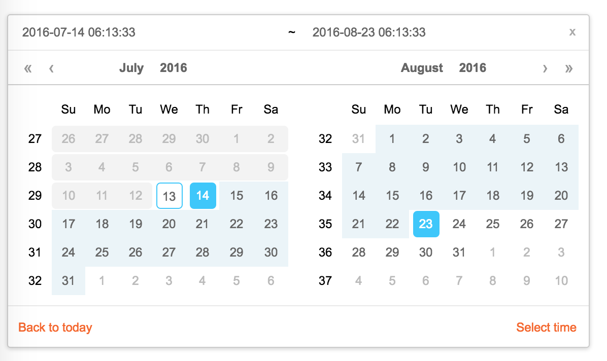
React Calendar


1import Calendar from 'rc-calendar';
2import React from 'react';
3import ReactDOM from 'react-dom';
4ReactDOM.render(<Calendar />, container);
npm install
npm start
http://localhost:8002/examples/
online example:
http://react-component.github.io/calendar/examples/index.html
| name | type | default | description |
|---|---|---|---|
| prefixCls | String | prefixCls of this component | |
| className | String | additional css class of root dom node | |
| style | Object | additional style of root dom node | |
| dateRender | (current, value) => React.Node | date cell | |
| renderSidebar | () => React.Node | side bar | |
| renderFooter | (mode) => React.Node | extra footer | |
| value | moment | current value like input's value | |
| defaultValue | moment | defaultValue like input's defaultValue | |
| locale | Object | import from 'rc-calendar/lib/locale/en_US' | calendar locale |
| format | String | String[] | depends on whether you set timePicker and your locale | use to format/parse date(without time) value to/from input. When an array is provided, all values are used for parsing and first value for display. |
| disabledDate | Function(current:moment):Boolean | whether to disable select of current date | |
| disabledTime | Function(current:moment):Object | a function which return a object with member of disabledHours/disabledMinutes/disabledSeconds according to rc-time-picker | |
| showDateInput | Boolean | true | whether to show input on top of calendar panel |
| showWeekNumber | Boolean | false | whether to show week number of year |
| showToday | Boolean | true | whether to show today button |
| showOk | Boolean | auto | whether has ok button in footer |
| timePicker | React Element | rc-timer-picker/lib/module/panel element | |
| onSelect | Function(date: moment) | called when a date is selected from calendar | |
| onClear | Function() | called when a date is cleared from calendar | |
| onChange | Function(date: moment) | called when a date is changed inside calendar (next year/next month/keyboard) | |
| onOk | Function(date: moment) | called when ok button is pressed, only if it's visible | |
| dateInputPlaceholder | String | date input's placeholder | |
| mode | enum('time', 'date', 'month', 'year', 'decade') | 'date' | control which kind of panel should be shown |
| onPanelChange | Function(date: moment, mode) | called when panel changed | |
| clearIcon | ReactNode | specific the clear icon. | |
| inputMode | string | text | Change the keyboard in mobile device |
| name | type | default | description |
|---|---|---|---|
| prefixCls | String | prefixCls of this component | |
| className | String | additional css class of root dom node | |
| style | Object | additional style of root dom node | |
| renderSidebar | () => React.Node | side bar | |
| renderFooter | () => React.Node | extra footer | |
| selectedValue | moment[] | current selected value range. with two elements. | |
| defaultSelectedValue | moment[] | default selected value range | |
| locale | Object | import from 'rc-calendar/lib/locale/en_US' | calendar locale |
| format | String | depends on whether you set timePicker and your locale | use to format/parse date(without time) value to/from input |
| disabledDate | Function(current:moment):Boolean | whether to disable select of current date | |
| showWeekNumber | Boolean | false | whether to show week number of year |
| showToday | Boolean | true | whether to show today button |
| showOk | Boolean | auto | whether has ok button in footer |
| showClear | Boolean | false | whether has clear button in header |
| timePicker | React Element | rc-timer-picker/lib/module/panel element | |
| onSelect | Function(date: moment[]) | called when a date range is selected from calendar | |
| onInputSelect | Function(date: moment[]) | called when a valid date entered in input | |
| onClear | Function() | called when a date range is cleared from calendar | |
| onChange | Function(date: moment[]) | called when a date range is changed inside calendar (next year/next month/keyboard) | |
| onOk | Function(date: moment) | called when ok button is pressed, only if it's visible | |
| dateInputPlaceholder | String[] | range date input's placeholders | |
| disabledTime | Function(current: moment[], type:'start'|'end'):Object | a function which return a object with member of disabledHours/disabledMinutes/disabledSeconds according to rc-time-picker | |
| showDateInput | Boolean | true | whether to show date inputs on top of calendar panels |
| type | enum('both','start', 'end') | both | whether fix start or end selected value. check start-end-range example |
| mode | enum('date', 'month', 'year', 'decade')[] | ['date', 'date'] | control which kind of panels should be shown |
| onPanelChange | Function(date: moment[], mode) | called when panels changed | |
| hoverValue | moment[] | control hover value | |
| onHoverChange | Function(hoverValue: moment[]) | called when hover value change | |
| clearIcon | ReactNode | specific the clear icon. |
| name | type | default | description |
|---|---|---|---|
| prefixCls | String | prefixCls of this component | |
| className | String | additional css class of root dom node | |
| style | Object | additional style of root dom node | |
| value | moment | current value like input's value | |
| defaultValue | moment | defaultValue like input's defaultValue | |
| locale | Object | import from 'rc-calendar/lib/locale/en_US' | calendar locale |
| disabledDate | Function(current:moment):Boolean | whether to disable select of current month | |
| onSelect | Function(date: moment) | called when a date is selected from calendar | |
| monthCellRender | function | Custom month cell render method | |
| monthCellContentRender | function | Custom month cell content render method,the content will be appended to the cell. | |
| onChange | Function(date: moment) | called when a date is changed inside calendar (next year/next month/keyboard) | |
| renderFooter | () => React.Node | extra footer |
| name | type | default | description |
|---|---|---|---|
| prefixCls | String | prefixCls of this component | |
| calendar | Calendar React Element | ||
| disabled | Boolean | whether picker is disabled | |
| placement | String|Object | one of ['left','right','top','bottom', 'topLeft', 'topRight', 'bottomLeft', 'bottomRight'] | |
| align | Object: alignConfig of [dom-align](https://github.com/yiminghe/dom-align) | value will be merged into placement's align config. | |
| animation | String | index.css support 'slide-up' | |
| transitionName | String | css class for animation | |
| value | moment|moment[] | current value like input's value | |
| defaultValue | moment|moment[] | defaultValue like input's defaultValue | |
| onChange | Function | called when select a different value | |
| onOpenChange | (open:boolean) => void | called when open/close picker | |
| open | Boolean | current open state of picker. controlled prop | |
| getCalendarContainer | () => HTMLElement | () => {return document.body;} | dom node where calendar to be rendered into |
| dropdownClassName | string | additional className applied to dropdown |
| name | type | default | description |
|---|---|---|---|
| prefixCls | String | prefixCls of this component | |
| Select | React Component Class | rc-select Component Class | |
| value | moment | current value like input's value | |
| defaultValue | moment | defaultValue like input's defaultValue | |
| defaultType | string | date | default panel type: date/month |
| type | string | panel type: date/month | |
| onTypeChange | function(type) | called when panel type change | |
| fullscreen | bool | false | |
| monthCellRender | function | Custom month cell render method | |
| dateCellRender | function | Custom date cell render method | |
| monthCellContentRender | function | Custom month cell content render method,the content will be appended to the cell. | |
| dateCellContentRender | function | Custom date cell content render method,the content will be appended to the cell. | |
| onSelect | Function(date: moment) | called when a date is selected from calendar |
npm test
npm run coverage
open coverage/ dir
rc-calendar is released under the MIT license.

No vulnerabilities found.
Reason
no dangerous workflow patterns detected
Reason
no binaries found in the repo
Reason
0 existing vulnerabilities detected
Reason
license file detected
Details
Reason
Found 8/24 approved changesets -- score normalized to 3
Reason
0 commit(s) and 0 issue activity found in the last 90 days -- score normalized to 0
Reason
detected GitHub workflow tokens with excessive permissions
Details
Reason
dependency not pinned by hash detected -- score normalized to 0
Details
Reason
no effort to earn an OpenSSF best practices badge detected
Reason
project is not fuzzed
Details
Reason
branch protection not enabled on development/release branches
Details
Reason
security policy file not detected
Details
Reason
SAST tool is not run on all commits -- score normalized to 0
Details
Score
Last Scanned on 2024-11-18
The Open Source Security Foundation is a cross-industry collaboration to improve the security of open source software (OSS). The Scorecard provides security health metrics for open source projects.
Learn More