Gathering detailed insights and metrics for rc-tabs
Gathering detailed insights and metrics for rc-tabs
Gathering detailed insights and metrics for rc-tabs
Gathering detailed insights and metrics for rc-tabs
npm install rc-tabsModule System
Min. Node Version
Typescript Support
Node Version
NPM Version
566 Stars
671 Commits
233 Forks
15 Watching
16 Branches
90 Contributors
Updated on 26 Nov 2024
Minified
Minified + Gzipped
TypeScript (92.2%)
Less (4.2%)
JavaScript (3.6%)
Cumulative downloads
Total Downloads
Last day
-6.5%
295,618
Compared to previous day
Last week
3.9%
1,577,367
Compared to previous week
Last month
11.4%
6,438,761
Compared to previous month
Last year
20.7%
65,684,387
Compared to previous year
33
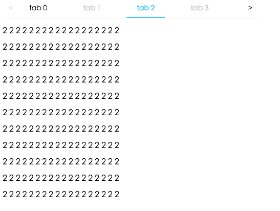
React Tabs component.

http://localhost:8000/examples
online example: https://tabs.react-component.now.sh/
1import Tabs from 'rc-tabs';
2import ReactDom from 'react-dom';
3
4const callback = (key) => {
5  console.log(key);
6};
7
8const items = [
9  {
10    key: '1',
11    label: 'Google',
12    children: (
13      <div className="text-xl">
14        <p>Lorem Ipsum is simply dummy text of the printing and typesetting</p>
15      </div>
16    ),
17  },
18  {
19    key: '2',
20    label: <p>Amazon</p>,
21    children:
22      'Neque porro quisquam est qui dolorem ipsum quia dolor sit amet, consectetur, adipisci velit...',
23    disabled: true,
24  },
25  {
26    key: '3',
27    label: <p>Twitter</p>,
28    children: (
29      <div>
30        "There is no one who loves pain itself, who seeks after it and wants to have it, simply
31        because it is pain..."
32      </div>
33    ),
34  },
35];
36
37ReactDom.render(
38  <Tabs
39    tabPosition="bottom"
40    items={items}
41    defaultActiveKey="1"
42    className="md:w-[70%] w-full mx-auto p-2 border-0"
43    onChange={callback}
44    style={{ color: 'yellow' }}
45  />,
46  root,
47);
| name | type | default | description |
|---|---|---|---|
| prefixCls | string | 'rc-tabs' | prefix class name, use to custom style |
| className | string | - | to define a class name for an element |
| style | CSS properties | - | object with css properties for styling |
| items | TabItem[] | [] | configure tab content |
| id | string | - | unique identifier |
| defaultActiveKey | string | - | initial active tabPanel's key if activeKey is absent |
| activeKey | string | - | current active tabPanel's key |
| direction | 'ltr' or 'rtl' | 'ltr' | Layout direction of tabs component |
| animated | boolean | { inkBar: boolean, tabPane: boolean } | { inkBar: true, tabPane: false } | config animation |
| renderTabBar | (props, TabBarComponent) => ReactElement | - | How to render tab bar |
| tabBarExtraContent | ReactNode | { left: ReactNode, right: ReactNode } | - | config extra content |
| tabBarGutter | number | 0 | config tab bar gutter |
| tabBarPosition | 'left' | 'right' | 'top' | 'bottom' | 'top' | tab nav 's position |
| tabBarStyle | style | - | tab nav style |
| tabPosition | 'left' or 'right' or 'top' or 'bottom' | 'top' | tab nav 's position |
| destroyInactiveTabPane | boolean | false | whether destroy inactive TabPane when change tab |
| onChange | (key) => void | - | called when tabPanel is changed |
| onTabClick | (key) => void | - | called when tab click |
| onTabScroll | ({ direction }) => void | - | called when tab scroll |
| editable | { onEdit(type: 'add' | 'remove', info: { key, event }), showAdd: boolean, removeIcon: ReactNode, addIcon: ReactNode } | - | config tab editable |
| locale | { dropdownAriaLabel: string, removeAriaLabel: string, addAriaLabel: string } | - | Accessibility locale help text |
| moreIcon | ReactNode | - | collapse icon |
| name | type | default | description |
|---|---|---|---|
| key | string | - | corresponding to activeKey, should be unique |
| label | string | - | TabPane's head display text |
| tab | ReactNode | - | current tab's title corresponding to current tabPane |
| className | string | - | to define a class name for an element |
| style | CSS properties | - | object with css properties for styling |
| disabled | boolean | false | set TabPane disabled |
| children | ReactNode | - | TabPane's head display content |
| forceRender | boolean | false | forced render of content in tabs, not lazy render after clicking on tabs |
| closable | boolean | false | closable feature of tab item |
| closeIcon | ReactNode | - | Config close icon |
| prefixCls | string | 'rc-tabs-tab' | prefix class name, use to custom style |
| id | string | - | unique identifier |
| animated | boolean | { inkBar: boolean, tabPane: boolean } | { inkBar: true, tabPane: false } | config animation |
| destroyInactiveTabPane | boolean | false | whether destroy inactive TabPane when change tab |
| active | boolean | false | active feature of tab item |
| tabKey | string | - | key linked to tab |
| name | type | default | description |
|---|---|---|---|
| destroyInactiveTabPane | boolean | false | whether destroy inactive TabPane when change tab |
| key | string | - | corresponding to activeKey, should be unique |
| forceRender | boolean | false | forced render of content in tabs, not lazy render after clicking on tabs |
| tab | ReactNode | - | current tab's title corresponding to current tabPane |
| closeIcon | ReactNode | - | Config close icon |
npm install
npm start
npm test
npm run chrome-test
npm run coverage
open coverage/ dir
rc-tabs is released under the MIT license.
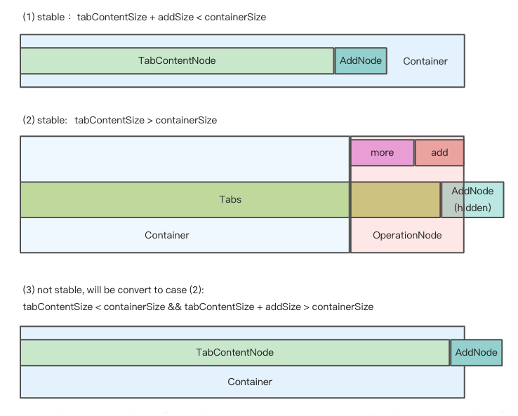
There are 3 cases when handling responsive tabs:

We get hidden tabs through useVisibleRange.ts.
If enconter the third case, in order to make tabs responsive, some tabs should be hidden.
So we minus addSize when calculating basicSize manully, even though there's no addNode in container.
In this way, case 3 turns to case 2, tabs become stable again.

No vulnerabilities found.
Reason
13 commit(s) and 0 issue activity found in the last 90 days -- score normalized to 10
Reason
no dangerous workflow patterns detected
Reason
no binaries found in the repo
Reason
0 existing vulnerabilities detected
Reason
license file detected
Details
Reason
SAST tool is not run on all commits -- score normalized to 4
Details
Reason
Found 9/23 approved changesets -- score normalized to 3
Reason
detected GitHub workflow tokens with excessive permissions
Details
Reason
no effort to earn an OpenSSF best practices badge detected
Reason
project is not fuzzed
Details
Reason
branch protection not enabled on development/release branches
Details
Reason
security policy file not detected
Details
Score
Last Scanned on 2024-11-18
The Open Source Security Foundation is a cross-industry collaboration to improve the security of open source software (OSS). The Scorecard provides security health metrics for open source projects.
Learn More