Installations
npm install react-native-easy-content-loaderDeveloper Guide
Typescript
Yes
Module System
CommonJS
Node Version
13.3.0
NPM Version
6.13.2
Score
36.6
Supply Chain
55.4
Quality
66.7
Maintenance
50
Vulnerability
93.6
License
Releases
Contributors
Unable to fetch Contributors
Languages
TypeScript (100%)
Love this project? Help keep it running — sponsor us today! 🚀
Developer
sarmad1995
Download Statistics
Total Downloads
472,772
Last Day
28
Last Week
1,825
Last Month
8,161
Last Year
85,491
GitHub Statistics
MIT License
230 Stars
70 Commits
23 Forks
5 Watchers
3 Branches
3 Contributors
Updated on Feb 11, 2025
Maintainers
Package Meta Information
Latest Version
0.3.2
Package Id
react-native-easy-content-loader@0.3.2
Unpacked Size
53.61 kB
Size
9.76 kB
File Count
21
NPM Version
6.13.2
Node Version
13.3.0
Total Downloads
Cumulative downloads
Total Downloads
472,772
Last Day
-46.2%
28
Compared to previous day
Last Week
-12.1%
1,825
Compared to previous week
Last Month
19.9%
8,161
Compared to previous month
Last Year
-0.9%
85,491
Compared to previous year
Daily Downloads
Weekly Downloads
Monthly Downloads
Yearly Downloads
Dependencies
1
Peer Dependencies
2


Provide a placeholder at the place which need waiting for loading, Easy to implement and fun to use, this package is highly customizable, Please go through docs to find info :).
I tried to move this package to @sarmad1995/react-native-content-loader, but seems like people are using this version a lot, so I will be maintaining this version from now, @sarmad1995/react-native-content-loader also has all the features.
Features
- :gear: Customizable: Feel free to change the colors, speed, sizes, paragraphs, title and much more.
- ⚛️ Lightweight: Lightweight with only neccessory code.
- :tada: Typescript: Fully typed
Index
Getting Started
1npm install react-native-easy-content-loader --save
2yarn add react-native-easy-content-loader
Examples
Simple Example
1<ContentLoader active />
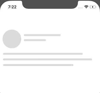
With Avatar
1<ContentLoader active avatar />
With Loading State
1<ContentLoader active avatar loading={this.state.loading}>
2  <Text>This would be rendered with loading is false</Text>
3</ContentLoader>
Number of paragraphs
1<ContentLoader active avatar pRows={4} />
Different Widths for differnt paragrahs lines
1<ContentLoader active avatar pRows={4} pWidth={["100%", 200, "25%", 45]} />
Facebook and Instagram Style
These are also flexible and customizable
| Facebook loader | Instagram loader |
|---|---|
|  |
1import { FacebookLoader, InstagramLoader } from 'react-native-easy-content-loader';
2
3<FacebookLoader active />
4
5<InstagramLoader active />
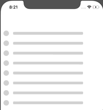
Bullets Style
1<Bullets active listSize={10} />
Default Style
It is highly customizable, please refer the options sections.
1import ContentLoader from "react-native-easy-content-loader";
2<ContentLoader
3  avatar
4  pRows={5}
5  pHeight={[100, 30, 20]}
6  pWidth={[100, 70, 100]}
7/>;
| Added custom heights and widths | Same with other loaders |
|---|---|
 |  |
Some more examples,
1<FacebookLoader pHeight={[20, 10]} />
2<ContentLoader reverse avatar pRows={5} pHeight={[40, 30, 20]} />
3
1<ContentLoader active listSize={10} />
| Default Loader | Colored |
|---|---|
 |  |
Usage
1import ContentLoader, {
2  FacebookLoader,
3  InstagramLoader,
4  Bullets
5} from "react-native-easy-content-loader";
1<ContentLoader active />
Options
These Options are common with every component,
primaryColor?: string, rgba/hex
Defaults to rgba(220, 220, 220, 1).
secondaryColor? string, rgba/hex
Defaults to rgba(200, 200, 200, 1).
animationDuration? number
Defaults to 500. The animation transition time from primaryColor to secondaryColor
loading?: bool | null
Defaults to null, If given a bool value, when false, it will return children (Works as a wrapper component)
active? bool
Defaults to false, true if you want to animate the compoennt.
title? bool
Defaults to true. If you want to show the title, Works only with ContentLoader.
titleStyles? object
Add styles to title.
listSize? number
Defaults to 1. If you want to render a list of loaders, Works with all the loaders.
avatar? bool
Defaults to false. If you want to render the avatar.
aShape? string 'circle' | 'square'
Defaults to circle. shape of the avatar, can be circle or square.
aSize? string 'default' 'small' 'large' | number
Defaults to default. can be a specific number.
reverse? bool
Defaults to false. if you want to reverse the view.
containerStyles? object
If you want to add style to container.
Title specific options.
tHeight? string | number
Used to change the title height.
tWidth? stirng | number
Used to change the title width.
sTHeight? string | number
Used to change the secondary title height Works with only Facebook and Instagram.
sTWidth? string | number
Used to change the secondary title width Works with only Facebook and Instagram.
titleStyles? object
Add styles to title.
secondaryTitleStyles? object
Add styles to secondaryTitle. Works with only Facebook and Instagram.
Paragraph specific options.
pHeight? string | number | array
Paragraph line height, Can specify same height with single value, Or could use array for different heights, eg ['100%', 200, 300], you can use pHeight and pWidth to achieve different shapes as well,
pWidth? string | number | array
Paragraph line width, Can specify same width with single value, Or could use array for different widths, eg ['100%', 200, 300]
paragraphStyles? objecct
Add paragraph styles
Instagram specific options.
imageHeight? number
Change the height of the image
imageStyles? number
Add styles to image
Release History
See CHANGE_LOG.md.
Contributing
Feel free to contribute, this is still in beta and I have plans to include more features in future :)

No vulnerabilities found.
Reason
no binaries found in the repo
Reason
license file detected
Details
- Info: project has a license file: LICENSE:0
- Info: FSF or OSI recognized license: MIT License: LICENSE:0
Reason
3 existing vulnerabilities detected
Details
- Warn: Project is vulnerable to: GHSA-f8q6-p94x-37v3
- Warn: Project is vulnerable to: GHSA-xvch-5gv4-984h
- Warn: Project is vulnerable to: GHSA-c2qf-rxjj-qqgw
Reason
Found 1/25 approved changesets -- score normalized to 0
Reason
0 commit(s) and 0 issue activity found in the last 90 days -- score normalized to 0
Reason
no effort to earn an OpenSSF best practices badge detected
Reason
security policy file not detected
Details
- Warn: no security policy file detected
- Warn: no security file to analyze
- Warn: no security file to analyze
- Warn: no security file to analyze
Reason
project is not fuzzed
Details
- Warn: no fuzzer integrations found
Reason
SAST tool is not run on all commits -- score normalized to 0
Details
- Warn: 0 commits out of 7 are checked with a SAST tool
Score
3
/10
Last Scanned on 2025-02-10
The Open Source Security Foundation is a cross-industry collaboration to improve the security of open source software (OSS). The Scorecard provides security health metrics for open source projects.
Learn More