Gathering detailed insights and metrics for react-native-form-component
Gathering detailed insights and metrics for react-native-form-component
Gathering detailed insights and metrics for react-native-form-component
Gathering detailed insights and metrics for react-native-form-component
@gluestack-ui/form-control
A universal headless form-control component for React Native, Next.js & React
tcomb-form-native
react-native powered UI library for developing forms writing less code
simple-react-form
A library to make reusable form components in React and React Native
react-native-radio-buttons-group
Simple and Best. An easy to use radio buttons for react native apps.
A customizable form component for react-native. It handles basic validation of input, and also alerts the user of failed validations.
npm install react-native-form-componentTypescript
Module System
TypeScript (73.37%)
JavaScript (26.63%)
Total Downloads
38,255
Last Day
18
Last Week
152
Last Month
642
Last Year
6,899
MIT License
60 Stars
512 Commits
5 Forks
1 Watchers
1 Branches
1 Contributors
Updated on Oct 01, 2024
Latest Version
2.6.14
Package Id
react-native-form-component@2.6.14
Unpacked Size
258.81 kB
Size
55.36 kB
File Count
98
Published on
Jan 19, 2024
Cumulative downloads
Total Downloads
Last Day
5.9%
18
Compared to previous day
Last Week
-14.1%
152
Compared to previous week
Last Month
64.2%
642
Compared to previous month
Last Year
-41.2%
6,899
Compared to previous year
2
20
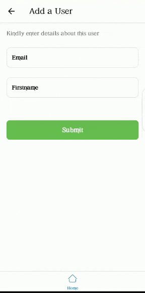
A customizable form component for react-native.
It handles basic validation of inputs, and also alerts you of failed validations.

1yarn add react-native-form-component
| Name | Description |
|---|---|
| submitForm | Does the same thing as onButtonPress() in Form component. It does validation first, then carries out the defined action |
Wrapper component for form items. It is advised to use this component to wrap every other component contained in this library. The Form component comes with a button that does validation of FormItems when clicked. The default validation for each FormItem is based on the value of its keyboardType prop.
1import { Form, FormItem } from 'react-native-form-component';
2//...
3
4return (
5  <Form onButtonPress={() => console.warn('do something')}>
6    <FormItem />
7  </Form>
8);
| Prop | Function | Type | Default | Platform |
|---|---|---|---|---|
| keyboardVerticalOffset | Distance between the top of the user screen and the Form component, may be non-zero in some use cases. | number | 50 | iOS |
| buttonText | Text to be displayed by submit button | string | Submit | All |
| buttonStyle | Style of submit button | object | object[] | - | All |
| buttonTextStyle | Style of submit button text | object | object[] | - | All |
| onButtonPress | Action to be performed when submit button is pressed | () => void | - | All |
| style | Style Form wrapper | ViewStyle | {} | All |
| hideSubmitButton | To not render the submit button | boolean | false | All |
1import React, { useRef } from 'react';
2import { FormItem } from 'react-native-form-component';
3//...
4
5const emailInput = useRef();
6
7return (
8  //...
9  <FormItem
10    label="Email"
11    isRequired
12    value={email}
13    onChangeText={(email) => setEmail(email)}
14    asterik
15    ref={emailInput}
16  />
17);
Inherits TextInput Props
| Prop | Function | Type | Required |
|---|---|---|---|
| ref | ref for item | React.Ref | yes |
| value | Value to show for the FormItem | string | yes |
| label | Label for FormItem | string | no |
| labelStyle | Style of label | object | object[] | no |
| textInputStyle | Style of TextInput portion of FormItem | object | object[] | no |
| isRequired | Indicates whethter this item is required or not | boolean | no |
| underneathText | Text just below the FormItem | string | no |
| underneathTextStyle | Style of underneathText | object | object[] | no |
| customValidation | A function used to add custom validation to a FormItem. The function returns an object of the shape {status: boolean, message: string}. status is true when the validation passes and false when it fails. message is the underneath text to be shown when validation fails. | () => {status: boolean, message: string} | no |
| asterik | Whether or not to add an asterik to label | boolean | no |
| children | A ReactElement to render on the left part of the TextInput. Usually an icon | ReactElement | no |
| floatingLabel | Whether or not the label should float | boolean | no |
| textArea | Whether or not the input should be a textArea | boolean | no |
| showErrorIcon | Whether or not to show an icon when an error occurs | boolean | no |
| errorBorderColor | Set the color of the border when an error occurs | string | no |
| showIcon | Icon to be rendered when secureTextEntry is true and you want password to be visible | JSX.Element | no |
| hideIcon | Icon to be rendered when secureTextEntry is true and you want password to be hidden | JSX.Element | no |
1import { Label } from 'react-native-form-component';
2//...
3
4return (
5  //...
6  <Label text="repository name" isRequired />
7);
| Prop | Type | Required |
|---|---|---|
| text | string | yes |
| asterik | boolean | no |
| textStyle | TextStyle | no |
| style | ViewStyle | no |
| asterikStyle | object | object[] | no |
1import { Modal } from 'react-native-form-component';
2
3return (
4  <Modal show isRequired>
5    <View style={{ flex: 1, alignItems: 'center', justifyContent: 'center' }}>
6      <Text>I am inside a modal!</Text>
7    </View>
8  </Modal>
9);
Inherits Modal Props
| Prop | Type | Required |
|---|---|---|
| show | boolean | yes |
| backgroundColor | string | no |
| children | ReactNode | no |

1import React, { useState } from 'react';
2import { Picker } from 'react-native-form-component';
3
4const [number, setNumber] = useState(1);
5
6return (
7  <Picker
8    items={[
9      { label: 'One', value: 1 },
10      { label: 'Two', value: 2 },
11      { label: 'Three', value: 3 },
12    ]}
13    label="Pick a number"
14    selectedValue={number}
15    onSelection={(item) => setNumber(item.value)}
16  />
17);
| Prop | Type | Required |
|---|---|---|
| items | Array<{label: string; value: string | number}> | yes |
| onSelection | (item) => void | yes |
| selectedValue | string | number | yes |
| pickerIcon | ReactNode | no |
| iconWrapperStyle | ViewStyle | no |
| asterik | boolean | no |
| asterikStyle | TextStyle | no |
| label | string | no |
| labelStyle | TextStyle | no |
| labelWrapperStyle | ViewStyle | no |
| placeholder | string | no |
| selectedValueStyle | TextStyle | no |
| buttonStyle | ViewStyle | no |
| itemLabelStyle | TextStyle | no |
| type | "modal" | "dropdown" | no |
1import React, { useState } from 'react';
2import { PinInput } from 'react-native-form-component';
3
4const [pin, setPin] = useState('');
5
6return <PinInput numOfInput={4} onChangeText={(text) => setPin(text)} />;
| Prop | Type | Required |
|---|---|---|
| numOfInput | number | yes |
| onChangeText | (text: string) => void | yes |
| textInputStyle | TextStyle | no |
| style | StyleProp | no |
See the contributing guide to learn how to contribute to the repository and the development workflow.
MIT

No vulnerabilities found.
Reason
no dangerous workflow patterns detected
Reason
no binaries found in the repo
Reason
license file detected
Details
Reason
Found 0/20 approved changesets -- score normalized to 0
Reason
detected GitHub workflow tokens with excessive permissions
Details
Reason
0 commit(s) and 0 issue activity found in the last 90 days -- score normalized to 0
Reason
no effort to earn an OpenSSF best practices badge detected
Reason
dependency not pinned by hash detected -- score normalized to 0
Details
Reason
security policy file not detected
Details
Reason
project is not fuzzed
Details
Reason
SAST tool is not run on all commits -- score normalized to 0
Details
Reason
90 existing vulnerabilities detected
Details
Score
Last Scanned on 2025-07-07
The Open Source Security Foundation is a cross-industry collaboration to improve the security of open source software (OSS). The Scorecard provides security health metrics for open source projects.
Learn More