Gathering detailed insights and metrics for react-native-liquid-gauge
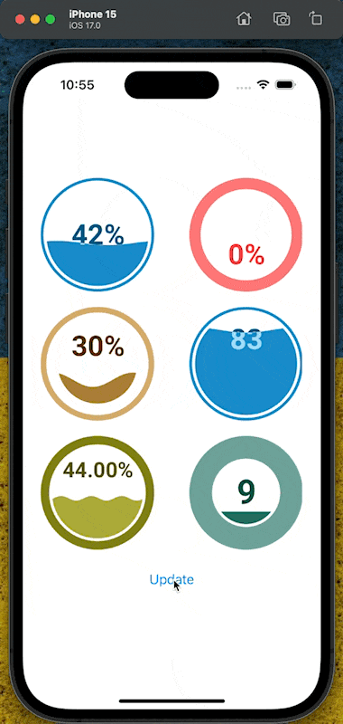
Unveiling the React Native Liquid Gauge, a charming and highly customizable UI component engineered to represent progress in a visually intuitive manner. This library is built on top of react-native-skia, ensuring smooth rendering and high performance across different platforms while making it easier to integrate within your React Native projects.
Installations
npm install react-native-liquid-gaugeDeveloper Guide
BETA
Typescript
Yes
Module System
CommonJS
Min. Node Version
>= 18.0.0
Node Version
18.17.1
NPM Version
9.6.7
Score
30.3
Supply Chain
54.7
Quality
65.6
Maintenance
50
Vulnerability
93.2
License
Contributors
1
Unable to fetch Contributors
Languages
2
TypeScript
JavaScript
TypeScript (82.72%)
JavaScript (17.28%)
Love this project? Help keep it running — sponsor us today! 🚀
Developer
dimaportenko
Download Statistics
Total Downloads
1,978
Last Day
4
Last Week
53
Last Month
207
Last Year
1,804
GitHub Statistics
MIT License
24 Stars
19 Commits
3 Forks
2 Watchers
1 Branches
1 Contributors
Updated on Jan 31, 2025
Maintainers
1
Package Meta Information
Latest Version
0.1.3
Package Id
react-native-liquid-gauge@0.1.3
Unpacked Size
219.96 kB
Size
100.90 kB
File Count
18
NPM Version
9.6.7
Node Version
18.17.1
Published on
Oct 20, 2023
Total Downloads
Cumulative downloads
Total Downloads
1,978
Last Day
33.3%
4
Compared to previous day
Last Week
12.8%
53
Compared to previous week
Last Month
3.5%
207
Compared to previous month
Last Year
936.8%
1,804
Compared to previous year
Daily Downloads
Weekly Downloads
Monthly Downloads
Yearly Downloads
Peer Dependencies
5
Dev Dependencies
23
@commitlint/config-conventional@evilmartians/lefthook@react-native/eslint-config@release-it/conventional-changelog@shopify/react-native-skia@types/d3@types/jest@types/react@types/react-nativecommitlintd3del-clieslinteslint-config-prettiereslint-plugin-prettierjestprettierreactreact-nativereact-native-builder-bobreact-native-reanimatedrelease-ittypescript
react-native-liquid-gauge


Unveiling the React Native Liquid Gauge, a charming and highly customizable UI component engineered to represent progress in a visually intuitive manner. This library is built on top of react-native-skia, ensuring smooth rendering and high performance across different platforms while making it easier to integrate within your React Native projects.
Installation
This library has peer dependencies on react-native-skia, react-native-reanimated, d3 and for typescript @types/d3
1npm install react-native-liquid-gauge @shopify/react-native-skia react-native-reanimated d3
2npm install --save-dev @types/d3
Follow additional steps on the libraries documentaiton page react-native-skia, react-native-reanimated.
Usage
Take a look example directory
1  import { LiquidGauge } from 'react-native-liquid-gauge';
2
3  // with default config
4  <LiquidGauge value={60} />
5
6  // or with custom config
7  <LiquidGauge
8    config={{
9      circleColor: '#FF7777',
10      textColor: '#FF4444',
11      waveTextColor: '#FFAAAA',
12      waveColor: '#FFDDDD',
13      circleThickness: 0.2,
14      textVertPosition: 0.2,
15      waveAnimateTime: 1000,
16    }}
17    value={30}
18    width={200}
19    height={200}
20  />
Props
The LiquidGauge component accepts the following props:
config (optional)
A configuration object that can override the default settings of the gauge. It is a partial type of GaugeConfig and can include any of the following properties:
1{
2  minValue: number;           // Default: 0 - The gauge minimum value.
3  maxValue: number;           // Default: 100 - The gauge maximum value.
4  circleThickness: number;    // Default: 0.05 - The outer circle thickness as a percentage of its radius.
5  circleFillGap: number;      // Default: 0.05 - The size of the gap between the outer circle and wave circle as a percentage of the outer circles radius.
6  circleColor: string;        // Default: '#178BCA' - The color of the outer circle.
7  waveHeight: number;         // Default: 0.05 - The wave height as a percentage of the radius of the wave circle.
8  waveCount: number;          // Default: 1 - The number of full waves per width of the wave circle.
9  waveRiseTime: number;       // Default: 1000 - The amount of time in milliseconds for the wave to rise from 0 to its final height.
10  waveAnimateTime: number;    // Default: 18000 - The amount of time in milliseconds for a full wave to enter the wave circle.
11  waveRise: boolean;          // Default: true - Control if the wave should rise from 0 to its full height, or start at its full height.
12  waveHeightScaling: boolean; // Default: true - Controls wave size scaling at low and high fill percentages.
13  waveAnimate: boolean;       // Default: true - Controls if the wave scrolls or is static.
14  waveColor: string;          // Default: '#178BCA' - The color of the fill wave.
15  waveOffset: number;         // Default: 0 - The amount to initially offset the wave. 0 = no offset. 1 = offset of one full wave.
16  textVertPosition: number;   // Default: 0.5 - The height at which to display the percentage text within the wave circle. 0 = bottom, 1 = top.
17  textSize: number;           // Default: 1 - The relative height of the text to display in the wave circle. 1 = 50%
18  valueCountUp: boolean;      // Default: true - If true, the displayed value counts up from 0 to its final value upon loading. If false, the final value is displayed.
19  textSuffix: string;         // Default: '%' - The text suffix to display after the value.
20  textColor: string;          // Default: '#045681' - The color of the value text when the wave does not overlap it.
21  waveTextColor: string;      // Default: '#A4DBf8' - The color of the value text when the wave overlaps it.
22  toFixed: number;            // Default: 0 - Round value to this many decimal places.
23}
width (optional)
The width of the gauge component. Default is 150.
height (optional)
The height of the gauge component. Default is 150.
value (optional)
The current value of the gauge. Default is 50.
Contributing
See the contributing guide to learn how to contribute to the repository and the development workflow.
License
MIT
Made with create-react-native-library
TODO
- publish to npm
- test install as npm package
- add github action to publish to npm
- add readme

No vulnerabilities found.
No security vulnerabilities found.