Gathering detailed insights and metrics for react-native-woodpicker
Gathering detailed insights and metrics for react-native-woodpicker
Gathering detailed insights and metrics for react-native-woodpicker
Gathering detailed insights and metrics for react-native-woodpicker
npm install react-native-woodpickerModule System
Min. Node Version
Typescript Support
Node Version
NPM Version
161 Stars
133 Commits
22 Forks
4 Watching
6 Branches
7 Contributors
Updated on 20 Nov 2024
Minified
Minified + Gzipped
TypeScript (71.64%)
Java (13.67%)
Objective-C (9.9%)
Ruby (1.76%)
JavaScript (1.71%)
Starlark (1.32%)
Cumulative downloads
Total Downloads
Last day
-16.1%
405
Compared to previous day
Last week
-3.5%
2,745
Compared to previous week
Last month
24.8%
12,663
Compared to previous month
Last year
9.8%
118,707
Compared to previous year
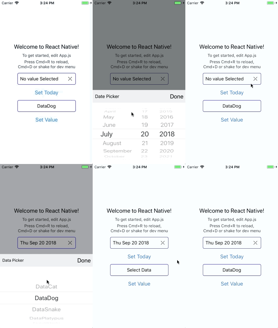
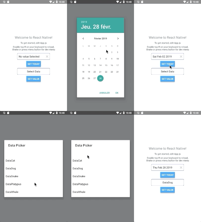
Customisable picker and datePicker react-native components for Android and iOS.


1yarn add react-native-woodpicker @react-native-community/datetimepicker @react-native-picker/picker
or
1npm install react-native-woodpicker @react-native-community/datetimepicker @react-native-picker/picker --save
1// add react-native-woodpicker with your package manager (yarn / npm / ...) and :
2expo install @react-native-community/datetimepicker @react-native-picker/picker
New Version 0.1.0 integrate new React-Native component DateTimePicker from @react-native-community/datetimepicker and Hooks.
Don't forget to add it to your project.
New Version 0.2.0 integrate new React-Native component Picker from @react-native-community/picker.
New Version 0.3.0 use Typescript and change the picker dependency from @react-native-community/picker to @react-native-picker/picker.
Thanks to everyone for your contribution! I try my best to review and update this repository. PR and feedback are welcomed!
You can use Picker to pick values/objects.
1import type { PickerItem } from 'react-native-woodpicker'
2import { Picker } from 'react-native-woodpicker'
3
4[...]
5
6const ExampleApp = (): JSX.Element => {
7  const [pickedData, setPickedData] = useState<PickerItem>();
8
9  const data: Array<PickerItem> = [
10    { label: "DataCat", value: 1 },
11    { label: "DataDog", value: 2 },
12    { label: "DataSnake", value: 3 },
13    { label: "DataPlatypus", value: 4 },
14    { label: "DataWhale", value: 5 }
15  ];
16
17  return (
18    <View>
19      <Picker
20        item={pickedData}
21        items={data}
22        onItemChange={setPickedData}
23        title="Data Picker"
24        placeholder="Select Data"
25        isNullable={false}
26      //backdropAnimation={{ opacity: 0 }}
27      //mode="dropdown"
28      //isNullable
29      //disable
30    />
31    </View>
32  );
33}
You can use DatePicker to pick Dates. Unlike the Picker, you need to handle the placeholder.
1import { DatePicker } from 'react-native-woodpicker'
2
3[...]
4
5const ExampleApp = (): JSX.Element => {
6  const [pickedDate, setPickedDate] = useState<Date>();
7
8  const handleText = (): string => pickedDate
9      ? pickedDate.toDateString()
10      : "No value Selected";
11
12  return (
13    <View>
14      <DatePicker
15        value={pickedDate}
16        onDateChange={setPickedDate}
17        title="Date Picker"
18        text={handleText()}
19        isNullable={false}
20        iosDisplay="inline"
21        //backdropAnimation={{ opacity: 0 }}
22        //minimumDate={new Date(Date.now())}
23        //maximumDate={new Date(Date.now()+2000000000)}
24        //iosMode="date"
25        //androidMode="countdown"
26        //iosDisplay="spinner"
27        //androidDisplay="spinner"
28        //locale="fr"
29      />
30    </View>
31  );
32}
| Name | type | Required | Description |
|---|---|---|---|
| title | string | false | Change DoneBar title |
| doneButtonLabel | string | false | Change done button label |
| style | ViewStyle | false | Configure the input style (View) |
| containerStyle | ViewStyle | false | Configure the input container style (View) |
| textInputStyle | TextStyle | false | Configure the input text style (Text) |
| disabled | boolean | false | Disable the input |
| isNullable | boolean | false | Picker : Add null value on items, DatePicker: add reset button |
| InputComponent | React.ElementType | false | Component to replace input. |
| DoneBarComponent | React.ElementType | false | Component to replace iOS Picker Done Bar |
| onOpen | function | false | Triggered when the picker is opening |
| onClose | function | false | Triggered when the picker is closing |
| backdropAnimation | Object | false | Configure backdrop animation property. Default: {opacity: 0.5 , duration: 1000, delay: 300} |
| iOSCustomProps | Object | false | Configure iOS props to pass to the native component (Picker or DatePicker) from react-native-community |
| androidCustomProps | Object | false | Configure Android props to pass to the native component (Picker or DatePicker) from react-native-community |
| Name | type | Required | Description |
|---|---|---|---|
| item | PickerItem ({ label: string, value: any }) | true | Configure the current selected item |
| placeholder | string | false | Configure the picker label if no item is selected |
| onItemChange | (item: PickerItem, index: number) => void; | true | Add listener on change event |
| items | Array | true | Configure the list of available items |
| mode (Android Only) | "dialog" or "dropdown" | false | Configure the android picker mode |
| itemFontFamily | string | false | Configure the default font family for items (each item can have a fontFamily property) |
| itemColor | string | false | Configure the default color for items (each item can have a color property) |
| Name | type | Required | Description |
|---|---|---|---|
| value | Date | true | Configure the picker title (not the placeholder) |
| onDateChange | (date: ?Date) => {} | true | Configure the placeholder when no value is selected |
| locale | string (Locale IDs) | false | Change the iOS picker locale |
| iosMode (iOS Only) | "date" or "time" or "datetime" | false | Change the iOS picker mode |
| androidMode (Android Only) | "calendar" or "spinner" or "default" | false | Change the Android picker mode |
| iosDisplay (iOS Only) | "default" or "spinner" or "inline" or "compact" | false | Change the iOS picker display |
| androidDisplay (Android Only) | "default" or "spinner" or "calendar" or "clock" | false | Change the Android picker display |
| minimumDate | Date | false | Restrict date selection with a minimum date |
| maximumDate | Date | false | Restrict date selection with a minimum date |
| neutralButtonLabel (Android Only) | string | false | Change "clear" button label |
| is24Hour (Android Only) | boolean | false | Changing timepicker to 24h format |
| textColor (iOS Only) | string | false | Change text color on "spinner" display |
| text | string | false | Change picker button text |
| onOpen | () => void | false | Add listener on modal open event |
| onClose | () => void | false | Add listener on modal close event |
| minuteInterval | number : 1 or 2 or 3 or 4 or 5 or 6 or 10 or 12 or 15 or 20 or 30 | false | The interval at which minutes can be selected |
| timeZoneOffsetInMinutes | number | false | Change the timeZone of the date picker |
| iosCompactHiddenStyle (iOS only) | ViewStyle | false | Change style for the ios picker in compact mode |
| touchableStyle | ViewStyle | false | Change style touchable view in the picker |
| Name | type | Description |
|---|---|---|
| resetValue | () => void | Reset value to null if nullable (DatePicker only) |
| togglePicker | (event: GestureResponderEvent) => void | Close Picker (iOS only) |
| text | string | Input text recieved from the current element |
| textInputStyle | StyleObj | textInputStyle props configured in the picker component |
| isNullable | boolean | isNullable props configured in the picker component |
| isCompactHiddenPickerNeeded (iOS only) | boolean | true if you need to use renderHiddenCompactIOSPicker |
| renderHiddenCompactIOSPicker (iOS only) | () => JSX.Element | Render the DateTimePicker as a invisible button that overlay his parent |
| Name | type | Description |
|---|---|---|
| title | string | title props configured in the picker component |
| doneButtonLabel | string | doneButtonLabel props configured in the picker component |
| onDonePress | (event: GestureResponderEvent) => void | Close the picker and trigger onChange |

No vulnerabilities found.
Reason
license file detected
Details
Reason
binaries present in source code
Details
Reason
Found 4/10 approved changesets -- score normalized to 4
Reason
0 commit(s) and 1 issue activity found in the last 90 days -- score normalized to 0
Reason
no effort to earn an OpenSSF best practices badge detected
Reason
security policy file not detected
Details
Reason
project is not fuzzed
Details
Reason
branch protection not enabled on development/release branches
Details
Reason
SAST tool is not run on all commits -- score normalized to 0
Details
Reason
21 existing vulnerabilities detected
Details
Score
Last Scanned on 2024-11-18
The Open Source Security Foundation is a cross-industry collaboration to improve the security of open source software (OSS). The Scorecard provides security health metrics for open source projects.
Learn More