Gathering detailed insights and metrics for react-time-picker-digital
Gathering detailed insights and metrics for react-time-picker-digital
Gathering detailed insights and metrics for react-time-picker-digital
Gathering detailed insights and metrics for react-time-picker-digital
react-time-picker-roll
A beautiful, smooth, and interactive time picker component for React applications with iOS-style rolling animation
react-material-time-picker
TimePicker is a user interface component that allows the user to easily select a specific time. It provides an analog clock interface that is easy to use and intuitive. TimePicker can be easily integrated into other user interface components, making it a
kenat-ui
Headless UI library for Ethiopian calendar components powered by kenat.
npm install react-time-picker-digitalTypescript
Module System
Node Version
NPM Version
26.6
Supply Chain
56.2
Quality
77
Maintenance
50
Vulnerability
92.6
License
JavaScript (87.1%)
CSS (12.9%)
Total Downloads
3,195
Last Day
1
Last Week
5
Last Month
77
Last Year
3,195
MIT License
41 Commits
1 Watchers
2 Branches
1 Contributors
Updated on Mar 11, 2025
Minified
Minified + Gzipped
Latest Version
0.5.3
Package Id
react-time-picker-digital@0.5.3
Unpacked Size
50.96 kB
Size
13.04 kB
File Count
33
NPM Version
11.0.0
Node Version
22.12.0
Published on
Mar 11, 2025
Cumulative downloads
Total Downloads
Last Day
0%
1
Compared to previous day
Last Week
0%
5
Compared to previous week
Last Month
-28%
77
Compared to previous month
Last Year
0%
3,195
Compared to previous year
5
1
This advanced, fully-responsive digital time picker library is designed to provide a seamless and dynamic time selection experience for modern web applications. Whether you're building an application for international users or aiming for an elegant and intuitive design, this library offers everything you need to manage time selection effortlessly.
You can install the package using npm or yarn:
1npm install react-time-picker-digital
or
1yarn add react-time-picker-digital
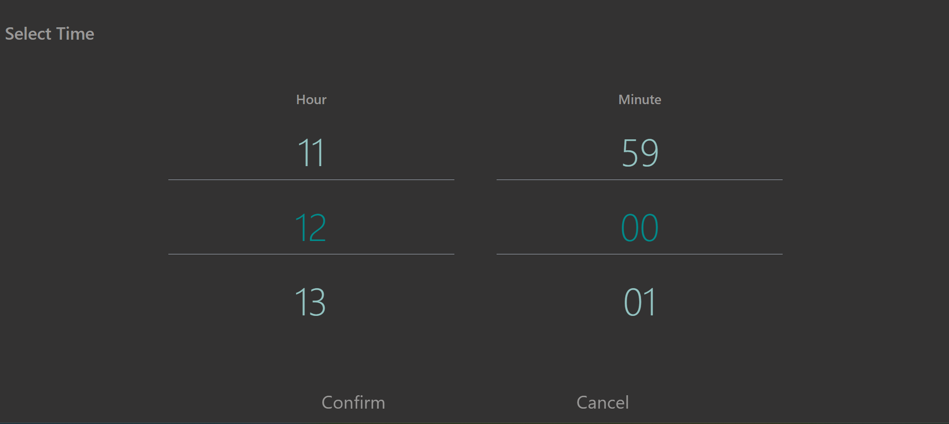
TimePicker is a versatile and user-friendly React component designed to allow users to select time easily. With its intuitive interface and responsive design, TimePicker ensures a seamless experience across all devices.
Key Features:
Bilingual Support: TimePicker supports both English and Persian languages, making it accessible for a wider audience.
Responsive Design: The component adapts to various screen sizes and devices, ensuring a consistent user experience whether on mobile or desktop.
Customizable Color Options: Choose from a variety of color options to match your application's design and theme.
Smooth Scrolling: Navigate through hours and minutes with smooth scrolling functionality.
Easy Integration: Simply import the component and use it in your project with minimal
Customizable Scroll and UI Behavior: Fine-tune the scroll behavior, the appearance of time elements, and even the active item’s color to match your application’s style. This level of customization helps ensure that the time picker fits perfectly within your app's design.
Seamless User Experience: From dynamic language switching to intuitive time scrolling, every detail of the user interface is crafted to provide an effortless and engaging user experience. Users can interact with the time picker with minimal effort and enjoy a modern, stylish interface.
activeColor, backgroundColor, textColor, and numbersColor to match your design needs.fa). It automatically adjusts text and layout direction based on the selected language.data function allows you to send the selected hour and minute back to the parent component.cancelPage and confirmPage links.Fixed useRef issues.
Improved and rebuild structure.
Improve functions and constants name .
Added constant file to store constant datas such as hours and minutes.
Enhanced Safety Checks.
Implemented Optional Chaining (?.).
Optimized Query Selection.
Added Cleanup (return function).
Improved Event Listener Logic.
For more details, see CHANGELOG.md.
Here is an example of how to use the TimePicker component in your React application:
1
2import React, { useState } from "react";
3import { TimePicker } from "react-time-picker-digital";
4
5function App() {
6  var [hour, setHour] = useState();
7  var [minute, setMinute] = useState();
8  function handleData(data) {
9    setHour(data.hour);
10    setMinute(data.minute);
11    console.log("hour", hour);
12    console.log("minute", minute);
13  }
14
15  return (
16
17      <TimePicker
18        backgroundColor={"black"}
19        activeColor={"crimson"}
20        textColor={"black"}
21        numbersColor={"gray"}
22        language={"en"}
23        cancelPage={"/"}
24        confirmPage={"/about"}
25        data={handleData}
26      />
27
28  );
29}
30
31export default App;
32
Prop Type Default Description data function Required Function to send the selected time to the parent. cancelPage string Required Link to the previous page. confirmPage string Required Link to the next page.
| Prop | Type | Default | Description |
|---|---|---|---|
data | function | Required | A callback function to send the selected hour and minute to the parent component. |
cancelPage | string | Required | The URL to navigate to when the back button is clicked. |
confirmPage | string | Required | The URL to navigate to when the confirm button is clicked. |
language | string | "en" | Determines the language of the timepicker. The user can select between Persian ('fa') and English ('en'). |
activeColor | string | "#2088B4" | Sets the color theme of the timepicker selected hour and minute. The user can select any valid CSS color. |
backgroundColor | string | "#fff" | Sets the color theme of the timepicker background color. The user can select any valid CSS color. |
textColor | string | "#000000" | Sets the color theme of the timepicker text color. The user can select any valid CSS color. |
numbersColor | string | "#bababa" | Sets the color theme of the timepicker numbers list color. The user can select any valid CSS color. |
Smooth Scrolling: Ensure that your container has sufficient height to enable smooth scrolling. Adjust CSS styles if you encounter performance issues.
Custom Styling: Use the activeColor, backgroundColor, textColor, and numbersColor props to tailor the appearance of the time picker to match your application's theme.
Language Direction: The component automatically adjusts text direction based on the selected language. For right-to-left languages (like Persian), the layout will adapt accordingly.
Initial Values: If you want to set default values for the hour and minute, consider using the scrollTo method in useEffect to programmatically set the initial scroll position.
Testing: When testing the component, ensure to test across different devices and screen sizes to confirm that the responsive design works as expected.
Q: How do I customize the appearance of the time picker?
A: You can customize the appearance using the activeColor, backgroundColor, textColor, and numbersColor props. These allow you to set colors for different elements within the time picker.
Q: What languages are supported by the time picker?
A: The time picker supports English and Persian. You can switch between these languages using the language prop.
Q: Can I use the time picker in a non-React project?
A: The time picker is built for React and requires React to be installed in your project. For non-React projects, you may need to find or build an alternative component.
Q: How do I handle the selected time data?
A: The selected time data is passed to the data callback function when the user confirms their selection. The data will include the selected hour and minute.
Q: What should I do if the component is not rendering correctly?
A: Ensure that the component is correctly imported and that all required props are provided. Check the console for any errors and make sure that your environment meets the necessary requirements.
Contributions are welcome! Please create an issue or a pull request.
For any questions or feedback, please contact me via:
Email: [hossein.azp94@gmail.com]
LinkedIn: [https://www.linkedin.com/in/hosseinazadpour]
This project is licensed under the MIT License - see the LICENSE file for details.
https://github.com/HosseinAzadpour/react-time-picker-digital

No vulnerabilities found.
No security vulnerabilities found.