Gathering detailed insights and metrics for vue3-circle-progress
Gathering detailed insights and metrics for vue3-circle-progress
Gathering detailed insights and metrics for vue3-circle-progress
Gathering detailed insights and metrics for vue3-circle-progress
vue-ellipse-progress
A Vue.js component to create beautiful animated circle progress bars
vue3-m-circle-progress-bar
vue3-circle-progress-bar
A circular progressbar component for Vue 3, built with SVG and extensively customizable. A fork of https://github.com/delowardev/vue3-circle-progress
circle-progress.vue

Highly customizable & lightweight circular progressbar component for Vue 3, built with SVG and extensively customizable
npm install vue3-circle-progressTypescript
Module System
Node Version
NPM Version
Vue (85.34%)
JavaScript (9.84%)
HTML (4.83%)
Total Downloads
0
Last Day
0
Last Week
0
Last Month
0
Last Year
0
MIT License
42 Stars
25 Commits
13 Forks
1 Watchers
1 Branches
3 Contributors
Updated on Apr 04, 2025
Latest Version
1.0.7
Package Id
vue3-circle-progress@1.0.7
Unpacked Size
719.06 kB
Size
171.25 kB
File Count
13
NPM Version
8.0.0
Node Version
16.11.0
Cumulative downloads
Total Downloads
Last Day
0%
NaN
Compared to previous day
Last Week
0%
NaN
Compared to previous week
Last Month
0%
NaN
Compared to previous month
Last Year
0%
NaN
Compared to previous year

Highly customizable & lightweight circular progressbar component for Vue 3, built with SVG and extensively customizable.
Install with npm:
npm install --save vue3-circle-progress
or yarn:
yarn add vue3-circle-progress
1
2<template>
3
4  // Basic Usage
5  <circle-progress :percent="40" />
6
7  // Default Gradient
8  <circle-progress :is-gradient="true"  />
9
10  // Customize Gradient
11  <circle-progress
12      :is-gradient="true"
13      :gradient="{
14        angle: 90,
15        startColor: '#ff0000',
16        stopColor: '#ffff00'
17    }"
18  />
19
20  // Default Shadow
21  <circle-progress :is-bg-shadow="true" />
22
23  // Customize Shadow
24  <circle-progress
25      :is-bg-shadow="true"
26      :bg-shadow="{
27        inset: true,
28        vertical: 2,
29        horizontal: 2,
30        blur: 4,
31        opacity: .4,
32        color: '#000000'
33    }"
34      empty-color="#f7f7f7"
35      :border-width="6"
36      :border-bg-width="30"
37  />
38</template>
39
40
41<script>
42
43import "vue3-circle-progress/dist/circle-progress.css";
44import CircleProgress from "vue3-circle-progress";
45export default {
46  components: {CircleProgress}
47}
48
49</script>
50
Available Props, this package supports 30+ props
| Names | Description | Default Value | Type | Range/Max |
|---|---|---|---|---|
| size | Circle height & Width | 180 | Int | ∞ |
| border-width | Circle Border width | 15 | Int | ∞ |
| border-bg-width | Circle Border Background width | 15 | Int | ∞ |
| fill-color | Stroke Fill Color | #288feb | String | N/A |
| empty-color | Stroke (empty) BG Fill Color | #288feb | String | N/A |
| background | Circle Background | none | String | N/A |
| class | Component Custom Class | '' | String | N/A |
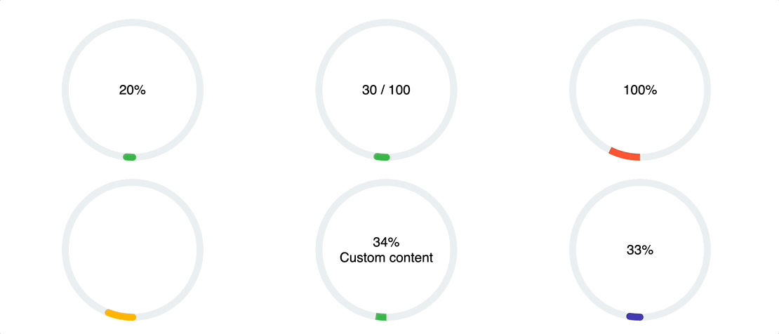
| percent | Fill Percent | 55 | Int | 100 |
| linecap | Stroke Line Style | round | String | N/A |
| is-gradient | Enable Gradient | false | Boolean | N/A |
| transition | Apply transition when percent change | 200 (ms) | Int | ∞ |
| gradient | Gradient Essential Values | {...} | Object | N/A |
| is-shadow | Enable Circle Shadow | false | Boolean | N/A |
| shadow | Shadow Essential Values | {...} | Object | N/A |
| is-bg-shadow | Enable Circle BG Shadow | false | Boolean | N/A |
| bg-shadow | Shadow Essential Values | {...} | Object | N/A |
| viewport | Animate when element is in viewport | true | Boolean | N/A |
| on-viewport | Callback function to detect viewport | undefined | Function | N/A |
| show-percent | Enable disable percent counter | false | Boolean | N/A |
1<template>
2  <circle-progress
3      :is-bg-shadow="true"
4      :bg-shadow="{
5        inset: true,
6        vertical: 2,
7        horizontal: 2,
8        blur: 4,
9        opacity: .4,
10        color: '#000000'
11    }"
12      empty-color="#f7f7f7"
13      :border-width="6"
14      :border-bg-width="30"
15  />
16</template>
17
18<script>
19
20import CircleProgress from "vue3-circle-progress";
21export default {
22  components: {CircleProgress}
23}
24
25</script>
26
| Names | Description | Default Value | Type | Range/Max |
|---|---|---|---|---|
| angle | Gradinet Angle | 0 | Int | 0-360 |
| startColor | Gradient Start Color | #ff0000 | String | N/A |
| stopColor | Gradient Stop Color | #ffff00 | String | N/A |
1<circle-progress
2    :is-gradient="true"
3    :gradient="{
4        angle: 90,
5        startColor: '#ff0000',
6        stopColor: '#ffff00'
7    }"
8/>
| Names | Description | Default Value | Type | Range/Max |
|---|---|---|---|---|
| inset | Set Shadow Inset or Outset | false | Boolean | N/A |
| vertical | Shadow Vertical Offset | 3 | Int | ∞ |
| horizontal | Shadow Horizontal Offset | 0 | Int | ∞ |
| blur | Shadow Blur | 0 | Int | ∞ |
| opacity | Shadow Opacity | .4 | Float | 0-1 |
| color | Shadow Color | #000000 | String | 0-1 |
1
2<circle-progress
3    :is-shadow="true"
4    :shadow="{
5        inset: true,
6        vertical: 2,
7        horizontal: 2,
8        blur: 4,
9        opacity: .4,
10        color: '#000000'
11    }"
12/>
13
| Names | Description | Default Value | Type | Range/Max |
|---|---|---|---|---|
| inset | Set Shadow Inset or Outset | false | Boolean | N/A |
| vertical | Shadow Vertical Offset | 3 | Int | ∞ |
| horizontal | Shadow Horizontal Offset | 0 | Int | ∞ |
| blur | Shadow Blur | 0 | Int | ∞ |
| opacity | Shadow Opacity | .4 | Float | 0-1 |
| color | Shadow Color | #000000 | String | 0-1 |
1
2<circle-progress
3    :is-bg-shadow="true"
4    :bg-shadow="{
5        inset: true,
6        vertical: 2,
7        horizontal: 2,
8        blur: 4,
9        opacity: .4,
10        color: '#000000'
11    }"
12/>
13
This callback function fires when the target element is in the viewport.
1<circle-progress
2    :on-viewport="() => {
3        // do something
4    }"
5/>

No vulnerabilities found.
Reason
no binaries found in the repo
Reason
license file detected
Details
Reason
Found 2/20 approved changesets -- score normalized to 1
Reason
0 commit(s) and 0 issue activity found in the last 90 days -- score normalized to 0
Reason
no effort to earn an OpenSSF best practices badge detected
Reason
security policy file not detected
Details
Reason
project is not fuzzed
Details
Reason
branch protection not enabled on development/release branches
Details
Reason
SAST tool is not run on all commits -- score normalized to 0
Details
Reason
76 existing vulnerabilities detected
Details
Score
Last Scanned on 2025-07-07
The Open Source Security Foundation is a cross-industry collaboration to improve the security of open source software (OSS). The Scorecard provides security health metrics for open source projects.
Learn More