Installations
npm install react-input-emojiDeveloper Guide
Typescript
Yes
Module System
CommonJS
Min. Node Version
>=8
Node Version
20.12.0
NPM Version
10.5.0
Score
74.2
Supply Chain
93
Quality
83.3
Maintenance
100
Vulnerability
100
License
Releases
Unable to fetch releases
Contributors
Languages
JavaScript (92.98%)
CSS (4.37%)
HTML (2.64%)
Developer
Download Statistics
Total Downloads
449,414
Last Day
506
Last Week
2,503
Last Month
11,338
Last Year
172,803
GitHub Statistics
121 Stars
142 Commits
68 Forks
1 Watching
3 Branches
5 Contributors
Bundle Size
127.35 kB
Minified
40.82 kB
Minified + Gzipped
Maintainers
Package Meta Information
Latest Version
5.9.0
Package Id
react-input-emoji@5.9.0
Unpacked Size
796.70 kB
Size
193.93 kB
File Count
32
NPM Version
10.5.0
Node Version
20.12.0
Publised On
29 Apr 2024
Total Downloads
Cumulative downloads
Total Downloads
449,414
Last day
-11.4%
506
Compared to previous day
Last week
-15.5%
2,503
Compared to previous week
Last month
-10.8%
11,338
Compared to previous month
Last year
21.3%
172,803
Compared to previous year
Daily Downloads
Weekly Downloads
Monthly Downloads
Yearly Downloads
Dev Dependencies
36
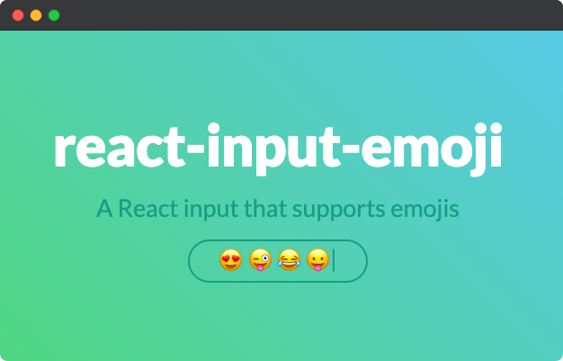
react-input-emoji 😍 😜 😂 😛
A powerful and customizable React component that seamlessly integrates emoji picker functionality into any input element, enhancing user experience.

📝 About
InputEmoji provides a simple and intuitive way to add emoji picker functionality to any input element in your React application. With just a few lines of code, you can enable your users to easily select and insert emojis into their text input.
The component is highly customizable, allowing you to control the styling, positioning and behavior of the emoji picker. It also supports various useful features out of the box, such as:
- Easy integration with any input element
- Customizable appearance via props
- Built-in support for cleaning input on enter
- Callback functions for onChange, onClick and onEnter events
- Ability to keep the picker open after selecting an emoji
- Internationalization support for multiple languages
InputEmoji leverages the power of the emoji-mart library to provide a wide range of emojis across different categories and styles. The internationalization capabilities allow you to cater to users from diverse linguistic backgrounds, making your application more inclusive and accessible.
Whether you're building a chat app, social media platform, or any other application that could benefit from emoji input, InputEmoji has you covered. Give your users a fun and engaging way to express themselves with this powerful yet easy-to-use component!
📦 Install
1npm install --save react-input-emoji
🚀 Usage
After install import the react-input-emoji component to display your input with emoji support like so:
1import React, { useState } from "react";
2import InputEmoji from "react-input-emoji";
3
4export default function Example() {
5  const [text, setText] = useState("");
6
7  function handleOnEnter(text) {
8    console.log("enter", text);
9  }
10
11  return (
12    <InputEmoji
13      value={text}
14      onChange={setText}
15      cleanOnEnter
16      onEnter={handleOnEnter}
17      placeholder="Type a message"
18    />
19  );
20}
🧩 Props
| Prop | Type | Default | Description |
|---|---|---|---|
background | string | "white" | Specifies the background color of the input element. Accepts any valid CSS color value. |
borderColor | string | "#EAEAEA" | Specifies the border color of the input container. Accepts any valid CSS color value. |
borderRadius | number | 21 | Determines the border radius of the input container in pixels. Higher values result in more rounded corners. |
buttonElement | HTMLElement | - | Allows you to provide a custom HTMLElement that, when clicked, triggers the emoji picker. If this prop is provided, the default emoji picker button is removed. |
buttonRef | React.MutableRefObject | - | Accepts a React mutable ref object that, when referenced, triggers the emoji picker. If this prop is provided, the default emoji picker button is removed. |
cleanOnEnter | boolean | false | When set to true, the input value will be cleared after the user presses the Enter key. |
color | string | "black" | Specifies the color of the input text. Accepts any valid CSS color value. |
fontSize | number | 15 | Controls the font size (in pixels) of the placeholder text and input value. |
fontFamily | string | "sans-serif" | Specifies the font family for the placeholder text and input value. Accepts any valid CSS font-family value. |
height | number | 40 | Sets the total height (in pixels) of the area in which the input element is rendered. |
keepOpened | boolean | false | When set to true, the emoji picker will remain open after the user selects an emoji. Defaults to false. |
language | string | 'en' | Specifies the language to be used for the emoji picker. Available values: 'ar', 'be', 'cs', 'de', 'en', 'es', 'fa', 'fi', 'fr', 'hi', 'it', 'ja', 'kr', 'pl', 'pt', 'ru', 'sa', 'tr', 'uk', 'vi', 'zh'. |
maxLength | number | - | Limits the maximum number of characters that can be entered in the input element. |
onChange | function | - | A callback function that is invoked whenever the input value changes. It receives the current value as its argument. |
onClick | function | - | A callback function that is invoked when the input element is clicked. |
onEnter | function | - | A callback function that is invoked when the Enter key is pressed. It receives the current input value as its argument. |
onFocus | function | - | A callback function that is invoked when the input element receives focus. |
onResize | function | - | A callback function that is invoked when the width or height of the input element changes. It receives the current size value as its argument. |
placeholder | string | "Type a message" | Specifies the placeholder text to be displayed when the input is empty. |
placeholderColor | string | "#C4C4C4" | Specifies the color of the placeholder text. Accepts any valid CSS color value. |
shouldConvertEmojiToImage | boolean | false | When set to true, emojis in the input value will be converted to images. |
shouldReturn | boolean | - | When set to true, allows the user to create a new line using the Shift + Enter or Ctrl + Enter keyboard shortcuts. |
theme | string | - | Specifies the theme for the emoji picker popup. Available values: "light", "dark", "auto". |
value | string | "" | The current value of the input element. |
License
MIT © cesarwbr

No vulnerabilities found.
Reason
no binaries found in the repo
Reason
0 existing vulnerabilities detected
Reason
license file detected
Details
- Info: project has a license file: LICENSE:0
- Info: FSF or OSI recognized license: MIT License: LICENSE:0
Reason
0 commit(s) and 1 issue activity found in the last 90 days -- score normalized to 0
Reason
Found 2/27 approved changesets -- score normalized to 0
Reason
no effort to earn an OpenSSF best practices badge detected
Reason
security policy file not detected
Details
- Warn: no security policy file detected
- Warn: no security file to analyze
- Warn: no security file to analyze
- Warn: no security file to analyze
Reason
project is not fuzzed
Details
- Warn: no fuzzer integrations found
Reason
branch protection not enabled on development/release branches
Details
- Warn: branch protection not enabled for branch 'master'
Reason
SAST tool is not run on all commits -- score normalized to 0
Details
- Warn: 0 commits out of 5 are checked with a SAST tool
Score
3
/10
Last Scanned on 2025-02-03
The Open Source Security Foundation is a cross-industry collaboration to improve the security of open source software (OSS). The Scorecard provides security health metrics for open source projects.
Learn MoreOther packages similar to react-input-emoji
@chayns-components/emoji-input
Input field that supports HTML elements and emojis
react-input-emoji-v3
A simple and customizable emoji input component for React, Typescript and Tailwind CSS.
react-emotor
带emoji表情功能的输入框组件
react-native-emoji-input
A React Native emoji keyboard component