Gathering detailed insights and metrics for react-multi-date-picker
Gathering detailed insights and metrics for react-multi-date-picker
Gathering detailed insights and metrics for react-multi-date-picker
Gathering detailed insights and metrics for react-multi-date-picker
react-multi-date-picker-calendar
A simple and accessible React Calendar component that allows users to select dates.
@itpsolver/react-multi-date-picker
a simple React datepicker component for working with gregorian, persian, arabic and indian calendars with the ability to select the date by single, multiple and range pickers.
@alefseen/react-multi-date-picker
A simple React datepicker component for working with gregorian, persian, arabic and indian calendars with the ability to select the date by single, multiple, range and multiple range pickers.
@progress/kendo-react-dateinputs
React DateInput is a perfect input component for handling quick and efficient date values. KendoReact Date Inputs package
a simple React datepicker component for working with gregorian, persian, arabic and indian calendars
npm install react-multi-date-pickerTypescript
Module System
Node Version
NPM Version
93
Supply Chain
87.9
Quality
76.2
Maintenance
100
Vulnerability
100
License
JavaScript (89.58%)
CSS (10.42%)
Total Downloads
7,585,527
Last Day
2,985
Last Week
96,521
Last Month
470,110
Last Year
3,843,009
MIT License
920 Stars
484 Commits
105 Forks
6 Watchers
5 Branches
11 Contributors
Updated on Jun 18, 2025
Minified
Minified + Gzipped
Latest Version
4.5.2
Package Id
react-multi-date-picker@4.5.2
Unpacked Size
358.88 kB
Size
77.94 kB
File Count
50
NPM Version
8.19.4
Node Version
16.20.0
Published on
Jun 15, 2024
Cumulative downloads
Total Downloads
Last Day
-54.7%
2,985
Compared to previous day
Last Week
-21.6%
96,521
Compared to previous week
Last Month
9.8%
470,110
Compared to previous month
Last Year
77.6%
3,843,009
Compared to previous year
2
21
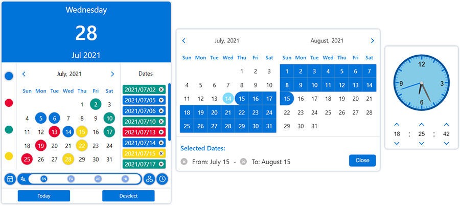
Simple React datepicker component for working with gregorian, persian, arabic and indian calendars
with the ability to select the date in single, multiple, range and multiple range modes.

You can change the appearance of the datepicker to prime or mobile by importing css files from the styles folder.

Ability to further customize the calendar and datepicker by adding one or more plugins.
1npm i react-multi-date-picker
1import React, { useState } from "react";
2import DatePicker from "react-multi-date-picker";
3
4export default function Example() {
5  const [value, setValue] = useState(new Date());
6
7  return <DatePicker value={value} onChange={setValue} />;
8}
1<!DOCTYPE html>
2<html>
3  <head>
4    <meta charset="UTF-8" />
5    <title>React Multi Date Picker</title>
6  </head>
7  <body>
8    <span>Calendar Example :</span>
9    <div id="calendar"></div>
10
11    <span>DatePicker Example :</span>
12    <div id="datePicker"></div>
13
14    <span>Plugins Example :</span>
15    <div id="datePickerWithPlugin"></div>
16
17    <!-- Ract -->
18    <script src="https://unpkg.com/react@17/umd/react.production.min.js"></script>
19    <script src="https://unpkg.com/react-dom@17/umd/react-dom.production.min.js"></script>
20
21    <!-- DatePicker and dependencies-->
22    <script src="https://cdn.jsdelivr.net/npm/date-object@latest/dist/umd/date-object.min.js"></script>
23    <script src="https://cdn.jsdelivr.net/npm/react-element-popper@latest/build/browser.min.js"></script>
24    <script src="https://cdn.jsdelivr.net/npm/react-multi-date-picker@latest/build/browser.min.js"></script>
25
26    <!-- Optional Plugin -->
27    <script src="https://cdn.jsdelivr.net/npm/react-multi-date-picker@latest/build/date_picker_header.browser.js"></script>
28
29    <script>
30      const { DatePicker, Calendar } = ReactMultiDatePicker;
31
32      ReactDOM.render(
33        React.createElement(Calendar),
34        document.getElementById("calendar")
35      );
36
37      ReactDOM.render(
38        React.createElement(DatePicker),
39        document.getElementById("datePicker")
40      );
41
42      ReactDOM.render(
43        React.createElement(DatePicker, {
44          plugins: [React.createElement(DatePickerHeader)],
45        }),
46        document.getElementById("datePickerWithPlugin")
47      );
48    </script>
49  </body>
50</html>
| Name | Type | Default | Availability (DatePicker/ Calendar) |
|---|---|---|---|
| value | Date, DateObject , String, Number or Array | new Date() | both |
| ref | React.RefObject | both | |
| multiple | Boolean | false (true if value is Array) | both |
| range | Boolean | false | both |
| onlyMonthPicker | Boolean | false | both |
| onlyYearPicker | Boolean | false | both |
| format | String | YYYY/MM/DD | both |
| formattingIgnoreList | Array | both | |
| calendar | Object | gregorian | both |
| locale | Object | gregorian_en | both |
| mapDays | Function | both | |
| onChange | Function | both | |
| onPropsChange | Function | both | |
| onMonthChange | Function | both | |
| onYearChange | Function | both | |
| onFocusedDateChange | Function | both | |
| digits | Array | both | |
| weekDays | Array | both | |
| months | Array | both | |
| showOtherDays | Boolean | false | both |
| minDate | Date, DateObject, String or Number | both | |
| maxDate | Date, DateObject, String or Number | both | |
| disableYearPicker | Boolean | false | both |
| disableMonthPicker | Boolean | false | both |
| disableDayPicker | Boolean | false | both |
| zIndex | Number | 100 | both |
| plugins | Array | [] | both |
| sort | Boolean | false | both |
| numberOfMonths | Number | 1 | both |
| currentDate | DateObject | both | |
| buttons | Boolean | true | both |
| renderButton | React.ReactElement or Function | both | |
| weekStartDayIndex | Number | both | |
| className | String | both | |
| readOnly | Boolean | false | both |
| disabled | Boolean | false | both |
| hideMonth | Boolean | false | both |
| hideYear | Boolean | false | both |
| hideWeekDays | Boolean | false | both |
| shadow | Boolean | true | both |
| fullYear | Boolean | false | both |
| displayWeekNumbers | Boolean | false | both |
| weekNumber | String | both | |
| weekPicker | Boolean | false | both |
| rangeHover | Boolean | false | both |
| monthYearSeparator | String | "," for LTR locales, "،" for RTL locales | both |
| formatMonth | Function | undefined | both |
| formatYear | Function | undefined | both |
| highlightToday | Boolean | true | both |
| style | React.CSSProperties | {} | both |
| headerOrder | Array | ["LEFT_BUTTON", "MONTH_YEAR", "RIGHT_BUTTON"] | both |
| onOpen | Function | DatePicker | |
| onClose | Function | DatePicker | |
| onPositionChange | Function | DatePicker | |
| containerClassName | String | DatePicker | |
| arrowClassName | String | 0 | DatePicker |
| containerStyle | React.CSSProperties | DatePicker | |
| arrowStyle | React.CSSProperties | 0 | DatePicker |
| arrow | Boolean or React.ReactElement | true | DatePicker |
| animations | Array | false | DatePicker |
| inputClass | String | DatePicker | |
| name | String | DatePicker | |
| id | String | DatePicker | |
| title | String | DatePicker | |
| required | Boolean | DatePicker | |
| placeholder | String | DatePicker | |
| render | React.ReactElement or Function | DatePicker | |
| inputMode | String | DatePicker | |
| scrollSensitive | Boolean | true | DatePicker |
| hideOnScroll | Boolean | false | DatePicker |
| calendarPosition | String | "bottom-left" | DatePicker |
| editable | Boolean | true | DatePicker |
| onlyShowInRangeDates | Boolean | true | DatePicker |
| fixMainPosition | Boolean | false | DatePicker |
| fixRelativePosition | Boolean | false | DatePicker |
| offsetY | Number | 0 | DatePicker |
| offsetX | Number | 0 | DatePicker |
| mobileLabels | Object | DatePicker | |
| portal | Boolean | DatePicker | |
| portalTarget | HTMLElement | DatePicker | |
| onOpenPickNewDate | Boolean | true | DatePicker |
| mobileButtons | HTMLButtonElement[] | [] | DatePicker |
| dateSeparator | String | '~' in range mode, ',' in multiple mode | DatePicker |
| multipleRangeSeparator | String | ',' | DatePicker |
| typingTimeout | String | 700 | DatePicker |
| autoFocus | Boolean | false | Calendar |
Click here to see the descriptions.
| Calendars | Gregorian | Persian (Solar Hijri) | Jalali | Arabic (Lunar Hijri) | Indian | |
|---|---|---|---|---|---|---|
| /calendars/gregorian | /calendars/persian | /calendars/jalali | /calendars/arabic | /calendars/indian | ||
| Locales | English | /locales/gregorian_en | /locales/persian_en | /locales/persian_en | /locales/arabic_en | /locales/indian_en |
| Portuguese - BRAZIL | /locales/gregorian_pt_br | - | - | - | - | |
| Farsi | /locales/gregorian_fa | /locales/persian_fa | /locales/persian_fa | /locales/arabic_fa | /locales/indian_fa | |
| Arabic | /locales/gregorian_ar | /locales/persian_ar | /locales/persian_ar | /locales/arabic_ar | /locales/indian_ar | |
| Hindi | /locales/gregorian_hi | /locales/persian_hi | /locales/persian_hi | /locales/arabic_hi | /locales/indian_hi | |
Of course, you can customize the names of the months and days of the week
in both the calendar & input by using the months and weekDays Props.
Also, you can create a custom Calendar and Locale:

No vulnerabilities found.
Reason
no dangerous workflow patterns detected
Reason
no binaries found in the repo
Reason
license file detected
Details
Reason
SAST tool detected but not run on all commits
Details
Reason
detected GitHub workflow tokens with excessive permissions
Details
Reason
0 commit(s) and 0 issue activity found in the last 90 days -- score normalized to 0
Reason
Found 2/27 approved changesets -- score normalized to 0
Reason
no effort to earn an OpenSSF best practices badge detected
Reason
security policy file not detected
Details
Reason
branch protection not enabled on development/release branches
Details
Reason
project is not fuzzed
Details
Reason
dependency not pinned by hash detected -- score normalized to 0
Details
Reason
110 existing vulnerabilities detected
Details
Score
Last Scanned on 2025-06-30
The Open Source Security Foundation is a cross-industry collaboration to improve the security of open source software (OSS). The Scorecard provides security health metrics for open source projects.
Learn More