Gathering detailed insights and metrics for react-native-country-codes-picker
Gathering detailed insights and metrics for react-native-country-codes-picker
Gathering detailed insights and metrics for react-native-country-codes-picker
Gathering detailed insights and metrics for react-native-country-codes-picker
react-native-international-phone-number
International mobile phone input component with mask for React Native
rn-country-code-picker-modal
react native country code picker with a modal, in typescript.
react-native-country-picker-samcodeng
This lib. provide country picker with search functionality an update to Mutovkin Yurii react-native-country-codes-picker
react-native-dialer-code-picker
Multi-language country dialer code picker with advanced search functionality, optimized performance, and customizable templates for React Native and Expo. Inspired by react-native-country-codes-picker but enhanced for better performance and issue-free exp
⚡ ⚡ ⚡This lib. provide multi lang. country picker with search functionality. Fully crossplatform and supported on React-native and expo. Didn't find your country ? Just add the required countries or locales and make a PR.⚡ ⚡ ⚡
npm install react-native-country-codes-pickerTypescript
Module System
Node Version
NPM Version
TypeScript (100%)
Total Downloads
0
Last Day
0
Last Week
0
Last Month
0
Last Year
0
MIT License
185 Stars
169 Commits
97 Forks
1 Watchers
3 Branches
29 Contributors
Updated on Jul 10, 2025
Latest Version
2.3.5
Package Id
react-native-country-codes-picker@2.3.5
Unpacked Size
267.04 kB
Size
53.58 kB
File Count
11
NPM Version
8.3.0
Node Version
18.12.1
Published on
Jan 12, 2024
Cumulative downloads
Total Downloads
Last Day
0%
NaN
Compared to previous day
Last Week
0%
NaN
Compared to previous week
Last Month
0%
NaN
Compared to previous month
Last Year
0%
NaN
Compared to previous year
2
3
:zap: :zap: :zap: This lib. provide multi lang. country picker or country list with search functionality. Fully crossplatform and supported on React-native and expo. Didn't find your country ? Just add the required countries or locales and make a PR. :zap: :zap: :zap:
I'm looking to enhance this library and would love to hear your thoughts on what features you'd like to see in the next version. Currently, I'm drafting a roadmap for the upcoming release of react-native-country-codes-picker.
Considering whether the next version should be based on reanimated v3 for improved performance or if it's better to introduce a flexible hook instead of a new component. Your input is crucial in guiding the development, so please share your ideas on the most valuable additions or changes you'd like to see.
If you have something interesting ! Just write to us :)
expo: expo install react-native-country-codes-picker
npm: npm i react-native-country-codes-picker
yarn: yarn add react-native-country-codes-picker
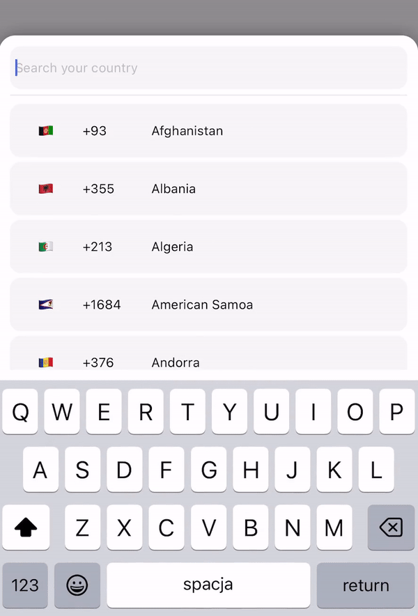
1import {CountryPicker} from "react-native-country-codes-picker";
2
3export default function App() {
4  const [show, setShow] = useState(false);
5  const [countryCode, setCountryCode] = useState('');
6
7  return (
8    <View style={styles.container}>
9      <TouchableOpacity
10        onPress={() => setShow(true)}
11        style={{
12            width: '80%',
13            height: 60,
14            backgroundColor: 'black',
15            padding: 10,
16        }}
17      >
18        <Text style={{
19            color: 'white',
20            fontSize: 20
21        }}>
22            {countryCode}
23        </Text>
24      </TouchableOpacity>
25
26      // For showing picker just put show state to show prop
27      <CountryPicker
28        show={show}
29        // when picker button press you will get the country object with dial code
30        pickerButtonOnPress={(item) => {
31          setCountryCode(item.dial_code);
32          setShow(false);
33        }}
34      />
35    </View>
36  );
37}
1import {CountryPicker} from "react-native-country-codes-picker";
2
3function ListHeaderComponent({countries, lang, onPress}) {
4    return (
5        <View
6            style={{
7                paddingBottom: 20,
8            }}
9        >
10            <Text>
11                Popular countries
12            </Text>
13            {countries?.map((country, index) => {
14                return (
15                    <CountryButton key={index} item={country} name={country?.name?.[lang || 'en']} onPress={() => onPress(country)} />
16                )
17            })}
18        </View>
19    )
20}
21
22export default function App() {
23  const [show, setShow] = useState(false);
24  const [countryCode, setCountryCode] = useState('');
25
26  return (
27    <View style={styles.container}>
28      <TouchableOpacity
29        onPress={() => setShow(true)}
30        style={{
31            width: '80%',
32            height: 60,
33            backgroundColor: 'black',
34            padding: 10,
35        }}
36      >
37        <Text style={{
38            color: 'white',
39            fontSize: 20
40        }}>
41            {countryCode}
42        </Text>
43      </TouchableOpacity>
44
45      // For showing picker just put show state to show prop
46      <CountryPicker
47        show={show}
48        // when picker button press you will get the country object with dial code
49        pickerButtonOnPress={(item) => {
50          setCountryCode(item.dial_code);
51          setShow(false);
52        }}
53        ListHeaderComponent={ListHeaderComponent}
54        popularCountries={['en', 'ua', 'pl']}
55      />
56    </View>
57  );
58}
1import {CountryList} from "react-native-country-codes-picker";
2
3export default function App() {
4  const [countryCode, setCountryCode] = useState('');
5
6  return (
7    <View style={styles.container}>
8      <View
9        style={{
10            width: '80%',
11            height: 60,
12            backgroundColor: 'black',
13            padding: 10,
14        }}
15      >
16        <Text style={{
17            color: 'white',
18            fontSize: 20
19        }}>
20            {countryCode}
21        </Text>
22      </TouchableOpacity>
23
24      // All props the same as for picker
25       <CountryList
26          lang={'pl'}
27          pickerButtonOnPress={(item) => {
28              setCountryCode(item.dial_code);
29          }}
30       />
31    </View>
32  );
33}
Below are the props you can pass to the React Component.
| Prop | Type | Default | Example | Description |
|---|---|---|---|---|
| show | boolean | This prop using for displaying the modal. Put your show state here. | ||
| pickerButtonOnPress | function | (country) => setCode(country.dial_code) | Put your function/functions here for getting country data from picker. | |
| inputPlaceholder | string | inputPlaceholder={'Your placeholder'} | If you need a custom placeholder for your input you may need this prop. | |
| searchMessage | string | searchMessage={'Some search message here'} | If you want to customize search message just use this prop. | |
| lang | string | 'en' | lang={'pl'} | If you need to change the lang. just put one of supported lang. Or if you didn't find required lang just add them and make a PR :) |
| enableModalAvoiding | boolean | false | enableModalAvoiding={true} | Is modal should avoid keyboard ? On android to work required to use with androidWindowSoftInputMode with value pan, by default android will avoid keyboard by itself |
| androidWindowSoftInputMode | string | androidWindowSoftInputMode={'pan'} | Basicaly android avoid keyboard by itself, if you want to use custom avoiding you may use this prop | |
| itemTemplate | ReactNode | CountryButton | itemTemplate={YourTemplateComponentsHere} | This parameter gets a React Node element to render it as a template for each item of the list. These properties are sent to the item: key, item, style, name, and onPress |
| style | Object | style={{yoursStylesHere}} | If you want to change styles for component you probably need this props. You can check the styling part below. | |
| disableBackdrop | boolean | false | disableBackdrop | if you don't wanna show modal backdrop pass this prop. |
| onBackdropPress | function | null | onBackdropPress={() => setShow(false)} | If you want to close modal when user taps on the modal background. |
| initialState | string | initialState={'+380'} | Sometimes you need to pre-select country for example by user current location so you may use this prop. | |
| excludedCountries | array | excludedCountries={['RU', 'BY']} | In this prop you can define list of countries which you want to remove by adding their codes. | |
| showOnly | array | showOnly={['UA', 'EN']} | This prop allow you to configure which countries you want to show. | |
| popularCountries | array | popularCountries={['UA', 'EN']} | This prop allow you to send popular countries array to your ListHeaderComponent. | |
| ListHeaderComponent | JSX.Element | ListHeaderComponent={ListHeaderComponent} | This prop allow you to create header component to show popular countries on top of list! Check example section with ListHeaderComponent |
:grey_exclamation: Also you can use all other FlatList and TextInput props if you need. :grey_exclamation:
1<CountryPicker
2    show={show}
3    lang={'cz'}
4    style={{
5        // Styles for whole modal [View]
6        modal: {
7            height: 500,
8            backgroundColor: 'red'
9        },
10        // Styles for modal backdrop [View]
11        backdrop: {
12
13        },
14        // Styles for bottom input line [View]
15        line: {
16
17        },
18        // Styles for list of countries [FlatList]
19        itemsList: {
20
21        },
22        // Styles for input [TextInput]
23        textInput: {
24              height: 80,
25              borderRadius: 0,
26        },
27        // Styles for country button [TouchableOpacity]
28        countryButtonStyles: {
29              height: 80
30        },
31        // Styles for search message [Text]
32        searchMessageText: {
33
34        },
35        // Styles for search message container [View]
36        countryMessageContainer: {
37
38        },
39        // Flag styles [Text]
40        flag: {
41
42        },
43        // Dial code styles [Text]
44        dialCode: {
45
46        },
47        // Country name styles [Text]
48        countryName: {
49
50        }
51    }}
52    pickerButtonOnPress={(item) => {
53        setCountryCode(item.dial_code);
54        setShow(false);
55    }}
56/>
1  "name": {
2    "en": "English",
3    "ru": "Russian",
4    "pl": "Polish",
5    "ua": "Ukrainian",
6    "cz": "Czech",
7    "by": "Belarusian",
8    "pt": "Portuguese",
9    "es": "Espanol",
10    "ro": "Romanian",
11    "bg": "Bulgarian",
12    "de": "German",
13    "fr": "French",
14    "nl": "Dutch",
15    "it": "Italian",
16    "cn": "Chinese",
17    "ee": "Estonian",
18    "jp": "Japanese",
19    "he": "Hebrew",
20    "tr": "Turkish"
21  },
You can add your lang. if you need !!! But after that make a PR please, it will help other people.
If you are using this package and need to target one of the components in your automated tests, we currently do provide a testID for the following components:
FlatList component: 'countryCodesPickerFlatList'TextInput component: 'countryCodesPickerSearchInput'TouchableOpacity) component: 'countryCodesPickerCountryButton'
No vulnerabilities found.
Reason
no binaries found in the repo
Reason
license file detected
Details
Reason
0 existing vulnerabilities detected
Reason
Found 11/16 approved changesets -- score normalized to 6
Reason
0 commit(s) and 0 issue activity found in the last 90 days -- score normalized to 0
Reason
no effort to earn an OpenSSF best practices badge detected
Reason
security policy file not detected
Details
Reason
project is not fuzzed
Details
Reason
branch protection not enabled on development/release branches
Details
Reason
SAST tool is not run on all commits -- score normalized to 0
Details
Score
Last Scanned on 2025-07-07
The Open Source Security Foundation is a cross-industry collaboration to improve the security of open source software (OSS). The Scorecard provides security health metrics for open source projects.
Learn More