Gathering detailed insights and metrics for react-native-select-dropdown
Gathering detailed insights and metrics for react-native-select-dropdown
Gathering detailed insights and metrics for react-native-select-dropdown
Gathering detailed insights and metrics for react-native-select-dropdown
@react-native-picker/picker
React Native Picker for iOS, Android, macOS, and Windows
react-native-picker-select
A Picker component for React Native which emulates the native <select> interfaces for each platform
@react-native-community/picker
React Native Picker for iOS & Android
react-native-modal-dropdown
A react-native dropdown component for both iOS and Android.
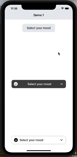
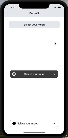
react-native-select-dropdown is a highly customized dropdown | select | picker | menu for react native that works for andriod and iOS platforms.
npm install react-native-select-dropdownTypescript
Module System
Node Version
NPM Version
99
Supply Chain
99.1
Quality
76.1
Maintenance
100
Vulnerability
100
License
JavaScript (100%)
Total Downloads
0
Last Day
0
Last Week
0
Last Month
0
Last Year
0
MIT License
359 Stars
124 Commits
148 Forks
6 Watchers
2 Branches
18 Contributors
Updated on Jun 27, 2025
Latest Version
4.0.1
Package Id
react-native-select-dropdown@4.0.1
Unpacked Size
34.63 kB
Size
9.29 kB
File Count
20
NPM Version
9.6.7
Node Version
20.3.0
Published on
Apr 09, 2024
Cumulative downloads
Total Downloads
Last Day
0%
NaN
Compared to previous day
Last Week
0%
NaN
Compared to previous week
Last Month
0%
NaN
Compared to previous month
Last Year
0%
NaN
Compared to previous year

No dependencies detected.
react-native-select-dropdown is a highly customized dropdown | select | picker | menu for react native that works for android and iOS platforms.
1npm install react-native-select-dropdown
1yarn add react-native-select-dropdown
import SelectDropdown from 'react-native-select-dropdown'
import Icon from 'react-native-vector-icons/MaterialCommunityIcons';
...
  const emojisWithIcons = [
    {title: 'happy', icon: 'emoticon-happy-outline'},
    {title: 'cool', icon: 'emoticon-cool-outline'},
    {title: 'lol', icon: 'emoticon-lol-outline'},
    {title: 'sad', icon: 'emoticon-sad-outline'},
    {title: 'cry', icon: 'emoticon-cry-outline'},
    {title: 'angry', icon: 'emoticon-angry-outline'},
    {title: 'confused', icon: 'emoticon-confused-outline'},
    {title: 'excited', icon: 'emoticon-excited-outline'},
    {title: 'kiss', icon: 'emoticon-kiss-outline'},
    {title: 'devil', icon: 'emoticon-devil-outline'},
    {title: 'dead', icon: 'emoticon-dead-outline'},
    {title: 'wink', icon: 'emoticon-wink-outline'},
    {title: 'sick', icon: 'emoticon-sick-outline'},
    {title: 'frown', icon: 'emoticon-frown-outline'},
  ];
...
  <SelectDropdown
    data={emojisWithIcons}
    onSelect={(selectedItem, index) => {
      console.log(selectedItem, index);
    }}
    renderButton={(selectedItem, isOpened) => {
      return (
        <View style={styles.dropdownButtonStyle}>
          {selectedItem && (
            <Icon name={selectedItem.icon} style={styles.dropdownButtonIconStyle} />
          )}
          <Text style={styles.dropdownButtonTxtStyle}>
            {(selectedItem && selectedItem.title) || 'Select your mood'}
          </Text>
          <Icon name={isOpened ? 'chevron-up' : 'chevron-down'} style={styles.dropdownButtonArrowStyle} />
        </View>
      );
    }}
    renderItem={(item, index, isSelected) => {
      return (
        <View style={{...styles.dropdownItemStyle, ...(isSelected && {backgroundColor: '#D2D9DF'})}}>
          <Icon name={item.icon} style={styles.dropdownItemIconStyle} />
          <Text style={styles.dropdownItemTxtStyle}>{item.title}</Text>
        </View>
      );
    }}
    showsVerticalScrollIndicator={false}
    dropdownStyle={styles.dropdownMenuStyle}
  />
...
  const styles = StyleSheet.create({
    dropdownButtonStyle: {
      width: 200,
      height: 50,
      backgroundColor: '#E9ECEF',
      borderRadius: 12,
      flexDirection: 'row',
      justifyContent: 'center',
      alignItems: 'center',
      paddingHorizontal: 12,
    },
    dropdownButtonTxtStyle: {
      flex: 1,
      fontSize: 18,
      fontWeight: '500',
      color: '#151E26',
    },
    dropdownButtonArrowStyle: {
      fontSize: 28,
    },
    dropdownButtonIconStyle: {
      fontSize: 28,
      marginRight: 8,
    },
    dropdownMenuStyle: {
      backgroundColor: '#E9ECEF',
      borderRadius: 8,
    },
    dropdownItemStyle: {
      width: '100%',
      flexDirection: 'row',
      paddingHorizontal: 12,
      justifyContent: 'center',
      alignItems: 'center',
      paddingVertical: 8,
    },
    dropdownItemTxtStyle: {
      flex: 1,
      fontSize: 18,
      fontWeight: '500',
      color: '#151E26',
    },
    dropdownItemIconStyle: {
      fontSize: 28,
      marginRight: 8,
    },
  });
array of data that will be represented in dropdown 'can be array of objects
| Type | Required |
|---|---|
| array | Yes |
function recieves selected item and its index in data array
| Type | Required |
|---|---|
| function | Yes |
function returns React component for the dropdown button
| Type | Required |
|---|---|
| function | Yes |
function returns React component for each dropdown item
| Type | Required |
|---|---|
| function | Yes |
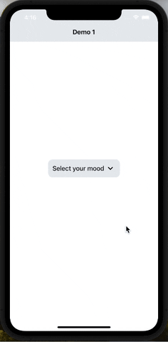
default selected item in dropdown ( check examples in Demo1)
| Type | Required |
|---|---|
| any | No |
default selected item index
| Type | Required |
|---|---|
| integer | No |
disable dropdown
| Type | Required |
|---|---|
| boolean | No |
array of disabled items index
| Type | Required |
|---|---|
| array | No |
disable auto scroll to selected value
| Type | Required |
|---|---|
| boolean | No |
dropdown menu testID
| Type | Required |
|---|---|
| string | No |
function fires when dropdown is opened
| Type | Required |
|---|---|
| function | No |
function fires when dropdown is closed
| Type | Required |
|---|---|
| function | No |
function fires when dropdown scrolls to the end (for paginations)
| Type | Required |
|---|---|
| function | No |
required to set true when statusbar is translucent (android only)
| Type | Required |
|---|---|
| boolean | No |
style object for dropdown view
| Type | Required |
|---|---|
| object | No |
backdrop color when dropdown is opened
| Type | Required |
|---|---|
| string | No |
When true, shows a vertical scroll indicator.
| Type | Required |
|---|---|
| boolean | No |
enable search functionality
| Type | Required |
|---|---|
| boolean | No |
style object for search input
| Type | Required |
|---|---|
| object | No |
text color for search input
| Type | Required |
|---|---|
| string | No |
style object for search input text
| Type | Required |
|---|---|
| object | No |
placeholder text for search input
| Type | Required |
|---|---|
| string | No |
text color for search input placeholder
| Type | Required |
|---|---|
| string | No |
function returns React component for search input icon
| Type | Required |
|---|---|
| function | No |
function returns React component for search input icon
| Type | Required |
|---|---|
| function | No |
function callback when the search input text changes, this will automatically disable the dropdown's internal search to be implemented manually outside the component
| Type | Required |
|---|---|
| function | No |
| Method | Description |
|---|---|
reset() | Remove selection & reset it |
openDropdown() | Open the dropdown. |
closeDropdown() | Close the dropdown. |
selectIndex(index) | Select a specific item by index. |
No vulnerabilities found.
Reason
no binaries found in the repo
Reason
0 existing vulnerabilities detected
Reason
license file detected
Details
Reason
Found 8/21 approved changesets -- score normalized to 3
Reason
0 commit(s) and 0 issue activity found in the last 90 days -- score normalized to 0
Reason
no effort to earn an OpenSSF best practices badge detected
Reason
security policy file not detected
Details
Reason
project is not fuzzed
Details
Reason
branch protection not enabled on development/release branches
Details
Reason
SAST tool is not run on all commits -- score normalized to 0
Details
Score
Last Scanned on 2025-06-30
The Open Source Security Foundation is a cross-industry collaboration to improve the security of open source software (OSS). The Scorecard provides security health metrics for open source projects.
Learn More